Try it on your house

Quick answer: The paint colors that make a room look brighter are high-LRV warm whites that reflect a lot of light without the cold glare of a stark white. The top three are Benjamin Moore White Dove OC-17 (LRV about 85), Sherwin-Williams Alabaster SW 7008 (LRV about 82), and Sherwin-Williams Creamy SW 7012 (LRV about 81). All three bounce daylight around the room while keeping a soft, livable warmth.
A dim room is not usually a lighting problem you can fix with a bigger bulb. It is a reflectance problem: the walls are soaking up the light instead of passing it back into the space. The fastest, cheapest way to make a room feel brighter is to paint it a color that reflects more of the light it already gets. The catch is that "bright" and "white" are not the same thing, and the wrong white can make a room feel colder and flatter rather than sunnier. This guide is part of our wider series on paint colors by room orientation, and it focuses on one job only: choosing a color that genuinely lifts the light in your space.
Why low light and a dim room change paint color
Brightness comes down to one measurable number: light reflectance value (LRV). LRV is a 0 to 100 scale that tells you how much visible light a color throws back into the room. A color at LRV 85 reflects most of the light that hits it, so the walls act almost like a soft, diffuse mirror; a color at LRV 40 absorbs more than half of it, so the same room reads darker and more closed in. If you want a space to feel brighter, you want high LRV. As a rule of thumb, anything above LRV 70 reads light, and the whites that actually brighten rooms usually land in the low-to-mid 80s.
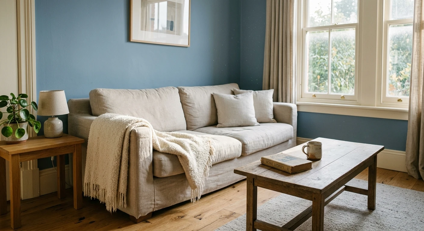
But there is a trap. The very brightest paints on the chip are pure, cool whites that can push past LRV 90, and they often disappoint. In a low-light or north-facing room, a cool white has no warm daylight to soften it, so it reads gray, blue, or clinical instead of sunny. That is why the best brightening colors are high-LRV warm whites and soft reflective neutrals: they keep the reflectance high but add just enough warmth to feel like light rather than a hospital wall. The other reason to favor a warm white is that light is unpredictable. The same color can look crisp at noon and dull at dusk, so the number on the chip is a starting point, not a guarantee.
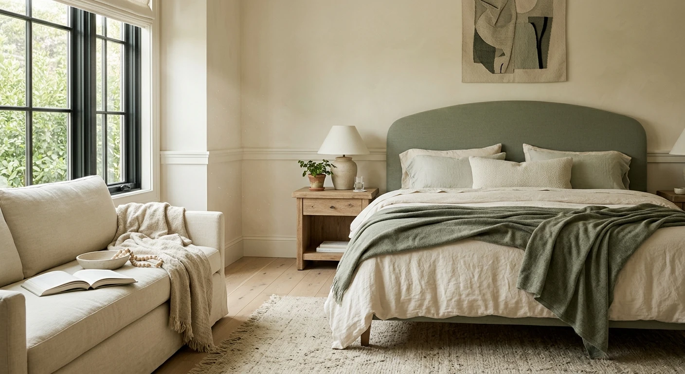
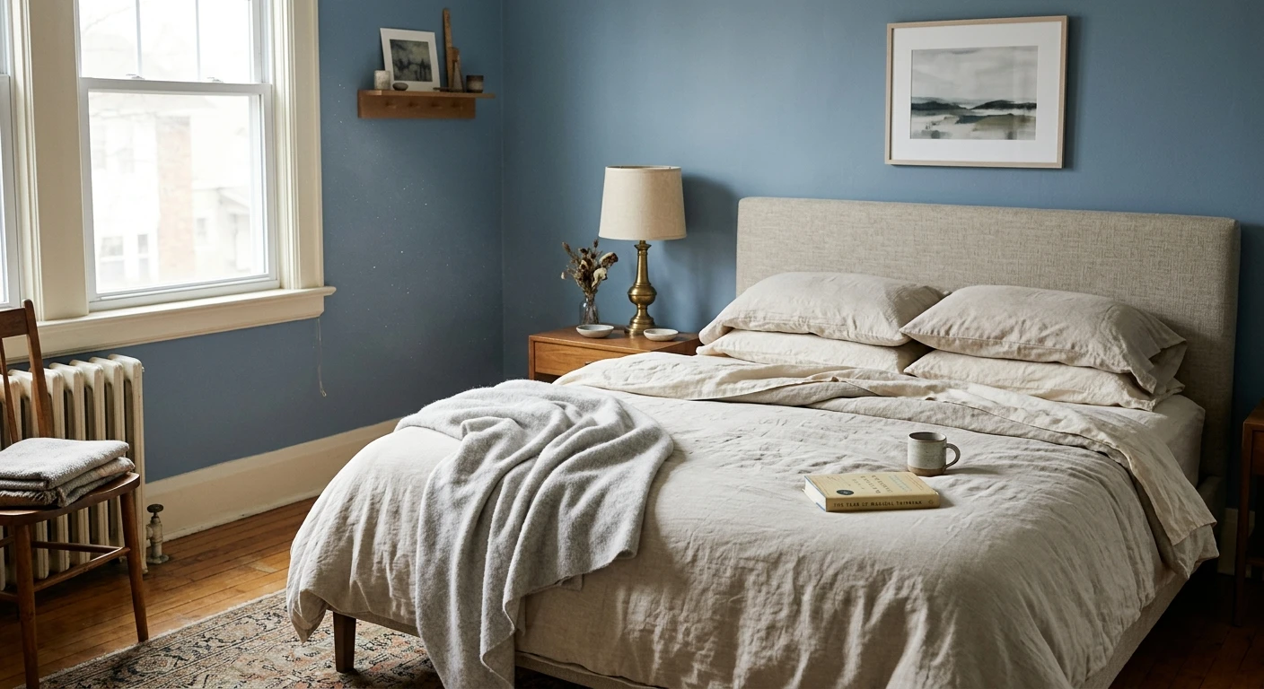
A bedroom sharpens that trap, because you only ever judge it at two extremes: early daylight and lamplight, with almost nothing in between. That is why our shortlist of bright picks for a small bedroom sorts its colors by window direction rather than by LRV alone, since the direction decides which end of the day the color has to survive.
The best colors for a brighter room
These are real, widely used colors with published LRVs in the brightening zone. The whites cluster in the low-to-mid 80s (bright but not sterile), and the two soft neutrals in the mid-70s brighten a room while giving walls a touch more substance than a pure white. LRV figures are the manufacturers' published values and can shift a point or two by fan-deck edition.
| Color | Brand + code | Approx LRV | Why it works here |
|---|---|---|---|
| White Dove | Benjamin Moore OC-17 | 85 | A soft warm white with very high reflectance. Bounces light like a bright white but stays gentle, so it lifts a room without the cold, sterile edge. |
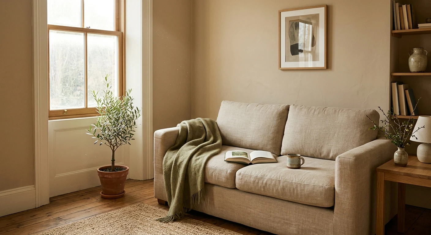
| Alabaster | Sherwin-Williams SW 7008 | 82 | A creamy, forgiving warm white. High LRV keeps a room airy, and the faint warmth reads as sunlight rather than gray in low or north light. |
| Creamy | Sherwin-Williams SW 7012 | 81 | A warmer off-white for rooms that feel cold. Still reflects plenty of light, but the cream tone makes a dim space feel cozy and lit rather than stark. |
| Greek Villa | Sherwin-Williams SW 7551 | 84 | A clean warm white with slightly higher reflectance than Alabaster. Great when you want maximum bounce but still want to avoid a blue-white look. |
| Classic Gray | Benjamin Moore OC-23 | 74 | A soft, reflective near-white with the faintest warm greige lean. Brightens walls while giving them a bit more depth than a full white. |
| Shoji White | Sherwin-Williams SW 7042 | 74 | A warm, light greige that stays bright while adding a hint of color, so a room reads open and soft rather than flat white. |
Try it on your house
No photo? Try a sample
If you want the single safest starting point, White Dove OC-17 and Alabaster SW 7008 are the two most reliable brighteners across almost every light condition, because their warmth carries them through both cool north light and bright afternoon sun. Drop to Creamy SW 7012 only if your room genuinely feels cold; step up to Greek Villa SW 7551 if you want the crispest, most reflective option that still refuses to go blue.
Upload one photo and preview the shortlist on your actual walls in your actual light. Free, no signup.
Colors to avoid
A few popular choices actively work against a brighter room, especially when the light is already limited:
- Stark cool whites (very high LRV, blue base). A pure bright white can top LRV 90, but in a dim or north-facing room it has no warm light to soften it, so it reads gray, blue, or clinical instead of sunny. High reflectance alone does not equal a brighter-feeling room.
- Cool, blue-based grays. Colors like a true blue-gray can look fresh in a showroom, but in low light they go dingy and cold, and they pull the whole room down even at a moderate LRV.
- Heavy beiges and tans. Warmth is good, but a saturated tan or "builder beige" sits lower on the LRV scale and can turn muddy and yellow in dim light rather than bright.
- Any deep or saturated color on all four walls. Navy, charcoal, forest green, and terracotta are beautiful, but they are low-LRV by nature and absorb light. Save them for an accent wall if brightness is the goal.
- Greiges below the mid-60s LRV. A darker greige reads sophisticated but not bright. If the room already feels dim, staying above LRV 70 matters more than the exact undertone.
The honest truth is that no chart can promise how a color will land in your room, because your windows, your bulbs, and the time of day all change it. Before you buy a gallon, preview your shortlist with our interior paint visualizer so you judge each white in your real light instead of a store's. If your goal is also to make a small space feel more open, pair this with paint colors that make a room look bigger, and for the toughest rooms with almost no daylight, read our guide to the best paint colors for dark rooms.
Frequently asked questions
What paint colors make a room look brighter?
High-LRV warm whites brighten a room best because they reflect the most light without the cold glare of a pure white. The top picks are Benjamin Moore White Dove OC-17 (LRV about 85), Sherwin-Williams Alabaster SW 7008 (LRV about 82), and Sherwin-Williams Creamy SW 7012 (LRV about 81). Soft reflective neutrals like Classic Gray OC-23 and Shoji White SW 7042, both around LRV 74, also brighten while adding a touch of warmth.
Is a bright white or a warm white better for a brighter room?
A warm white is usually better. Pure cool whites have the highest LRV, but in low-light or north-facing rooms they read gray, blue, or clinical because there is no warm daylight to soften them. A high-LRV warm white like White Dove OC-17 or Alabaster SW 7008 keeps the reflectance high while making the light feel like sunshine rather than a hospital wall.
What LRV should I look for to brighten a room?
Aim for an LRV above 70, and for the brightest effect look in the low-to-mid 80s, where most brightening warm whites sit. Anything above 70 reads light; below 60 a color starts absorbing more light than it reflects and the room feels darker. In a dim or north-facing space, favor the higher end of that range and a warmer undertone.
Do I need to test the color before buying?
Yes. LRV tells you how a color behaves on average, but your windows, bulbs, and the time of day change how it actually lands, and light is unpredictable. Preview your shortlist on a photo of your own room, or paint a large sample and view it morning, midday, and night, before you commit to a gallon.
1 HD render plus 3 free color variations.
Color names and codes are trademarks of their respective owners (Sherwin-Williams, Benjamin Moore, Behr). FacadeColorizer is an independent AI visualization tool and is not affiliated with them. LRV and hex values are approximate; the authoritative reference is a physical paint sample viewed in your own light.
Trademarks mentioned (Sherwin-Williams, Benjamin Moore, Behr, Caparol, Brillux, Sto, Alpina, Valspar, PPG, Glidden, Dulux, Crown Trade, Sandtex, Farrow & Ball, Johnstone's, Leyland) are property of their respective owners. FacadeColorizer is independent and not affiliated with any of them. Nominative fair use under Lanham Act §1125.