Try it on your house

Quick answer: A dark, low-light room has two winning strategies, not one. To brighten it, use a high-LRV warm white that bounces what little light you have: Benjamin Moore White Dove (OC-17, LRV 85) or Sherwin-Williams Alabaster (SW 7008, LRV 82). To embrace it, lean into a saturated, moody dark so the room feels cozy and intentional: Benjamin Moore Hale Navy (HC-154, LRV 6) or Sherwin-Williams Iron Ore (SW 7069, LRV 6). The one losing move is a muddy mid-tone. Because light is unpredictable, preview your shortlist on a photo of your own room before you buy.
A room that never gets much daylight is not automatically a design problem, but it is a decision you cannot dodge. A north-facing den, a basement, an interior hallway, or a bedroom shaded by a big tree all share the same trait: there is simply not much light for the walls to work with. Most people reach for a safe beige and hope it opens things up, and most of the time it just looks dull and slightly dirty. The fix is to stop hoping for the middle and commit to one of two clear directions. This article is the low-light corner of our wider paint colors by room orientation guide, and below you get real colors, real codes, and the reasoning behind each one.
Why little natural light changes paint color
Paint has no light of its own. Every color you see on a wall is light that landed on the surface and bounced back to your eye, so when there is very little light in the room, there is very little for the color to do. This is where light reflectance value (LRV) matters more than in any other room. LRV runs from 0 (pure black) to 100 (pure white), and it tells you how much light a color throws back. In a bright, south-facing room a mid-tone gray looks crisp and clean. Move that exact same gray into a dark room and it slumps: with no light to lift it, it reads flat, cold, and a little muddy.
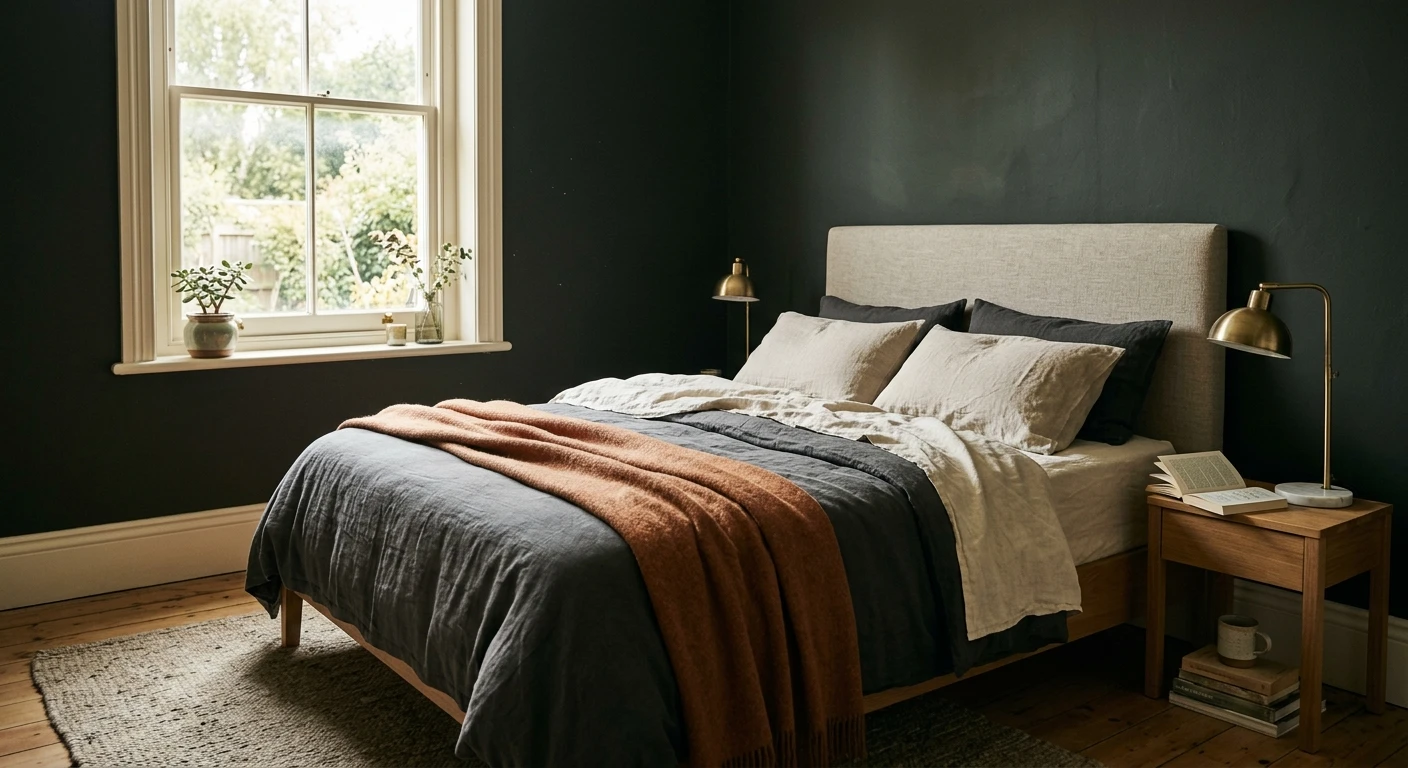
That is why the two smart strategies sit at opposite ends of the LRV scale. Strategy one is to lighten: choose a warm white or soft warm neutral with a very high LRV (80 and up) so it grabs every bit of available light and multiplies it around the room. Strategy two is to embrace the dark: pick a genuinely saturated color with a low LRV (under 10) so the room stops looking like it is failing to be bright and instead looks deliberately moody and cozy. Both work. What does not work is the muddy middle, roughly LRV 30 to 55, where colors have neither enough reflectance to brighten nor enough depth to feel intentional. They just look dingy.
One of those four rooms sits partly outside the LRV argument. Below grade, the binding constraint is not the color but the aperture: a legal egress window is only 5.7 square feet at the IRC minimum, a fraction of the glass on any above-grade wall. Two moves that do not exist upstairs then matter more than the shade you land on. Painting the inside of the egress well a high-LRV white nearly doubles the daylight that reaches the glass, and painting exposed joists and the underside of the subfloor the same warm white as the walls buys back the ceiling height a basement never had. Our basement paint color ideas guide covers both, alongside the moisture-resistant coatings a below-grade wall needs and a shaded den does not.
The best colors for dark, low-light rooms
The table below covers both strategies. The top three are the brighteners, chosen because they are warm and high-LRV, so they lift a low-light room without turning cold or blue. The bottom three are the embracers, deep enough to read as an intentional mood rather than an accident. LRV values are from the manufacturer color data and are a guide to depth, not a promise on your specific wall.
| Color | Brand + code | Approx LRV | Why it works here |
|---|---|---|---|
| White Dove | Benjamin Moore OC-17 | 85 | Highest-bounce warm white: reflects the most light without going cold or blue. |
| Alabaster | Sherwin-Williams SW 7008 | 82 | Soft warm white with a whisper of greige: brightens without feeling sterile. |
| Shoji White | Sherwin-Williams SW 7042 | 74 | Warm greige-white for a touch more color: cozy, not dingy, in weak light. |
| Hale Navy | Benjamin Moore HC-154 | 6 | Deep, soft navy: embraces the low light and reads cozy and intentional. |
| Iron Ore | Sherwin-Williams SW 7069 | 6 | Warm charcoal near-black: full envelope drama on a warm, not cold, base. |
| Rookwood Dark Green | Sherwin-Williams SW 2816 | 7 | Earthy heritage forest green: moody and restful, lovely under lamp light. |
Try it on your house
No photo? Try a sample
Sources: Benjamin Moore and Sherwin-Williams published color data 2026. LRV figures are manufacturer values and vary slightly by source.
A few notes on the picks. Among the brighteners, White Dove is the workhorse: it is warm enough to feel soft yet bright enough to reflect real light, which is exactly what a low-light room needs. Alabaster does the same job with a hair more warmth, useful if a pure white feels flat in your space. Shoji White nudges toward greige for people who want a little quiet color on the wall without dropping into the muddy zone. Among the embracers, Hale Navy is the gentlest way into a dark room because it stays soft even at LRV 6, Iron Ore gives you a warm near-black without the harshness of true black, and Rookwood Dark Green is the cozy, library-like option that comes alive under warm bulbs.
Upload one photo and preview the shortlist on your actual walls in your actual light. Free, no signup.
Colors to avoid
Almost everything that goes wrong in a dark room comes from picking a color that lives in the muddy middle or fights the low light instead of working with it. Steer clear of these:
- Muddy mid-tone beiges and taupes (roughly LRV 30 to 55): with little light to warm them, they lose their glow and read flat, dull, and slightly dirty. This is the classic dark-room mistake.
- Murky mid grays and greiges: without daylight to lift them, they slide cold and can pull blue or gray-brown, making the room feel gloomier, not brighter.
- Stark, cool bright whites: a blue-based white sounds like it should brighten, but with nothing to bounce it reads gray and lifeless. If you go white, go warm white.
- Muted mid-tone sage and olive: lovely in a sunny room, murky and drab in a dark one, because the low light strips out the freshness and leaves the gray behind.
The pattern is simple: in a low-light room, either commit high (a warm white that bounces light) or commit low (a saturated dark that owns the mood), and avoid the in-between shades that do neither. To pressure-test a shortlist before you spend a cent on sample pots, run it through our interior paint visualizer on a photo of the actual room. If you are leaning bright, our roundup of the best white paint colors for dark rooms goes deeper on warm whites, and if the room has no window at all, see our guide to paint colors for windowless rooms. The commit-low route has its own shortlist: our twelve moody game room paint colors are picked for rooms lit by a screen rather than a window, with one budget caveat worth knowing before you commit, because anything under LRV 10 needs a tinted gray primer plus three finish coats.
Frequently asked questions
What are the best paint colors for a dark room with little light?
There are two winning strategies. To brighten, use a high-LRV warm white or soft warm greige that bounces what little light exists: Benjamin Moore White Dove (OC-17, LRV 85) or Sherwin-Williams Alabaster (SW 7008, LRV 82). To embrace the low light, go deep and moody with a saturated navy, charcoal, or forest green like Hale Navy (HC-154, LRV 6), so the room feels intentional and cozy. The one thing to avoid is a muddy mid-tone, which just looks dingy. Because light is unpredictable, preview your shortlist on a photo of your own room before you buy.
Should I paint a dark room a light color or a dark color?
Both can look great, they just solve the problem differently. A light warm white maximizes the little light you have and keeps the room feeling open. A saturated dark stops fighting the low light and turns it into a cozy, deliberate mood. The losing choice is the muddy middle: mid-tone beiges, taupes, and murky grays go flat and gray in weak light. Pick a lane, bright or bold, and skip the in-between.
Do bright white paints make a dark room lighter?
A warm white helps because it reflects the most light, but stark cool whites can backfire: with little light to bounce, they can read dull, gray, or even blue. Choose a warm white with a high LRV (White Dove at 85 or Alabaster at 82) over a crisp blue-white, and add a warm bulb (2700K) and a mirror opposite the window to multiply what light you have.
What LRV should I look for in a low-light room?
If you are trying to brighten, aim high: LRV 80 or above bounces the most light, which is why warm whites win. If you are embracing the dark, LRV under 10 gives you a true moody depth that reads intentional. The zone to avoid is the muddy middle (roughly LRV 30 to 55) in a low-light room, where colors lose their character and turn dingy. LRV is only a starting point, so always confirm on your own wall.
1 HD render plus 3 free color variations.
Color names and codes are trademarks of their respective owners (Sherwin-Williams, Benjamin Moore, Behr). FacadeColorizer is an independent AI visualization tool and is not affiliated with them. LRV and hex values are approximate; the authoritative reference is a physical paint sample viewed in your own light.
Trademarks mentioned (Sherwin-Williams, Benjamin Moore, Behr, Caparol, Brillux, Sto, Alpina, Valspar, PPG, Glidden, Dulux, Crown Trade, Sandtex, Farrow & Ball, Johnstone's, Leyland) are property of their respective owners. FacadeColorizer is independent and not affiliated with any of them. Nominative fair use under Lanham Act §1125.