Try it on your house

Quick answer: For an east-facing room, pick soft, balanced colors that flatter both the warm morning sun and the flatter afternoon light. The three that do this best in 2026 are Sherwin-Williams Sea Salt (SW 6204, LRV 63), a gentle green-blue that stays fresh all day; Benjamin Moore Palladian Blue (HC-144, LRV 61), an airy blue-green; and Sherwin-Williams Repose Gray (SW 7015, LRV 58), a balanced greige that never leans too warm or too cold. Preview any of them on a photo of your own room before you buy, because your exact light is the real judge.
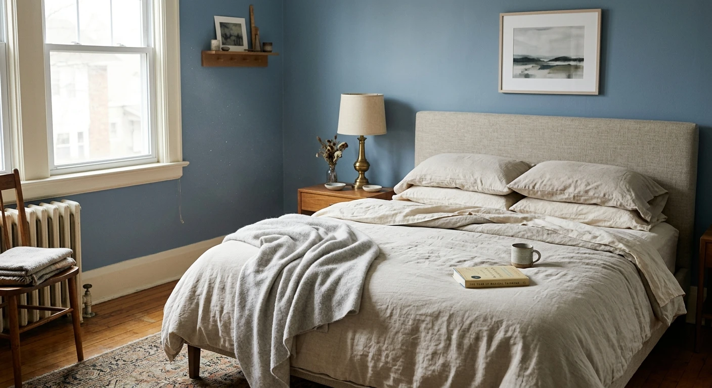
East-facing rooms have a split personality. In the morning they fill with warm, golden, direct sunlight, so a color can look cozy and glowing at breakfast. By early afternoon the sun has moved to the other side of the house, the direct light is gone, and the same walls fall into a cooler, flatter, more neutral wash. The trick is to choose a color that reads well in both phases rather than one that only sings at 8 a.m. or only settles at 3 p.m. This guide is part of our larger series on paint colors by room orientation, and it focuses specifically on the east-facing case.
Why east-facing light changes paint color
Paint has no fixed color of its own. What you see is the wavelengths a color reflects back, filtered through whatever light is falling on it. East light changes dramatically over the day. Around sunrise and through mid-morning, direct sun streams in at a low angle and skews warm and golden (roughly 3,000 to 4,500 K). This adds yellow and a little peach to everything on the wall, so warm colors can turn buttery and cool colors soften. After the sun swings west, the room only receives indirect skylight, which is cooler, bluer, and much flatter (often 6,000 K or higher on an overcast afternoon). That second phase strips warmth back out and can leave an over-warm color looking dull or muddy.
This is also why the reflectance of a color matters as much as its hue. A color's light reflectance value (LRV) tells you how much light it bounces back, on a 0 (black) to 100 (pure white) scale. In an east-facing room, a mid-range LRV in the high 50s to mid 60s tends to work best: high enough to keep the walls from going gloomy once the direct morning sun is gone, but not so high that the golden AM light blows the color out to a washed, colorless white. That mid-range is the sweet spot for the balanced greens, blues, and greiges below.
The best colors for east-facing rooms
The colors that flatter east light share a common trait: a soft, slightly muted quality with a balanced undertone that neither craves warmth nor fights the cool afternoon. Soft greens, gentle blues, and neutral greiges dominate the list. Here are six real, widely documented picks with their published LRV values.
| Color | Brand + code | Approx LRV | Why it works here |
|---|---|---|---|
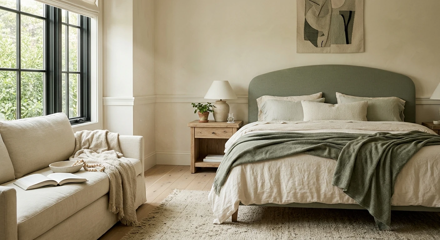
| Sea Salt | Sherwin-Williams SW 6204 | 63 | A green-blue-gray that morning gold warms into a soft spa green and afternoon light calms into a quiet gray-green. Reads fresh in both phases. |
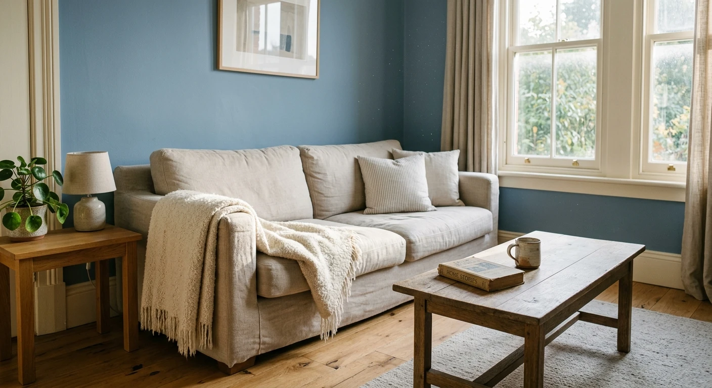
| Palladian Blue | Benjamin Moore HC-144 | 61 | An airy blue with a green whisper. The warm AM sun keeps it from going icy, and the flat PM light lets its soft blue read clean, not cold. |
| Repose Gray | Sherwin-Williams SW 7015 | 58 | A balanced greige with a barely-there purple base. It holds a neutral read across the golden-to-flat swing without tipping too warm or too cold. |
| Gray Owl | Benjamin Moore OC-52 | 65 | A light, airy gray with a green-blue undertone. The higher LRV keeps the room bright once the direct sun leaves; morning warmth stops it going stark. |
| Rainwashed | Sherwin-Williams SW 6211 | 60 | A watery green-blue, a touch bluer than Sea Salt. Ideal in a breakfast room where AM sun makes it glow and PM light keeps it soft and airy. |
| Quiet Moments | Benjamin Moore 1563 | 62 | A gentle blue-green-gray with a spa feel. Balanced enough that the morning glow and afternoon flatness both flatter it, especially in bedrooms. |
Try it on your house
No photo? Try a sample
East-facing rooms that get their heaviest use in the morning (bedrooms, breakfast nooks, home offices, dining rooms used for breakfast) benefit most from these picks, because the color you fell in love with is the one you will actually live in while the golden light is present. If a room is mainly used in the evening under lamplight, weigh the artificial-light read too, since warm bulbs push these greens and blues a shade greener.
Upload one photo and preview the shortlist on your actual walls in your actual light. Free, no signup.
Colors to avoid
A few families of color fight east light rather than flatter it. None of these are bad colors; they simply tend to disappoint in this specific orientation.
- Strong, saturated yellows and golds. The warm morning sun already adds yellow to the room. A yellow wall can look electric or acidic at breakfast, then turn dull and heavy once the direct light is gone.
- Warm terracottas, peaches, and orange-reds. These glow beautifully for an hour at sunrise, then go muddy and drab under the cool, flat afternoon skylight, which is when the room is often empty and dark anyway.
- Cold, blue-based grays (the classic north-facing rescue colors). Without the sustained warm light a south or west room enjoys, a steely blue-gray can read icy and clinical by afternoon in an east room.
- Very deep, low-LRV colors (charcoals, navies, forest greens below the low 20s). They swallow the fleeting morning light and leave the room feeling like a cave for the rest of the day. If you want depth, save it for an accent wall or a west-facing space.
- Bright, ultra-white walls above LRV 85. The golden AM sun blows them out to a glaring, colorless surface, and they turn flat and slightly gray in the afternoon. A soft off-white or a low-chroma color holds its character better.
The most reliable way to settle the choice is to preview your shortlist on a photo of the real room using our interior paint visualizer, then compare the result against the physical samples on the wall. If your space faces a different way, the same logic changes: see our companion guides on the best colors for west-facing rooms and the best colors for south-facing rooms, where warm, sustained light rewards cooler and more saturated picks that would fall flat in the east.
Frequently asked questions
What are the best paint colors for an east-facing room?
Soft, balanced colors in the high-50s to mid-60s LRV range work best because they flatter both the warm morning sun and the cooler afternoon light. Reliable picks include Sherwin-Williams Sea Salt (SW 6204, LRV 63), Benjamin Moore Palladian Blue (HC-144, LRV 61), Sherwin-Williams Repose Gray (SW 7015, LRV 58), Benjamin Moore Gray Owl (OC-52, LRV 65), Sherwin-Williams Rainwashed (SW 6211, LRV 60), and Benjamin Moore Quiet Moments (1563, LRV 62). Soft greens, gentle blues, and neutral greiges hold up across the day.
Why do east-facing rooms look different in the morning and afternoon?
An east-facing room gets direct, warm, golden sunlight in the morning (roughly 3,000 to 4,500 K), which adds yellow and softens cool colors. By early afternoon the sun has moved west, so the room only receives cooler, bluer, flatter indirect skylight (often 6,000 K or higher). A color that looks glowing at breakfast can look dull by mid-afternoon, which is why balanced, low-chroma colors are the safest choice.
What paint colors should I avoid in an east-facing room?
Avoid strong saturated yellows and golds (the morning sun already adds yellow, so they can look acidic then dull), warm terracottas and orange-reds (they go muddy once the direct light leaves), cold blue-based grays (they read icy in the flat afternoon), very dark low-LRV colors (they swallow the brief morning light), and glaring ultra-whites above LRV 85 that the golden AM sun blows out.
Do I need to test east-facing paint colors before buying?
Yes. Light is unpredictable, and your exact latitude, window size, trim, flooring, and neighboring surfaces all shift how a color reads. The published LRV and codes above are a strong starting shortlist, not a guarantee. Preview your two or three favorites on a photo of your actual room with a free tool like our interior paint visualizer, then confirm with a physical sample viewed at breakfast and again in mid-afternoon before you commit.
1 HD render plus 3 free color variations.
Color names and codes are trademarks of their respective owners (Sherwin-Williams, Benjamin Moore, Behr). FacadeColorizer is an independent AI visualization tool and is not affiliated with them. LRV and hex values are approximate; the authoritative reference is a physical paint sample viewed in your own light.
Trademarks mentioned (Sherwin-Williams, Benjamin Moore, Behr, Caparol, Brillux, Sto, Alpina, Valspar, PPG, Glidden, Dulux, Crown Trade, Sandtex, Farrow & Ball, Johnstone's, Leyland) are property of their respective owners. FacadeColorizer is independent and not affiliated with any of them. Nominative fair use under Lanham Act §1125.