Try it on your house

Two rooms can wear the exact same gallon of paint and look like different colors. The reason is almost never the paint. It is which way the windows face. A room's orientation decides the temperature, angle, and intensity of the daylight that lands on your walls all day long, and that light quietly rewrites every color you put up. This is the hub guide to paint colors by room orientation: what north, south, east, and west light actually do to a color, and the one-line strategy that keeps each exposure from working against you.
The one-line rule for each exposure
- North-facing: lean warm. Cool, indirect light drains color, so warm whites, creamy neutrals, and greiges hold up best.
- South-facing: almost anything works. Abundant warm light all day carries deep colors, cool grays, and crisp whites alike.
- East-facing: pick balanced, morning-friendly colors. Soft greens, gentle greiges, and true neutrals flatter the warm early light without going flat by afternoon.
- West-facing: lean cool. A calm color in the morning gets a strong warm-orange glow at sunset, so cool grays and blue-greens keep the room from going gold.
Light direction is the biggest hidden variable in choosing paint, and it is the one most people skip. They fall for a chip in the store under bright neutral fluorescents, bring it home, and are baffled when the same color reads muddy in a dim north room or washed out in a blazing south one. Before you go further, it helps to understand the number that predicts how bright a color will feel: read our LRV guide so the picks below make sense. Then use this page as your map. Each exposure gets its own headline strategy and a couple of real, widely stocked colors, and every deep-dive guide is linked at the bottom.
Try it on your house
No photo? Try a sample
North-facing rooms
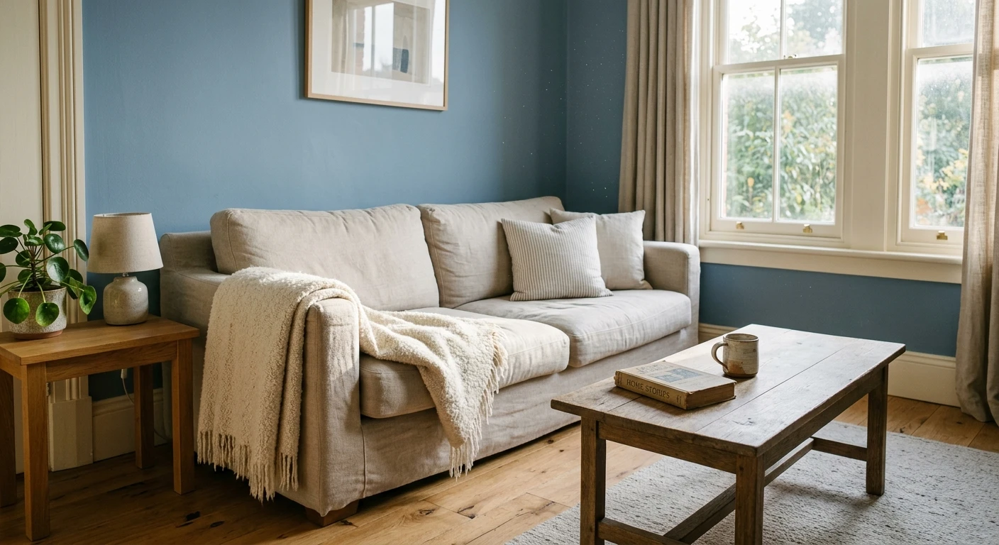
North-facing rooms never get direct sun. The light is cool, soft, and indirect all day, which sounds pleasant but has a cost: it pulls colors grayer and slightly darker, exaggerates blue and gray undertones, and can make a crisp white look dingy. The fix is to fight cool with warm. Choose colors that carry a warm undertone and a fairly high Light Reflectance Value so they stay bright and inviting instead of flat and cold.
Reliable north-facing picks:
- SW Alabaster (SW 7008, LRV 82): a soft, creamy white with just enough warmth to shrug off the cool light rather than turning gray.
- Benjamin Moore White Dove (OC-17, LRV 85): the go-to warm white for north rooms, bright without reading clinical.
- SW Accessible Beige (SW 7036, LRV 58): a warm greige that adds a hint of coziness where north light would otherwise feel austere.
Steer clear of cool grays and stark blue-whites here, which the north light will only make colder. For the full breakdown, including bedrooms, offices, and the exact whites and greiges that survive this light, see our deep dive on the best paint colors for north-facing rooms.
South-facing rooms
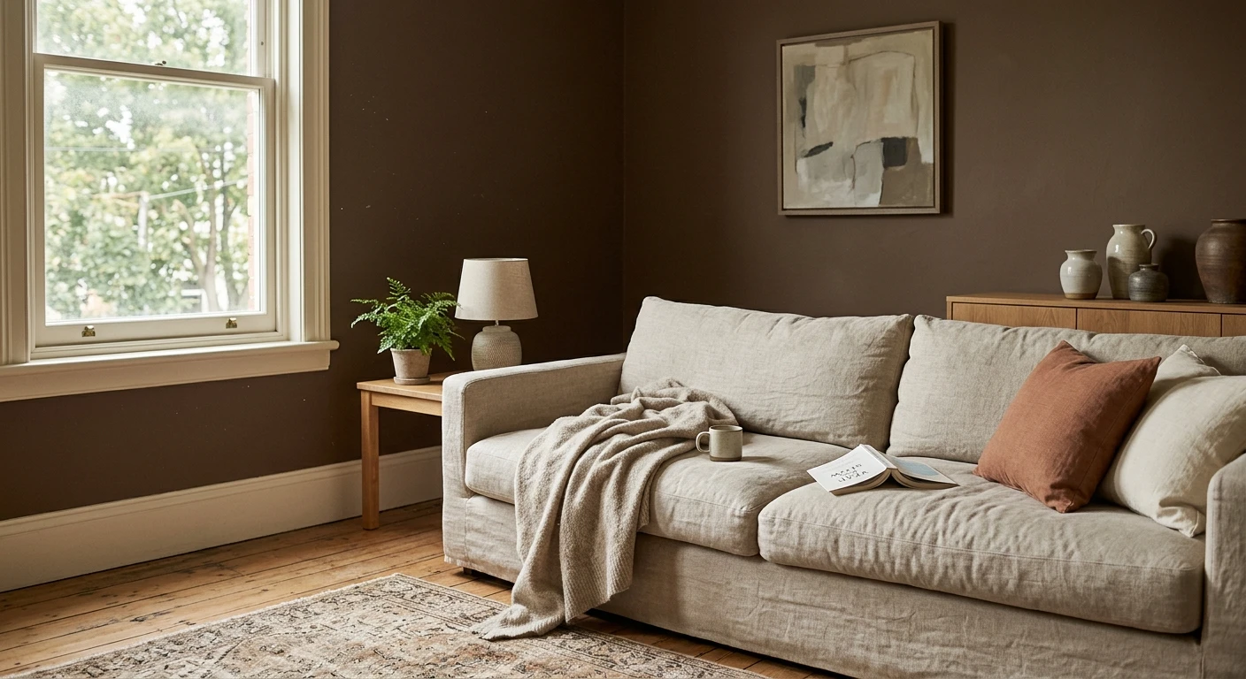
South-facing rooms are the lucky ones. They get warm, abundant light for most of the day, which brightens nearly everything and lets you use colors that would fall flat elsewhere. Deep, saturated shades read true instead of muddy. Cool grays keep their integrity instead of turning cold. Even bold colors have enough light to breathe. The only real risk is that very high-LRV whites can glare or wash out under so much sun, so a mid-tone often looks richer than a bright white.
Colors that make the most of south light:
- SW Repose Gray (SW 7015, LRV 58): a light gray that stays balanced and clean in strong sun instead of tipping warm.
- SW Evergreen Fog (SW 9130, LRV 30): a muted gray-green that reads sophisticated and layered when there is plenty of light to reveal its depth.
- Benjamin Moore Hale Navy (HC-154, LRV 6): a deep navy that a south room can carry beautifully on an accent wall or a full moody study.
Because south rooms are so forgiving, this is your chance to be a little braver with color. Our complete guide to the best paint colors for south-facing rooms covers the whites, grays, and saturated shades that shine in that all-day sun.
Orientation changes everything, so the surest test is your own wall. Upload a photo to our free interior paint visualizer and preview any shade in your actual light in about 30 seconds.
East-facing rooms
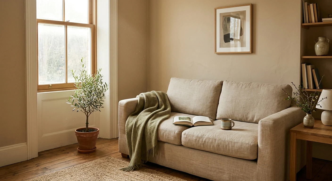
East-facing rooms change character through the day. In the morning they get warm, golden direct sun, then by afternoon the light turns cooler, flatter, and more indirect. That split is why east rooms suit balanced colors that look good both ways: warm enough to glow at breakfast, stable enough to hold up after lunch. Soft greens, gentle greiges, and true neutrals are the sweet spot, which is one reason east exposure is prized for bedrooms and kitchens.
Balanced east-facing picks:
- SW Sea Salt (SW 6204, LRV 63): a soft green-blue-gray that turns serene in the cool afternoon and gently warm in the morning sun.
- Benjamin Moore Revere Pewter (HC-172, LRV 55): a warm greige that anchors the room and reads consistent as the light shifts.
- SW Agreeable Gray (SW 7029, LRV 60): a forgiving greige that flatters the warm morning light without going yellow later.
The key with an east room is to judge a color at the time of day you use the space most. If it is a breakfast kitchen, test it in the morning. Our full guide to the best paint colors for east-facing rooms walks through morning versus afternoon behavior color by color.
West-facing rooms
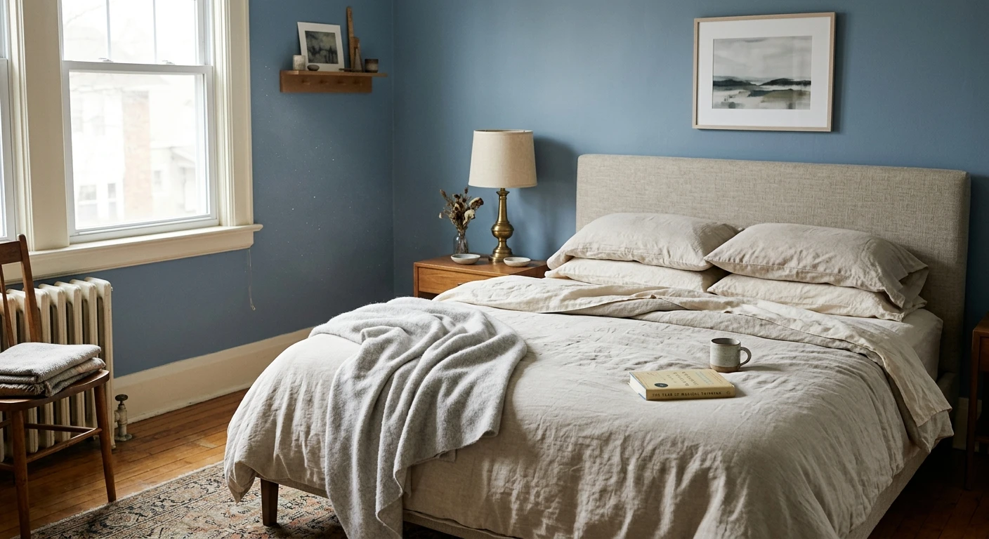
West-facing rooms are the mirror image of east. They start flat or dim in the morning, then catch an intense, warm-orange glow in the late afternoon and evening as the sun sets. That golden hour is gorgeous on the right color and disastrous on the wrong one: anything that already leans yellow can go full gold or even orange at sunset. The strategy is to lean cool. A slightly cool gray or a blue-green stays calm in the morning and gets pushed toward a pleasant, balanced warmth by the evening light rather than tipping over it.
Cool-leaning west-facing picks:
- SW Repose Gray (SW 7015, LRV 58): a cool-neutral gray that absorbs the evening warmth without turning muddy.
- Benjamin Moore Gray Owl (OC-52, LRV 65): a light gray with green-blue undertones that keeps a west room fresh as the sun drops.
- SW Sea Salt (SW 6204, LRV 63): a blue-green that counters the golden hour beautifully and stays restful at night.
Avoid warm yellows, golds, and buttery creams here unless you actively want a sunset-amplified glow. For the deeper list, including how each shade reads before and after the light changes, see the best paint colors for west-facing rooms.
More light and color guides
Orientation is the foundation, but light and color has a few more moving parts: dark rooms, small rooms, artificial bulbs, and the eternal warm-versus-cool question. Every deep-dive guide in this cluster is below.
- Best paint colors for north-facing rooms
- Best paint colors for south-facing rooms
- Best paint colors for east-facing rooms
- Best paint colors for west-facing rooms
- Best paint colors for dark rooms
- Paint colors that make a room look bigger
- Paint colors that make a room look brighter
- Best paint colors for rooms with LED lighting
- Best white paint colors for north-facing rooms
- Best white paint colors for dark rooms
- Best gray paint colors for north-facing rooms
- Best paint colors for windowless rooms
- How natural light affects paint color
- Warm vs cool paint colors by exposure
Frequently asked questions
How does room orientation change a paint color?
A room's orientation decides the temperature and intensity of its daylight, and that light shifts how a color reads. North-facing rooms get cool, indirect light that pulls colors grayer and slightly darker. South-facing rooms get warm, abundant light that brightens almost everything. East-facing rooms are warm in the morning and cooler by afternoon. West-facing rooms are flat in the morning and glow warm-orange at sunset. The same gallon can look noticeably different in each, which is why you should match the color to the exposure rather than to a store chip.
What are the best paint colors for a north-facing room?
Because north light is cool and can drain color, lean warm and fairly light. Warm whites like SW Alabaster (SW 7008) and Benjamin Moore White Dove (OC-17), plus a warm greige such as SW Accessible Beige (SW 7036), hold up well and keep the room from feeling cold or dingy. Avoid stark blue-whites and cool grays, which the north light only makes colder.
Should west-facing rooms use warm or cool colors?
Lean cool. A west room is dim in the morning and then catches an intense warm-orange glow at sunset, so a cool gray like SW Repose Gray (SW 7015) or a blue-green like SW Sea Salt (SW 6204) stays balanced instead of turning gold. Warm yellows, golds, and buttery creams tend to get amplified by the evening light and can look overly orange unless that is the effect you want.
Which room orientation is the easiest to paint?
South-facing rooms are the most forgiving. They receive warm, abundant light for most of the day, which brightens nearly every color and lets deep shades, cool grays, and crisp whites all read well. The main thing to watch is that very bright, high-LRV whites can occasionally glare in strong sun, so a mid-tone sometimes looks richer than a stark white.
Preview north, south, east, or west picks on your actual wall under your own light before buying a single sample pot.
Disclaimer: Sherwin-Williams, Alabaster (SW 7008), Accessible Beige (SW 7036), Repose Gray (SW 7015), Evergreen Fog (SW 9130), Sea Salt (SW 6204), and Agreeable Gray (SW 7029) are trademarks of The Sherwin-Williams Company. Benjamin Moore, White Dove (OC-17), Hale Navy (HC-154), Revere Pewter (HC-172), and Gray Owl (OC-52) are trademarks of Benjamin Moore & Co. FacadeColorizer is an independent paint visualization service and is not affiliated with, endorsed by, or sponsored by Sherwin-Williams or Benjamin Moore. Color reproduction on screens approximates the manufacturer's chip; always confirm with a manufacturer sample under your own light before purchase. Sources: Sherwin-Williams and Benjamin Moore color data 2026, designer field reports compiled by FacadeColorizer.
Trademarks mentioned (Sherwin-Williams, Benjamin Moore, Behr, Caparol, Brillux, Sto, Alpina, Valspar, PPG, Glidden, Dulux, Crown Trade, Sandtex, Farrow & Ball, Johnstone's, Leyland) are property of their respective owners. FacadeColorizer is independent and not affiliated with any of them. Nominative fair use under Lanham Act §1125.