Try it on your house

Quick answer: The same paint color shifts because the light hitting it shifts. North light is cool and flat, south is warm and bright all day, east is warm at dawn and cooler by afternoon, and west turns orange at sunset. No single color beats this, so pick shades that tolerate a wide swing, then test them in your own light.
The most light-tolerant picks are warm-leaning neutrals: Benjamin Moore White Dove OC-17 (approx LRV 85), Sherwin-Williams Agreeable Gray SW 7029 (LRV 60), and Benjamin Moore Revere Pewter HC-172 (approx LRV 55). Their built-in warmth keeps them from going cold and blue in weak light or blowing out in strong light.
Whatever makes your shortlist, preview it on a photo of your actual room before you buy. Light is unpredictable, and a chip in the store tells you almost nothing about your wall.
If you have ever painted a sample and sworn the store handed you the wrong can, you are not imagining it. A paint chip has one fixed color, but your room does not have one fixed light, so the same gallon can read crisp next to a south window and dull, cool gray in a north hallway three feet away. This guide explains why, orientation by orientation and hour by hour, and gives you a short protocol to catch a bad match before all four walls. If you already know which way your windows face, our room-by-room breakdown in paint colors by room orientation is the fastest next step; if not, start here with the mechanism.
Why natural light changes paint color
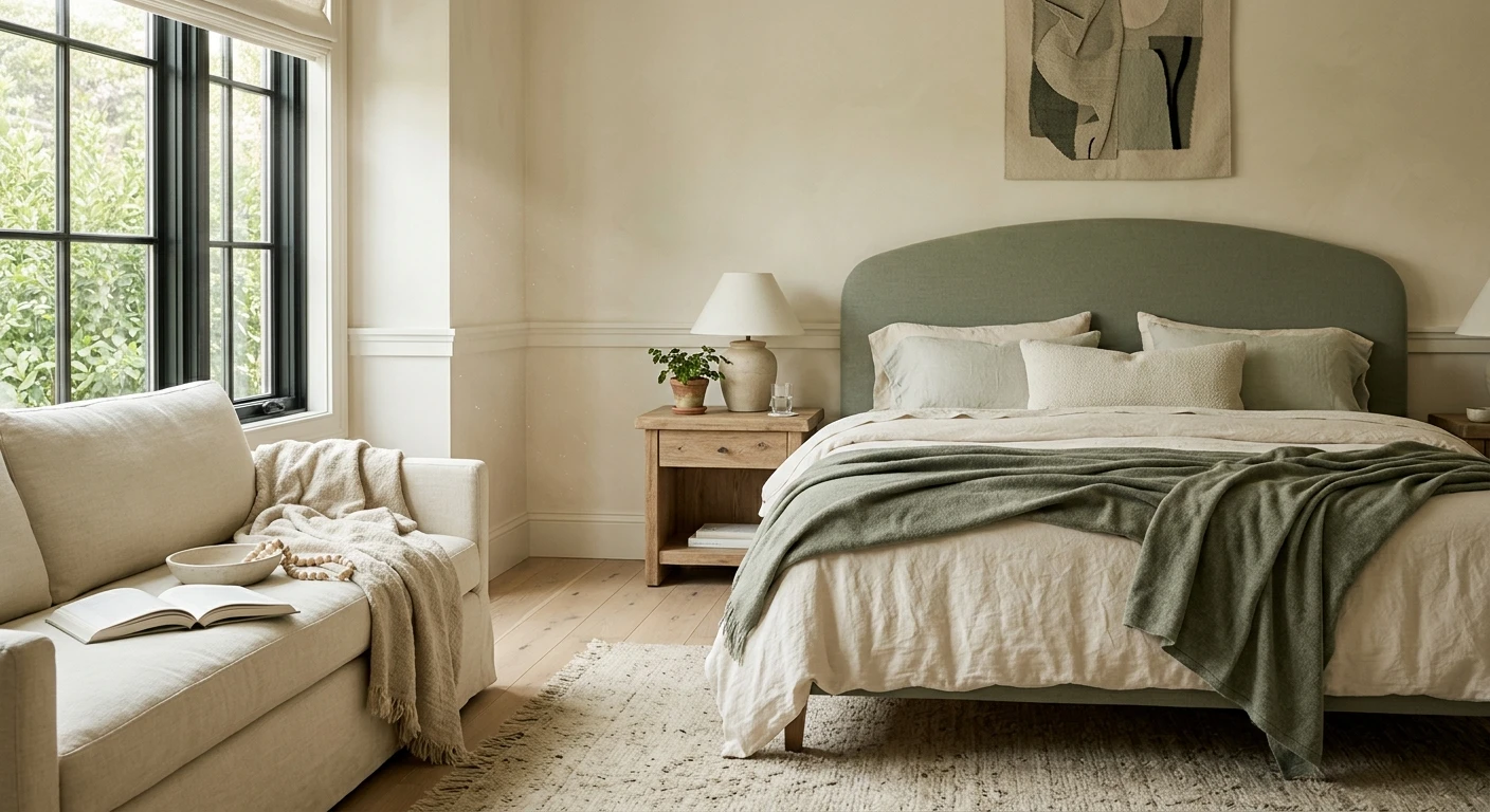
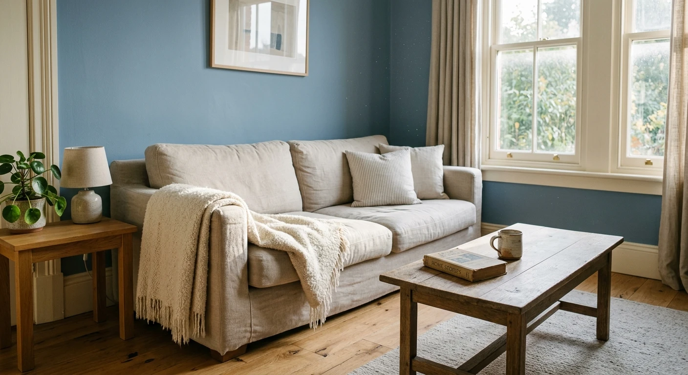
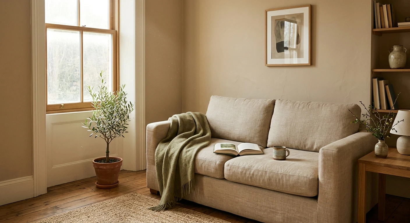
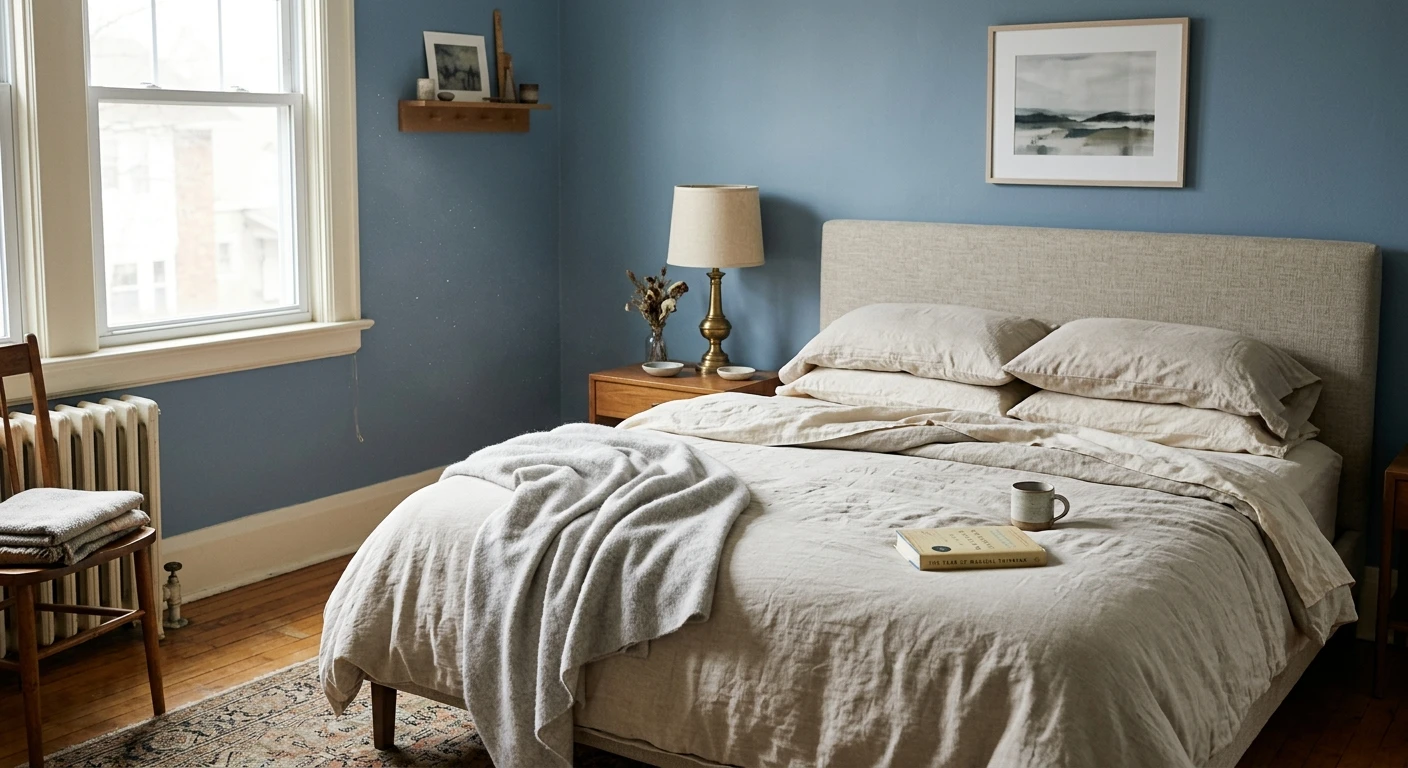
Paint does not make its own color; it reflects whatever light lands on it, and daylight is never one steady thing. The biggest variable is direction. North-facing rooms get soft, indirect light with a cool cast, so colors read darker, grayer, and more muted, and any blue or gray undertone is exaggerated. South-facing rooms get warm, bright light for most of the day, which lifts everything and can wash pale colors toward white. East-facing rooms are golden in the morning, then cool by afternoon; west-facing rooms are dim early, then glow orange at sunset, warm enough to turn a soft beige gold. Time of day matters too: the same west bedroom that looks gray at 9 a.m. can look amber at 6 p.m.
Two more forces pile on. Weather changes the source: a bright day sharpens contrast, while heavy overcast flattens and slightly cools every shade in the house. And light picks up color from whatever it bounces off before reaching the wall:
- Floors: a warm wood floor throws gold up onto the lower walls; a cool gray or tile floor does the opposite.
- Outside greenery: a lawn, hedge, or tree outside casts a faint green tint indoors, making a gray look murky.
- Neighboring walls: a red-brick house, a blue pool, or a painted fence a few feet away bounces its color through the glass.
- Big furnishings: a saturated rug, sofa, or countertop reflects up onto the wall behind it.
How far a color moves comes down to two of its own traits: its light reflectance value (LRV), how much light it reflects on a 0 to 100 scale, and its undertone, the blue, green, violet, or yellow lean beneath the main color. High-LRV colors shift more visibly; warm neutrals with little hidden undertone shift least. Read that LRV guide once and half the mystery disappears.
The best colors for changing natural light
No color is immune, but some are far more forgiving. The safe zone is warm-leaning neutrals from soft white to mid-greige: enough warmth to survive cool north light, not so saturated that they swing by the hour. Here are five decorators lean on because they hold their character across exposures.
| Color | Brand and code | Approx LRV | Why it works in changing light |
|---|---|---|---|
| White Dove | Benjamin Moore OC-17 | 85 | A soft white with a whisper of warmth: it stays creamy in cool north light instead of blue, and does not glare in bright south rooms. |
| Alabaster | Sherwin-Williams SW 7008 | 82 | Slightly warmer and softer than a pure white; the warmth buffers against the graying of weak or overcast light. |
| Classic Gray | Benjamin Moore OC-23 | 74 | A barely-there warm gray that reads light and clean, without the blue flash that trips up cooler grays in low light. |
| Agreeable Gray | Sherwin-Williams SW 7029 | 60 | The go-anywhere greige: its balanced warm base holds steady from bright noon to dim evening, the default safe pick. |
| Revere Pewter | Benjamin Moore HC-172 | 55 | A deeper green-gray greige whose warmth keeps it grounded across exposures; give it decent light, or it can feel heavy in a dark room. |
Try it on your house
No photo? Try a sample
LRV figures above are the manufacturers' published approximations and vary by deck edition and device. Treat them as a starting point, not a guarantee of how the color reads in your light.
Upload one photo and preview the shortlist on your actual walls in your actual light. Free, no signup.
Colors to avoid (or test twice as hard)
These are not bad colors, just the ones that swing most under changing light, so they punish a skipped test.
- Stark cool whites such as Sherwin-Williams Extra White SW 7006 (LRV 86). They can glare in bright south light and drop toward a cold blue-gray in flat north light.
- Pale grays with a blue or violet undertone such as Sherwin-Williams Repose Gray SW 7015 (LRV 58). Lovely in warm light, but in weak north light the hidden violet can surface and the wall flashes lavender.
- Muted greens and blue-greens such as Sherwin-Williams Sea Salt SW 6204 (LRV 63), the classic chameleon: green in bright light, gray in dim light, almost blue near water. Great for that shimmer, risky if you wanted one steady color.
- Very deep or saturated colors such as navy Sherwin-Williams Naval SW 6244 (LRV 4). Low-LRV colors have little light to reflect, so in a north or low-light room a rich navy can read flat near-black and lose its depth.
One of those four flips from liability to asset the moment you fix the exposure. Sea Salt is the clearest case: across a house with mixed light its chameleon habit is a real risk, but in a west-facing room the cool green-gray base has only one job, countering the orange light that arrives at sunset, and it stays calm from morning through evening. That is why it heads our shortlist of paint colors for west-facing rooms. Read the list above as "test twice as hard", not as "avoid".
Test before you commit: a 4-step protocol
Every color above still has to be checked in your room, not ours. Here is the fast test that catches a bad match before you buy a gallon.
- Sample on more than one wall. Opposite walls get different light, so paint a large swatch, or a movable poster board, on at least two: the wall opposite the main window and one beside it.
- Look at it morning, noon, and night. Check each swatch in early light, at midday, and after dark under your bulbs, plus once on a gray day. It has to pass when you actually use the room, not just at noon.
- Hold it against your trim and floor. Judge the color next to your real trim and flooring, since both bounce light and set the contrast. A swatch that looks perfect alone can go muddy next to a warm floor.
- Preview it on a photo of your own room. Before any physical work, upload one photo and see the shortlist on your actual walls in your actual light. It is the quickest way to cut five candidates to two.
Previewing works because it puts the color in your light, not the store's. Our interior paint visualizer renders any shade here onto a photo of your own room, so you compare warm and cool options in the exposure they will live in. Two companions go deeper: how to choose warm vs cool paint colors by exposure helps you decide which way to lean, and the best paint colors for LED lighting covers what happens after dark, when your bulbs, not the sun, run the room.
Frequently asked questions
Why does the same paint color look different in every room?
Because paint reflects light rather than producing its own color, and the light differs in every room. Three things move it most: direction (north is cool and flat, south warm and bright, east warm in the morning, west warm at sunset), time of day, and color reflected off floors, greenery, and nearby walls. A color's LRV and undertone set how far it travels, so a high-LRV shade with a hidden undertone shifts most and a warm neutral shifts least.
Which paint colors are least affected by changing light?
Warm-leaning neutrals in the soft-white to mid-greige range are the most forgiving: their built-in warmth buffers them against cool light and they have little hidden undertone to flip. Reliable examples are Benjamin Moore White Dove OC-17 (approx LRV 85), Sherwin-Williams Alabaster SW 7008 (LRV 82), Agreeable Gray SW 7029 (LRV 60), and Revere Pewter HC-172 (approx LRV 55). None are immune, so still test your finalist in the room where it will live.
How does north-facing light differ from south-facing light for paint?
North-facing rooms get soft, indirect light with a cool cast, so colors read darker and grayer and any blue or gray undertone is exaggerated; the fix is a warmer shade and a higher LRV. South-facing rooms get warm, bright light most of the day, which lifts colors and can wash pale shades toward white, so a mid-LRV color holds better. East rooms are warm at dawn and cooler after; west rooms are dim early and glow orange at sunset.
How can I tell how a paint color will look before I paint the whole room?
Use a four-step test. Sample on more than one wall, since opposite walls get different light. Look at each swatch in the morning, at noon, and at night under your bulbs, plus once on an overcast day. Hold the color against your actual trim and flooring, which bounce light and set the contrast. Then preview the shortlist on a photo of your own room, so you judge it in your real light before buying.
1 HD render plus 3 free color variations.
Color names and codes are trademarks of their respective owners (Sherwin-Williams, Benjamin Moore, Behr). FacadeColorizer is an independent AI visualization tool and is not affiliated with them. LRV and hex values are approximate; the authoritative reference is a physical paint sample viewed in your own light.
Trademarks mentioned (Sherwin-Williams, Benjamin Moore, Behr, Caparol, Brillux, Sto, Alpina, Valspar, PPG, Glidden, Dulux, Crown Trade, Sandtex, Farrow & Ball, Johnstone's, Leyland) are property of their respective owners. FacadeColorizer is independent and not affiliated with any of them. Nominative fair use under Lanham Act §1125.