Try it on your house

Quick answer: Match the undertone to your light. In cool north-facing or dim rooms, lean warm: Benjamin Moore White Dove OC-17 (about LRV 85) or Sherwin-Williams Accessible Beige SW 7036 (about LRV 58). In bright, warm south and west rooms, lean cool: Benjamin Moore Gray Owl OC-52 (about LRV 66) or Stonington Gray HC-170 (about LRV 59). East rooms shift all day, so a balanced greige like Sherwin-Williams Agreeable Gray SW 7029 (about LRV 60) is the safe pick. Always preview your shortlist on a photo of your own room first, because real light is unpredictable.
The same gallon can look crisp and clean in one room and cold or muddy in the room next door, and the culprit is almost always the light coming through the window. Which direction a room faces sets the temperature of its daylight, and that daylight either flatters or fights the undertone in your paint. Getting that pairing right is the difference between a color you love and a repaint. This guide shows how to read a color's undertone, match it to your room's exposure, and shortlist real shades that hold up, building on our pillar guide to paint colors by room orientation.
Why light direction changes paint color
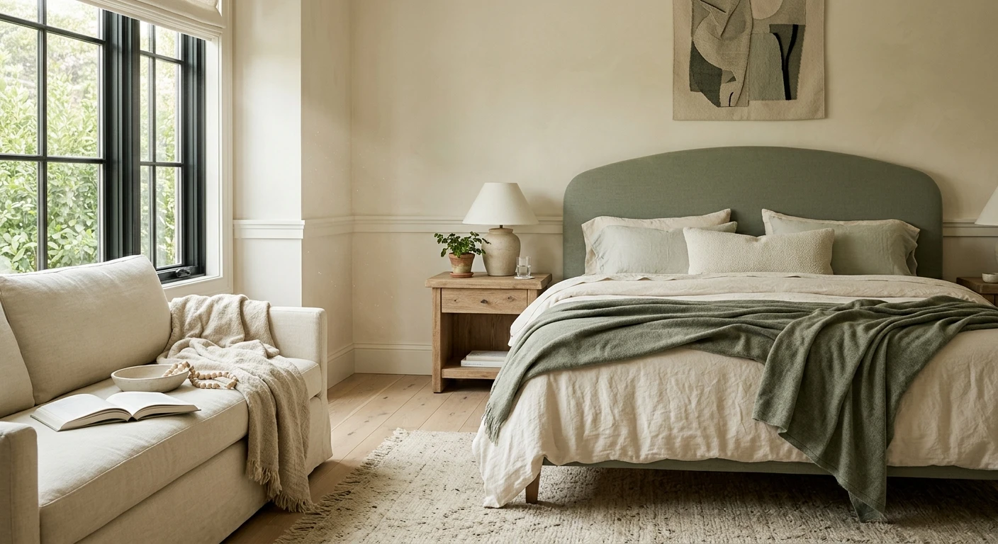
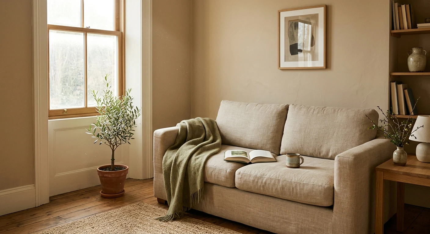
Daylight is not neutral. North-facing windows deliver cool, bluish, indirect light for most of the day, which drains warmth out of a color and exaggerates any blue, gray, or green in it. South-facing windows flood a room with warm, golden light that brightens everything and can push warm colors toward butter or cream. East light is warm and soft in the morning, then cooler and flatter by afternoon, while west light is dim early and then turns intense and orange at sunset. The paint never changes, but the light landing on it does, which is why a swatch that looked perfect in the store can betray you at home.
Two properties decide how a color behaves: its lightness and its undertone. Lightness is measured objectively as light reflectance value (LRV), the 0 to 100 scale for how much light a paint bounces back. Undertone is the subtle lean toward yellow, red, and orange (warm) or blue, green, and violet (cool) hiding under the main color. LRV tells you how bright a room will feel; undertone tells you whether the color will read cozy or clean once your particular light hits it. The strategy is simple: warm colors counteract cool light, and cool colors balance warm light.
To read an undertone, set the chip against a sheet of pure white paper in daylight. On its own, almost any beige or gray looks neutral; against true white, its lean jumps out. A greige that suddenly looks pink or tan is a warm greige, while a gray that turns icy is a cool gray. Do this with two or three candidates at once, because the contrast makes the undertone obvious in a way a single chip never will.
Quick matrix: undertone by exposure
- North-facing: go warm (warm whites and warm greiges) to offset the cool, dim light.
- South-facing: go cool, or either, since strong warm light is forgiving and does the brightening for you.
- East-facing: go balanced (a neutral greige that flexes from warm morning to cooler afternoon).
- West-facing: go cool-leaning, and steer clear of yellows that turn gold at sunset.
The best colors for each exposure
Here is a shortlist that puts the strategy to work. The LRV figures are the manufacturers' published values, so treat them as accurate reference points, then match the pick to your exposure in the last column.
| Color | Brand + code | Approx LRV | Why it works here |
|---|---|---|---|
| White Dove | Benjamin Moore OC-17 | 85 | Warm white that softens cool north light without reading cream; high LRV keeps a dim room open. |
| Accessible Beige | Sherwin-Williams SW 7036 | 58 | Warm greige that counters gray north light and stays cozy in low-light rooms. |
| Edgecomb Gray | Benjamin Moore HC-173 | 63 | Soft warm greige; the safe middle for east rooms that swing from warm morning to cool afternoon. |
| Agreeable Gray | Sherwin-Williams SW 7029 | 60 | Near-neutral greige that flexes warm or cool, ideal for variable east light and open plans. |
| Gray Owl | Benjamin Moore OC-52 | 66 | Cool gray with a soft green-blue lean that calms strong, warm south light and keeps a fresh feel. |
| Stonington Gray | Benjamin Moore HC-170 | 59 | Clean cool gray that balances the warm west glow and resists going gold at sunset. |
Try it on your house
No photo? Try a sample
Upload one photo and preview the shortlist on your actual walls in your actual light. Free, no signup.
Colors to avoid
No color is wrong everywhere, but some pairings fight the light and leave you disappointed. Watch for these:
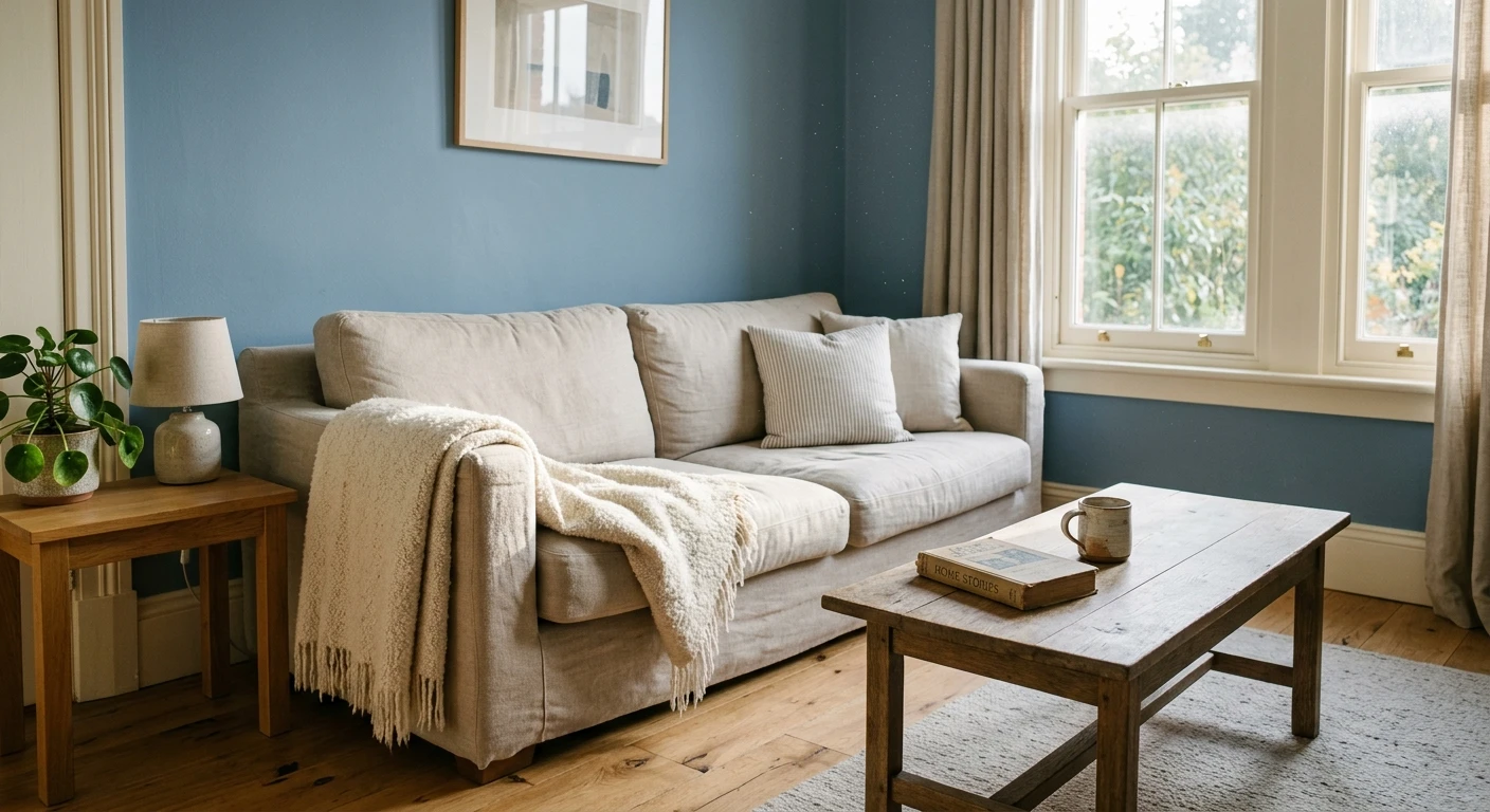
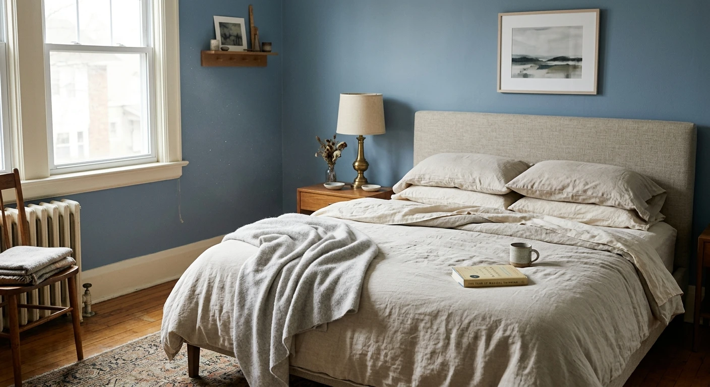
- Cool blue-grays in north-facing rooms. Cool light plus a cool undertone reads icy, and on a gray day it can look downright dingy. Save clean blue-grays like Sherwin-Williams Krypton SW 6247 for brighter exposures where the warmth of the sun balances them.
- Very high-LRV whites in bright south rooms. An LRV 90-plus white can glare and wash out when strong daylight piles on. A soft white or a color with a little depth holds its character better.
- Yellow-based colors in west-facing rooms. The late-afternoon orange glow amplifies yellow, so a buttery cream can turn gold or muddy right when you use the room most. The counter-list is worth having on hand before you sample: our paint colors for west-facing rooms shortlist is built entirely on cool or neutral bases that balance that evening glow instead of amplifying it.
- Muddy, low-LRV colors in dark or north rooms. Without much incoming light, a deep color loses its richness and just reads flat. If you want drama in a dim room, commit fully rather than landing in the murky middle.
Charts and codes get you a smart shortlist, but they cannot see your window, your bulbs, or the tree outside that filters your afternoon light. That is why the last step is always to preview the finalists in your own space with our interior paint visualizer: upload one photo and see each shade on your actual walls before you commit to a gallon. To go deeper on the physics, read how natural light affects paint color, and if you are wrestling with a specific cool exposure, our guide to the best gray paint colors for north-facing rooms narrows the field even further. Keep in mind that exposure only governs the daylight hours: once the sun sets, your bulbs take over and can undo the balance entirely, which is what the best paint colors for rooms with LED lighting are chosen to survive.
Frequently asked questions
Should north-facing rooms use warm or cool paint colors?
Warm colors, as a rule. North light is cool and indirect, so it pulls colors grayer and can make cool grays look icy or dingy. A warm undertone counteracts that. Reach for a warm white like Benjamin Moore White Dove OC-17 (about LRV 85) or a warm greige like Sherwin-Williams Accessible Beige SW 7036 (about LRV 58), and keep the LRV on the higher side because north light is dim. Preview the shade on a photo of your own room first, since every north window is different.
What paint colors work best in bright south-facing rooms?
South-facing rooms get warm, abundant light all day, which brightens colors and can wash out very pale shades or push warm tones buttery. Cool colors balance that warmth and stay true. A cool gray with a soft green-blue lean like Benjamin Moore Gray Owl OC-52 (about LRV 66) or Stonington Gray HC-170 (about LRV 59) holds its color well. Warm colors can still work here if you want a cozy feel, because strong south light is forgiving.
How do I tell if a paint color is warm or cool?
Hold the chip against a sheet of true white paper in daylight. Against pure white, a warm color leans yellow, red, or orange, and a cool color leans blue, green, or violet. Undertone is separate from lightness, so a light gray can still be cool and a pale beige can still be warm. Compare two or three candidates side by side, because the lean is much easier to see in contrast than on a single chip alone.
Which paint colors should I avoid in a west-facing room?
Avoid colors that already lean yellow or gold. West-facing rooms get a dim morning and then an intense warm-orange glow in late afternoon, and a yellow-based color can turn gold or muddy at sunset. Cool-leaning grays and soft green-grays hold up much better in that light. Whatever you shortlist, preview it on a photo of the actual room in evening light before you buy, because west light changes dramatically through the day.
1 HD render plus 3 free color variations.
Color names and codes are trademarks of their respective owners (Sherwin-Williams, Benjamin Moore, Behr). FacadeColorizer is an independent AI visualization tool and is not affiliated with them. LRV and hex values are approximate; the authoritative reference is a physical paint sample viewed in your own light.
Trademarks mentioned (Sherwin-Williams, Benjamin Moore, Behr, Caparol, Brillux, Sto, Alpina, Valspar, PPG, Glidden, Dulux, Crown Trade, Sandtex, Farrow & Ball, Johnstone's, Leyland) are property of their respective owners. FacadeColorizer is independent and not affiliated with any of them. Nominative fair use under Lanham Act §1125.