Try it on your house

Quick answer: In a windowless room the bulb is the only light, so choose with the fixture in mind. For a fresh, open feel, use a warm high-LRV white or soft neutral like Benjamin Moore White Dove OC-17 (LRV 85), Sherwin-Williams Alabaster SW 7008 (LRV 82), or Shoji White SW 7042 (LRV 74). For a small powder room, lean the other way with a confident deep tone like Benjamin Moore Hale Navy HC-154 (LRV 6) or Sherwin-Williams Iron Ore SW 7069 (LRV 6) so the space feels intentional rather than accidental.
A windowless room breaks the usual color advice. An interior bathroom, powder room, hallway, closet, or laundry has no daylight at all, so the color you see is entirely the product of your light bulbs. That single fact flips two rules people repeat without thinking: that dark colors are only for bright rooms, and that a windowless space should always be painted the lightest white you can find. Neither one holds up here. This guide is part of our series on paint colors by room orientation, and it covers the two routes that actually work when the bulb, not the sun, decides everything.
Why a windowless room changes paint color
In a room with windows, daylight shifts all day and does most of the work of revealing a color's depth and undertone. Remove the window and that variable disappears. What is left is your fixture: its brightness in lumens, its color temperature in Kelvin, and its color rendering index (CRI). A warm 2700K bulb makes a white feel soft and a navy feel cocooning. A cool 4000K bulb can push that same white toward flat gray and make the navy read cold and blue. Because the light never changes, a windowless room is actually more predictable than a north-facing one, as long as you choose the bulb and the paint together instead of one at a time.
The other number to know is light reflectance value (LRV), the 0 to 100 scale that tells you how much light a color bounces back. In a daylit room a high-LRV white borrows the sun to brighten the space. In a windowless room there is no sun to borrow, so a very bright white can still read flat if the bulb is weak or the wrong temperature. That is the counterintuitive part: pushing LRV as high as possible does not guarantee a brighter-feeling room here. A warm white in the low 80s under a good bulb often feels fresher than a stark 90-plus white under a cheap one.
The best colors for a windowless room
Here are six picks that hold up under bulb-only light, split between the two routes: warm whites and soft neutrals that keep the room feeling fresh, and deep, saturated tones that make a small windowless room feel deliberate. All codes and LRVs are the manufacturers' published figures.
| Color | Brand + code | Approx LRV | Why it works here |
|---|---|---|---|
| White Dove | Benjamin Moore OC-17 | 85 | Warm white with a whisper of soft gray. Stays creamy, not clinical, under 2700K bulbs. The safe bright pick for an interior bath or laundry. |
| Alabaster | Sherwin-Williams SW 7008 | 82 | Creamy warm white. The warmth masks the flatness of artificial light, so the room reads fresh rather than sterile. |
| Shoji White | Sherwin-Williams SW 7042 | 74 | Soft warm greige-white. Forgiving under mixed vanity bulbs and less prone to glare than a bright white in a tight, enclosed space. |
| Hale Navy | Benjamin Moore HC-154 | 6 | Deep gray-navy that reads intentional in a small powder room. With no daylight to muddy it, the saturation lands clean under a good bulb. |
| Naval | Sherwin-Williams SW 6244 | 4 | Rich, enveloping navy. A windowless powder room is the ideal place to commit fully to a dark, jewel-box look. |
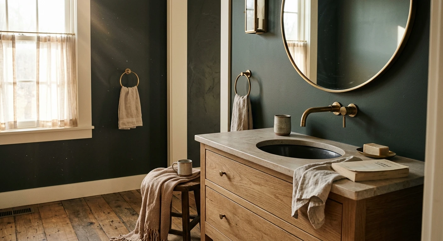
| Iron Ore | Sherwin-Williams SW 7069 | 6 | Warm charcoal, softer than true black. Cocooning under warm light and a natural partner for brass, wood, and warm metals. |
Try it on your house
No photo? Try a sample
Notice that the deep picks all sit at LRV 4 to 6, near the bottom of the scale. In a daylit room that darkness would swallow the light, but a windowless room has no competing daylight to flatten the color, so a well-lit deep tone shows its true richness. This is exactly why saturated color often works better here than in a light-starved living room: there is no weak sun fighting the pigment.
Upload one photo and preview the shortlist on your actual walls in your actual light. Free, no signup.
Colors to avoid
A few color families reliably disappoint when there is no daylight to help them along.
- Cool, blue-based grays and stark "hospital" whites. Without daylight to soften them, they read cold, gray, and dingy under most bulbs. If you love gray, reach for a warm greige instead.
- Muddy mid-tone taupes and complex greiges that rely on natural light to reveal their undertone. In bulb-only light they collapse into a flat, dirty beige.
- Crisp blue-whites under cool 4000K or higher bulbs. The combination looks clinical and gray rather than clean. Pair a bright white with warm bulbs, or step down to a warmer white like Alabaster.
- Loud, high-chroma mid-tones (a bright saturated primary) in a tiny enclosed room. They can feel oppressive at close range. If you want color, go deep and grounded with a jewel tone rather than bright and busy.
- Any color judged only under the wrong bulb. The most common "bad color" is actually a good color viewed under a 5000K daylight bulb it was never meant for.
The honest caveat with every pick above is that light is unpredictable, and your fixture, your CRI, and your exact wall will all shift the result. The only way to know is to see the color in your own room before you buy a gallon. Our interior paint visualizer lets you upload one photo and preview the whole shortlist on your actual walls under your actual light. If your room has a small window but still feels dim, our guide to the best paint colors for dark rooms goes deeper on low-light picks, and if your goal is to open the space up, colors that make a room look brighter covers the moves that add the most perceived light.
Frequently asked questions
What are the best paint colors for a windowless room?
Two routes work. For a fresh, bright feel, use a warm high-LRV white or soft neutral like Benjamin Moore White Dove OC-17 (LRV 85), Sherwin-Williams Alabaster SW 7008 (LRV 82), or Shoji White SW 7042 (LRV 74). For a small windowless powder room, a confident dark or jewel tone like Benjamin Moore Hale Navy HC-154 (LRV 6), Sherwin-Williams Naval SW 6244 (LRV 4), or Iron Ore SW 7069 (LRV 6) reads intentional and rich. Because the bulb is the only light, preview any pick on a photo of your own room before buying.
Should a windowless room be painted light or dark?
Either can work, and there is no rule that a windowless room must be pale. If you want it to feel open and clean, such as an interior bathroom, laundry, or closet, go with a warm high-LRV white or soft neutral. If it is a small room you pass through or use briefly, like a powder room or a bar, leaning into a saturated dark or jewel tone makes the missing window feel deliberate rather than accidental. The deciding factors are how you use the room and the bulbs you install.
Why does saturated color often work better in a windowless room than in a dim living room?
A dim living room still has a window fighting the paint, and weak daylight flattens a dark color so it looks muddy. A windowless room has no competing daylight, so a well-lit deep color shows its true richness under the bulb you chose. With good warm 2700K to 3000K bulbs at CRI 90 or higher, a small windowless powder room in a deep navy or charcoal can feel jewel-box intentional rather than gloomy.
What light bulbs are best for a windowless room's paint color?
Because artificial light is the only light, the bulb decides the outcome. For both warm whites and jewel tones, choose 2700K to 3000K warm-white bulbs with a CRI (color rendering index) of 90 or higher so colors look true and skin tones stay flattering. Avoid 4000K and cooler bulbs, which can push a warm white toward flat gray and make a navy read cold. Add enough lumens, because a saturated color needs adequate, good-quality light to reveal its depth.
1 HD render plus 3 free color variations.
Color names and codes are trademarks of their respective owners (Sherwin-Williams, Benjamin Moore, Behr). FacadeColorizer is an independent AI visualization tool and is not affiliated with them. LRV and hex values are approximate; the authoritative reference is a physical paint sample viewed in your own light.
Trademarks mentioned (Sherwin-Williams, Benjamin Moore, Behr, Caparol, Brillux, Sto, Alpina, Valspar, PPG, Glidden, Dulux, Crown Trade, Sandtex, Farrow & Ball, Johnstone's, Leyland) are property of their respective owners. FacadeColorizer is independent and not affiliated with any of them. Nominative fair use under Lanham Act §1125.