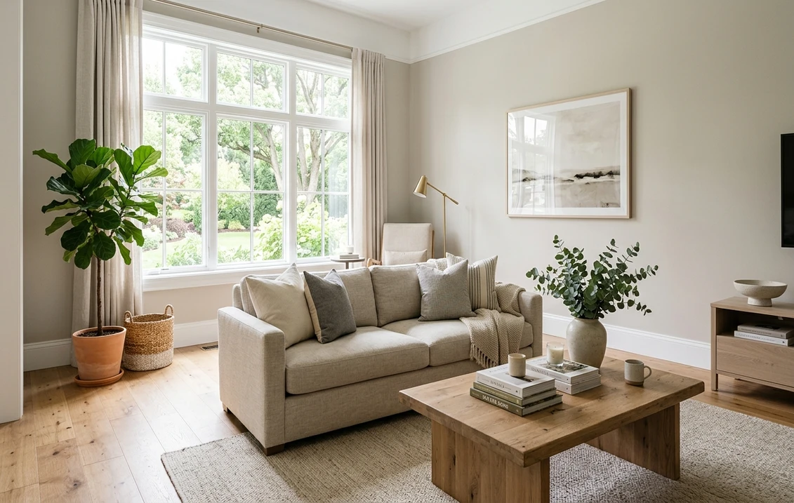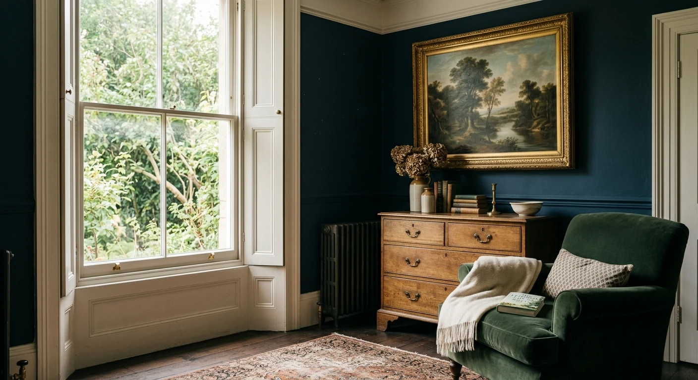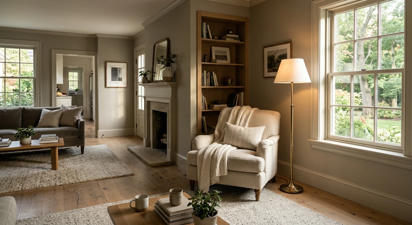

Farrow & Ball Drop Cloth (No. 283) is a traditional mid gray-beige (greige) from the brand's Core palette, named after the heavy unbleached canvas decorators lay over floors during a paint job. Its main appeal inside American homes is balance: it sits squarely in the middle of the warm-neutral spectrum, reading neither too yellow like a dated builder beige nor too cold and concrete-like in north-facing rooms. Farrow & Ball does not publish an official LRV, so by our calculation from the brand's approximate digital rendering (#C5BDAC), Drop Cloth carries a relative luminance of about 51.2 on a 0 to 100 scale, placing it right at the center of the mid-tone neutral band.
The official color number, Core palette status, Mid Tones primer recommendation, complementary whites, screen color, and US finish prices below come from farrow-ball.com/us, read on 2026-11-22. Our calculated luminance value, Delta E 2000 comparisons against Sherwin-Williams and Benjamin Moore charts, room coverage math, and trim pairing notes are editorial calculations. Because every screen shifts neutral pigments, confirm the real paint on a large sample board in your own room light before ordering gallons. If you are comparing Farrow & Ball with American retail lines, our Farrow & Ball paint colors guide and our US retail paint brands guide map out the broader brand differences.
Our US interior simulator uses Sherwin-Williams and Benjamin Moore palettes rather than Farrow & Ball. This link preloads SW 7638 Jogging Path, the closest Sherwin-Williams match to Drop Cloth by our calculation, on your walls.
What Farrow & Ball says about Drop Cloth No. 283
The official Drop Cloth No. 283 page on farrow-ball.com places the shade in the Core palette and describes it as a traditional mid gray-beige inspired by a painter's canvas drop cloth, calibrated to feel neither too yellow nor too gray. On that same page, Farrow & Ball specifies its Mid Tones Primer & Undercoat as the base system and lists four coordinated companions from the same neutral family: Shaded White (No. 201), Shadow White (No. 282), School House White (No. 291), and London Stone (No. 6).
| Specification | Farrow & Ball Drop Cloth (No. 283) |
|---|---|
| Official name and number | Drop Cloth, No. 283 (Core palette) |
| Color family | Traditional mid gray-beige (greige), canvas-inspired |
| Approximate digital rendering | #C5BDAC |
| Published LRV | Not published by Farrow & Ball |
| Calculated relative luminance | About 51.2 on a 0 to 100 scale (derived from #C5BDAC) |
| Recommended Primer & Undercoat | Mid Tones |
| Complementary whites and pairings | Shaded White (No. 201), Shadow White (No. 282), School House White (No. 291), London Stone (No. 6) |
Try it on your room
- 1Your photoPhoto
- 2Your colorColor
- 3HD render in ~30 sHD render in ~30 s
Your photo is used only to create your preview. JPG, PNG, HEIC (iPhone)
A relative luminance around 51.2 explains why Drop Cloth behaves differently from pale off-whites. Paints above 70 bounce most of the room's light back at you and fade into the background; paints below 35 absorb enough light to feel moody and cocooning. At 51.2, Drop Cloth has real visual weight on drywall and plaster. It holds its color in bright sunlit family rooms without washing out to white, yet it reflects enough ambient light to keep hallways and north-facing rooms from feeling closed in. That middle-ground value is why designers often treat Drop Cloth as a whole-house anchor in our warm neutral greige paint guide.
Undertones and room-by-room light shifts
In pigment terms, Drop Cloth is a muted stone greige with a subtle earthy warmth and a whisper of dry green-gray that keeps the beige from turning peachy or pink. Unlike taupe-leaning shades that can flash violet at dusk, Drop Cloth stays grounded and mineral. Its exact reading still shifts noticeably with window orientation, artificial bulb temperature, and the wood tones directly beneath it.
| Room orientation or light source | How Drop Cloth No. 283 reads on walls | Practical adjustment |
|---|---|---|
| North-facing rooms | Cooler, softer stony gray-beige with a slight dry putty cast in deep corners | Pair with warm 2700K lamps, natural linen textiles, and warm oak or brass accents |
| South-facing rooms | Creamier, warmer canvas beige that stays calm without turning yellow | Use Shaded White No. 201 or School House White No. 291 trim to keep contrast gentle |
| East-facing rooms | Crisp, balanced greige in morning sun; shifts toward deeper stone gray by late afternoon | Works well in kitchens and breakfast nooks; add under-cabinet 2700K to 3000K lighting |
| West-facing rooms | Quiet gray-beige at midday; turns noticeably richer and golden-warm at sunset | Avoid overly yellow trim whites that amplify late-day warmth |
| Artificial LEDs (2700K vs 4000K) | 2700K brings out the cozy beige canvas; 4000K strips warmth and pushes it toward flat putty gray | Stick to 2700K or 3000K high-CRI (90+) bulbs throughout open-plan rooms |
Fixed finishes in American homes exert just as much pull as window light. Over natural white oak or honey-toned red oak hardwood floors, Drop Cloth bridges the warm wood grain and cool stone countertops cleanly. Next to gray-veined quartz or Carrara marble, the beige element steps forward and keeps the kitchen from feeling sterile. The one pairing that deserves extra caution is strong orange-stained pine or cherry trim: next to heavy orange wood, the muted gray component in Drop Cloth can look slightly greenish-gray by simultaneous contrast. Always set your painted sample board directly against the floor and baseboard before committing.
US interior finishes, sheen levels, and dated prices
Choosing the right Farrow & Ball finish matters as much as choosing the color, because gloss level changes both light bounce and durability. The table below lists official US interior prices from farrow-ball.com/us as checked on 2026-11-22. Treat these figures as a dated reference snapshot rather than a permanent quote, and check your local showroom or the brand's site before placing a bulk order.
| Interior finish | Sheen | Best interior surfaces | 750 ml / Sample | US Gallon |
|---|---|---|---|---|
| Sample Pot | 2% (Estate Emulsion) | Test boards only (100 ml) | $9 (100 ml) | N/A |
| Estate Emulsion | 2% chalky matte | Living rooms, dining rooms, bedrooms, ceilings | Not listed | $160 |
| Modern Emulsion | 7% matte | Kitchens, bathrooms, hallways, mudrooms (washable) | Not listed | $160 |
| Dead Flat | 2% ultra-matte | Multi-surface: walls, woodwork, radiators, color drenching | $56 | $168 |
| Flat Eggshell | 20% low sheen | Interior woodwork, wainscoting, cabinets, metal | $56 | $168 |
| Modern Eggshell | 40% mid sheen | High-wear trim, kitchen cabinets, stairs, interior floors | $56 | $168 |
| Full Gloss | 95% high shine | Statement doors, accent cabinetry, interior wood and metal | $56 | $168 |
For dry, lower-traffic rooms where you want the signature velvety depth that Farrow & Ball is known for, the Estate Emulsion product page details a 2% sheen chalky matte formula at $160 per US gallon. Because it is wipeable rather than scrubbable, reserve it for formal living rooms, adult bedrooms, dining rooms, and ceilings.
In family rooms with kids or pets, kitchens, bathrooms, and narrow hallways, step up to the Modern Emulsion finish, also priced at $160 per US gallon. Its 7% sheen remains softly matte from straight on while resisting scuffs, steam, and repeated washing. If you want one single ultra-matte finish across drywall, baseboards, crown molding, and doors, the Dead Flat multi-surface paint ($56 for 750 ml or $168 per US gallon) delivers a 2% sheen engineered to handle everyday scuffs on walls, woodwork, and primed metal. For dedicated cabinetry and heavy-use trim, Flat Eggshell (20% sheen) keeps a quiet traditional look, Modern Eggshell (40% sheen) offers maximum scrub resistance, and Full Gloss (95% sheen) creates a lacquered accent on paneled doors.
Where Drop Cloth No. 283 works best inside American homes
Drop Cloth thrives in American floor plans that mix open living areas with transitional woodwork. Because its calculated luminance (51.2) is deep enough to frame white trim yet light enough not to swallow a room, it performs reliably across five main interior zones:
- Family rooms and open-plan living areas: Painted in Estate Emulsion or Modern Emulsion, Drop Cloth gives large drywall expanses warmth and architectural calm. It pairs effortlessly with oatmeal sectionals, cognac leather chairs, black steel fireplace surrounds, and wide-plank white oak floors.
- Kitchen cabinetry and islands: Drop Cloth is a standout alternative to stark white cabinets. In Flat Eggshell (20% sheen) or Modern Eggshell (40% sheen), it creates a custom British-inspired shaker kitchen that softens stainless steel appliances and complements unlacquered brass or oil-rubbed bronze hardware.
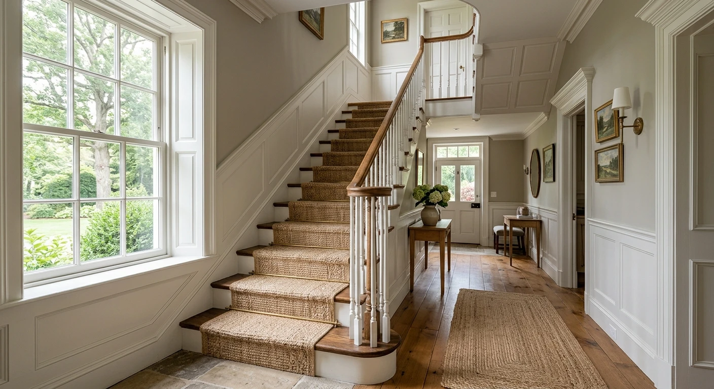
- Hallways, foyers, and stairwells: Entryways take the brunt of backpacks, coats, and handprints. Using Drop Cloth in Modern Emulsion (7% sheen) or Dead Flat hides minor dust better than pale off-whites while giving a welcoming transition into brighter adjacent rooms.
- Bedrooms and quiet studies: In a bedroom, Drop Cloth creates a restful, textile-like envelope that pairs with crisp white bedding, wool rugs, and dark walnut furniture. Color drenching walls, baseboards, and ceiling in Dead Flat removes visual breaks and makes low 8-foot ceilings feel calmer.
- Trim and woodwork against lighter walls: You do not have to put Drop Cloth on the walls. Using it in Flat Eggshell on baseboards, paneled doors, and built-in bookcases against Shaded White or School House White walls delivers a classic, heritage reverse-trim scheme.
If you are deciding between Drop Cloth and other soft neutrals across an entire home, our interior neutral paint colors guide breaks down how to stagger light, mid, and deep neutrals from room to room without creating jarring doorway transitions.
Trim whites, architectural pairings, and the Farrow & Ball tonal ladder
Stark blue-white builder trim is the fastest way to make a subtle greige look muddy. Drop Cloth needs an off-white with a touch of gray or stone in its base so the transition between wall and molding feels intentional. Farrow & Ball builds a four-step neutral ladder directly around Drop Cloth, making it straightforward to coordinate ceilings, trim, walls, and deeper accent woodwork.
| Farrow & Ball shade | Role with Drop Cloth No. 283 | Visual effect |
|---|---|---|
| School House White (No. 291) | Ceilings, crown molding, crispest trim choice | Soft, timeless chalky off-white without cool blue glare |
| Shadow White (No. 282) | Trim, doors, or brighter adjoining rooms | Gentle cream-gray step lighter than Drop Cloth for low-contrast flow |
| Shaded White (No. 201) | Official complementary white for trim and ceilings | Balanced gray-beige off-white that echoes Drop Cloth's canvas tone |
| London Stone (No. 6) | Accent cabinets, islands, mudroom paneling, or interior doors | Deeper earthy stone neutral that grounds Drop Cloth walls |
Homeowners also frequently cross-shop Drop Cloth against two other popular Farrow & Ball warm neutrals. If you prefer a moodier mid-gray with a noticeable magenta-taupe undertone that shifts dramatic in evening light, compare Drop Cloth with our Farrow & Ball Elephant's Breath No. 229 guide. If you want a much paler, whisper-soft neutral with a gentle blush-cream cast for bright bedrooms and hallways, read our Farrow & Ball Dimity No. 2008 interior guide. Drop Cloth sits right between those two personalities: warmer and earthier than Elephant's Breath, yet noticeably deeper and more stone-grounded than Dimity.
Closest Sherwin-Williams and Benjamin Moore matches
At $160 to $168 per US gallon, painting an entire open-concept American home in Farrow & Ball adds up quickly. Many homeowners use genuine Farrow & Ball in a focal room or on kitchen cabinets while looking for a closely related Sherwin-Williams or Benjamin Moore shade for secondary bedrooms, hallways, or contractor-supplied drywall runs. Because no cross-brand paint is an official equivalent, we calculated Delta E 2000 color distances from Drop Cloth's approximate screen rendering (#C5BDAC, calculated luminance 51.2) to identify the closest starting points. Always test wet paint samples side by side on your own wall before substituting.
| Brand and color | Digital rendering | Delta E 2000 vs Drop Cloth | Calculated luminance | How it compares |
|---|---|---|---|---|
| Benjamin Moore CSP-170 Greenwich Gate | #C6BFAE | 0.69 | 52.3 | Closest overall match by screen math; a hair lighter |
| Sherwin-Williams SW 7638 Jogging Path | #C0B9A9 | 1.21 | 48.8 | Closest SW match; slightly deeper and earthier |
| Benjamin Moore CC-490 / 984 Stone Hearth | #C4BAAA | 1.41 | 49.8 | Classic BM greige; slightly warmer and a touch deeper |
| Sherwin-Williams SW 6170 Techno Gray | #BFB9AA | 1.55 | 48.7 | Close SW alternative; leans a touch grayer in cool light |
| Sherwin-Williams SW 7542 Naturel | #CBC0AD | 1.66 | 53.4 | Slightly lighter, warmer beige-greige option |
Among Sherwin-Williams colors, Jogging Path SW 7638 sits closest at a Delta E 2000 of 1.21 and a calculated luminance of 48.8, making it slightly deeper than Drop Cloth (51.2) while preserving the same balanced canvas-stone character. Techno Gray SW 6170 (Delta E 1.55, luminance 48.7) is a practical backup if your room gets strong southern sun and you want slightly less warmth, whereas Naturel SW 7542 (Delta E 1.66, luminance 53.4) works better when you want a slightly brighter wall.
In the Benjamin Moore catalog, CSP-170 Greenwich Gate registers the tightest mathematical proximity (Delta E 0.69, calculated luminance 52.3). For a widely stocked core-deck alternative that most dealers carry on sample chips, Stone Hearth 984 (CC-490) sits at Delta E 1.41 and a calculated luminance of 49.8. Remember that sheen and resin chemistry affect how pigments scatter light: a matte Benjamin Moore Regal Select or Sherwin-Williams Emerald matte finish will look closer to Estate Emulsion than a standard eggshell will.
Upload a photo of your living room, bedroom, or kitchen to preview Stone Hearth 984 (a close Benjamin Moore match to Drop Cloth) before buying sample pots.
Primer, gallon math, sample testing, and indoor air quality
Farrow & Ball specifies its Mid Tones Primer & Undercoat beneath Drop Cloth No. 283. On bare drywall, fresh joint compound, repaired plaster, or dark previously painted walls, skipping a tinted primer forces you into a third topcoat, which wastes expensive finish paint. One full coat of Mid Tones primer followed by two even topcoats of Estate Emulsion, Modern Emulsion, or Dead Flat gives true color saturation and uniform sheen across patched areas.
Estimating paint volume carefully prevents ordering an extra $160 gallon you do not need. Take a typical American family room measuring 14 feet by 16 feet with 9-foot ceilings. The perimeter is 60 linear feet, giving 540 square feet of gross wall area. Subtract roughly 70 square feet for two standard windows and a doorway to leave 470 square feet of net paintable wall. Two coats require 940 square feet of coverage. Using a conservative working spread rate of 350 to 400 square feet per US gallon on primed drywall (always verify the exact spread rate on the can label for your chosen finish), two full coats take about 2.4 to 2.7 gallons, so you should order 3 US gallons of topcoat ($480 in Estate or Modern Emulsion, or $504 in Dead Flat) plus 1 to 2 gallons of Mid Tones primer if the walls are unpainted or dark.
Before buying gallons, follow a strict three-day sample protocol. Buy one 100 ml Sample Pot ($9) and roll two full coats onto a primed 2-by-2-foot foam board or poster board, leaving a narrow white margin untouched if you want to gauge contrast against trim. Move that board to at least three walls (the window wall, the opposite wall, and a shaded corner) and check it at 9 a.m., 2 p.m., and 8 p.m. under your normal lamps. If you are weighing Sherwin-Williams Jogging Path or Benjamin Moore Stone Hearth alongside Drop Cloth, paint separate boards so you can hold them edge to edge against your flooring and trim.
Finally, plan for ventilation during and after painting, especially in tightly sealed modern homes during winter or high-humidity summer months. As the US Environmental Protection Agency notes on its volatile organic compounds and indoor air quality page, paints and primers release VOCs during application and curing, and indoor concentrations can reach up to ten times outdoor levels without fresh air exchange. Even when working with modern water-based emulsions, open cross-ventilating windows, run a box fan exhausting outward, keep doors to occupied bedrooms closed until the coat dries, and store leftover cans tightly sealed away from living spaces.
Sources and references
- Farrow & Ball, Drop Cloth No. 283 product page: Core palette status, canvas gray-beige description, Mid Tones Primer & Undercoat recommendation, complementary whites (Shaded White, Shadow White, School House White, London Stone), digital rendering #C5BDAC, and US finish prices (read 2026-11-22).
- Farrow & Ball, Estate Emulsion finish page: 2% chalky matte sheen, interior wall and ceiling suitability, and US gallon pricing ($160).
- Farrow & Ball, Modern Emulsion finish page: 7% washable matte sheen for kitchens, bathrooms, and high-traffic hallways ($160 per US gallon).
- Farrow & Ball, Dead Flat multi-surface finish page: 2% ultra-matte sheen for walls, woodwork, and primed metal ($56 for 750 ml / $168 per US gallon).
- Sherwin-Williams, Jogging Path SW 7638 color page: neutral color reference compared by Delta E 2000 against Drop Cloth's digital rendering.
- Benjamin Moore, Stone Hearth 984 (CC-490) color page: neutral greige reference compared by Delta E 2000 against Drop Cloth's digital rendering.
- US Environmental Protection Agency, Volatile Organic Compounds' Impact on Indoor Air Quality: indoor VOC exposure from paints and primers, plus ventilation guidance during and after painting.
Frequently asked questions
What undertones does Farrow & Ball Drop Cloth No. 283 have?
What is the LRV of Farrow & Ball Drop Cloth?
Which white trim color goes best with Farrow & Ball Drop Cloth?
What are the closest Sherwin-Williams and Benjamin Moore matches to Drop Cloth?
How much does Farrow & Ball Drop Cloth cost in the US?
Trademarks mentioned (Sherwin-Williams, Benjamin Moore, Behr, Caparol, Brillux, Sto, Alpina, Valspar, PPG, Glidden, Dulux, Crown Trade, Sandtex, Farrow & Ball, Johnstone's, Leyland) are property of their respective owners. FacadeColorizer is independent and not affiliated with any of them. Nominative fair use under Lanham Act §1125.