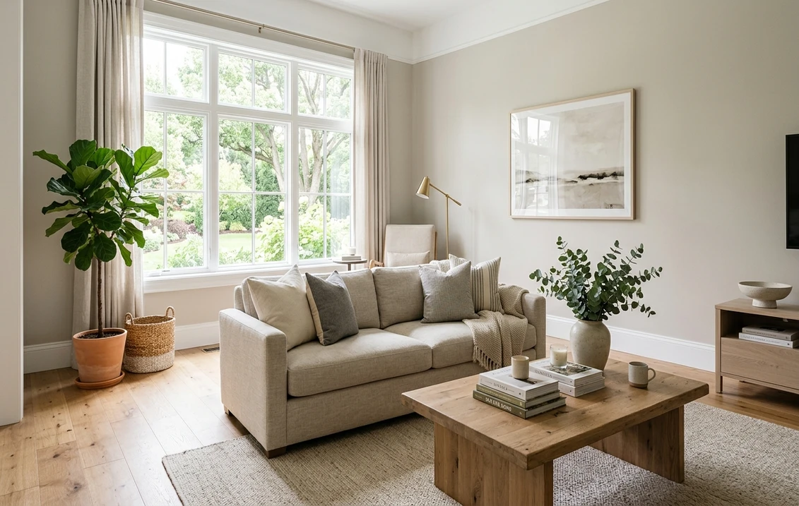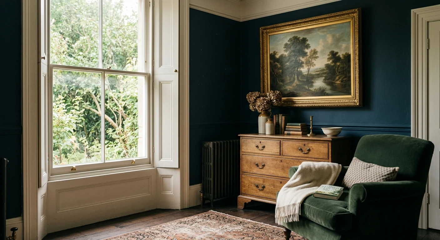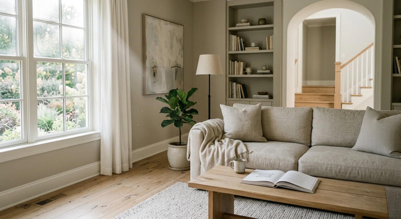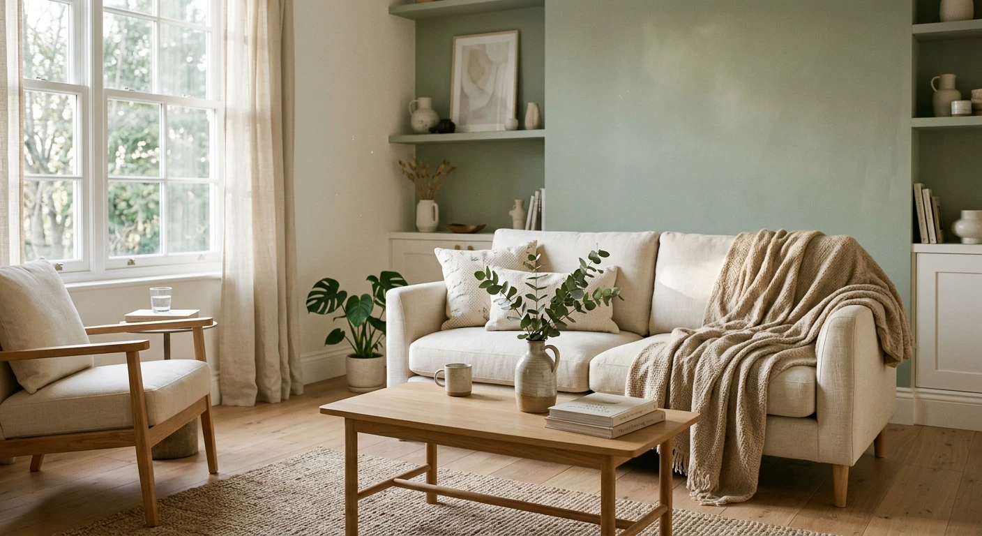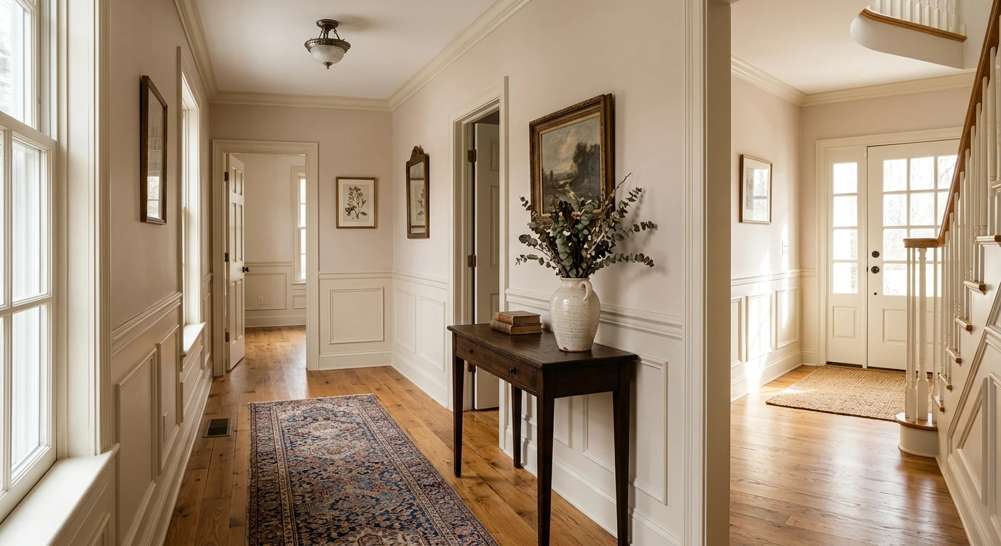

Farrow & Ball Dimity (No. 2008) is a very pale, red-based warm taupe from the Core Warm Neutrals collection. In American homes it gives hallways, foyers, and bedrooms quiet warmth under gray skies without turning yellow like cream or flat like builder beige. Farrow & Ball does not publish an LRV, but our relative luminance calculation from the brand's screen color (#EAE1D3) places Dimity at roughly 76.0 on a 0 to 100 scale.
The color number, palette status, fabric origin, primer, complementary white, scheme pairings, screen hex, and US prices come from farrow-ball.com, checked on November 21, 2026. Relative luminance, Delta E 2000 comparisons against Sherwin-Williams and Benjamin Moore, and gallon counts are our own calculations. Digital swatches only approximate real pigment, so always verify Dimity on a painted board in your own light.
Our US room tool uses Sherwin-Williams and Benjamin Moore charts rather than Farrow & Ball. This link preselects Panda White SW 6147 (Delta E 2000 of 0.52 to Dimity) on your walls.
What Farrow & Ball says about Dimity No. 2008
The official Dimity No. 2008 page on farrow-ball.com calls it "a very pale taupe" brimming with warmth and depth, ideal for understated hallways. It sits in the Core palette's Warm Neutrals family (not Archive, so it mixes across standard US finishes without archive surcharges). Its name comes from dimity, the lightweight woven cotton originally used for bustles and now for bedding.
The brand highlights two styling directions: alongside crisp whites like All White (No. 2005) or Pointing (No. 2003), Dimity reads noticeably pinker; alongside darker Oxford Stone (No. 264) on woodwork, it takes on a relaxed, slightly aged look. At roughly 76.0 calculated relative luminance, Dimity keeps tight stairwells bright while carrying enough body to read clearly as a deliberate wall color rather than stark white primer.
| Specification | Dimity No. 2008 details |
|---|---|
| Official name and number | Dimity, No. 2008 |
| Collection status | Core palette, Warm Neutrals (not Archive) |
| Brand description | A very pale taupe, brimming with warmth and depth, ideal for understated hallways |
| Screen hex color (approximate) | #EAE1D3 |
| Published LRV | Not published by Farrow & Ball |
| Calculated relative luminance | About 76.0 on a 0 to 100 scale (from #EAE1D3) |
| Recommended Primer & Undercoat | White & Light Tones |
| Complementary white | Pointing (No. 2003) |
Try it on your room
- 1Your photoPhoto
- 2Your colorColor
- 3HD render in ~30 sHD render in ~30 s
Your photo is used only to create your preview. JPG, PNG, HEIC (iPhone)
Red-taupe undertones and how Dimity shifts in American light
Dimity No. 2008 is defined by its red-based taupe undertone. Without heavy yellow or green pigment pulling it toward khaki, the subtle red warmth stays visible whenever cool daylight or bright white trim creates contrast. In our north-facing room paint colors guide, we show why cool northern skylight turns cool grays stony; Dimity counters that blue cast without tipping into harsh peach.
| Light source | How Dimity No. 2008 reads | Design adjustment |
|---|---|---|
| North-facing rooms | Soft plaster taupe; cool light tones down the pink into a calm neutral | Use 2700K bulbs in sconces and lamps to keep evening warmth |
| South-facing rooms | Bright, airy pale taupe that softens near sunlit windows | Pair with Pointing No. 2003 trim for gentle contrast, or Oxford Stone for depth |
| East-facing rooms | Luminous in morning sun; slightly cooler and blush by late afternoon | Well suited to primary bedrooms that catch soft morning light |
| West-facing rooms | Quiet taupe in morning shade; warm rose-parchment glow at sunset | Avoid stark blue-white trim that exaggerates the late-day blush |
| Windowless hallways | Warm linen under 2700K LEDs; muted pink-gray under 3500K to 4000K | Standardize bulbs at 2700K to 3000K (CRI 90+) along the corridor |
Adjacent materials also steer the undertone. Stark blue-white ceilings or baseboards pull the blush-pink forward, whereas unlacquered brass, natural linen, travertine, or warm wood floors settle Dimity into stony parchment.
Best rooms in an American house: hallways, bedrooms and living spaces
Dimity excels as a whole-home connector neutral in center-hall and open-plan layouts:
- Hallways, foyers, and stairwells: Farrow & Ball's flagship use for Dimity. Its roughly 76.0 relative luminance keeps narrow passages bright while its warm taupe body prevents the clinical gray cast of pure white drywall.
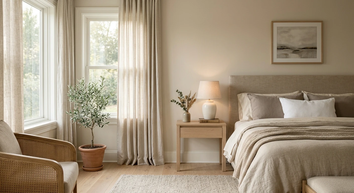
- Bedrooms and nurseries: Echoing its cotton bedding namesake, matte Dimity creates a quiet backdrop behind linen headboards, walnut nightstands, and wool rugs without morning glare.
- Living and dining rooms: Pairs naturally with wainscoting, crown molding, fireplace surrounds, and warm evening chandelier light.
- Kitchens and bathrooms: Works on upper walls alongside soapstone, honed marble, or warm quartz; test carefully next to cool blue-veined marble or bright white subway tile, which push Dimity pinker.
Flooring compatibility is a major strength in US homes. Beside honey oak or red oak floors, yellow-based creams often clash with amber grain, while Dimity's red-taupe undertone bridges the wood cleanly. With white oak or walnut, it reads tailored and architectural; only cool gray-washed laminate or silver-gray carpet tends to make its blush note stand out sharply.
Interior finishes, sheen levels and US prices
Sheen controls both washability and color depth: flatter finishes absorb glare and deepen the red-taupe tone, while higher sheens reflect more light. Below are the official US interior prices on farrow-ball.com as of November 21, 2026 (treat as a dated snapshot).
| Interior finish | Sheen level | 750 ml US price | US gallon price | Best interior use |
|---|---|---|---|---|
| Sample Pot | Matte (test only) | $9 (100 ml) | Not applicable | Painting 2-coat sample boards |
| Estate Emulsion | 2% (signature chalky matte) | Not listed | $160 | Low-traffic bedrooms, ceilings, formal living and dining walls |
| Modern Emulsion | 7% (washable matte) | Not listed | $160 | High-traffic hallways, kitchens, bathrooms, kids' rooms |
| Dead Flat | 2% (multi-surface matte) | $56 | $168 | Color-drenching walls, woodwork, and radiators in one washable flat finish |
| Flat Eggshell | 20% (low-sheen wood/metal) | $56 | $168 | Interior trim, doors, wainscoting, cabinetry with a soft satin glow |
| Modern Eggshell | 40% (mid-sheen tough) | $56 | $168 | High-wear baseboards, stairs, kitchen cabinets, interior doors |
| Full Gloss | 95% (high shine) | $56 | $168 | Architectural woodwork accents, statement doors, smooth trim |
For American hallways and stairwells, choose between Modern Emulsion ($160 per gallon, 7% sheen) and Dead Flat ($168 per gallon, 2% sheen). Classic Estate Emulsion ($160, 2% sheen) delivers the signature chalky matte look for low-traffic bedrooms and ceilings, while Modern Emulsion adds scuff and moisture protection for corridors, baths, and kitchens. Dead Flat pairs a 2% sheen with multi-surface washability across walls, woodwork, and radiators, letting you color-drench an entire room from one can.
Trim whites, woodwork and Farrow & Ball color schemes
Because Dimity is a pale neutral, the trim color you put beside it decides whether the walls look creamy taupe, softly blush, or antique plaster. On the Dimity product page, Farrow & Ball names Pointing (No. 2003) as the official complementary white and groups Dimity alongside a tight family of warm neutrals and earthy accents. If you are building a whole-house palette across multiple Farrow & Ball rooms, our Farrow & Ball paint colors guide maps how the Warm Neutrals family connects to the rest of the chart.
| Pairing shade | Role relative to Dimity No. 2008 | Visual result in a room |
|---|---|---|
| Pointing (No. 2003) | Official complementary white (lighter) | Warm, fresh trim white that lifts Dimity gently without harsh glare |
| All White (No. 2005) | Pure white scheme pairing (lighter) | Maximum crispness; pulls out the soft blush-pink note in Dimity |
| Tailor Tack (No. 302) | Lighter comparison neutral | Even paler, delicate warm off-white for ceilings or sunlit adjoining rooms |
| Joa's White (No. 226) | Darker scheme neutral | Clean, slightly deeper warm taupe for wainscoting, doors, or cabinets |
| Oxford Stone (No. 264) | Darker woodwork pairing | Creates the relaxed, slightly aged look highlighted by Farrow & Ball |
| London Stone (No. 6) | Deep earthy neutral accent | Grounds Dimity on built-in bookcases, kitchen islands, or interior doors |
| Red Earth (No. 64) | Warm terracotta accent | Echoes Dimity's red undertone in an adjacent powder room or dining alcove |
Along a Dimity hallway, richer Farrow & Ball rooms transition smoothly: pair a Dimity foyer with dusty rose in an adjoining bedroom (see our Farrow & Ball Sulking Room Pink No. 295 guide), deep magenta-brown in a study (see our Farrow & Ball London Clay No. 244 guide), or soft gray-green in a bath or kitchen (see our Farrow & Ball Mizzle No. 266 guide). If you are stepping up or down in depth within the same red-based neutral family, compare Dimity directly against lighter Pointing (No. 2003) and Tailor Tack (No. 302) for ceilings or trim, and against darker Joa's White (No. 226) and Oxford Stone (No. 264) for lower wainscoting, stair risers, or interior doors. Color-drenching walls, trim, and ceiling in Dimity removes visual breaks under 8-foot ceilings and makes the red-taupe undertone read calmer and less pink.
Closest Sherwin-Williams and Benjamin Moore matches
At $160 to $168 per US gallon, painting an entire floor in Farrow & Ball adds up quickly. We compared Dimity's screen hex (#EAE1D3, luminance 76.0) against Sherwin-Williams and Benjamin Moore digital charts using Delta E 2000 (under 1.0 is very close on screen; 1.0 to 2.0 is a subtle side-by-side shift). These are calculated starting points, never official equivalents: resin bases, sheen, and pigments differ, so test samples on your own wall.
| Brand and shade | Screen hex | Calculated screen luminance | Delta E 2000 to Dimity |
|---|---|---|---|
| Farrow & Ball Dimity No. 2008 (reference) | #EAE1D3 | 76.0 | 0.00 |
| Sherwin-Williams Panda White SW 6147 | #EAE2D4 | 76.6 | 0.52 |
| Sherwin-Williams Steamed Milk SW 7554 | #ECE1D1 | 76.3 | 1.00 |
| Sherwin-Williams Pacer White SW 6098 | #E5DDD0 | 72.9 | 1.05 |
| Sherwin-Williams Moderate White SW 6140 | #E9DECF | 74.1 | 1.07 |
| Benjamin Moore First Crush CSP-310 | #E9DFD0 | 74.7 | 0.66 |
| Benjamin Moore Ice Breaker CC-428 | #E8DED0 | 74.0 | 0.79 |
| Benjamin Moore Sonnet AF-55 | #E4DCCE | 72.1 | 1.26 |
At Sherwin-Williams, Panda White SW 6147 is closest (Delta E 0.52, luminance 76.6), followed by creamier Steamed Milk SW 7554 (1.00) and slightly deeper Pacer White SW 6098 (1.05) and Moderate White SW 6140 (1.07). For big-box and retail line comparisons, see our Lowe's paint colors and store brand guide. At Benjamin Moore, First Crush CSP-310 leads (Delta E 0.66, luminance 74.7), followed by Ice Breaker CC-428 (0.79) and deeper Sonnet AF-55 (1.26). Picking a native closest match is generally more repeatable for future touch-ups than asking a store to custom-scan a matte paper chip into a different brand's base.
Surface preparation, gallon math and indoor air quality
Measure wall perimeter times ceiling height, subtract 20 sq ft per door and 15 sq ft per window, and multiply by two topcoats (plus one coat of White & Light Tones Primer & Undercoat over bare drywall, dark paint, or glossy trim):
- 12 by 14 ft bedroom (8 ft ceilings): 52 linear ft = 416 gross sq ft; minus one door and two windows = ~366 net sq ft per coat (732 sq ft for two coats). Plan on 2 US gallons of Estate or Modern Emulsion ($320 before primer).
- Two-story hallway and stairwell (~750 net sq ft): Two coats require ~1,500 sq ft, or 4 US gallons ($640 in Modern Emulsion, or $672 in Dead Flat if carrying onto trim).
- Bedroom woodwork only: One 750 ml can of Flat Eggshell or Modern Eggshell ($56) typically covers baseboards, casings, and one door over primed wood.
Wash greasy stair-rail smudges with mild detergent, rinse cleanly, spackle nail holes, sand smooth with 180- to 220-grit paper, and spot-prime patches with White & Light Tones Primer & Undercoat so matte walls dry without dull flashing. On previously painted glossy baseboards or interior doors, clean thoroughly, scuff-sand with 180-grit sandpaper, wipe away dust with a tack cloth, apply a full coat of White & Light Tones Wood Primer & Undercoat, and finish with two thin coats of Flat Eggshell (20% sheen), Modern Eggshell (40% sheen), or Dead Flat (2% sheen). Always allow full recoat times listed on the can before closing freshly painted doors against jambs so the film does not stick or print. Even with water-based interior paints, follow US EPA guidance on volatile organic compounds (VOCs): indoor VOC levels from paints and coatings rise sharply during and right after application, so crack windows, run an exhaust fan outward, and let bedrooms air out thoroughly before sleeping.
How to test Dimity No. 2008 and preview it on your own walls
Order a 100 ml Sample Pot ($9) and roll two coats onto a primed 24 by 24 inch poster board, leaving a white border so your eye reads the red-taupe undertone accurately. Move the board between a window-lit wall and a shadowed doorway wall, checking morning daylight, midday sun, and evening 2700K to 3000K lamps against your baseboards and floors. If comparing American alternatives, paint a second board in First Crush CSP-310 or Panda White SW 6147 and view both from six feet back.
Upload a photo of your own room to see how a pale warm taupe pairs with your existing floors, trim, and light before buying sample pots.
Sources and references
- Farrow & Ball, Dimity No. 2008 product page: Core Warm Neutrals status, fabric name origin, brand description, screen color #EAE1D3, White & Light Tones primer, Pointing No. 2003 complementary white, scheme pairings, and US prices (read November 21, 2026).
- Farrow & Ball, Estate Emulsion, Modern Emulsion, and Dead Flat finish pages: sheen levels, surface suitability, and washability.
- Sherwin-Williams, Panda White SW 6147: color page and digital screen reference used for closest-match Delta E 2000 comparison.
- Benjamin Moore, First Crush CSP-310: Color Stories reference used for closest-match Delta E 2000 comparison.
- US Environmental Protection Agency, Volatile Organic Compounds' Impact on Indoor Air Quality: indoor VOC behavior from paints and coatings and ventilation precautions.
Frequently asked questions
Does Farrow & Ball Dimity No. 2008 look pink on walls?
What is the LRV of Farrow & Ball Dimity No. 2008?
What is the closest Sherwin-Williams or Benjamin Moore match to Dimity?
Which Farrow & Ball finish is best for Dimity in a hallway?
What white trim goes best with Farrow & Ball Dimity?
Trademarks mentioned (Sherwin-Williams, Benjamin Moore, Behr, Caparol, Brillux, Sto, Alpina, Valspar, PPG, Glidden, Dulux, Crown Trade, Sandtex, Farrow & Ball, Johnstone's, Leyland) are property of their respective owners. FacadeColorizer is independent and not affiliated with any of them. Nominative fair use under Lanham Act §1125.