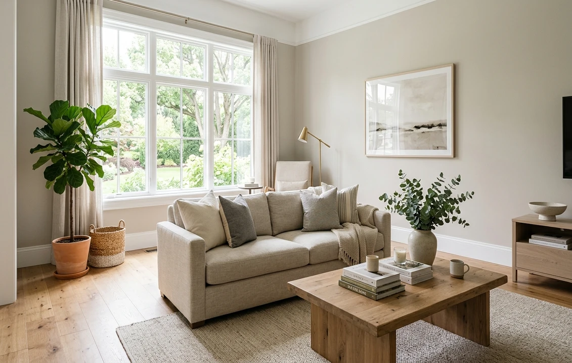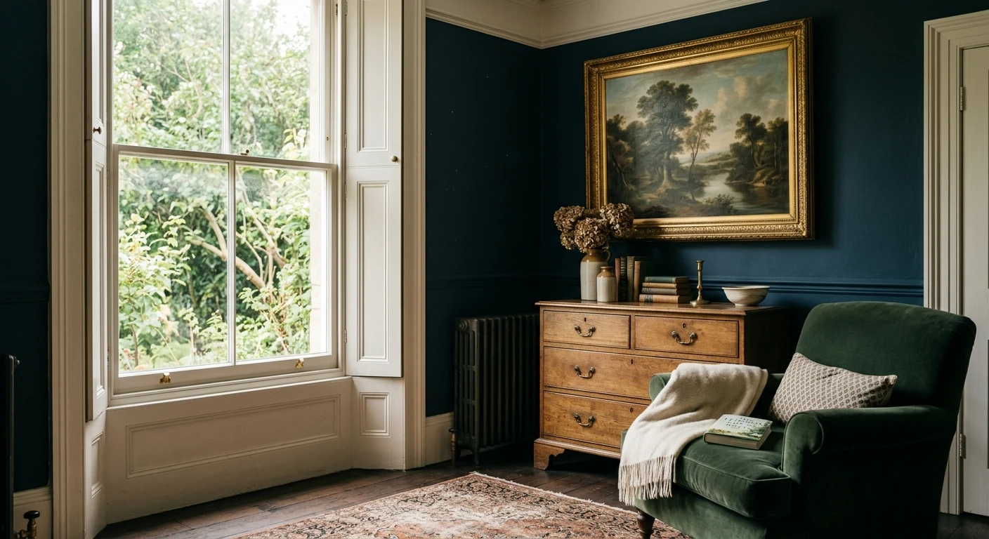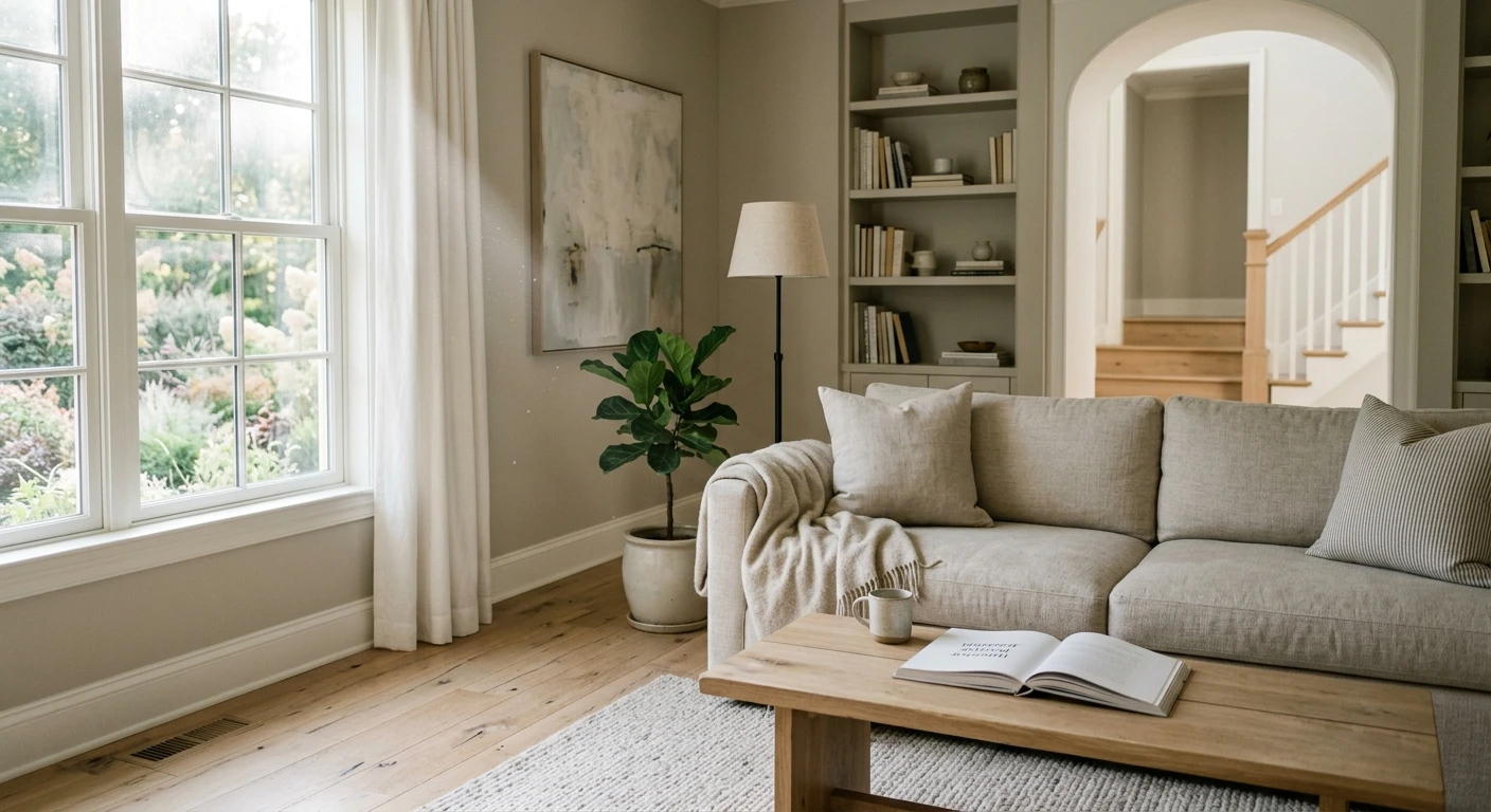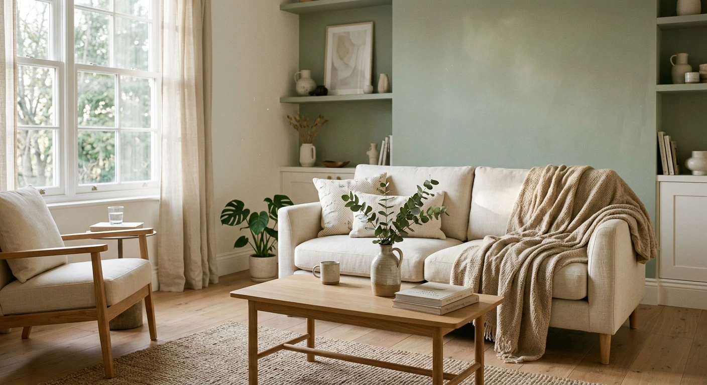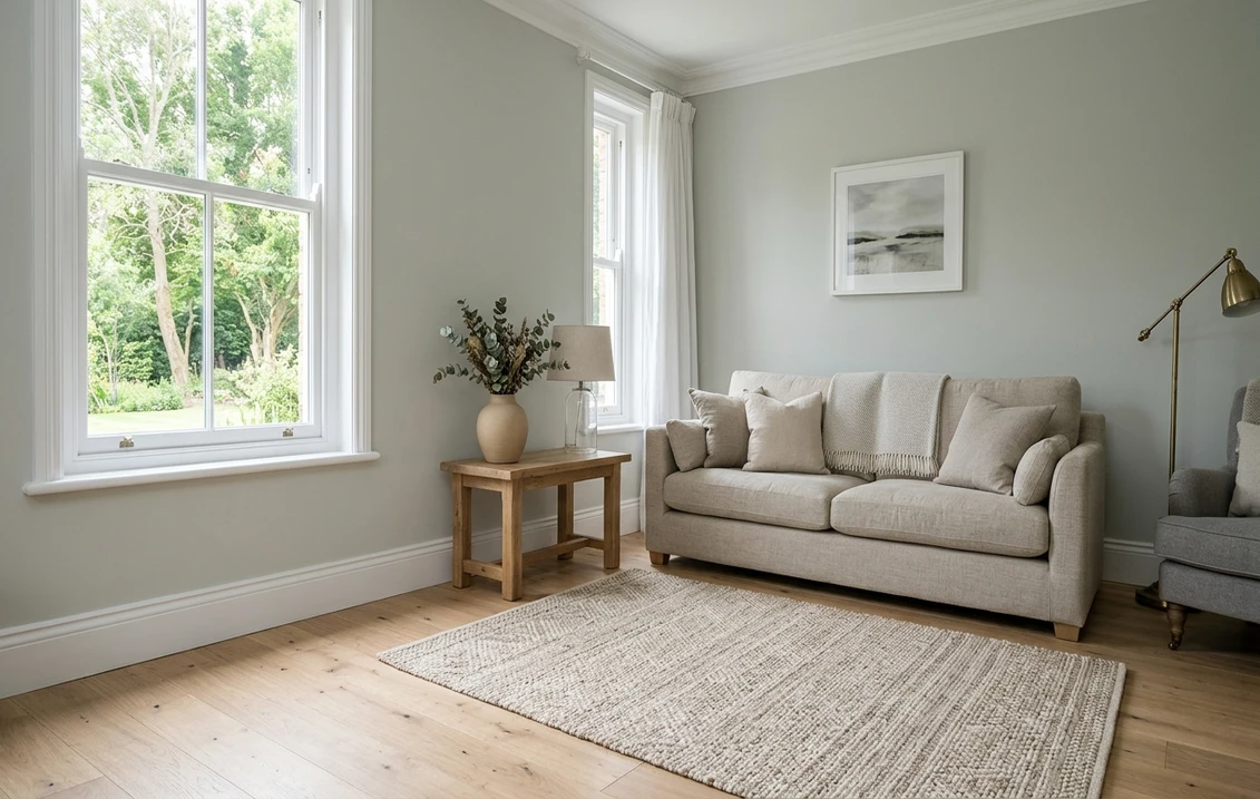

Farrow & Ball Mizzle (No. 266) is a soft gray-green, a lighter version of Pigeon and Blue Gray in which green pigment calms the blue. It is a mid-light color: by our calculation from the brand's own screen color, it reflects about half of the light that reaches it. In an American home it suits living rooms, bedrooms and kitchen cabinets; it looks greener and quieter in north light and softer, closer to gray, in south light. The closest Sherwin-Williams color on screen is Contented SW 6191, and the closest Benjamin Moore is Horizon Gray 2141-50.
The description, the primer, the complementary white, the color schemes, the screen color and the US prices come from the Mizzle page on farrow-ball.com, read on 20/11/2026; the finish descriptions come from the brand's finish pages. The LRV values of the Sherwin-Williams and Benjamin Moore colors come from those brands. The light index of Mizzle, the Lab values and the color differences are our calculations, and the advice on rooms and light is our color reasoning. A screen color is an approximation: decide on a painted sample in the room.
The interior tool uses the Sherwin-Williams and Benjamin Moore charts. Pick Contented SW 6191 or Horizon Gray 2141-50, the closest colors to Mizzle by our calculation.
What Farrow & Ball says about Mizzle No. 266
The Mizzle page on farrow-ball.com calls it "a soft grey green" named after West Country evening skies, when mist and drizzle mix. It says the added green pigment diminishes any cool blue tones, making a lighter shade of Pigeon and Blue Gray, and that rooms feel soft and contented in this "rather indeterminate" color. The page recommends the Mid Tones primer and undercoat and names School House White No. 291 as the complementary white.
| Attribute | Mizzle No. 266 |
|---|---|
| Name and number | Mizzle, No. 266 |
| Brand description | A soft gray-green, lighter than Pigeon and Blue Gray |
| Screen color shown by the brand | #BEC1B3 |
| LRV | Not published by Farrow & Ball |
| Light index (our calculation from #BEC1B3) | About 52 on a 0 to 100 scale |
| Lab (our calculation) | L 77.5, a -3.6, b 6.7: chroma about 7.6, hue angle about 118 degrees |
| Recommended primer and undercoat | Mid Tones |
| Complementary white | School House White No. 291 |
Try it on your room
- 1Your photoPhoto
- 2Your colorColor
- 3HD render in ~30 sHD render in ~30 s
Your photo is used only to create your preview. JPG, PNG, HEIC (iPhone)
Some websites quote an LRV for Mizzle. Farrow & Ball does not publish one, so any figure you see comes from a third-party measurement or from a screen value like ours. Our index is the relative luminance of the brand's screen color and is close to the measured LRV of Contented SW 6191 (51.87), the Sherwin-Williams color nearest to Mizzle on screen. Treat 50 to 52 as an order of size, not as a lab value.
Green, gray or blue? Reading the undertone
The Lab values explain why people disagree on what Mizzle is. A negative a value (-3.6) leans green, a positive b value (+6.7) leans yellow, and the chroma of about 7.6 is low: a muted color with a sage cast rather than a clear green. The hue angle of about 118 degrees sits between yellow-green and green. There is no blue in the numbers; the "blue" that people see comes from the gray reading cool next to warm whites or in shade.
Our color reasoning: next to a creamy white such as Pointing No. 2003, Mizzle looks grayer and cooler; next to a pure white, it looks greener. Next to warm oak floors, the green comes forward; next to gray tile or concrete, it reads as a gray. That is the "indeterminate" quality the brand describes, and it is why a sample on your own wall matters more than any photo.
North light, south light: how Mizzle shifts
In North America, a north-facing room gets indirect, cool light for most of the day. There, Mizzle reads greener and a little deeper, and the room can feel quiet rather than bright: good for a bedroom or a study, less so for a dark hallway. A south-facing room gets warm, direct light; Mizzle softens toward a warm gray and can look lighter than the chip at midday.
| Room orientation | How Mizzle reads (our color reasoning) | What to pair |
|---|---|---|
| North-facing | Greener, cooler, a little deeper | Warm white trim, warm wood, brass |
| South-facing | Softer, closer to warm gray, lighter at midday | A crisper white if you want the green to show |
| East-facing | Bright in the morning, grayer in the afternoon | Test the sample at both times |
| West-facing | Gray-green by day, warm and soft at sunset | Lamps with warm bulbs keep the evening calm |
Artificial light matters as much. Warm bulbs (2700 K) pull Mizzle toward olive; cooler bulbs (4000 K) pull it toward gray. Check the sample at night under your own lamps before you decide. Our guide to paint colors by room orientation explains the light effects in more detail.
Room by room
Living room. Mizzle suits a living room that you want calm without going beige. With white trim and a light oak floor, it gives a soft, airy look; with dark wood furniture, the green deepens and the room feels more traditional. On a large open-plan wall, its low chroma keeps it from feeling loud.
Bedroom. The muted green reads restful, and in a north-facing bedroom the slight deepening suits the mood. Pair it with natural linen and a white ceiling; a ceiling in Mizzle as well wraps the room, which works best in a room with good light.
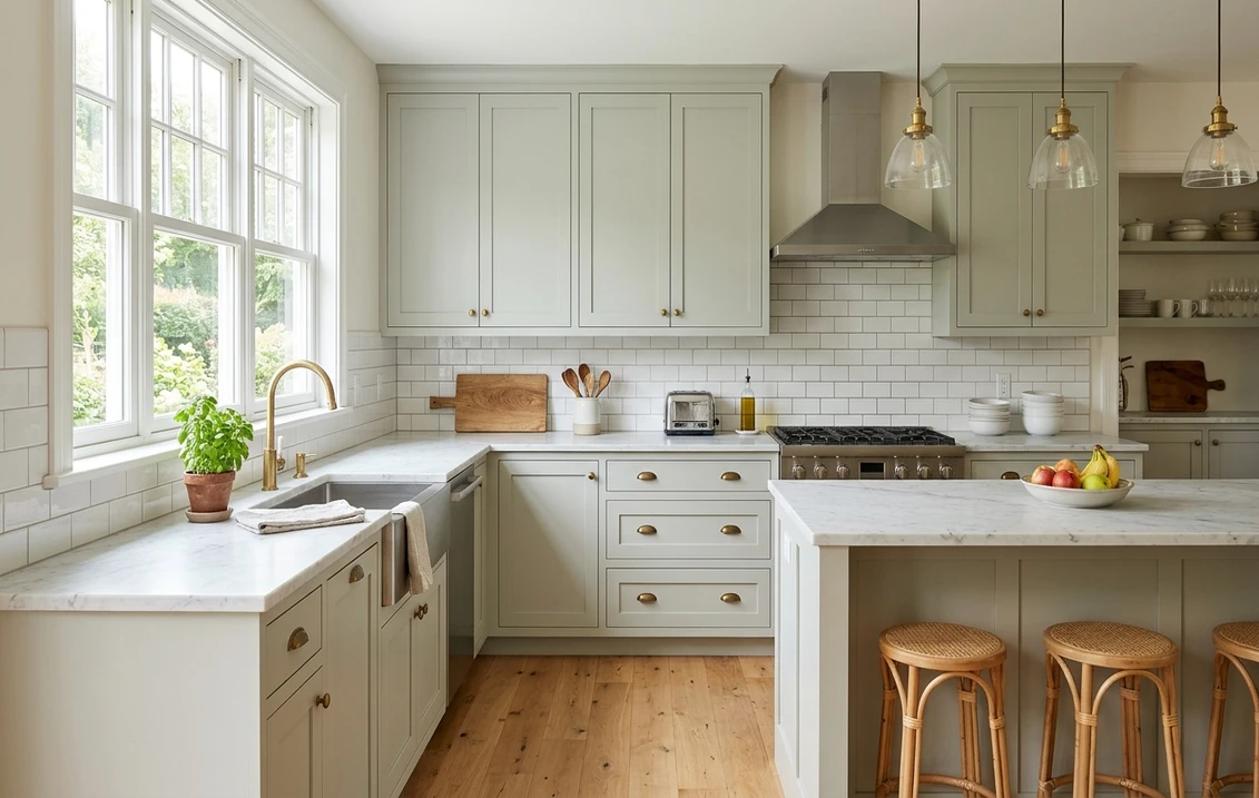
Kitchen. On cabinets, Mizzle is soft enough to sit next to marble and white subway tile, and green enough to read as a choice rather than a default. On cabinets, use a mid-sheen wood finish (see the finishes below) and keep the walls lighter, for example in School House White. Brass or unlacquered hardware warms it, black hardware makes it look more modern.
Bathroom. With white sanitaryware and chrome, Mizzle looks clean and cool; with a wood vanity, it warms up. Choose a finish that the brand describes as suitable for moisture-prone rooms. Hallway. In a narrow hall with little daylight, Mizzle can look gray and flat; by our reasoning, a lighter neighbor such as Cromarty No. 285 keeps more light there.
Ceilings, trim and doors: contrast or color drenching
There are two ways to treat the woodwork around Mizzle walls. The first is contrast: trim, doors and ceiling in a white, which outlines the room and keeps it bright. With School House White or Pointing, the contrast stays gentle, because both are warm whites with a light index in the 70s and 80s against about 52 for Mizzle. A brilliant white makes the edge sharper and the walls look greener.
The second is color drenching: walls, baseboards, casings and doors all in Mizzle, with only the sheen changing (a matte finish on the walls, Modern Eggshell on the woodwork). Our color reasoning: drenching makes a small room look larger because the edges disappear, and it suits rooms with plain trim, such as many post-war American houses. In a room with ornate moldings, a white trim shows them off better. A ceiling in Mizzle lowers the room visually; in a room with 8-foot ceilings, keep it white unless the room has strong daylight.
Interior doors in a deeper partner are a third option: Blue Gray No. 91 on the doors and Mizzle on the walls keeps the same family, one step darker. Down Pipe on the doors, as in one of the brand's schemes, gives a much stronger contrast and suits a modern interior with black hardware.
Finishes and US prices
The Mizzle product page lists these interior finishes and US prices on 20/11/2026. The uses come from the brand's finish pages; prices change, so read them as a dated snapshot.
| Finish | What the brand says it is for | 750 ml | US gallon |
|---|---|---|---|
| Modern Emulsion | Walls and ceilings, matte with a 7% sheen, washable, mold-protected, for kitchens and bathrooms | - | $160 |
| Estate Emulsion | Chalky finish for walls and ceilings in low-traffic rooms | - | $160 |
| Dead Flat | The most matte, multi-surface (walls, wood, metal), washable and scuff resistant | $56 | $168 |
| Modern Eggshell | Mid-sheen for wood, metal and concrete: trim, doors, kitchen cabinets, furniture, even floors | $56 | $168 |
| Sample pot | 100 ml | $9 (100 ml) | - |
The finish texts come from the Modern Emulsion page, the Estate Emulsion page, the Dead Flat page and the Modern Eggshell page. Our reasoning on sheen: Estate Emulsion gives the chalkiest, deepest version of Mizzle but marks more easily; Modern Emulsion is the practical wall choice for a family room or a kitchen; on cabinets, Modern Eggshell is the finish the brand names for kitchen cabinets.
Whites and colors that go with Mizzle
The Mizzle page pairs it with three schemes. We add our light index from each screen color, to show the contrast.
| Farrow & Ball scheme | Light index (our calculation) | Our color reasoning |
|---|---|---|
| Pointing No. 2003 with School House White No. 291 | 86 and 73 | Soft and warm; the classic choice for trim and ceilings |
| Blue Gray No. 91 with Down Pipe No. 26 | 44 and 13 | A deeper green-gray for a lower wall or an island, a dark gray for doors |
| Shaded White No. 201 with Cromarty No. 285 | 63 and 60 | A low-contrast, tonal room |
Pointing is covered in our Farrow & Ball Pointing interior guide, and Down Pipe in our Down Pipe exterior guide. Our reasoning for American materials: Mizzle sits well with white oak, walnut, cream marble, terracotta and natural linen; it can look muddy next to yellow-orange pine or a cool gray carpet.
Mizzle next to other Farrow & Ball gray-greens
People often compare Mizzle with French Gray, Light Blue, Blue Gray and Cromarty. We compared the screen colors (Delta E 2000: under 2 is close, 3 to 5 is a clear difference, above 5 a different color).
| Color | Light index | Delta E 2000 to Mizzle | Our reading |
|---|---|---|---|
| Cromarty No. 285 | 60 | 3.1 | Lighter, grayer: the safer choice in a dark room |
| Light Blue No. 22 | 49 | 3.6 | Same depth, cooler and bluer |
| Vert de Terre No. 234 | 48 | 3.7 | Same depth, more yellow-green |
| Blue Gray No. 91 | 44 | 4.1 | Deeper; the brand calls Mizzle a lighter shade of it |
| French Gray No. 18 | 42 | 5.5 | Deeper and warmer, more olive |
| Pigeon No. 25 | 34 | 9.8 | Much deeper; the brand calls Mizzle a lighter shade of it |
For the deeper neighbors, see our French Gray guide and our Light Blue guide. The Farrow & Ball paint colors guide gives the brand's range and how it is sold in the US.
Closest Sherwin-Williams and Benjamin Moore colors
We compared the Mizzle screen color with the published color data of both brands. A close screen match is not the same paint; sheen and base change the reading, so paint the two samples side by side before you swap.
| Color | Brand LRV | Screen color | Delta E 2000 to Mizzle (our calculation) |
|---|---|---|---|
| Contented SW 6191 | 51.87 | #BDC0B3 | 0.5 |
| Austere Gray SW 6184 | 51.21 | #BEBFB2 | 1.2 |
| Horizon Gray 2141-50 (Benjamin Moore) | 50.68 | #BFC0B1 | 1.0 |
| Gray Horse 2140-50 (Benjamin Moore) | 48.54 | #B9BBB1 | 2.3 |
Contented is very close on screen and its measured LRV (51.87) sits next to our index for Mizzle, which makes it the first sample to try in the Sherwin-Williams range. Horizon Gray is the closest Benjamin Moore. Neither brand presents these colors as equivalents of Mizzle: treat them as a closest match and compare the samples in daylight and at night.
How to sample Mizzle well
Use the 100 ml sample pot ($9 on the brand's page) on a board about two feet square, in two coats. Paint the board, not the wall, so that the old color does not frame the sample. Move it around the room: next to the window, on the darkest wall, next to the trim and next to the floor. Look at it in the morning, at midday and at night under your own lamps. If you are choosing between Mizzle and Contented, paint both on one board with a white strip between them.
Before painting, use the Mid Tones primer and undercoat that the brand recommends for Mizzle, or follow its advice for the surface you have. On a previously dark wall, an undercoat helps the gray-green read true in two coats.
See it in your room first
Upload a photo of your room and test the closest American colors on the walls, then on the cabinets: Contented SW 6191 for Sherwin-Williams, Horizon Gray 2141-50 for Benjamin Moore. The interior paint visualizer keeps your furniture and floor, so you see the gray-green with your own materials.
Or start with the walls: open the interior tool.
Sources and references
- Farrow & Ball, Mizzle No. 266: description, Mid Tones primer, School House White as complementary white, color schemes, screen color #BEC1B3 and US prices (read on 20/11/2026).
- Farrow & Ball, Modern Emulsion, Estate Emulsion, Dead Flat and Modern Eggshell: surfaces and properties of each finish.
- Sherwin-Williams, Contented SW 6191 and Austere Gray SW 6184: color pages; LRV and screen colors from the brand's public color data.
- Benjamin Moore, Horizon Gray 2141-50 and Gray Horse 2140-50: LRV and screen color.
Frequently asked questions
Is Farrow & Ball Mizzle green or gray?
Is Mizzle warm or cool?
What is the LRV of Farrow & Ball Mizzle?
What Sherwin-Williams color is closest to Mizzle?
What white goes with Mizzle?
Trademarks mentioned (Sherwin-Williams, Benjamin Moore, Behr, Caparol, Brillux, Sto, Alpina, Valspar, PPG, Glidden, Dulux, Crown Trade, Sandtex, Farrow & Ball, Johnstone's, Leyland) are property of their respective owners. FacadeColorizer is independent and not affiliated with any of them. Nominative fair use under Lanham Act §1125.