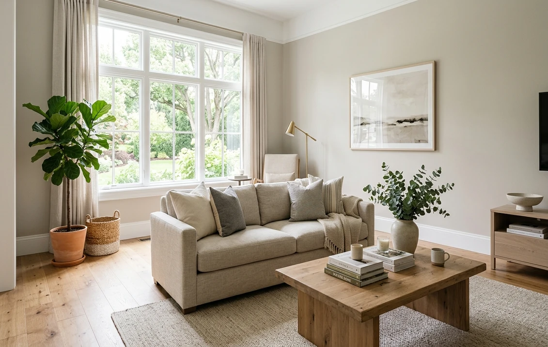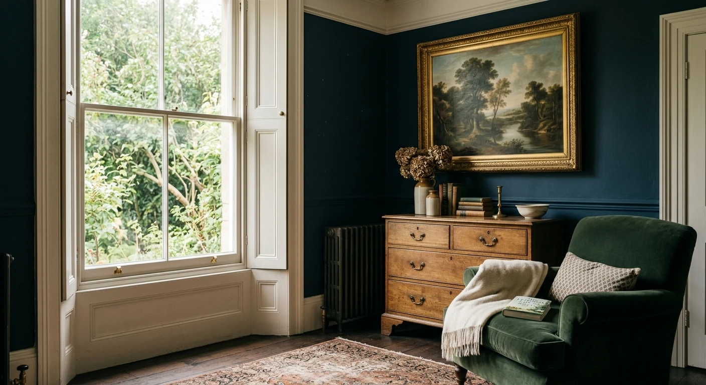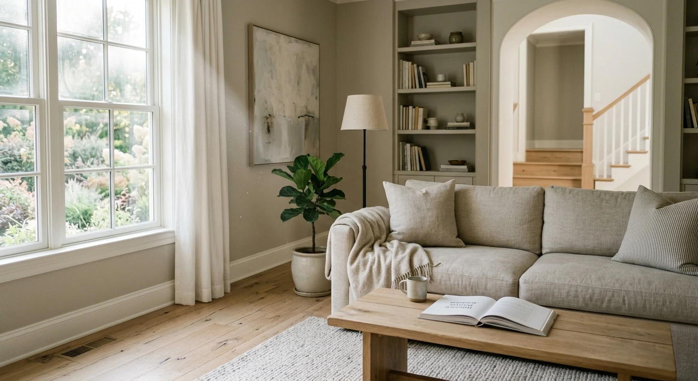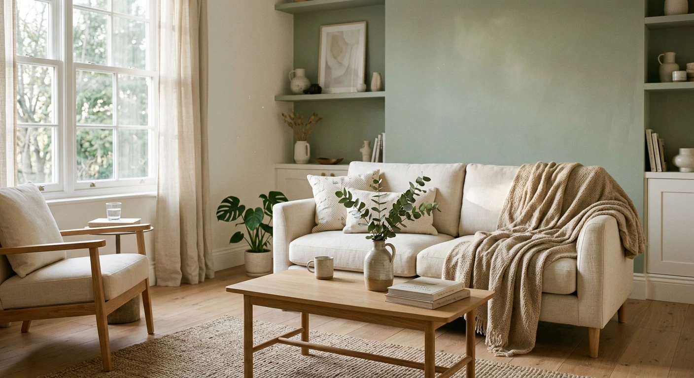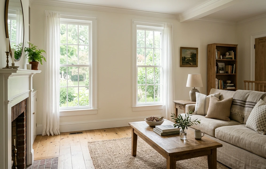

Farrow & Ball Pointing No. 2003 is a warm white from the brand's Warm Neutrals, named after the color of lime pointing used in traditional brickwork. Farrow & Ball calls it a fresh and uncomplicated white with a warm undertone, and says it creates its prettiest spaces on walls. The brand publishes no LRV. Calculated from its swatch hex, #F3EFE3, our lightness index is about 86 out of 100, close to the Sherwin-Williams whites Whitetail and Westhighland White. Its complementary white is All White No. 2005. On the US store, read on November 19, 2026, a US gallon costs $160 to $178 depending on the finish, and a 100 ml sample pot costs $9.
Farrow & Ball does not publish an LRV for Pointing, and the brand argues that its paint cannot be matched by other makers. Every lightness index, color difference and lookalike below is our calculation from the hex values each maker shows on its own website. Treat the comparisons as a shortlist to sample, not as official equivalents. Prices can change.
Upload a room photo and compare the Sherwin-Williams and Benjamin Moore whites listed below before you order samples.
What Farrow & Ball publishes for Pointing No. 2003
The Pointing page on Farrow & Ball's US site opens with the heading "A warm and delicate white". The facts the brand gives for the color are gathered in the table below, read on November 19, 2026.
| Item | Pointing No. 2003 | Source |
|---|---|---|
| Color group | Warm Neutrals | Color page |
| Name | The color of lime pointing used in traditional brickwork | Color page |
| Undertone | Warm; the brand says it softens a room alongside strong, traditional colors | Color page |
| Complementary white | All White No. 2005 | Color page |
| Recommended primer | White and Light Tones Primer & Undercoat | Color page |
| Swatch color on the site | #F3EFE3, a screen value | Color page data |
| Lighter selection | Pointing, All White No. 2005, Wimborne White No. 239 | Color page |
| Darker selection | Pointing, Dimity No. 2008, School House White No. 291 | Color page |
| Sample selection | Three 100 ml pots: All White, Wimborne White and Pointing | Color page |
Try it on your room
- 1Your photoPhoto
- 2Your colorColor
- 3HD render in ~30 sHD render in ~30 s
Your photo is used only to create your preview. JPG, PNG, HEIC (iPhone)
The brand's own groupings show where it places Pointing. For a lighter room, its selection pairs Pointing with All White and Wimborne White. For a more intimate, moodier room, it pairs Pointing with Dimity and School House White.
Warm or neutral? Pointing by light direction
Farrow & Ball's guide to how light affects color gives rules for each orientation of a room. It does not name Pointing, so the reading below is ours, starting from the brand's own description of Pointing as a warm white:
- North-facing: the guide says northern light brings out the cooler tones within a color, so a lighter shade should avoid a blue or gray base. Its yellow-based examples are Yellow Ground, New White and White Tie. Pointing's warm undertone points the same way, in our reading, which makes it a sensible starting point for a north room. Test a large sample on the darkest wall first.
- South-facing: the guide describes warm light from dawn until dusk in fine weather, and recommends soft, pale tones on the walls, with Warm Neutrals for a warmer feel. Pointing is a soft, pale warm neutral, so in a south room it should read creamier than it looks on a screen, in our reading.
- West-facing: the guide says light in a west room is cooler in the morning and brighter in the afternoon. It names Slipper Satin for these rooms because it looks cool in the morning and balances the warmer light later in the day. Pointing is lighter than Slipper Satin, so in our reading its warm side will show most in the afternoon. Check it at 9 a.m. and again at 5 p.m. before you decide.
- East-facing: the guide says these rooms get the most sun in the morning, then cooler, muted light in the evening. Plan the sample around the hours you actually use the room. For a living room that is usually the evening.
Artificial light matters as much as daylight. The guide says halogen and incandescent bulbs emit yellow light, which makes wall colors look warmer, while cool white bulbs give off a bluer light, and that a neutral white bulb comes closest to daylight. A warm white like Pointing will look different under the bulbs you switch on at night, so judge the sample under those bulbs as well as in daylight.
Walls, woodwork and ceilings: one white or two?
Farrow & Ball pairs each of its colors with a complementary white, and for Pointing that is All White No. 2005. The brand says that All White "contains no other pigment except for white", which avoids the cold blue undertones of a brilliant white. In practice, Pointing carries the warmth on the walls and All White carries the lightness on the trim.
The brand's Dimity page also names All White and Pointing as partners, so the three colors can be used together. Two schemes follow from that. In a one-white room, Pointing goes on the walls, the trim and the ceiling. The room reads as one soft field, and the woodwork does not compete with the wall. In a two-white room, Pointing stays on the walls and All White goes on the doors, window frames and skirting boards. That gives a clearer edge where the wall meets the frame.
For the ceiling, the simplest choice is the wall color or All White, not a third shade. For the base coat, the brand recommends its White and Light Tones Primer & Undercoat for Pointing. That primer is built on All White, the brand's simplest color, so it keeps the base consistent with the lightest partner in the scheme.
Pointing room by room
Pointing is an interior color for walls and woodwork, and its strongest uses follow the light notes above. These examples are our reading of how the color behaves, not claims made by the brand about each room.
- Living room: with a linen sofa and an oak table, Pointing reads as a warm backdrop rather than as a statement. Put All White on the trim for a clean edge. Compare the sample on the wall facing the window and on the wall beside it, because the two will not look the same at the same hour.
- Bedroom: with wool, linen and natural wood, Pointing's warmth reads as calm. Check it at night under the bedside lamp, since the guide says warm bulbs push wall colors warmer.
- Kitchen: on the walls, Pointing sits well with white quartz counters and with brass or nickel hardware. For cabinets, the finish matters as much as the shade, so choose the finish first and then compare the color on a door.
- Bathroom: the brand describes Modern Emulsion as resistant to mould and as the best finish for steamy spaces. Use Modern Emulsion for a bathroom wall painted in Pointing, and sample the color beside the mirror and the window.
Try a warm white on your kitchen cabinets
The cabinet setting of the US tool lets you try a color on kitchen cabinets before you buy a sample.
Try an off-white on my kitchen cabinets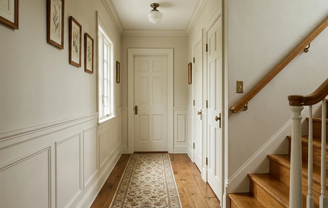
Pointing against the other Farrow & Ball whites
The table compares Pointing with the brand's other whites and off-whites, using the swatch hex that each color page shows. The lightness index is the relative luminance of the hex on a 0 to 100 scale. The difference is the CIEDE2000 color difference from Pointing, both our calculation.
| Color | Our index | Hex on the brand's page | Difference from Pointing (our calculation) | What the brand says |
|---|---|---|---|---|
| All White No. 2005 | 91.9 | #F6F6F2 | 3.94 | Contains no pigment other than white |
| Wimborne White No. 239 | 88.5 | #F4F2E7 | 1.10 | Just a little softer than All White |
| Pointing No. 2003 | 86.3 | #F3EFE3 | 0 | Warm undertone, one of the Warm Neutrals |
| White Tie | 81.6 | #EFE9D8 | 2.38 | A pale creamy white, deepened with a touch of black pigment |
| Dimity No. 2008 | 76.0 | #EAE1D3 | 3.66 | A very pale taupe, one of the Warm Neutrals |
| Slipper Satin No. 2004 | 74.8 | #E6E0D2 | 3.37 | A chalky off white that often reads as a pale gray chalk |
| School House White No. 291 | 73.1 | #E3DED0 | 3.79 | A soft off white, without the cool undertones of the contemporary neutral groups |
Of the brand's whites in the table, Wimborne White is the closest to Pointing, and it is the simplest sample to compare with it, since the brand's own selection groups the two. Slipper Satin is the grayer option. The brand says it often reads as a pale gray chalk without cool blue undertones, and it is the color its page pairs with darker Old White woodwork. Pointing is lighter than Slipper Satin by about 11.5 index points, so the two do not give the same room the same brightness. For a broader reading of the brand's whites, the Slipper Satin No. 2004 guide covers the same light and trim questions for the gray-chalk side of the range.
The closest Sherwin-Williams and Benjamin Moore whites
The table lists the Sherwin-Williams and Benjamin Moore whites closest to Pointing by hex value, among the colors we compared. The published LRV comes from each maker's color page, read on November 19, 2026. The index and the difference are our calculation from the hex values on those pages. These are comparisons, not official matches, so compare physical samples before you choose.
| Color | Code | Published LRV | Our index | Difference from Pointing (our calculation) |
|---|---|---|---|---|
| Whitetail | SW 7103 | 86.44 | 86.6 | 0.76 |
| Westhighland White | SW 7566 | 85.81 | 85.7 | 0.77 |
| Greek Villa | SW 7551 | 84.22 | 84.0 | 1.06 |
| Vapor | AF-35 | 81.6 | 83.7 | 1.02 |
| Swiss Coffee | OC-45 | 81.91 | 83.6 | 1.18 |
| Cloud White | OC-130 | 85.05 | 87.5 | 1.44 |
| Moonlight White | 2143-60 | 83.19 | 85.0 | 1.45 |
For the three Sherwin-Williams colors, our index sits within about 0.2 point of the published LRV, so the calculation holds up on those pages. For the four Benjamin Moore colors it runs 1.7 to 2.5 points above the published LRV. Compare Benjamin Moore numbers with their published LRVs, not with our index. On our measure, Pointing's index of 86.3 is level with Whitetail and Westhighland White, which is why those two Sherwin-Williams whites are the first to sample.
Among the Benjamin Moore whites, Vapor AF-35 and Swiss Coffee OC-45 are the closest in hex value, at about 1 point of color difference each, and both sit about 2 index points below Pointing. Cloud White OC-130 is lighter on our index, at 87.5, and is covered in the Cloud White review. Moonlight White 2143-60 is also lighter than Pointing on our index. This list is a shortlist of the Benjamin Moore whites we compared, not a full census of the brand's range, so treat it as a place to start.
Finishes and US prices on November 19, 2026
The Pointing page lists the finishes below with US prices, read on November 19, 2026. Prices are shown in US dollars, as on the page, and they can change.
| Finish | US gallon | 750 ml | Note from the brand |
|---|---|---|---|
| Estate Emulsion | $160 | Not listed | Excluded from the Scrub Class 1 rating |
| Modern Emulsion | $160 | Not listed | Matt, 7% sheen, resistant to mould |
| Dead Flat | $168 | $56 | Multi-surface finish |
| Flat Eggshell | $168 | $56 | - |
| Modern Eggshell | $168 | $56 | - |
| Full Gloss | $168 | $56 | Multi-surface finish |
| 100 ml sample pot | $9 | Sample of the color before you buy paint | |
The brand states that all of its finishes are water based, with a low-odor, low-VOC base that scores A+ for indoor air quality. Its Scrub Class 1 rating covers all of its colors except the two finishes it names, Estate Emulsion and Exterior Masonry. The Pointing page also offers a sample selection of three 100 ml pots, All White, Wimborne White and Pointing, so you can compare the three side by side on your own wall.
How to sample Pointing before you choose
- Order the 100 ml sample pot or the three-pot selection. Paint a patch large enough to judge on each wall you plan to change, and paint a board you can move between rooms.
- Look at the patch in the morning, around midday and in the evening. The guide says the quality of light changes how a color reads through the day.
- Compare it with All White and Wimborne White, the brand's own neighbors, and with the Sherwin-Williams whites above if you are choosing between brands.
- Check it under the bulbs you use at night, because warm and cool bulbs shift the color in different directions.
The US visualizer works with American brands such as Sherwin-Williams and Benjamin Moore. It does not offer Farrow & Ball, so use it to compare the closest matches above, not Pointing itself. Upload a room photo and try the Sherwin-Williams or Benjamin Moore whites on your own walls. The interior paint visualizer page is the landing page for the tool's interior rooms.
Start with the Sherwin-Williams whites in the table above, then order the sample that wins.
If you want to see the brand's other whites in context, the Farrow & Ball paint colors guide groups the range by family. For a wider look at off-whites and their undertones, the shades of white guide compares the same families across brands. For north-facing rooms specifically, the best white paint colors for north-facing rooms adds the cooler-light cases in more detail.
Farrow & Ball pairs Pointing with Mizzle No. 266, its soft gray-green, in one of its color schemes; our Mizzle interior guide covers rooms, light and the closest Sherwin-Williams color.
Sources and references
- Farrow & Ball, Pointing No. 2003 color page (US): description, Warm Neutrals group, complementary white, primer, lighter and darker selections, sample selection, swatch hex, finishes, Scrub Class 1 note, US prices read on November 19, 2026.
- Farrow & Ball, How light affects color: the rules for north, south, west and east rooms, and the notes on halogen, incandescent and neutral white bulbs.
- Farrow & Ball, color pages for All White No. 2005, Wimborne White No. 239, White Tie, Slipper Satin No. 2004, Dimity No. 2008 and School House White No. 291: descriptions and swatch hex values, read on November 19, 2026.
- Sherwin-Williams, color pages for Whitetail SW 7103, Westhighland White SW 7566 and Greek Villa SW 7551: name, number and published LRV, read on November 19, 2026.
- Benjamin Moore, color pages for Vapor AF-35, Swiss Coffee OC-45, Cloud White OC-130 and Moonlight White 2143-60: published LRV and color hex, read on November 19, 2026.
- Lightness index (relative luminance of the hex, 0 to 100) and CIEDE2000 color differences: FacadeColorizer calculation from the hex values on each maker's website, November 19, 2026.
Frequently asked questions
What color is Farrow and Ball Pointing No. 2003?
What is the LRV of Pointing?
What is the complementary white for Pointing?
How much does Farrow and Ball Pointing cost in the US?
Which Sherwin-Williams color is closest to Pointing?
Does Pointing suit a north-facing room?
Is Pointing lighter than Slipper Satin?
Trademarks mentioned (Sherwin-Williams, Benjamin Moore, Behr, Caparol, Brillux, Sto, Alpina, Valspar, PPG, Glidden, Dulux, Crown Trade, Sandtex, Farrow & Ball, Johnstone's, Leyland) are property of their respective owners. FacadeColorizer is independent and not affiliated with any of them. Nominative fair use under Lanham Act §1125.