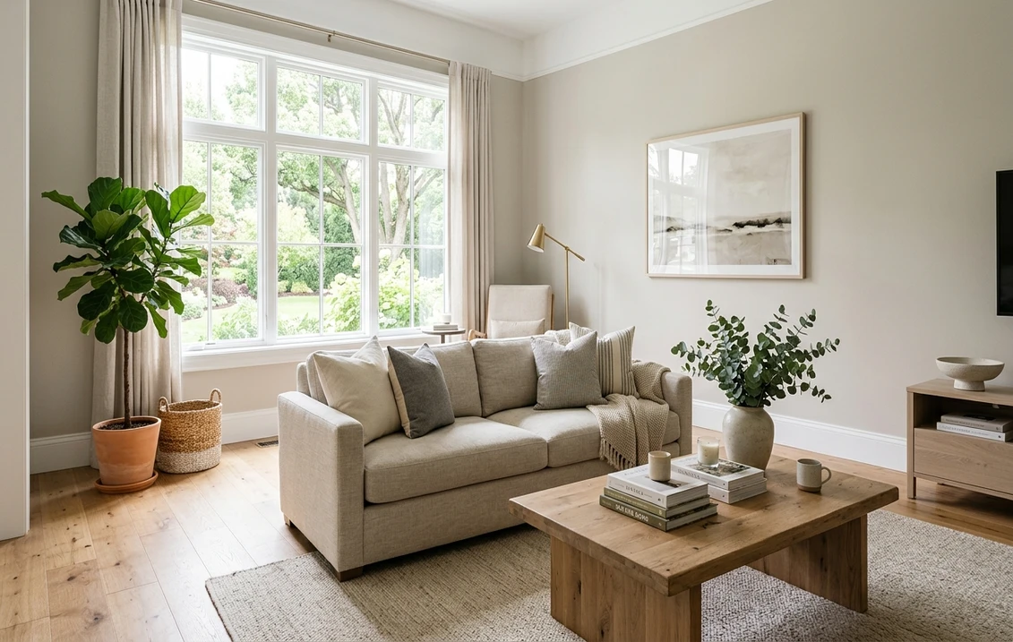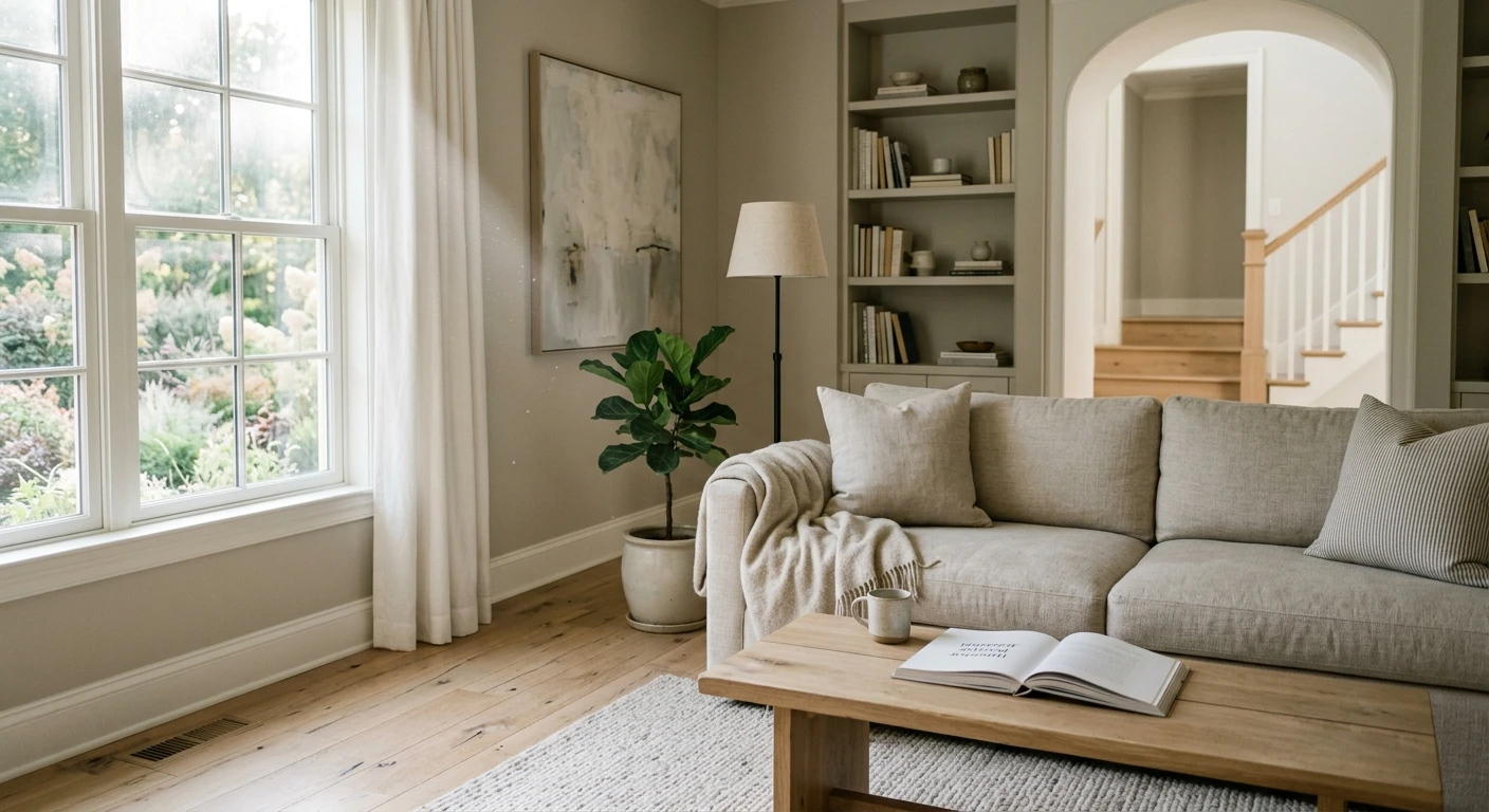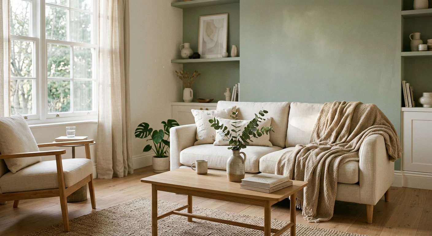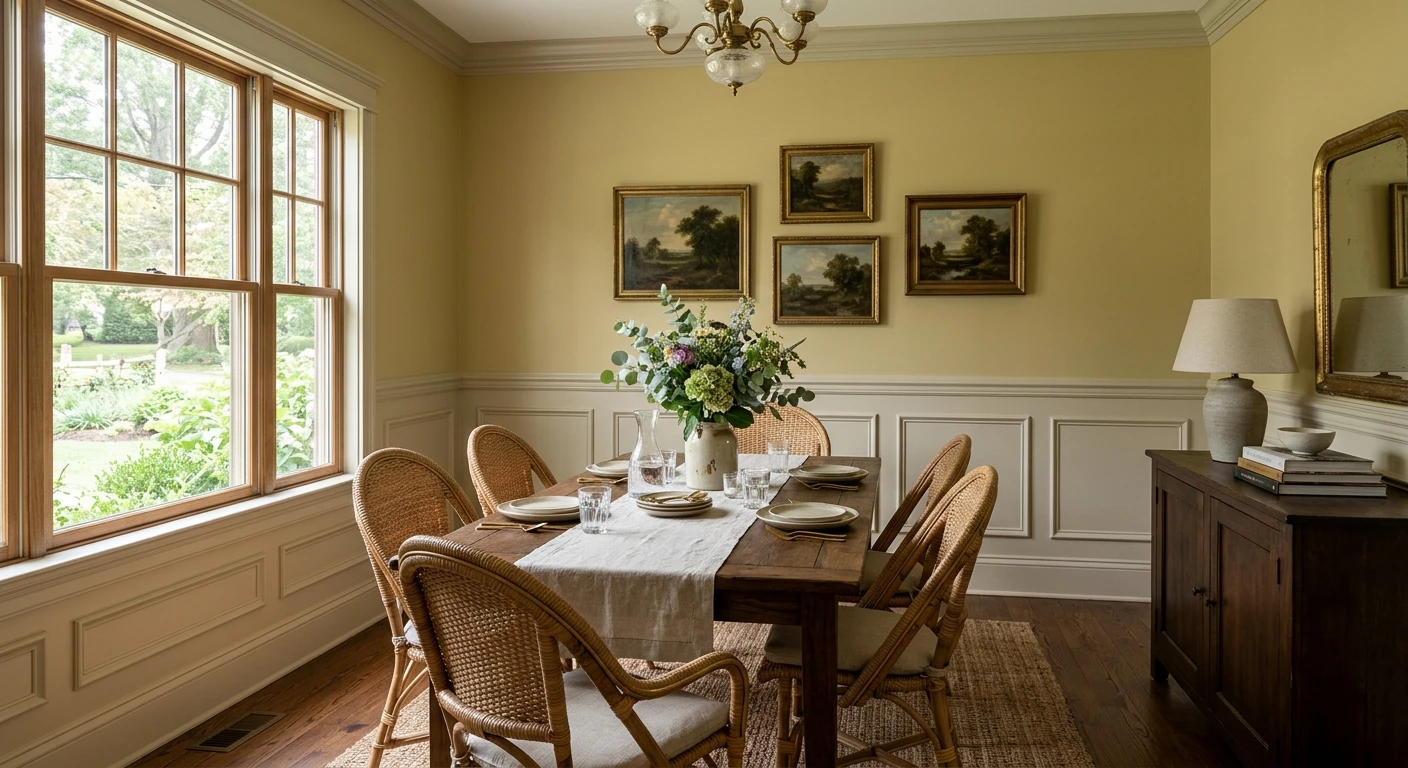

Farrow & Ball Hay (No. 37) is a muted, dusty yellow named after the dried crop, part of the brand's Core palette rather than its Archive collection. Unlike bright butter or lemon yellows, its distinctly green undertone keeps four walls calm and grounded next to off-white wainscoting, dark walnut or brass. Farrow & Ball does not publish an official LRV; by our calculation from its screen color (#D9C497), Hay has a relative luminance of about 56.5 on a 0 to 100 scale.
The name, number, description, Mid Tones primer, Wimborne White pairing, scheme colors, screen hex and US prices come from farrow-ball.com, verified on November 21, 2026. The relative luminance, Delta E 2000 comparisons against Sherwin-Williams and Benjamin Moore, and room gallon math are our calculations. Because a screen swatch only approximates real pigment, always judge Hay on a painted sample board in your room.
Our US interior tool uses Sherwin-Williams and Benjamin Moore palettes rather than Farrow & Ball. This link preselects SW 9027 Pale Moss, our closest SW match to Hay No. 37, on your walls.
What Farrow & Ball says about Hay No. 37
On the official Farrow & Ball Hay No. 37 page, the brand calls Hay "a dusty yellow" that feels modest, warm and dusty, and less intense and sunny than Yellow Ground. Its distinctly green undertone pulls the yellow away from sugary cream or sharp mustard, creating an established, peaceful mood, especially contrasted with muted Lime White woodwork.
| Attribute | Farrow & Ball Hay No. 37 |
|---|---|
| Official name and number | Hay, No. 37 (Core palette, not Archive) |
| Origin of the name | Named after the dried crop |
| Brand description | Modest, warm and dusty yellow with a distinctly green undertone |
| Approximate screen color | #D9C497 |
| Published LRV | Not published by Farrow & Ball |
| Calculated relative luminance | About 56.5 on a 0 to 100 scale (from #D9C497) |
| Recommended Primer & Undercoat | Mid Tones |
| Complementary white | Wimborne White (No. 239) |
Try it on your room
- 1Your photoPhoto
- 2Your colorColor
- 3HD render in ~30 sHD render in ~30 s
Your photo is used only to create your preview. JPG, PNG, HEIC (iPhone)
At a calculated luminance of 56.5, Hay carries clear visual weight on drywall and plaster while still reflecting more than half of incoming light. In pure yellow paints, four surrounding walls bounce yellow light back onto each other until the room glows neon; in Hay, the green-gray undertone absorbs that excess saturation. On overcast mornings it reads like dried meadow grass or aged parchment, and in direct sun its golden warmth steps forward without losing its dusty restraint.
How Hay No. 37 shifts across room orientations and American lighting
Because Hay sits between warm yellow and muted green, window orientation and LED Kelvin temperature visibly shift its character across the day.
| Light source or exposure | How Hay No. 37 reads on walls | Practical adjustment |
|---|---|---|
| North-facing rooms | Cool daylight draws out the green undertone; the yellow feels quieter and slightly olive-ochre | Use 2700K lamps and warm trim like Wimborne White or Lime White |
| South-facing rooms | Steady daylight warms the pigment into a soft, sunlit straw yellow without turning bright | Works on all four walls; 2% matte sheen prevents glare on wide drywall |
| East-facing rooms | Warm straw in morning sun, cooling toward muted parchment-green by late afternoon | Strong fit for breakfast nooks and east bedrooms |
| West-facing rooms | Subdued in the morning, intensifying into rich golden hay in late afternoon sun | Check sample boards at 4:00 PM to confirm you like peak warmth |
| 2700K warm LED | Deepens into candlelight honey-ochre while the green undertone recedes | Best bulb choice for dining rooms, living rooms and bedrooms |
| 3000K neutral-warm LED | Preserves the balanced dusty yellow-green character close to midday light | Ideal for kitchens, mudrooms and studies with task lighting |
| 4000K+ cool white LED | Pushes the green undertone forward and can make the yellow look sallow | Avoid cool daylight bulbs; switch to 2700K or 3000K high-CRI (90+) LEDs |
Check bulb CRI (Color Rendering Index) alongside Kelvin. Budget 80-CRI LEDs lack warm red wavelengths and exaggerate Hay's green cast; 90+ CRI bulbs at 2700K or 3000K preserve its natural warmth.
Best rooms and architectural surfaces for Hay No. 37
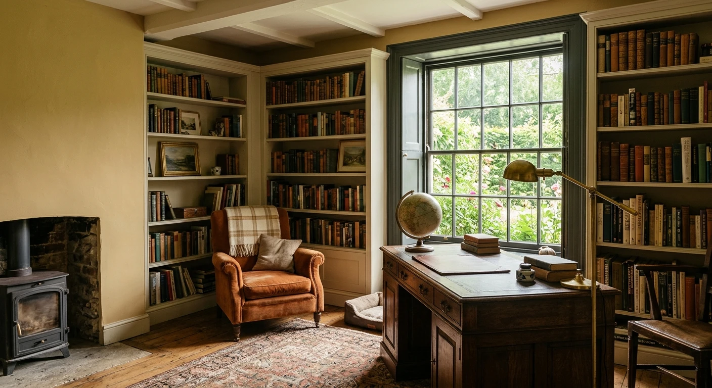
Hay shines in rooms with moldings, wainscoting, beams or deep casings, where a 2% flat sheen lets shadows soften the architecture. If you are comparing other shades in this family, see our guide to yellow interior paint colors.
- Formal dining rooms: Above off-white or Lime White wainscoting, Hay frames dark walnut, cherry or mahogany tables with quiet historic poise and glows softly under 2700K chandelier light.
- Kitchens and pantries: Pairs naturally with soapstone, honed marble or butcher block. On perimeter cabinets or an island in Modern Eggshell (40%) or Flat Eggshell (20%), the dusty tone hides smudges better than crisp white.
- Bedrooms and studies: Low saturation keeps bedrooms restful alongside natural linen, wool rugs and muted blue-gray accents.
- Hallways and mudrooms: At 56.5 calculated luminance, Hay warms dim corridors where cool grays turn gloomy. Use Modern Emulsion (7%) or Dead Flat (2%) for scuff resistance.
- Color-drenched ceilings and trim: Rolling walls, trim and ceiling in Hay Dead Flat (2%) erases chopping lines in low-ceiling rooms.
Trim whites, woodwork and Farrow & Ball color pairings
Stark blue-leaning gallery whites make Hay look muddy and the trim look icy. Farrow & Ball names Wimborne White (No. 239) as Hay's complementary white and recommends Lime White (No. 1) for muted woodwork contrast.
| Farrow & Ball pairing | Role in the room | How it interacts with Hay No. 37 |
|---|---|---|
| Wimborne White (No. 239) | Complementary white for trim and ceilings | Soft warm off-white giving clean definition without blue glare |
| Lime White (No. 1) | Woodwork, wainscoting and paneling | Muted chalky off-white creating the peaceful historic contrast F&B highlights |
| Off-White (No. 3) | Traditional trim, doors and ceilings | Soft stone-white keeping wall-to-molding transitions understated |
| Oval Room Blue (No. 85) | Adjacent room, cabinetry or doors | Blackened historic blue-green that cools Hay while echoing its muted depth |
| Sulking Room Pink (No. 295) | Adjacent parlor, textiles or millwork | Muted rose-brown sharing Hay's dusty softness for a lived-in palette |
| Blue Gray (No. 91) | Bookshelves, pantry doors or adjoining hall | Weathered blue-green-gray balancing Hay's golden warmth in sightlines |
| Treron (No. 292) | Kitchen island, lower cabinets or fireplace | Dark gray-green anchor pulling directly on Hay's green undertone |
For connected-room planning, read our guides to Farrow & Ball Oval Room Blue No. 85 and Farrow & Ball Sulking Room Pink No. 295, plus our broader guide to colors that go with yellow. Among hard finishes, Hay pairs effortlessly with dark walnut, medium white oak, aged pine, honed soapstone, warm travertine and unlacquered brass, while orange honey-oak floors or icy blue-veined marble require careful sample testing.
US interior finishes, sheen levels and 2026 gallon prices
Farrow & Ball sells Hay No. 37 in six core US interior finishes plus a 100 ml sample pot. The pricing below reflects the official farrow-ball.com US store on November 21, 2026; retail prices can shift over time, so treat this table as a dated budget snapshot rather than a permanent quote.
| Interior finish | Sheen | 750 ml price | US gallon price | Best interior use |
|---|---|---|---|---|
| Sample Pot (100 ml) | 2% matte | $9 (100 ml) | Not applicable | Two-coat test boards across different walls |
| Estate Emulsion | 2% | Not listed | $160 | Low-traffic walls and ceilings needing classic chalky depth |
| Modern Emulsion | 7% | Not listed | $160 | Kitchens, bathrooms, hallways and family rooms needing washability |
| Dead Flat | 2% | $56 | $168 | Multi-surface matte for walls, woodwork and metal, ideal for color drenching |
| Flat Eggshell | 20% | $56 | $168 | Low-sheen interior wood, cabinetry, trim and radiators |
| Modern Eggshell | 40% | $56 | $168 | High-wear cabinetry, baseboards, doors and wooden floors |
| Full Gloss | 95% | $56 | $168 | Dramatic lacquered-look trim, interior doors and statement woodwork |
Choosing the wall finish comes down to sheen versus washability. The Estate Emulsion page positions its 2% matte finish for calm bedrooms, dining rooms and ceilings. For kitchens, baths and corridors, the Modern Emulsion page offers a washable 7% sheen at the same $160 gallon price. If you want ultra-flat 2% depth with scuff resistance across walls, trim and radiators, the Dead Flat page details Farrow & Ball's multi-surface matte at $168 per gallon ($56 for 750 ml).
Primer, room gallon math and indoor air quality
Farrow & Ball specifies its Mid Tones Primer & Undercoat under Hay No. 37. Skipping a tinted primer over bright white drywall or dark paint often forces a third coat of $160 to $168 topcoat. A tinted undercoat evens porosity and lets two coats of Hay reach full depth.
To estimate gallons accurately, take a 12 by 14 foot US dining room with 9-foot ceilings:
- Gross wall area: (12 + 14) x 2 = 52 linear feet x 9 feet = 468 square feet.
- Net paintable area: Subtracting two windows (30 sq ft), one cased opening (35 sq ft) and 36-inch wainscoting (135 sq ft) leaves about 268 sq ft of upper drywall, or 403 sq ft without wainscoting.
- Two coats and gallon count: Two coats require 536 sq ft (with wainscoting) or 806 sq ft (full height). At a typical 350 to 400 sq ft per US gallon per coat on smooth primed drywall (confirm exact spread rates on the finish's advice sheet), budget 2 gallons with wainscoting or 2 to 3 gallons for full-height walls.
Even with water-based interior paints, ventilation matters. The US Environmental Protection Agency guidance on volatile organic compounds notes that indoor VOC levels are consistently higher than outdoors. Cross-ventilate with open windows and an outward-facing fan while rolling, and keep the room aired for 48 to 72 hours during curing.
Closest Sherwin-Williams and Benjamin Moore matches to Hay No. 37
Many US homeowners love the look of Hay No. 37 but need a locally stocked American paint line for a large open-plan repaint, contractor spraying or tighter gallon budget. We compared Hay's screen hex (#D9C497) against the Sherwin-Williams and Benjamin Moore palettes using the Delta E 2000 perceptual color-difference formula (where values under 1.5 are very close on screen and 2 to 3 show a subtle side-by-side shift). None of these shades is an official equivalent to Hay; treat them strictly as the closest starting points to sample on your own wall.
| Brand and color | Screen hex | Calculated luminance | Delta E 2000 to Hay | Visual note |
|---|---|---|---|---|
| Farrow & Ball Hay No. 37 (reference) | #D9C497 | 56.5 | 0.00 | Dusty yellow with distinctly green undertone |
| Sherwin-Williams SW 9027 Pale Moss | #DCC797 | 58.3 | 1.04 | Closest SW match on screen; slightly lighter with the same muted green-yellow lean |
| Sherwin-Williams SW 7698 Straw Harvest | #DBC8A2 | 59.0 | 2.13 | Slightly lighter and softer, leaning a touch more beige-straw |
| Sherwin-Williams SW 6407 Ancestral Gold | #DDCDA6 | 61.8 | 2.97 | Lighter and creamier; good fallback if Hay feels too saturated in a dim room |
| Benjamin Moore AF-365 Amulet | #DAC89B | 58.6 | 1.39 | Closest BM match on screen; balanced dusty yellow-green in the Affinity line |
| Benjamin Moore CSP-970 Shortbread | #DCC396 | 56.4 | 1.43 | Nearly identical luminance to Hay, reading a hair warmer and more golden |
| Benjamin Moore HC-31 Waterbury Cream | #DDCA9A | 59.9 | 1.79 | Historic Collection yellow that feels slightly brighter and airier |
Keep one key material difference in mind when comparing brands: pigment complexity and sheen. Even when a Sherwin-Williams or Benjamin Moore swatch lands near a Delta E of 1.0 to 1.4 on screen, a standard eggshell base reflects more specular light than Farrow & Ball's 2% Estate Emulsion or Dead Flat. If you opt for SW 9027 Pale Moss or BM AF-365 Amulet, choose a dead-flat or matte architectural line from that brand to preserve Hay's velvety, non-reflective atmosphere. For a broader look at how Farrow & Ball's palette compares to US retail brands, read our Farrow & Ball paint colors guide and our US retail paint brands and store picks hub.
How to test Hay No. 37 on your walls before buying gallons
At $160 to $168 per US gallon, guessing from a paper fan deck or a phone screen is an expensive mistake. Spend $9 on a 100 ml Farrow & Ball sample pot of Hay (plus sample pints of SW 9027 Pale Moss or BM AF-365 Amulet if you are cross-shopping) and follow a disciplined test-board protocol:
- Paint movable boards, not the drywall: Roll two full coats onto heavy primed poster board or foam core at least 18 by 24 inches, leaving a one-inch white border around the edge so your old wall color does not distort your perception.
- Move the board around all four walls: The wall directly opposite a window receives full daylight and looks warmest; the window wall itself sits in shadow and reveals the deepest green undertone.
- Check three lighting windows: Evaluate the board at 9:00 AM, 2:00 PM and after dusk under your actual evening lamps. Notice whether the green cast feels soothing or too olive in your room's shadow corners.
- Test next to trim and flooring: Lean the board directly against your baseboards, cabinetry and sofa fabric. If your existing bright-white trim suddenly looks harsh and bluish next to Hay, plan to repaint the trim in a softer warm white such as Wimborne White or Lime White.
Preview a dusty yellow on your own room photo
Before investing in sample pots and primer, test how a muted, dusty yellow changes the proportions and mood of your actual room. Upload a daylight photo of your dining room, kitchen or bedroom into our US interior wall painter. Because the visualizer carries the Benjamin Moore and Sherwin-Williams color systems rather than Farrow & Ball, the button below preselects Benjamin Moore AF-365 Amulet (our closest BM match to Hay No. 37) on your walls so you can judge the tonal weight immediately, then confirm the final finish with a physical sample board.
Upload one room photo, preview dusty yellow walls against your real trim and floors, and compare SW 9027 Pale Moss side by side.
Sources and references
- Farrow & Ball, Hay No. 37 product page: Core palette status, description, Mid Tones primer, Wimborne White complementary white, scheme pairings, screen color #D9C497 and US prices (verified November 21, 2026).
- Farrow & Ball, Estate Emulsion, Modern Emulsion and Dead Flat interior finish pages: sheen ratings, washability and recommended interior surfaces.
- Sherwin-Williams, SW 9027 Pale Moss: official color page used as the closest Sherwin-Williams starting point in our Delta E 2000 comparison.
- Benjamin Moore, AF-365 Amulet: official color page used as the closest Benjamin Moore starting point in our Delta E 2000 comparison.
- US Environmental Protection Agency, Volatile Organic Compounds' Impact on Indoor Air Quality: indoor VOC concentration behavior and ventilation guidance during and after interior painting.
Frequently asked questions
What undertones does Farrow & Ball Hay No. 37 have?
What is the LRV of Farrow & Ball Hay No. 37?
What is the best white trim color to pair with Farrow & Ball Hay?
What are the closest Sherwin-Williams and Benjamin Moore matches to Farrow & Ball Hay?
How much does Farrow & Ball Hay interior paint cost in the US?
Trademarks mentioned (Sherwin-Williams, Benjamin Moore, Behr, Caparol, Brillux, Sto, Alpina, Valspar, PPG, Glidden, Dulux, Crown Trade, Sandtex, Farrow & Ball, Johnstone's, Leyland) are property of their respective owners. FacadeColorizer is independent and not affiliated with any of them. Nominative fair use under Lanham Act §1125.