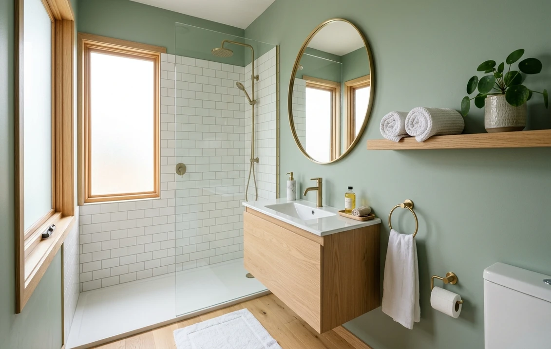
The most common mistake in a small bathroom is defaulting to white to make the room feel bigger, when a saturated color like Sherwin-Williams Oceanside (SW 6496), a peacock teal at LRV 8, almost always does more for the space. The paint-it-white reflex is one of the most persistent myths in American home design. It is also mostly wrong. A windowless powder room or a 5-by-8 hall bath has so little wall area that a saturated color rarely overwhelms it. Deep color hides the awkward corners, blurs the line between wall and ceiling, and makes the room read as a deliberate jewel box. The smallest rooms in the house are exactly where a bold color belongs.
This is a curated shortlist of 14 colors that consistently work in a colorful small bathroom, with the exact Sherwin-Williams and Benjamin Moore codes, published LRV values, the undertone each reveals under bathroom lighting, and the trim, tile, and metal pairings that keep the space feeling rich. For the full overview, start with our pillar on small bathroom paint colors, then come back for the bold end of the spectrum.
Upload a photo of your bathroom and preview any of the 14 colors below on your actual walls in about 30 seconds, free.
The logic is counterintuitive but reliable: the less wall area a room has, the more forgiving it is of a dramatic color. A powder room with 90 square feet of wall, much of it broken up by a mirror, vanity, door, and tile, does not have the surface to feel oppressive the way a 400-square-foot great room would. The color becomes an accent that wraps the whole room, and a wraparound color (walls plus ceiling) looks intentional here in a way it rarely does in larger rooms.
The 14 colors at a glance
LRV is the Light Reflectance Value published by each manufacturer: 0 is black, 100 is pure white. In a windowless or single-window bathroom, below about LRV 10 feels genuinely dark and dramatic, LRV 20 to 45 gives saturated color that still bounces light, and above 50 reads as soft rather than bold. All three registers are here, because "colorful" does not have to mean "dark." For how warm, cool, and undertone work across the whole spectrum, see our interior paint color families guide.
| Color | Code | LRV | Family / undertone |
|---|---|---|---|
| SW Oceanside | SW 6496 | 8 | Peacock teal, blue-green |
| BM Hale Navy | HC-154 | 6.3 | Classic navy, slight gray-violet |
| SW Naval | SW 6244 | 4 | Deep true navy, low gray |
| BM Hunter Green | 2041-10 | 5.1 | Forest green, cool |
| SW Evergreen Fog | SW 9130 | 30.5 | Gray-sage green, muted |
| BM Cushing Green | HC-125 | 17 | Smoky green, gray base |
| SW Cavern Clay | SW 7701 | 20 | Terracotta, warm earthy red |
| SW Redend Point | SW 9081 | 38 | Warm blush, rosy beige |
| BM Caliente | AF-290 | 7.2 | Vivid true red |
| SW Tricorn Black | SW 6258 | 3 | Near-neutral soft black |
| BM Wrought Iron | 2124-10 | 8 | Charcoal, soft black-gray |
| SW Sea Salt | SW 6204 | 63 | Soft aqua-green, gray base |
| SW Quietude | SW 6212 | 46 | Sage-blue, soft and cool |
| BM Shadow | 2117-30 | 7.5 | Smoky eggplant plum |
Try it on your house
No photo? Try a sample
LRV values from Sherwin-Williams and Benjamin Moore published technical data. Several picks (Evergreen Fog, Cavern Clay, Redend Point, Caliente, Shadow) are former Colors of the Year.
The teals and peacock blue-greens
A deep teal is the safest dramatic choice, bold without being polarizing, and it is the color in the photo above. Sherwin-Williams Oceanside (SW 6496), LRV 8, sits on the line between blue and green, so it shifts through the day: more blue under cool morning light, more green under warm sconce light at night. That movement keeps a windowless room from feeling dead, and in satin or high-gloss, Oceanside looks lacquered and expensive.
Pair teal with warm metals: brass fixtures, a round brass-framed mirror, and a white pedestal sink keep the room from going cold. White wainscoting on the lower third of the wall, as in the cover image, breaks up the saturation. White marble hex or warm wood-look tile both work underfoot; a cool gray floor fights the green.
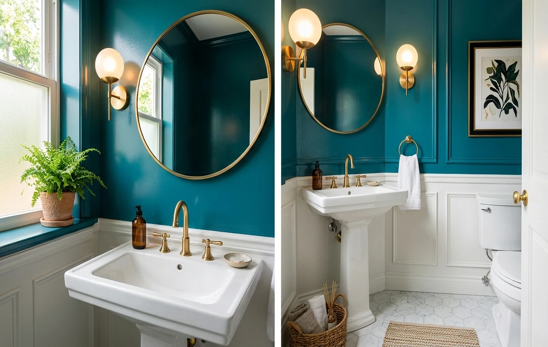
The navies
Navy is the most-painted bold bathroom color in the United States for a reason: it behaves like a neutral. Benjamin Moore Hale Navy (HC-154), LRV 6.3, is the softer of the two, with a faint gray-violet base that keeps it from looking like a primary blue. Sherwin-Williams Naval (SW 6244), LRV 4, is deeper and truer, closer to a classic ink navy, the choice if you want the room to read almost black-blue at night.
Give either navy a crisp warm white trim and watch it pop. Run Pure White (SW 7005) or White Dove (OC-17) along the trim, baseboards, and door, and navy suddenly looks tailored. Add brass or matte-black hardware, and a patterned cement or penny-tile floor works because navy is forgiving of busy floors. If you are weighing the two brands, our Sherwin-Williams vs Benjamin Moore interior comparison covers coverage and durability.
The greens, from deep forest to soft sage
No color has grown faster in bathrooms this decade than green. It reads as calm and natural, and it covers the whole range from dramatic to gentle. At the bold end, Benjamin Moore Hunter Green (2041-10), LRV 5.1, is a saturated forest tone that looks stunning with brass and marble.
In the middle sit two of the most popular muted greens in the country. Sherwin-Williams Evergreen Fog (SW 9130), LRV 30.5, the 2022 Color of the Year, is a gray-sage that feels modern rather than loud, the right pick if "bold" makes you nervous but "all-white" bores you. Benjamin Moore Cushing Green (HC-125), LRV 17, is smokier and a touch deeper, with a gray base that keeps it sophisticated. Either one still reads as real color. And both bounce enough light to keep a windowless room from turning into a cave.
Greens pair beautifully with wood vanities, brass or aged-bronze hardware, and cream tile. Avoid a gray-green like Evergreen Fog under stark cool-white LEDs, which push the gray base toward dingy; a 2700K to 3000K warm bulb keeps the green alive. Our best interior paint colors guide has more on where each green sits in the 2026 palette.
The warm colors: terracotta, blush, and a true red
Warm colors make a small windowless bathroom feel like an embrace instead of a closet. Sherwin-Williams Cavern Clay (SW 7701), LRV 20, the 2019 Color of the Year, is a terracotta whose warmth flatters skin tones in the mirror. Sherwin-Williams Redend Point (SW 9081), LRV 38, the 2023 Color of the Year, is the gentler option: a rosy blush-beige that adds warmth without committing to full terracotta. For genuine drama, Benjamin Moore Caliente (AF-290), LRV 7.2, the 2018 Color of the Year, is a vivid true red that turns a powder room into a statement, best in a guest bath you treat as a surprise. All three pair with brass, wood, and cream tile; keep the trim creamy.
The dark neutrals: black, charcoal, and eggplant
A near-black bathroom is the most modern look on this list, and small is the ideal scale for it. Sherwin-Williams Tricorn Black (SW 6258), LRV 3, is a clean, near-neutral black with no strong undertone, the most versatile dark pick. Benjamin Moore Wrought Iron (2124-10), LRV 8, is a softer charcoal that reads as very dark gray rather than true black, useful if full black feels severe. Benjamin Moore Shadow (2117-30), LRV 5.6, the 2017 Color of the Year, is a smoky eggplant that shifts between plum and charcoal with the light.
Dark walls demand careful lighting: add sconces at mirror height (not just an overhead fixture), use warm bulbs, and let a large mirror double the light. White marble, brass, and a black-framed mirror make a dark bathroom look like a hotel. Without that lighting, the same colors read gloomy.
The soft colors: when bold is too much
What if you want color but not commitment? Plenty of "colorful" bathrooms never go anywhere near saturated. Two soft, higher-LRV colors give a clear sense of color while keeping the room bright. Sherwin-Williams Sea Salt (SW 6204), LRV 63, is the country's most popular spa color, a soft aqua-green-gray that shifts between green and blue with the light. Sherwin-Williams Quietude (SW 6212), LRV 46, is a sage-blue a step deeper, still soft but with more presence. Both suit a primary bath you want restful rather than dramatic.
Lighting and finish: the two things that make or break a bold small bath
Pick the perfect color and two other choices will still decide how it looks. The first is bulb temperature: a saturated color looks completely different under a cool 4000K to 5000K LED than under a warm 2700K to 3000K bulb. Warm bulbs flatter terracotta, blush, and red and deepen blues and greens pleasantly, while cool bulbs can make gray-based colors look dingy. Always test the final color under the bulbs you will actually use.
The second is finish, which also changes how the color reads. Satin and semi-gloss bounce light and make a deep color look lacquered (the look in the cover photo) but show every wall imperfection, so prep matters. A matte or eggshell bathroom paint mutes the drama slightly and hides flaws. Either way, choose a paint rated for bathrooms (mildew-resistant) over a standard flat. If you are budgeting the project, our interior house painting cost guide breaks down per-room and per-square-foot pricing.
Upload one photo and preview teal, navy, and green on your bathroom walls before buying a single sample pot.
How to test a bold color before you commit
A bold color is the riskiest kind to choose from a 2-inch chip, because saturation is exactly what a tiny chip cannot convey. Three steps lower the risk:
- Buy peel-and-stick samples. A large peel-and-stick swatch (about $5 to $8) shows true saturation far better than a chip. Stick it on two different walls.
- Observe it under your real lighting. Judge the swatch with the door closed and the light on, morning and night. A windowless bath should be assessed only under artificial light.
- Preview it digitally first. Before ordering samples, upload a real photo of your bathroom into our AI visualizer and apply each candidate. Nothing trims 14 ideas down to the two or three worth sampling faster. The room logic in our pillar small bathroom paint colors guide applies to the bold end too.
Frequently asked questions
Does a dark or bold color make a small bathroom look smaller?
Not usually, and often the opposite. A small bathroom has so little wall area, much of it broken up by the mirror, vanity, and tile, that a saturated color reads as a deliberate jewel box rather than a wall closing in. Painting the ceiling the same color blurs the edges and can make the room feel taller. The real enemy of a small bathroom is poor lighting, not dark paint.
What finish should I use for a colorful bathroom?
Choose a moisture-resistant sheen rated for bathrooms. Satin or semi-gloss makes a deep color look lacquered and resists humidity, but it shows wall imperfections, so prep matters. Eggshell or a bathroom-specific matte hides flaws and mutes the drama slightly, a good trade in an older home. Avoid a standard flat, which is not built for steam and scrubbing.
What trim and hardware go with a bold bathroom color?
A crisp warm white trim such as Pure White (SW 7005) or White Dove (OC-17) frames almost any bold wall. For hardware, brass and aged bronze warm up navy, teal, and green; matte black gives those colors a modern edge. With warm colors like terracotta, blush, and red, keep the trim creamy rather than blue-white, and lean brass or warm wood for fixtures.
Preview teal, navy, green, terracotta, or black on a real photo of your room before buying a single sample pot.
Disclaimer: Sherwin-Williams, SW color names and numbers (Oceanside SW 6496, Naval SW 6244, Evergreen Fog SW 9130, Cavern Clay SW 7701, Redend Point SW 9081, Tricorn Black SW 6258, Sea Salt SW 6204, Quietude SW 6212) are trademarks of The Sherwin-Williams Company. Benjamin Moore and BM color names and numbers (Hale Navy HC-154, Hunter Green 2041-10, Cushing Green HC-125, Caliente AF-290, Wrought Iron 2124-10, Shadow 2117-30) are trademarks of Benjamin Moore and Co. FacadeColorizer is an independent paint visualization service and is not affiliated with, endorsed by, or sponsored by Sherwin-Williams, Benjamin Moore, or Behr. Color reproduction on screens approximates the manufacturer's chip; always confirm with a manufacturer sample before purchase. Sources: Sherwin-Williams and Benjamin Moore published technical data sheets and color cards 2026; manufacturer Color of the Year announcements; designer references and The Spruce paint guides.
Trademarks mentioned (Sherwin-Williams, Benjamin Moore, Behr, Caparol, Brillux, Sto, Alpina, Valspar, PPG, Glidden, Dulux, Crown Trade, Sandtex, Farrow & Ball, Johnstone's, Leyland) are property of their respective owners. FacadeColorizer is independent and not affiliated with any of them. Nominative fair use under Lanham Act §1125.