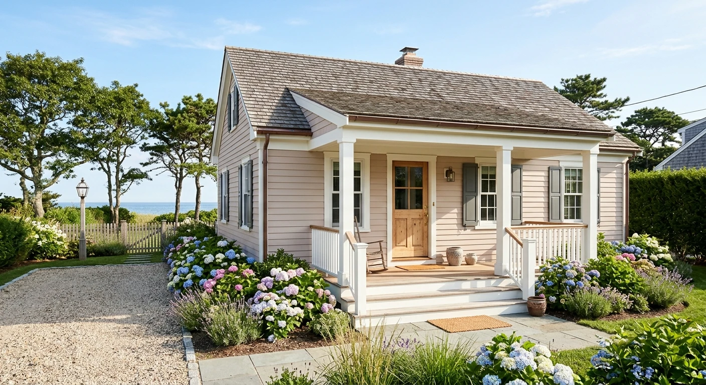

Sherwin-Williams Breathless (SW 6022) is a muted, dusty blush-beige neutral from the Sherwin-Williams Red color family that brings vintage warmth to an American house exterior without tipping into nursery pink. With a Light Reflectance Value (LRV) of about 56.7 and a digital screen rendering of #D6C2BE (RGB 214, 194, 190), it sits in a practical middle-high brightness band: light enough to soften coastal cottages, stucco walls and suburban lap siding, yet pigmented enough to hold its presence against bright afternoon sun and crisp white trim.
The color name, code, family classification and product positioning come from the official Sherwin-Williams Breathless SW 6022 page and exterior product documentation read on 22/11/2026. The Delta E 2000 comparisons against Sherwin-Williams neighbors and Benjamin Moore alternatives are our calculations from published screen values, and the architectural pairing guidance is our color reasoning. Because every screen alters dusty violet-gray and rose-beige undertones, always confirm Breathless on a painted sample board outdoors before ordering exterior gallons.
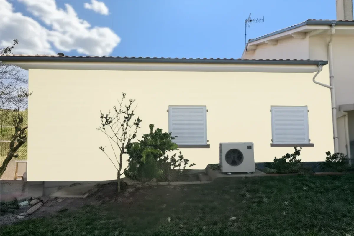
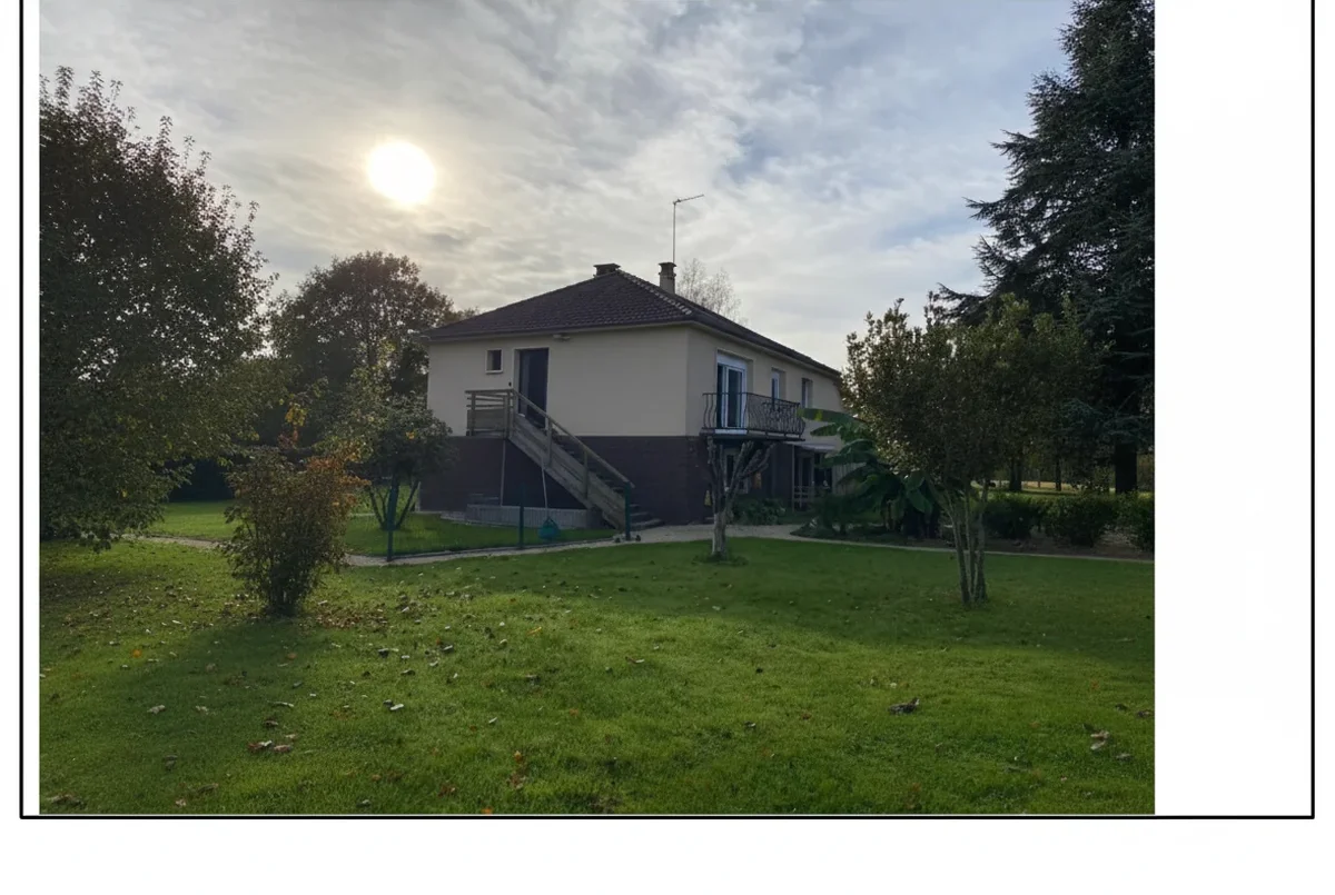
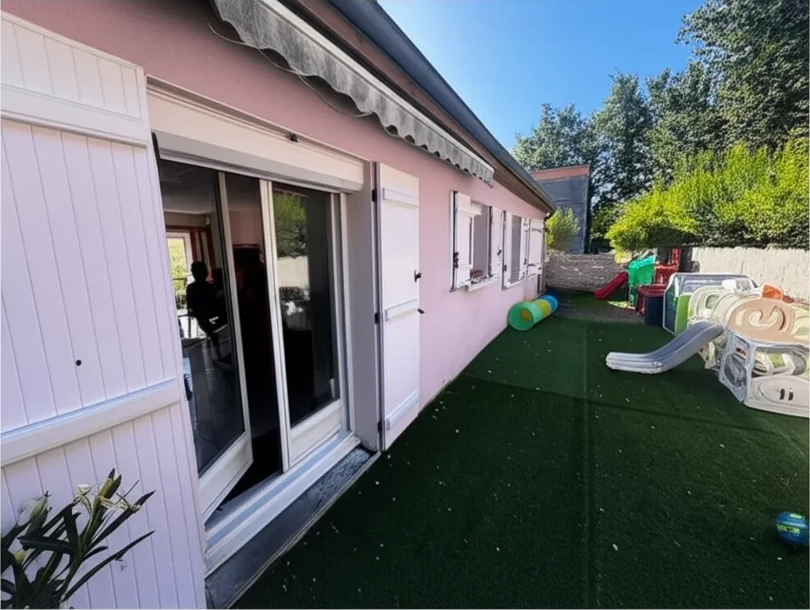
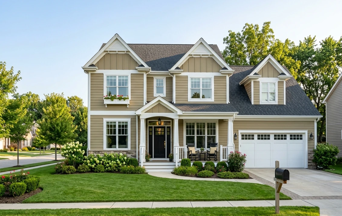
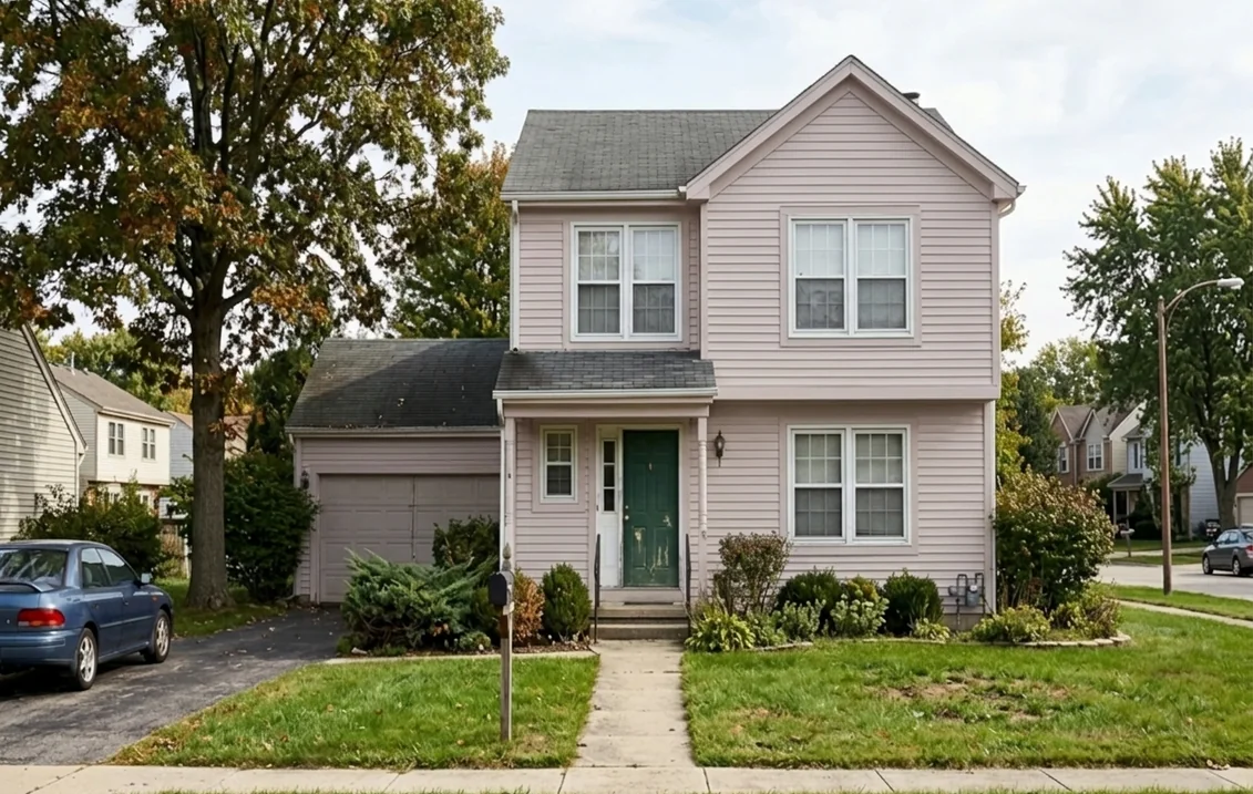
Upload one exterior photo to see Sherwin-Williams Breathless SW 6022 on your siding or stucco before buying sample quarts.
What Sherwin-Williams Breathless SW 6022 actually looks like outside
Indoors, homeowners often spot the soft blush of Breathless immediately, especially under warm LED bulbs. Outdoors, natural daylight is far more intense and carries a stronger blue spectral component, which washes out delicate pastel pigments. That outdoor shift is exactly why Breathless works so well on a facade: its warm, dusty violet-gray and pale rose-beige blush undertones flatten into a quiet, weathered stone-blush neutral rather than reading as bubblegum pink.
In direct midday sun, the violet-gray dustiness pulls the color back toward a refined, sun-bleached plaster tone that looks right at home on coastal clapboard, Mediterranean stucco or Cape Cod shingles. When clouds roll in or the wall sits in north-facing shade, the pigment deepens into a cozy warm taupe-blush with subtle mauve-gray depth. This dual behavior makes it far more forgiving than cleaner pastel pinks, which can look chalky or sweet at street scale.
| Attribute | Sherwin-Williams Breathless SW 6022 |
|---|---|
| Color name and code | Breathless, SW 6022 |
| Brand color family | Red / Blush Neutral family |
| Screen hex and RGB (approximate) | #D6C2BE (RGB 214, 194, 190) |
| Light Reflectance Value (LRV) | About 56.7 (moderate-to-high reflectance) |
| Primary undertones | Warm dusty violet-gray and pale rose-beige blush |
| Sun vs. shade reading | Muted vintage rose-stone in sun; cozy warm taupe-blush in shade |
| Vinyl siding compatibility | Right above the 55 to 56 LRV threshold; also mixable in VinylSafe formulas |
Try it on your house
- 1Your photoPhoto
- 2Your colorColor
- 3HD render in ~30 sHD render in ~30 s
Your photo is used only to create your preview. JPG, PNG, HEIC (iPhone)
From a technical standpoint, LRV measures the percentage of visible light a surface reflects on a 0 to 100 scale. At roughly 56.7, Breathless avoids both the heat load of dark charcoals and the harsh glare of bright whites, while keeping clapboard shadow lines and window trim readable from the curb.
How light, compass direction and surroundings shift Breathless
Because Breathless sits at the intersection of pale red, warm beige and dusty violet-gray, its appearance depends heavily on which way the main facade faces and what surrounds the house. Green lawns, red brick walkways and blue sky all bounce colored light onto siding. Understanding those shifts before you paint keeps you from being surprised once four walls are coated.
| Facade orientation | How Breathless SW 6022 reads | Practical trim and accent tip |
|---|---|---|
| South-facing (full sun) | Brightest and most neutral; rose-beige fades into a soft vintage sand-blush | Pair with warm white trim so the siding still shows gentle contrast |
| North-facing (indirect cool light) | Deepens to a warm taupe-blush; dusty violet-gray undertone becomes more visible | Use crisp white trim and warm brass or wood accents to keep the entry lively |
| East-facing (morning sun, afternoon shade) | Warm rosy cream at sunrise; shifts toward muted mauve-taupe by late afternoon | Test your front door color in afternoon shade, when the facade is at its deepest |
| West-facing (shade early, hot evening sun) | Quiet taupe-beige in the morning; glows with warm peach-rose tones at golden hour | Avoid overly yellow trim whites, which can clash during warm late-day sun |
Landscaping matters just as much as compass direction. Heavy evergreen trees or dense summer foliage cast green-tinted shade onto lower walls; because green sits opposite red on the color wheel, lush greenery actually neutralizes the blush in Breathless and makes it read slightly grayer and more grounded. Conversely, a house surrounded by bare winter branches or pale limestone gravel will display more of the pale rose-beige warmth. That is why a single color swatch held in your hand never tells the whole story.
LRV 57 and VinylSafe: using Breathless on vinyl, wood, fiber cement and stucco
Exterior paint performance depends on matching both the color's light reflectance and the coating chemistry to the substrate underneath. Breathless has a major practical advantage over darker mauve-taupe shades: its LRV of approximately 56.7 lands just above the classic 55 to 56 solar-heat reflectance threshold that vinyl siding manufacturers typically cite to prevent panel buckling and warping in direct sun.
Even better, Sherwin-Williams offers VinylSafe color formulations that use specialized infrared-reflective pigments to reduce heat buildup on PVC panels. When ordering Breathless for vinyl siding, ask the paint counter explicitly to verify the VinylSafe formula for your chosen exterior line and check your siding manufacturer's warranty terms before painting. Never apply a high-gloss finish to vinyl, as higher sheen highlights every seam and wave in the panels.
| Exterior substrate | Suitability for SW 6022 | Prep and sheen guidance |
|---|---|---|
| Vinyl siding | Strong fit (LRV ~56.7 sits above typical 55 to 56 threshold; VinylSafe available) | Wash chalking and mildew thoroughly; use Satin or Flat in a VinylSafe-approved acrylic |
| Wood lap siding and shingles | Classic match for coastal cottages, Craftsman and Victorian homes | Spot-prime bare wood and tannin-rich cedar knots with a stain-blocking exterior primer; Satin finish |
| Fiber cement siding | Excellent dimensional stability and crisp shadow lines | Ensure factory primer is clean and intact; Flat or Satin hides caulked joints evenly |
| Stucco and painted masonry | Natural vintage plaster look; softens rough sand or dash textures | Use a breathable masonry-compatible acrylic and Flat sheen to avoid highlighting trowel patches |
On stucco homes, Breathless looks particularly architectural because traditional lime washes and tinted plasters across coastal and Southwestern regions often carried faint earth-rose minerals. If your house has textured cementitious stucco, review our Sherwin-Williams stucco paint colors guide for masonry primer rules and hairline crack bridging before painting.
Duration Exterior vs Emerald Exterior for Breathless SW 6022
Muted red-family neutrals rely on delicate oxide and violet-tinted colorants to keep their dusty balance. If an exterior paint chalks early or fades unevenly on a south-facing wall, a blush-beige quickly looks streaky. The two flagship Sherwin-Williams acrylics for a full Breathless exterior are Duration Exterior Acrylic Latex and Emerald Exterior Acrylic Latex. Duration builds a thick protective film that resists peeling and blistering and is self-priming on sound, previously painted wood and stucco. Emerald Exterior sits at the top of the lineup for smooth leveling, dirt resistance and long-term UV color retention.
| Criteria | Duration Exterior Acrylic Latex | Emerald Exterior Acrylic Latex |
|---|---|---|
| Core strength | Thick protective film built for durability on older siding and stucco | Flagship color retention, smooth leveling and dirt-shedding finish |
| Priming profile | Self-priming on sound, previously painted wood and stucco (bare spots still need primer) | Self-priming on sound painted surfaces; dedicated primer still required on bare wood or chalky masonry |
| Best use with SW 6022 | Weathered clapboard, textured stucco, harsh freeze-thaw or coastal wind exposure | Smooth fiber cement, high-UV southern elevations, and crisp trim contrast |
| Recommended wall sheen | Flat for stucco or uneven siding; Satin for cleanable lap siding | Flat for low-glare plaster look; Satin for subtle light reflection on siding |
For a broader look at how Sherwin-Williams exterior tiers stack up across budgets and climates, read our Sherwin-Williams exterior paint guide and our roundup of the best Sherwin-Williams outdoor paints. If you are also weighing a mid-tier line against the flagship formula, our SuperPaint vs Emerald Exterior comparison breaks down where the extra spend pays off on sun-drenched walls.
Trim, front door, shutter and roof pairings for Breathless SW 6022
A dusty blush-beige siding color only looks intentional when every fixed element around it speaks the same visual language. The biggest mistake homeowners make with SW 6022 is pairing it with stark blue-white vinyl windows or bright yellow-cream trim, both of which fight its rose-beige and violet-gray balance. Instead, anchor Breathless with either a soft warm white or a clean neutral white, then add a grounded, low-LRV accent on the front door or shutters.
| Exterior element | Best pairing direction with SW 6022 | Visual result on the facade |
|---|---|---|
| Warm soft white trim | Sherwin-Williams Alabaster in Satin or Semi-Gloss | Cozy, heritage cottage look; harmonizes with the warm beige side of Breathless |
| Crisp neutral white trim | Sherwin-Williams Pure White in Satin or Semi-Gloss | Cleaner modern contrast; makes the dusty blush undertone look fresher and sharper |
| Front door | Deep forest green, muted sage-charcoal, dark bronze or natural stained walnut | Dark botanical greens sit opposite blush on the color wheel and instantly ground the entry |
| Shutters and metalwork | Dark charcoal-green, aged bronze, matte black iron or weathered taupe | Frames windows without creating harsh cartoon contrast against LRV 57 siding |
| Roof materials | Weathered cedar shake, charcoal-gray asphalt, warm brown architectural shingles or muted terracotta tile | Cedar and charcoal bring out the sophisticated stone-blush side; bright orange clay can look busy |
Choosing between a soft warm white and a cleaner neutral white on your fascia and window casings changes the mood of Breathless. See our Sherwin-Williams Alabaster exterior guide for a creamy cottage pairing, or our Sherwin-Williams Pure White exterior guide if you have bright white vinyl windows. Weathered bluestone, limestone steps and warm red-brown brick porches also flatter Breathless, whereas bright salmon-orange pavers or cool silver metal roofs can pull out unwanted pinkness.
Closest Sherwin-Williams neighbors and Benjamin Moore matches
Homeowners often test Breathless and decide they want either a touch less pink, slightly higher brightness, or a Benjamin Moore equivalent for a contractor who prefers Benjamin Moore exterior lines. We calculated the perceptual color distance (Delta E 2000) from Breathless (#D6C2BE) to nearby Sherwin-Williams shades and the closest Benjamin Moore colors using published digital color data. On the Delta E 2000 scale, a difference under 2 is very close to the human eye, while 2 to 3.5 is clearly noticeable when two boards sit side by side.
| Brand and color | Screen hex | Relative luminance (calc.) | Delta E 2000 to SW 6022 | How it compares outdoors |
|---|---|---|---|---|
| SW 6022 Breathless (reference) | #D6C2BE | ~56.7 (LRV) | 0.00 | Dusty violet-gray and rose-beige blush neutral |
| SW 6029 White Truffle | #D7C8C2 | 59.7 | 2.78 | Slightly lighter and creamier beige with softer blush |
| SW 6050 Abalone Shell | #DBC7BD | 59.6 | 3.17 | Slightly lighter and warmer, leaning closer to peach-shell beige |
| BM 2103-60 Pale Berry | #DCC4C1 | 58.5 | 1.80 | Closest Benjamin Moore match; a fraction lighter with a similar soft berry-blush veil |
| BM AF-610 Batik | #CDBAB6 | 51.5 | 2.13 | Noticeably deeper and moodier taupe-mauve; watch vinyl heat limits |
| BM 2110-50 Gobi Desert | #D4C4BE | 57.2 | 2.14 | Nearly identical brightness, shifting slightly earthier and more desert-beige |
Treat these Delta E figures strictly as a shortlist of closest matches rather than exact factory equivalents. Sherwin-Williams and Benjamin Moore use different resin bases and proprietary tint systems, so two colors that measure Delta E 1.80 on screen can diverge slightly under midday UV light or in flat versus satin sheen. If your painter prefers Benjamin Moore, Benjamin Moore Pale Berry 2103-60 is the logical first sample to paint next to Breathless on an outdoor board, while Gobi Desert 2110-50 is worth testing if you want to dial back the rose note slightly. Keep in mind that Batik AF-610 drops to a calculated luminance around 51.5, which moves below the typical 55 to 56 threshold for standard vinyl siding.
Test the closest Benjamin Moore match on your own siding photo side by side with Breathless SW 6022.
Outdoor sample board protocol, gallon math and EPA RRP prep
Never approve a blush-beige exterior color from a two-inch paper strip or a single brush stroke painted directly over old siding, where the surrounding wall color tricks your eye. Follow a disciplined outdoor test before buying full five-gallon buckets:
- Paint a large primed board: Apply two full coats of Breathless SW 6022 in your planned sheen onto a primed 2-by-2-foot foam board or fiber cement scrap, leaving a clean white border around the edge so old siding does not distort the undertone.
- Check two elevations at three times of day: Prop the board against your sunniest wall and your shadiest wall at 9 AM, 1 PM and 5 PM. Step back to the sidewalk or driveway so you judge the color at real viewing distance.
- Test next to fixed materials: Hold the painted board directly against your roof eaves, window frames, brick foundation and stone walkway. Confirm that the dusty violet-gray undertone does not clash with cool gray or orange-red masonry.
- Compare one neighbor side by side: Paint a second board in SW 6029 White Truffle, SW 6050 Abalone Shell or BM 2103-60 Pale Berry so your eye has a concrete reference for how much blush feels right on your architecture.
To estimate how many gallons of Duration Exterior or Emerald Exterior you need, calculate your net paintable wall area first rather than guessing from interior floor square footage. Measure the width and height of each exterior wall (including triangular gable peaks, calculated as half the base times the height), add all wall sections together, and subtract the area of standard windows and doors. Multiply that net square footage by two coats, then divide by the square-foot-per-gallon spread rate printed on the official Sherwin-Williams product data sheet for your exact product and sheen. Add 15 to 20 percent extra material if you are coating porous stucco, rough-sawn cedar shingles or deep clapboard laps, because textured substrates absorb more paint on the first pass.
Finally, check the build date of your home before scraping or sanding old exterior paint. According to the US Environmental Protection Agency's Lead Renovation, Repair and Painting (RRP) Program, many homes built before 1978 still contain lead-based paint layers under newer coatings. Under federal rules, any paid contractor who disturbs painted surfaces on a pre-1978 home must be EPA-certified and follow lead-safe containment and cleanup practices. Even if you are a homeowner tackling your own prep work, test older siding and window trim before dry-scraping, use wet-sanding or HEPA-vacuumed tools, and capture all paint chips on heavy plastic sheeting so lead dust does not contaminate soil around your foundation.
Sources and references
- Sherwin-Williams, Breathless SW 6022: official color code, Red / Blush Neutral family, approximate screen rendering (#D6C2BE, RGB 214, 194, 190) and LRV reference (read 22/11/2026).
- Sherwin-Williams, Duration Exterior Acrylic Latex: thick protective film, self-priming guidance on sound painted wood and stucco, and exterior application specifications.
- Benjamin Moore, Pale Berry 2103-60: official color reference for the closest calculated Benjamin Moore exterior match to Breathless SW 6022.
- US Environmental Protection Agency, Lead Renovation, Repair and Painting (RRP) Program: pre-1978 exterior paint disturbance rules, contractor certification requirements and lead-safe prep standards.
Frequently asked questions
Does Sherwin-Williams Breathless SW 6022 look pink on a house exterior?
Can you use Sherwin-Williams Breathless SW 6022 on vinyl siding?
What trim and front door colors pair best with Breathless SW 6022?
Should I choose Duration Exterior or Emerald Exterior for Breathless SW 6022?
What is the closest Benjamin Moore color to Sherwin-Williams Breathless SW 6022?
Trademarks mentioned (Sherwin-Williams, Benjamin Moore, Behr, Caparol, Brillux, Sto, Alpina, Valspar, PPG, Glidden, Dulux, Crown Trade, Sandtex, Farrow & Ball, Johnstone's, Leyland) are property of their respective owners. FacadeColorizer is independent and not affiliated with any of them. Nominative fair use under Lanham Act §1125.