Try it on your room

Quick answer: High Reflective White (SW 7757) is the brightest white Sherwin-Williams sells, with a published Light Reflectance Value of 93 and an undertone so faint it reads colorless in almost any light. That makes it the reference ceiling and trim white in the SW deck, a strong wall color for bright, modern rooms, and a poor choice for dim north-facing rooms, where it turns flat and slightly gray-blue instead of glowing. Preview it on your own room before buying a gallon: upload a photo to the interior paint visualizer and compare it with Pure White and Snowbound on your walls and ceiling.
Every paint deck has a white at the top of the scale, the one the others are measured against. In the Sherwin-Williams deck that white is SW 7757. People search for it under three different jobs: a ceiling that has to bounce the most light, trim that has to look crisp against a colored wall, and a wall color for a minimalist room. This guide takes each job in turn, explains what the LRV of 93 actually does in a room, decodes the undertone question that fills the forums, and lines the color up against the six whites it is most often cross-shopped with, from Sherwin-Williams, Benjamin Moore and Behr.
What LRV 93 means on a wall, a ceiling and a trim board
The Light Reflectance Value is the manufacturer's measurement of how much visible light a color sends back, on a scale where absolute black is 0 and a theoretical perfect white is 100. Sherwin-Williams publishes LRV 93 for SW 7757, the highest figure in its lineup. For context, most whites that designers use on walls sit between 80 and 90, and the general-purpose favorites are lower still: Extra White SW 7006 at 86 and Pure White SW 7005 at 84. The full mechanics of the scale are in the LRV guide; the three consequences that matter here are simple.
- On a ceiling, LRV 93 returns the most light of any SW color to the room below. Lighting engineers design around exactly this: the federal GSA high-performance building guidance on lighting asks for walls, ceilings and furniture surfaces of light color and high surface reflectance because that reduces the output required of the lighting system. A ceiling in SW 7757 is the residential version of that rule.
- On trim, the same brightness is what makes casings and baseboards look sharp against a colored wall. The larger the LRV gap between wall and trim, the crisper the edge; against a mid-tone greige or a navy, the gap with SW 7757 is the largest available.
- On a wall, a color this reflective takes the color of whatever light hits it. In a bright south or west room it stays white all day. In a dim room it reflects the gray of the sky and looks gray; it cannot create light that is not there.
The undertone question, settled
The color's reputation is "no undertone", and for practical purposes that is right: it is not a warm white like Alabaster (cream) and not a cool white like Extra White (a faint blue-gray). Measured precisely, SW 7757 carries a microscopic trace of yellow-green, so faint that it only surfaces as a hint of warmth next to a truly blue-white and never reads as cream. What people actually see is a mirror effect. Next to warm oak floors and brass, the wall picks up warmth and looks softer; next to cool gray tile and stainless steel it looks icier; under a warm 2700 K bulb at night it goes slightly ivory, under a 4000 K bulb it goes clinical. The wall is not changing, the light is. The practical rule is to judge it at three times of day against the finishes that will stay in the room, and to render it on a photo first, because a two-inch chip of a color this bright tells you nothing.
Best rooms and surfaces for High Reflective White
| Where | Verdict | Why | Sheen |
|---|---|---|---|
| Ceilings, any room | Best use | Maximum bounce, no cast to fight the wall color; the SW default ceiling white for a reason. | Flat |
| Interior trim, doors, casings | Excellent with colored walls | Crispest possible edge against greige, green, navy or charcoal walls. | Satin or semi-gloss |
| Walls, bright south or west rooms | Good for modern, gallery-style rooms | Stays white all day, lets art and wood do the talking; can feel stark in a traditional interior. | Matte or eggshell |
| Walls, small windowless rooms (powder room, hallway) | Good with strong artificial light | Every lumen counts; pair with warm bulbs so it does not read clinical. | Eggshell |
| Walls, north-facing or shaded rooms | Avoid | Reflects gray daylight and goes flat and cold; a softer, warmer white glows instead. | n/a |
| Kitchen cabinets | Only in very bright, modern kitchens | Shows every fingerprint and reads stark next to warm counters; Pure White or Alabaster are safer. | Satin enamel |
| Exterior trim on a dark body | Very good | Against charcoal, black or deep green siding the contrast is the whole look. | Satin or semi-gloss |
| Exterior body | Usually too much | Outdoor light is already intense; a whole facade at LRV 93 glares. Pure White or Snowbound read white without the glare. | n/a |
Try it on your house
No photo? Try a sample
Free first HD render, 3 variations, no account.
Wall colors and finishes that pair with it
Because it carries almost no color of its own, SW 7757 is the easiest trim white to pair: it does not argue with warm or cool walls the way a cream or a blue-white does. The pairings that work hardest are the high-contrast ones. Charcoal and black walls (Iron Ore SW 7069, Tricorn Black SW 6258) with trim in this white are the modern classic; navy (Naval SW 6244) and deep green (Pewter Green SW 6208) read richer against a trim this bright than against a softer white. Mid-tone greiges such as Agreeable Gray (SW 7029) and Accessible Beige (SW 7036) also hold up, but the trim will read cooler next to a warm greige than it does next to a gray one. The pairing to avoid is another near-white: put Alabaster or Snowbound walls next to SW 7757 trim and the walls suddenly look dingy, because the trim exposes the cream in them. If the walls are a soft white, match the trim to the wall or drop only a few LRV points.
Finishes push it the same way. White oak, brass and terracotta warm it; concrete, black steel and marble cool it; both directions look intentional as long as the room commits to one. Under lighting, keep bulbs at 2700 to 3000 K if the room has any warm material in it, and use 3500 to 4000 K only in a room that is deliberately cool and gallery-like.
High Reflective White vs the six whites it competes with
Brightness is only one axis; the other is undertone. This is how SW 7757 sits against the whites people compare it with, using each manufacturer's published LRV.
| Color | LRV | Undertone | Pick it over SW 7757 when |
|---|---|---|---|
| High Reflective White SW 7757 | 93 | Neutral, trace of yellow-green | Reference: ceilings, trim, bright modern walls. |
| Extra White SW 7006 | 86 | Cool, faint blue-gray | Walls and trim are gray, blue or black and you want the white to lean cool with them. |
| Pure White SW 7005 | 84 | Soft neutral, very slightly warm | You want a whole-house white for walls and cabinets, not a ceiling white. |
| Snowbound SW 7004 | 83 | Warm-neutral, faint gray | The room faces north or is dim and SW 7757 goes flat. |
| Alabaster SW 7008 | 82 | Warm cream | Farmhouse or traditional interiors where a stark white looks out of place. |
| Chantilly Lace OC-65 (Benjamin Moore) | 92.2 | Neutral, crisp | The rest of the house is Benjamin Moore; it is the closest like-for-like rival. |
| Ultra Pure White (Behr) | 94 | Neutral, no tint | You buy at Home Depot and want the same ceiling-white role one point brighter. |
The Chantilly Lace and Ultra Pure White figures come from the manufacturers' own pages, Benjamin Moore OC-65 and Behr Ultra Pure White. Cross-brand matches are never official: a Benjamin Moore or Behr store can mix a match to SW 7757 from the code, but ask for a drawdown and expect a small shift in undertone. If Chantilly Lace is on the shortlist, the Chantilly Lace review covers its behavior room by room; the wider ranking of wall whites by undertone and brightness is in the guide to the best white paint for walls.
Too bright, or just right?
Upload one photo of the room, apply High Reflective White to the walls, then Pure White, then Snowbound, and compare the three renders against your floor and your furniture before you commit to a five-gallon bucket.
Compare three whites on my roomSame white on walls and ceiling, or a brighter ceiling?
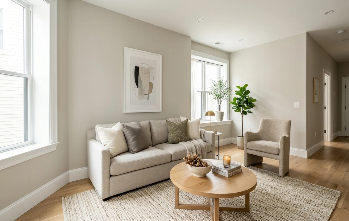
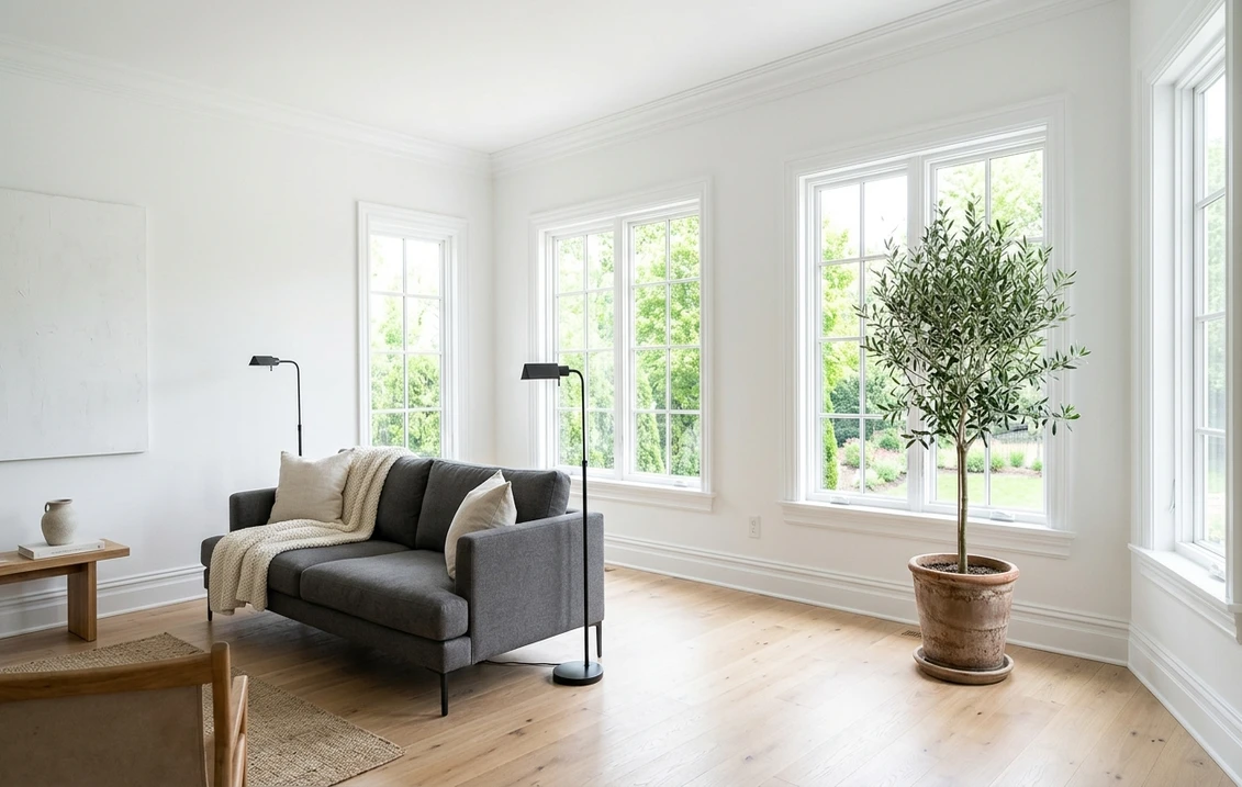
The most common question about this color is not whether to use it but where the ceiling line goes. There are two coherent answers. The first is the "seamless" scheme: walls, ceiling and trim all in SW 7757, walls in matte, ceiling in flat, trim in satin. The sheen change carries the architecture and the color never breaks, which makes a low ceiling read taller and a small room read larger; it is the scheme in the photograph at the top of this page and the one modern and Scandinavian-leaning interiors use. The second is the "lifted ceiling" scheme: walls in a softer white or a color, ceiling in SW 7757 flat. Here the nine to twelve LRV points between a Pure White wall and the ceiling are enough to make the ceiling read as a source of light rather than a lid, without the harsh line a stark trim white would draw against a cream wall.
What does not work is the reverse: a ceiling darker or warmer than SW 7757 walls. The ceiling then reads as a stain and the room feels lower. If the walls are going to be this bright, the ceiling matches them or exceeds them, which in practice means the same color in flat. One more detail for the seamless scheme: buy the wall and ceiling paint in the same product line, because the same color mixed into two different bases can differ by a visible fraction of a shade, and on a color this bright that fraction shows exactly at the ceiling line.
Product and sheen: keeping a bright white from looking cheap
A color this bright shows two things a mid-tone hides: sheen inconsistency and film thinness. Two coats are not optional; a single coat over a colored wall lets the old color ghost through as a faint tint, and touch-ups in a different sheen flash under raking light. For ceilings, a flat or ultra-flat ceiling paint hides roller texture and joint-compound seams; for trim, a satin or semi-gloss enamel gives the wipeable, hard film that a door needs, and the cleaner the enamel levels, the whiter the trim reads. Whites with a high titanium dioxide load hide better, which is one reason to buy the premium line for this color rather than the builder grade: the difference between one coat that covers and two that do not is visible on exactly this shade. The north-facing rooms white guide explains why the same product choice matters even more where daylight is weak.
Mistakes people make with SW 7757
- Using it to "brighten" a dark room: it reflects the gray light it gets and looks flat. A warmer white with a lower LRV glows more in the same room.
- Trim in SW 7757 next to soft-white walls: the walls look dirty by comparison. Match the trim to the wall white or keep the gap small.
- Whole exterior body: glare, and every dirt streak visible. Reserve it for exterior trim on dark bodies.
- Cool bulbs everywhere: at 4000 K and above the room reads like a lab. Warm bulbs where there is wood, cool bulbs only in a deliberately cool scheme.
- One coat, builder grade: the old color ghosts through. Two coats of a premium line.
- Judging it on a chip: a bright white on a two-inch card looks like every other white. Render it on the room, then paint a full sample board.
Sources and references
- Sherwin-Williams, High Reflective White SW 7757 (published LRV 93), Extra White SW 7006 (LRV 86) and Pure White SW 7005 (LRV 84) color pages.
- Benjamin Moore, Chantilly Lace OC-65 color page (LRV 92.2).
- Behr, Ultra Pure White color page (LRV 94).
- US General Services Administration, High-performance buildings: lighting (light-colored, high-reflectance surfaces reduce required lighting output).
Color names and codes are trademarks of their owners; LRV figures are the manufacturers' published values and digital renderings remain approximations. FacadeColorizer is an independent visualization tool and is not affiliated with Sherwin-Williams, Benjamin Moore or Behr.
Frequently asked questions
What is the LRV of Sherwin-Williams High Reflective White?
Does High Reflective White have undertones?
Is High Reflective White good for ceilings?
Can I use High Reflective White on exterior walls?
High Reflective White vs Extra White: which should I choose?
Trademarks mentioned (Sherwin-Williams, Benjamin Moore, Behr, Caparol, Brillux, Sto, Alpina, Valspar, PPG, Glidden, Dulux, Crown Trade, Sandtex, Farrow & Ball, Johnstone's, Leyland) are property of their respective owners. FacadeColorizer is independent and not affiliated with any of them. Nominative fair use under Lanham Act §1125.