Try it on your room

Crushed Ice SW 7647 is a light, cool-leaning gray with a soft green undertone and a Light Reflectance Value of 66. It sits between the pale grays that read almost white and the mid grays that darken a room, which is why it shows up on so many shortlists for living rooms and bedrooms. This guide gives you the measured facts, explains what the undertone does in each exposure, and puts Crushed Ice next to the colors people cross-shop it with, so you can decide from data rather than from a chip under store lighting.
The data sheet behind Crushed Ice SW 7647
Start with the number that matters. Crushed Ice has an LRV of 66, a figure confirmed independently by the two most thorough color reviews of this shade, Kylie M Interiors and The Heathered Nest. On the 0 to 100 scale, where 0 is absolute black and 100 is pure white, 66 places it firmly in the light range but well below the off-whites: Alabaster sits at 82 and Pure White at 84. In practice that means Crushed Ice keeps visible color on a wall in a bright room instead of washing out, and still bounces enough light to work in a medium-sized space with one window.
One detail surprises people: on the official Sherwin-Williams color page, Crushed Ice is filed under the white paint colors family rather than the grays. That classification tells you how Sherwin-Williams expects it to be used: as a very soft, tinted background that behaves like a warm-ish white in a bright room, not as a statement gray. If you have seen it described as "the gray that is almost a white", that is where the description comes from.
| Spec | Crushed Ice SW 7647 |
|---|---|
| LRV | 66 (light range) |
| Sherwin-Williams family | White paint colors |
| Temperature | Gray with a soft green undertone; reads slightly warm in south or west light, cooler in north light |
| Undertone flashes | Green first, occasionally blue-gray, rarely a hint of violet under some artificial light |
| Coordinating whites listed by SW | Extra White SW 7006, Pure White SW 7005 |
| Best exposures | South and west facing rooms; bright east rooms in the morning |
| Avoid | Basements and windowless rooms; cream or yellow-white trim and cabinets |
Try it on your house
No photo? Try a sample
The undertone: why "warm gray" is only half the story
Crushed Ice is usually sold as a warm gray, and that label is both right and misleading. Its warmth does not come from the beige or yellow base that makes Agreeable Gray or Accessible Beige feel cozy. It comes from a subtle green-taupe base. Kylie M Interiors describes it as having "a soft green undertone" that "can easily flash slightly green-blue", and files it under what she calls a "warmy stormy" gray: warm enough not to look icy, gray enough not to look beige. The Heathered Nest reaches the same conclusion from the other direction, calling it a "fairly balanced color" that "doesn't strongly commit to undertones" and can swing between "light but stormy gray" and a "stunning blue-gray-green" depending on the room.
This matters for the finishes you already own. Green-based grays are friendly to oak floors, brass, black window frames, and true whites. They are unfriendly to cream, ivory and yellow-based whites: put Crushed Ice next to a cream cabinet and the cabinet suddenly looks dirty while the wall looks blue. Kylie M Interiors is blunt about the cream-trim combination, and having tested it on hundreds of uploaded room photos, we agree. If your trim is an older cream white, either repaint the trim in a clean white or move to a greige with a yellow base such as Agreeable Gray SW 7029.
Gray or greige? Let the exposure decide
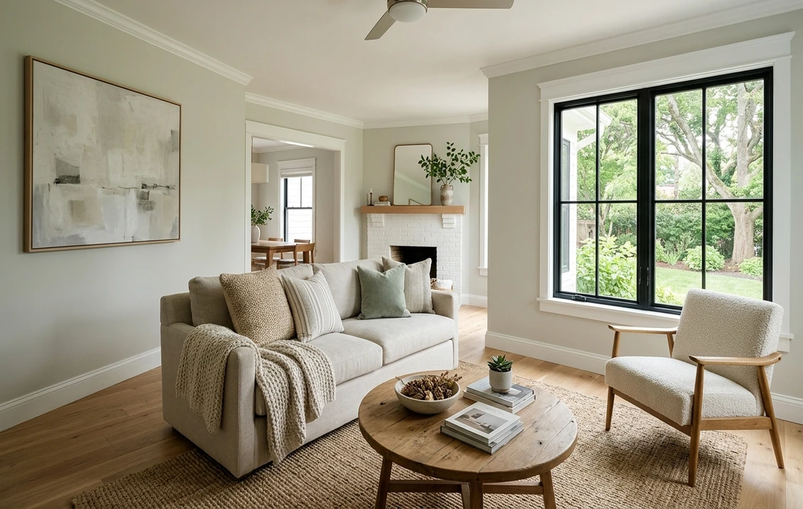
Because the undertone is quiet, the light in the room writes most of the story. In a room with southern sun or afternoon western light, Crushed Ice softens and its warmth becomes visible; it looks like a gentle greige with a hint of sage, which is the look most people are after when they pick it. In cool northern light, the green recedes and the gray comes forward; the wall reads cooler and more clearly gray, sometimes with a faint blue cast on overcast days. Neither result is wrong, but they are two different colors, so decide which exposure your main rooms have before you buy.
Two situations work against it. In a basement or a room without a real window, an LRV of 66 is not enough to lift the wall, and the green-gray base turns dingy under warm LED bulbs. And on a large, brightly lit wall with nothing on it, Crushed Ice can wash out to a near white; it needs contrast, either crisp white trim or furniture with some depth, to keep reading as a color. Our guide to light gray paint colors and their undertones explains this washing-out effect across the whole light-gray range.
A practical test that costs nothing
Photograph your room at 9 am, 1 pm and 5 pm, then upload the same three photos to the simulator and apply Crushed Ice to the walls. The three renders show you the morning gray, the midday greige and the evening warmth on your own walls, with your own trim and floor, before you buy a sample pot.
The rooms Crushed Ice flatters
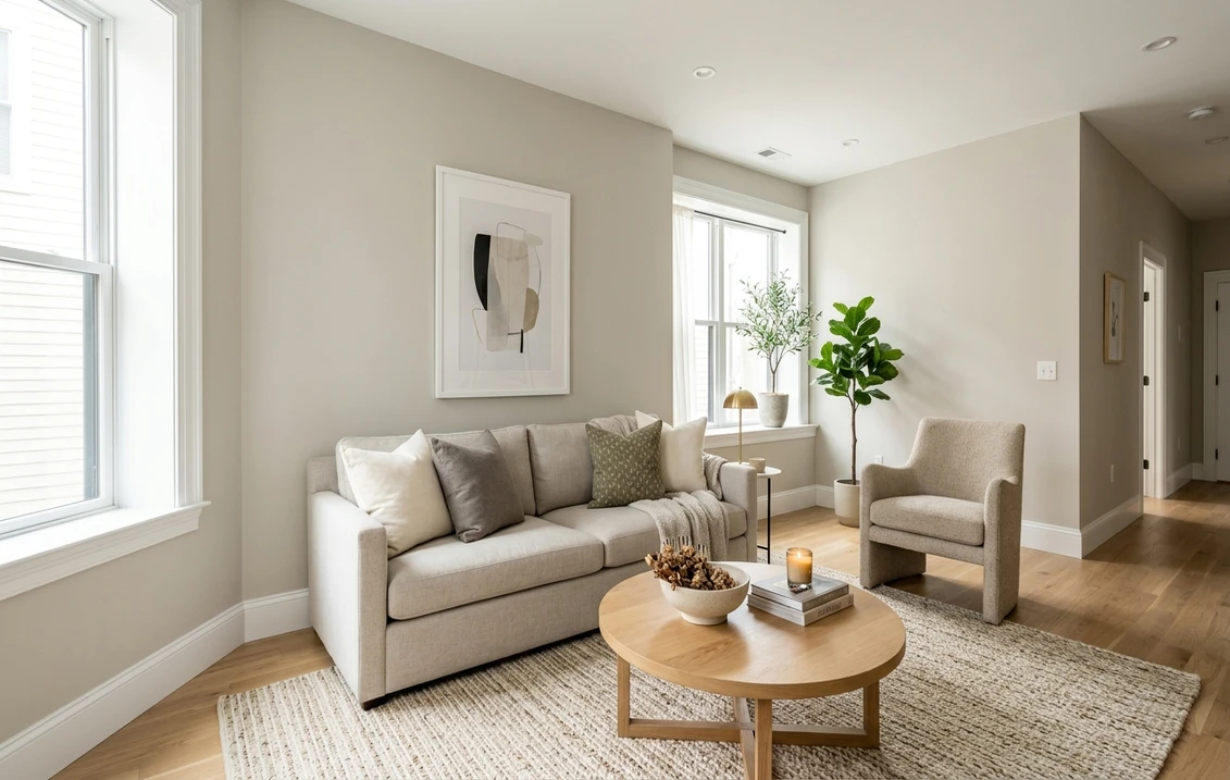
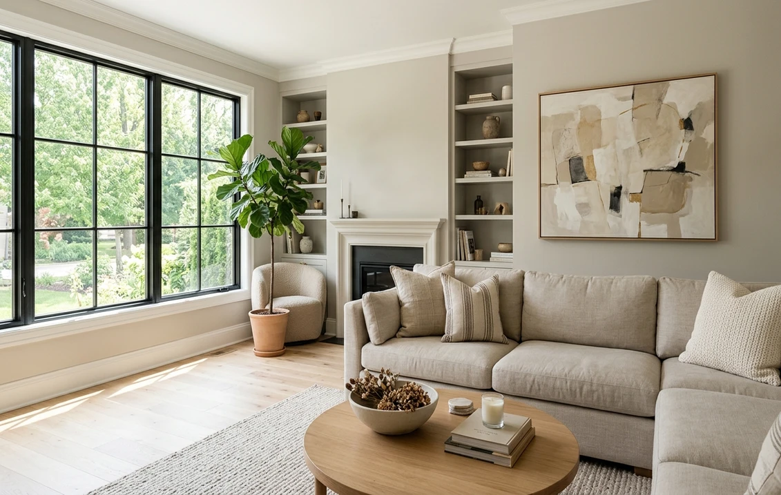
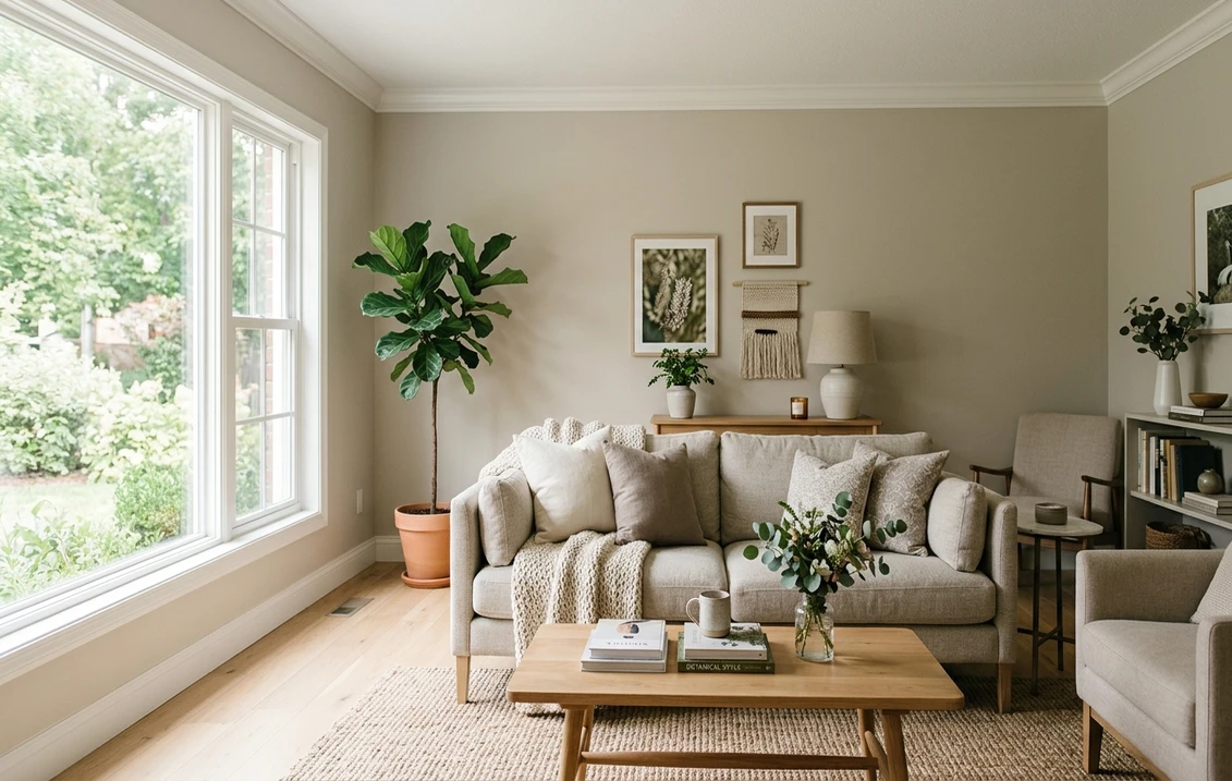
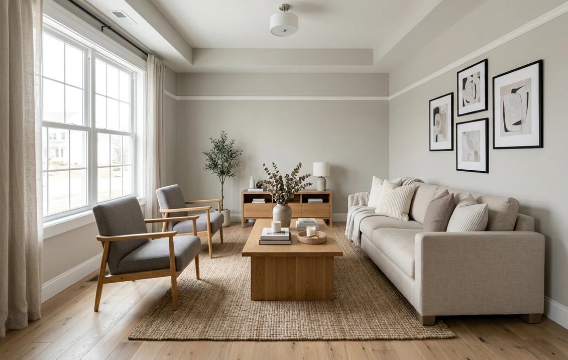
Living rooms and family rooms. This is its home turf. With a south or west window it gives the soft, layered gray that photographs well and does not fight with wood tones. Pair it with white trim, a natural-fiber rug and oak or walnut furniture; it handles both cool and warm woods because the undertone is balanced.
Bedrooms and nurseries. The Heathered Nest lists bedrooms, nurseries and playrooms among the rooms where the color performs, and the reason is the LRV: 66 is bright enough for a restful room without the sterile feel of an off-white. In a north-facing bedroom expect the cooler, grayer version.
Kitchens. On kitchen walls it works with white or black cabinets and with quartz counters that have gray veining. As a cabinet color it is a quieter alternative to the mid grays, but only with a bright white counter and clean white trim; against cream, see the warning above. For a kitchen where the cabinets are the feature, our Sherwin-Williams interior color guide lists the grays that hold up on doors and drawer fronts.
Bathrooms and powder rooms. Good in a bathroom with a window and white tile; the green-gray undertone pairs naturally with chrome and brushed nickel. In a windowless powder room it goes flat, so choose a deeper color there and keep Crushed Ice for the rooms with daylight.
Exteriors. Both reviewers have seen it used outside. Outdoors, the LRV of 66 reads as a pale gray siding color rather than white, and the green undertone sits comfortably against landscaping. Bear in mind that exterior light is far brighter than interior light, so expect it to look one to two shades lighter on siding than on an interior wall.
Trim, ceiling and decor pairings
Sherwin-Williams pairs Crushed Ice with Extra White SW 7006 and Pure White SW 7005 for trim, and those are the two safe answers. Pure White, with its LRV of 84, has a faint softness that keeps the contrast gentle; Extra White is brighter and crisper and makes the walls look a touch grayer. Kylie M Interiors adds White Snow and Benjamin Moore's White OC-151 as workable options; what unites all of them is the absence of yellow. For the ceiling, either use the trim white or Crushed Ice cut to 50 percent, which avoids the hard line a bright white ceiling draws over a soft gray wall.
The coordinating palette Sherwin-Williams publishes for this color includes Magnetic Gray, Cityscape, Comfort Gray, Passive and Software, among others. In plain terms: it wants either deeper grays from the same cool-neutral family for an accent wall or cabinets, or the soft green-blues (Comfort Gray, Sea Salt) that share its green base. A darker accent such as Cityscape or Iron Ore on a fireplace or built-ins gives the depth that keeps a Crushed Ice room from looking unfinished. Our accent wall color strategy covers where that darker wall should go.
Sheen and product line: the two choices that change how it reads
Two decisions made at the counter change Crushed Ice more than most people expect. The first is sheen. In flat or matte, the green-gray reads soft and slightly chalky, which suits bedrooms and living rooms and hides wall imperfections. In eggshell or satin, the surface bounces more light and the color looks a step lighter and cooler, which is what you want in a kitchen or bathroom that gets wiped down, but it also makes the blue flash more visible under north light. Keep the same sheen throughout an open-plan space; a matte living room wall meeting a satin kitchen wall in the same color will look like two different grays at the corner.
The second is the product line. Light grays with a green base show the difference between a budget paint and a high-hide line clearly: with a thin, low-hide product the previous wall color bleeds through and shifts the undertone, so a formerly beige wall makes Crushed Ice look greige and a formerly blue wall makes it look icy. Two coats of a self-priming line over a properly cleaned wall give the color the reviewers describe. Over a dark previous color, a tinted primer first saves a third coat.
Crushed Ice versus the colors people cross-shop
| Color | LRV | How it differs from Crushed Ice |
|---|---|---|
| Crushed Ice SW 7647 | 66 | Reference: light gray, soft green undertone |
| Eider White SW 7014 | 73 | Lighter and pinker; reads as an off-white with a violet lean |
| Drift of Mist SW 9166 | 69 | Lighter and warmer; more greige, less green |
| First Star SW 7646 | 69 | Lighter and cooler; a more standard cool gray without the green |
| Gossamer Veil SW 9165 | 62 | Slightly darker and warmer; leans greige |
| Agreeable Gray SW 7029 | 60 | Darker and warmer, with a beige base; the safer choice next to cream trim |
| Repose Gray SW 7015 | 58 | Darker and more neutral; less warmth, a cleaner mid-light gray |
The LRV figures for the comparison colors come from the same two reviewers and from the manufacturer's color pages; Repose Gray at 58 and Agreeable Gray at 60 are the two we get asked about most. The practical reading of the table: Crushed Ice is the lightest of the true grays in this group and the only one with a green lean. If you want lighter, Drift of Mist and Eider White are the next steps up but both shift warmer or pinker. If you want more presence on the wall, Repose Gray at 58 is the closest match in character with more depth, and our Agreeable Gray versus Repose Gray comparison settles the warm-versus-neutral question between the two darker options.
One more neighbor worth naming: Drift of Mist SW 9166 is what many people actually want when they ask for Crushed Ice in a north-facing room. Its LRV of 69 and warmer base resist the blue cast that Crushed Ice can pick up under a gray sky.
How to test Crushed Ice before you commit
- Upload a photo of the room to the simulator and render Crushed Ice on the walls; then render Agreeable Gray and Repose Gray on the same photo. Seeing the three side by side on your own trim and floor answers the warm-or-cool question in one minute.
- Buy one sample of the winner and paint two large boards, not the wall. Move the boards: one next to the window, one on the wall opposite it, and look at them morning and evening.
- Hold your trim white against the board. If the trim looks yellow next to Crushed Ice, the trim is cream and you have your answer.
- Check the bulbs. Warm 2700 K bulbs push the green-gray toward khaki at night; 3000 K to 3500 K keeps it closer to its daytime color.
Sources and references
- Sherwin-Williams, Crushed Ice SW 7647 color page: official listing, color family classification and coordinating colors.
- Sherwin-Williams, Agreeable Gray SW 7029 color page: the comparison color used most often against Crushed Ice.
- Kylie M Interiors, Crushed Ice review: LRV 66, undertone behavior by exposure, comparison with First Star and Gossamer Veil, trim whites.
- The Heathered Nest, Crushed Ice review: LRV 66, coordinating colors, comparison with Agreeable Gray, Repose Gray and On the Rocks, rooms used.
Frequently asked questions
What is the LRV of Sherwin-Williams Crushed Ice SW 7647?
Is Crushed Ice a warm or cool gray?
What trim white goes with Crushed Ice?
Crushed Ice or Agreeable Gray: which should I choose?
Trademarks mentioned (Sherwin-Williams, Benjamin Moore, Behr, Caparol, Brillux, Sto, Alpina, Valspar, PPG, Glidden, Dulux, Crown Trade, Sandtex, Farrow & Ball, Johnstone's, Leyland) are property of their respective owners. FacadeColorizer is independent and not affiliated with any of them. Nominative fair use under Lanham Act §1125.