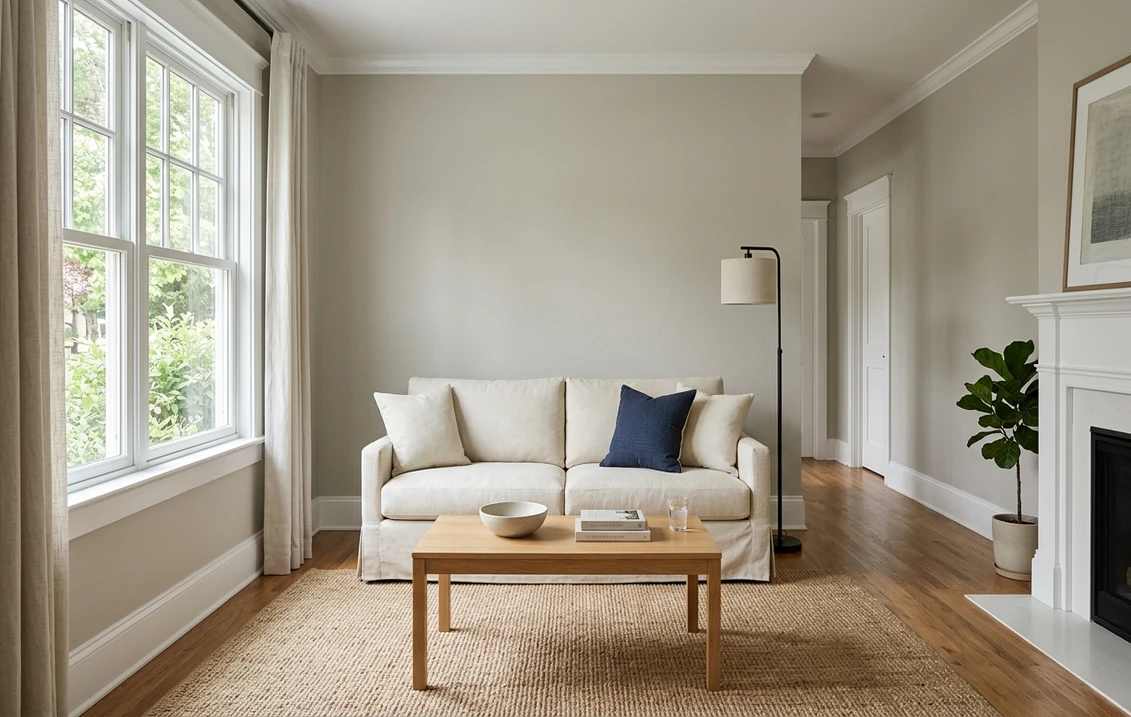
Try it on your room

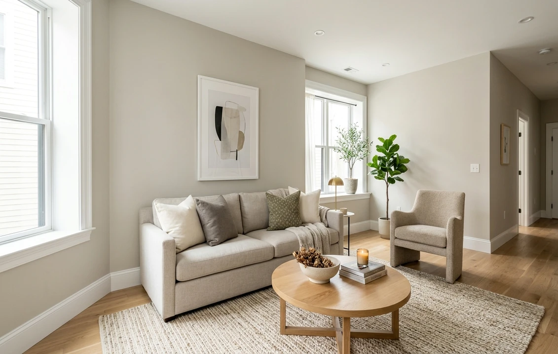
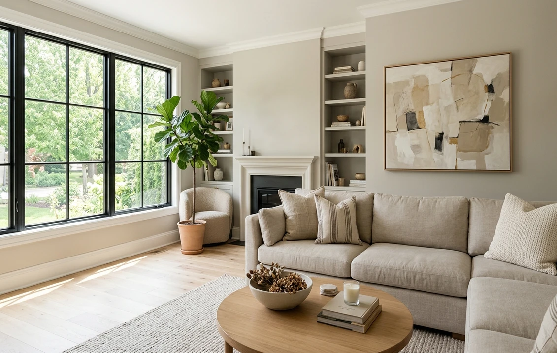
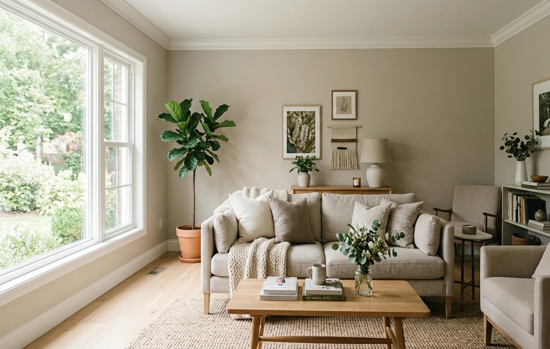
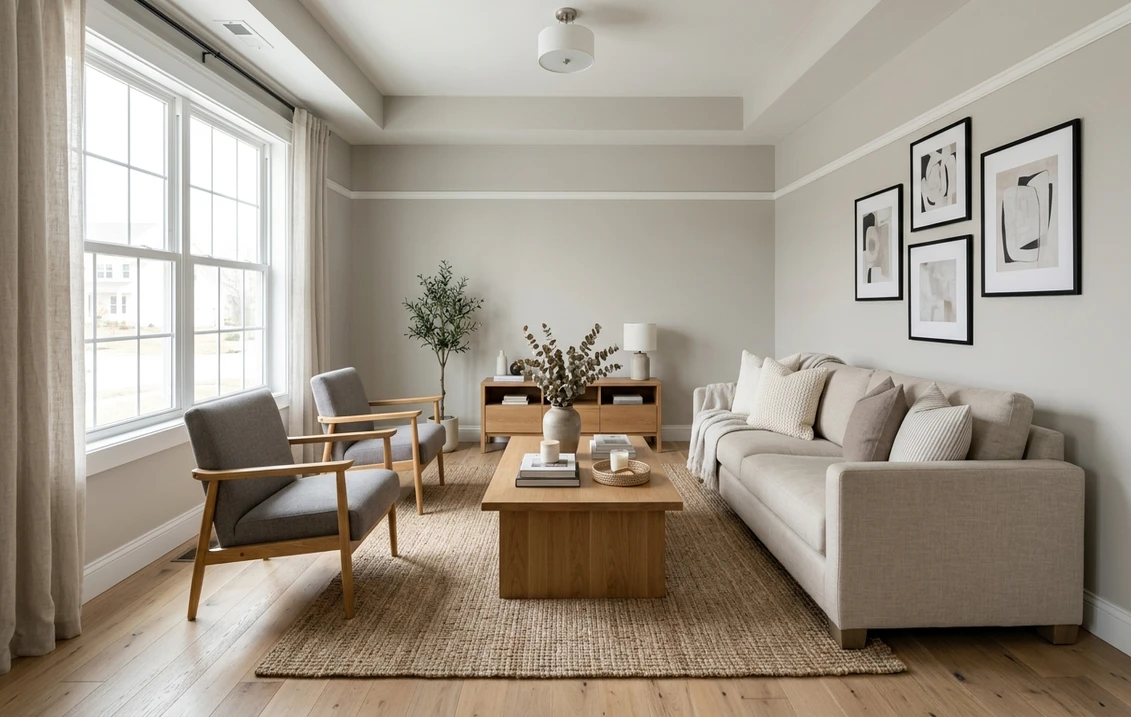
Sherwin-Williams Gossamer Veil SW 9165 is a light warm gray, the kind of color usually called a greige, and it sits closer to gray than to beige. Its color page gives an LRV of 61.829 and the hex code D3CEC4, which is RGB 211, 206, 196. That makes it about 1.4 points lighter than Agreeable Gray, about 7.3 points darker than Drift of Mist and about 4.2 points lighter than Accessible Beige. It is a current color: the Sherwin-Williams page for SW 9165 is live and carries no discontinued notice.
One limit first: the color page prints no undertone, names no rooms and labels no trim color. Every undertone reading and room suggestion below is ours, built on the published numbers and on Sherwin-Williams' general guides. This article covers interior use.
Upload a photo of your room and preview SW 9165 on the walls before you buy a sample.
What Sherwin-Williams publishes for SW 9165
The Gossamer Veil color page names the color SW 9165 and gives its light reflectance value as 61.829. The hex code is D3CEC4 and the RGB values are 211, 206 and 196. Usage is listed as interior and exterior, the color family is Neutral, and the color strip locator, the reference used to find the chip in the store display, is 238-C1.
The page lists three coordinating colors: Eider White SW 7014, African Gray SW 9162 and Anchors Aweigh SW 9179. None of them is labeled as a trim, ceiling or accent color on the page. For the wider family of interior colors we cover, start with the Sherwin-Williams interior paint colors guide.
| Figure | Value for SW 9165 | Where it comes from |
|---|---|---|
| Name and number | Gossamer Veil, SW 9165 | Sherwin-Williams color page |
| LRV | 61.829 | Sherwin-Williams color page |
| Hex code | D3CEC4 | Sherwin-Williams color page |
| RGB | 211, 206, 196 | Sherwin-Williams color page |
| Usage | Interior and exterior | Sherwin-Williams color page |
| Color family | Neutral | Sherwin-Williams color page |
| Strip locator | 238-C1 | Sherwin-Williams color page data |
| Coordinating colors | Eider White SW 7014, African Gray SW 9162, Anchors Aweigh SW 9179 | Sherwin-Williams color page |
| Hue and saturation | Hue 40 degrees, saturation about 0.07 | Our calculation from the RGB values |
| Undertone | Not printed | Our reading, see below |
Try it on your room
No photo? Try a sample
Lightness. LRV is the light reflectance value. The Wikipedia entry on light reflectance value describes it as a measure of the visible light a surface reflects when a light source shines on it, and Sherwin-Williams uses a scale from 0 (no light) to 100 (all light). At 61.829, Gossamer Veil is a light color with visible body. It reflects clearly less light than off-whites in the 70s and 80s, so it will not pass for a white on the wall. Many articles round the figure to 62; we keep the full value because the gaps with its neighbors are small.
Screens are approximate. The hex code and RGB values are a digital rendering. Use them to compare shades, and use a physical sample to judge the paint.
Is Gossamer Veil gray or beige? Reading the undertone
Because Sherwin-Williams prints no undertone, the RGB values are the most reliable clue. Gossamer Veil has its highest value in red (211), a slightly lower value in green (206) and its lowest in blue (196). A pure gray would have three equal values; here red sits 15 points above blue, a small but real lean toward warmth. On the color wheel, where 0 degrees is red and 60 degrees is yellow, that works out to a hue of 40 degrees with a saturation of about 0.07 on a scale from 0 to 1. Both figures are our calculation from the published RGB values.
In plain words: it is a gray with a little warm, slightly yellow beige mixed in. The saturation is the telling number. Accessible Beige, a color most people read as beige, has a saturation of about 0.12 on the same calculation, nearly twice as much. Gossamer Veil at 0.07 is much closer to a neutral gray. So the short answer to "gray or beige" is: a warm gray, with the gray side showing first.
Sherwin-Williams' public color data also stores a Lab reading for each color, in which one axis (a) runs from green to red and another (b) from blue to yellow. For Gossamer Veil, a is about 0.0 and b about 5.6: the color leans neither pink nor green, and all of its warmth sits on the yellow side. For comparison, the same data gives Agreeable Gray an a value of about 0.3, a touch toward red, and Repose Gray about minus 0.6, a touch toward green. Those differences are small, and how far they show on a wall is our interpretation. Read that way, Agreeable Gray is the likeliest of the three to show a faint pink-beige cast, Repose Gray the likeliest to show a faint green one, and Gossamer Veil sits between them.
Light direction: north, south, east and west
Sherwin-Williams' guide to color by room orientation does not mention Gossamer Veil. The points below apply its general rules to SW 9165. It does name two close neighbors: Worldly Gray for north-facing rooms and Repose Gray for south-facing rooms.
North-facing rooms get the least daylight, and that light is cool. The guide says to avoid cool undertones there, to choose a warm neutral or a color with warm undertones, and to look for a higher LRV. Gossamer Veil is on the right side of that advice, but only just: its warmth is slight. In a north room, expect it to read as a soft true gray, with most of the beige gone. If you want the wall to stay visibly warm in north light, a neutral with more saturation, such as Accessible Beige, holds its warmth better. In a small, dim north room, compare it with Drift of Mist, about 7 points lighter. This is our reading of the guide.
South-facing rooms get warm light that stays fairly steady through the day. The guide says most colors work there and notes that neutral tones may look warmer. This is where Gossamer Veil shows its greige side: the warm light brings the beige forward, and the low saturation keeps it from turning yellow. That is our reading.
East- and west-facing rooms change through the day. East rooms are warm in the morning and cool in the evening, and west rooms do the reverse. The guide's advice is to choose by when you use the room most, and it notes that a neutral creates a balanced feel in a bedroom used all day. A near-balanced greige suits that advice: grayer in the cool half of the day, warmer in the other.
Rooms with little daylight depend on their bulbs. The guide says to pick colors for warm lighting as you would for a south-facing room, and for white or cool lighting as you would for a north-facing room. Under warm bulbs Gossamer Veil should read as a soft greige; under cool white bulbs it should read as a plain light gray. Check a large sample board at night as well as by day, next to the finishes you are not changing: countertop, tile, carpet.
Gossamer Veil beside Agreeable Gray, Drift of Mist, Accessible Beige and Repose Gray
Warm grays are easiest to judge side by side. The table lists the LRV and hex published by Sherwin-Williams for each color. Hue and saturation are our calculation from the RGB values.
| Color | Number | LRV (Sherwin-Williams) | Hex | RGB | Hue, saturation (our calculation) |
|---|---|---|---|---|---|
| City Loft | SW 7631 | 70.468 | DFDAD1 | 223, 218, 209 | 38.6 degrees, 0.06 |
| Drift of Mist | SW 9166 | 69.14 | DCD8D0 | 220, 216, 208 | 40.0 degrees, 0.05 |
| Gossamer Veil | SW 9165 | 61.829 | D3CEC4 | 211, 206, 196 | 40.0 degrees, 0.07 |
| Agreeable Gray | SW 7029 | 60.386 | D1CBC1 | 209, 203, 193 | 37.5 degrees, 0.08 |
| Repose Gray | SW 7015 | 58.22 | CCC9C0 | 204, 201, 192 | 45.0 degrees, 0.06 |
| Accessible Beige | SW 7036 | 57.67 | D1C7B8 | 209, 199, 184 | 36.0 degrees, 0.12 |
Is Gossamer Veil lighter than Agreeable Gray? Yes, but only by about 1.4 points of LRV (61.829 against 60.386). On most walls that gap is too small to see as a lightness difference. What separates the two is temperature. Agreeable Gray has a slightly lower hue (37.5 against 40 degrees) and slightly more saturation, so it reads a touch warmer and more beige; Gossamer Veil reads a touch cooler and grayer. If Agreeable Gray looked too beige on your sample board, Gossamer Veil is the next one to try. For the other color on its own, see the Agreeable Gray undertones guide.
Gossamer Veil and Drift of Mist. These two are the closest relatives in the table. Sherwin-Williams' color data places them on the same store strip, 238-C1 for Gossamer Veil and 238-C2 for Drift of Mist, and their calculated hue is identical at 40 degrees. Drift of Mist is about 7.3 points lighter (69.14) and a little less saturated. In practice it is the same idea one step paler: closer to an off-white and better in dim rooms. Our Drift of Mist undertones guide covers it room by room.
Gossamer Veil and Accessible Beige. Accessible Beige is about 4.2 points darker (57.67) and has nearly twice the saturation, with a 25-point gap between red and blue against 15 for Gossamer Veil. That is the difference between a beige with some gray in it and a gray with some beige in it. Choose Accessible Beige when the room has warm fixed finishes, such as honey oak, cream tile or tan carpet, and Gossamer Veil when the finishes are cooler or mixed. The Accessible Beige undertones guide goes deeper on that color.
Gossamer Veil and Repose Gray. Repose Gray is about 3.6 points darker (58.22), with a higher hue of 45 degrees and a similar low saturation. It is the grayer choice of the two. Read the Repose Gray undertones guide if you want the wall to stay gray in warm sun.
Gossamer Veil and City Loft. City Loft is about 8.6 points lighter (70.468), and Sherwin-Williams files it under White & Pastel instead of Neutral. It is the alternative when Gossamer Veil feels too dark. See the City Loft undertones guide.
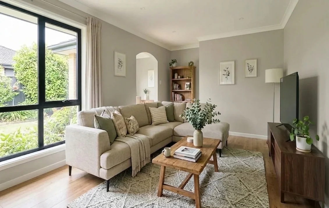
Best rooms for Gossamer Veil, by light
Sherwin-Williams does not name rooms for SW 9165. The suggestions below come from the light rules above. They are our reading, not a list from the manufacturer.
- Open-plan living areas. A greige with a red-green balance near zero is easy to run through a kitchen, dining area and living room that each get different light, because it has no strong lean to exaggerate.
- South- and west-facing living rooms. Warm light brings out the beige side and the LRV of 61.829 gives the wall enough body not to glare.
- Bedrooms with east or west light. The guide's point about neutrals in rooms used all day fits a quiet warm gray. Under warm bedside lamps it should read soft and slightly beige.
- Hallways and stairwells with some daylight. It is light enough to keep a corridor open while hiding scuffs better than an off-white. In a windowless hall, test the sample under the bulbs first, or step up to Drift of Mist.
Where it is a weaker fit: a small north-facing room where you want warmth, and a room full of yellow-cream finishes. If you are still deciding between the gray and beige families, the greige paint colors guide explains how the in-between shades behave.
Trim, ceiling and coordinating colors
The color page labels no trim or ceiling color for SW 9165, but each of its coordinating colors has a published LRV. The roles below are our suggestions.
| Color | LRV (Sherwin-Williams) | Hex | Possible role next to Gossamer Veil (our suggestion) |
|---|---|---|---|
| Extra White SW 7006 | 85.861 | EEEFEA | Brightest, crispest trim; cooler than the wall |
| Pure White SW 7005 | 83.957 | EDECE6 | Clean trim and ceiling with a slight softness |
| Alabaster SW 7008 | 82.215 | EDEAE0 | Warmer, creamier trim; test it, it can look yellow beside a gray-leaning wall |
| Eider White SW 7014 (coordinating) | 73.219 | E2DED8 | Tone-on-tone trim, ceiling or adjoining room |
| African Gray SW 9162 (coordinating) | 30.984 | 939899 | Cool mid-gray for an island, vanity or built-in |
| Anchors Aweigh SW 9179 (coordinating) | 3.384 | 2B3441 | Near-black navy for an accent wall, interior door or lower cabinets |
A trim color with a higher LRV than the wall gives a crisper edge. Pure White sits about 22.1 points above Gossamer Veil and Extra White about 24.0, plenty for a clear outline on baseboards and casings. Eider White is only about 11.4 points above, so the edge is soft and tone-on-tone. In the color data behind the page, Eider White is the one of the three coordinates stored as the white. The gaps are our subtraction. The Eider White undertones guide and the Pure White undertones guide cover the two most likely trim candidates.
The two darker coordinates both sit on the cool side. African Gray's RGB values put blue slightly above red, and Anchors Aweigh is a very dark navy with an LRV of 3.384. A warm gray paired by its maker with a cool gray and a navy is, in our reading, neutral enough to carry cool accents such as blue-gray upholstery or black metal.
Gossamer Veil on kitchen cabinets
Cabinets come up often in searches around this color, and the numbers suggest why. At an LRV near 62 it is visibly a color against a white countertop or a white backsplash, yet it stays light enough for a kitchen with modest daylight. Its slight warmth should suit both cool surfaces (white quartz, stainless steel) and warmer ones (butcher block, brass). Those pairing notes are ours.
Three combinations to preview: Gossamer Veil cabinets with Pure White walls; Gossamer Veil uppers with African Gray or Anchors Aweigh on the island or the lowers; or white cabinets with Gossamer Veil walls, where the 22-point LRV gap keeps the cabinets bright.
Wall paint is not the right product for cabinet doors. Sherwin-Williams' Emerald family page lists Emerald Urethane Trim Enamel "for windows, doors, trim and cabinets", and the color can be tinted into it. For a full cabinet walk-through on a neighboring neutral, see our guide to Accessible Beige kitchen cabinets.
Upload a photo of your kitchen and recolor the cabinets while the counters and backsplash stay as they are.
Sheen: which finish to pick
The color page does not name a sheen. The Sherwin-Williams paint sheen guide describes sheens by room, not by color. It suggests eggshell or satin for bedrooms and living rooms, flat for ceilings, and satin or semi-gloss for bathrooms, and it puts trim, doors and cabinets at the glossier end of the range, from satin up to high gloss. It notes that flat is prone to scuffs and stains, that satin and eggshell are easily washable, and that semi-gloss is easy to clean and suited to moisture-prone areas.
Paint line and ventilation
Gossamer Veil is a color, not a product, so it can be tinted into the brand's different interior lines. The Emerald family page lists Emerald Interior Acrylic Latex and Emerald Symmetry for walls, and Sherwin-Williams states there that Emerald typically offers improved coverage and enhanced stain resistance compared with Duration Home. That is the manufacturer's own comparison, not an independent test. Read the coverage and recoat figures on the data sheet of the exact line and sheen you buy. The Cashmere interior paint review covers one alternative line.
Whatever the shade, ventilate. The U.S. Environmental Protection Agency states that paints, varnishes and wax all contain organic solvents, and advises increasing ventilation and providing plenty of fresh air when using products that emit volatile organic compounds (VOCs).
Preview Gossamer Veil in your own room
A published LRV and a hex code tell you how light a color is and roughly how it looks on a screen. They do not show how it sits next to your floor, your sofa or your window light, and with a greige that context decides whether you see gray or beige. Upload a photo of your room and the visualizer shows SW 9165 on the walls, using the same hex code as this article, so you can compare it with Agreeable Gray or Drift of Mist in the same photo before you order samples. The interior paint visualizer works the same way for any of the colors compared above.
Sources and references
- Sherwin-Williams, Gossamer Veil SW 9165 color page (LRV 61.829, hex D3CEC4, RGB 211, 206, 196, usage, Neutral family, strip locator 238-C1, coordinating colors, active status): sherwin-williams.com. Read on November 12, 2026, and cross-checked against Sherwin-Williams' public color data (same figures, plus the Lab values).
- Sherwin-Williams color pages: Agreeable Gray SW 7029 (LRV 60.386), Drift of Mist SW 9166 (69.14, strip 238-C2), Accessible Beige SW 7036 (57.67)
- Sherwin-Williams color data for Repose Gray SW 7015 (LRV 58.22), City Loft SW 7631 (70.468), Pure White SW 7005 (83.957), Extra White SW 7006 (85.861) and Alabaster SW 7008 (82.215), and color pages for the coordinating colors: Eider White (73.219), African Gray (30.984), Anchors Aweigh (3.384)
- Sherwin-Williams, guide to color by room orientation (north, south, east and west light, artificial light, LRV advice, Worldly Gray and Repose Gray named): sherwin-williams.com
- Sherwin-Williams, paint sheen guide (sheens by room, cleaning notes): sherwin-williams.com
- Sherwin-Williams, Emerald family page (interior products, Urethane Trim Enamel for cabinets, manufacturer comparisons with Duration Home and SuperPaint): sherwin-williams.com
- U.S. Environmental Protection Agency, Volatile Organic Compounds' Impact on Indoor Air Quality (VOC sources, ventilation advice): epa.gov
- Wikipedia, Light reflectance value (definition of LRV only, secondary support): en.wikipedia.org
Frequently asked questions
Is Gossamer Veil gray or beige?
What is the LRV of Sherwin-Williams Gossamer Veil SW 9165?
Is Gossamer Veil lighter than Agreeable Gray?
What colors go well with Gossamer Veil?
Has Sherwin-Williams discontinued Gossamer Veil?
Is Gossamer Veil a good color for kitchen cabinets?
Does Gossamer Veil work in a north-facing room?
Trademarks mentioned (Sherwin-Williams, Benjamin Moore, Behr, Caparol, Brillux, Sto, Alpina, Valspar, PPG, Glidden, Dulux, Crown Trade, Sandtex, Farrow & Ball, Johnstone's, Leyland) are property of their respective owners. FacadeColorizer is independent and not affiliated with any of them. Nominative fair use under Lanham Act §1125.