Try it on your room

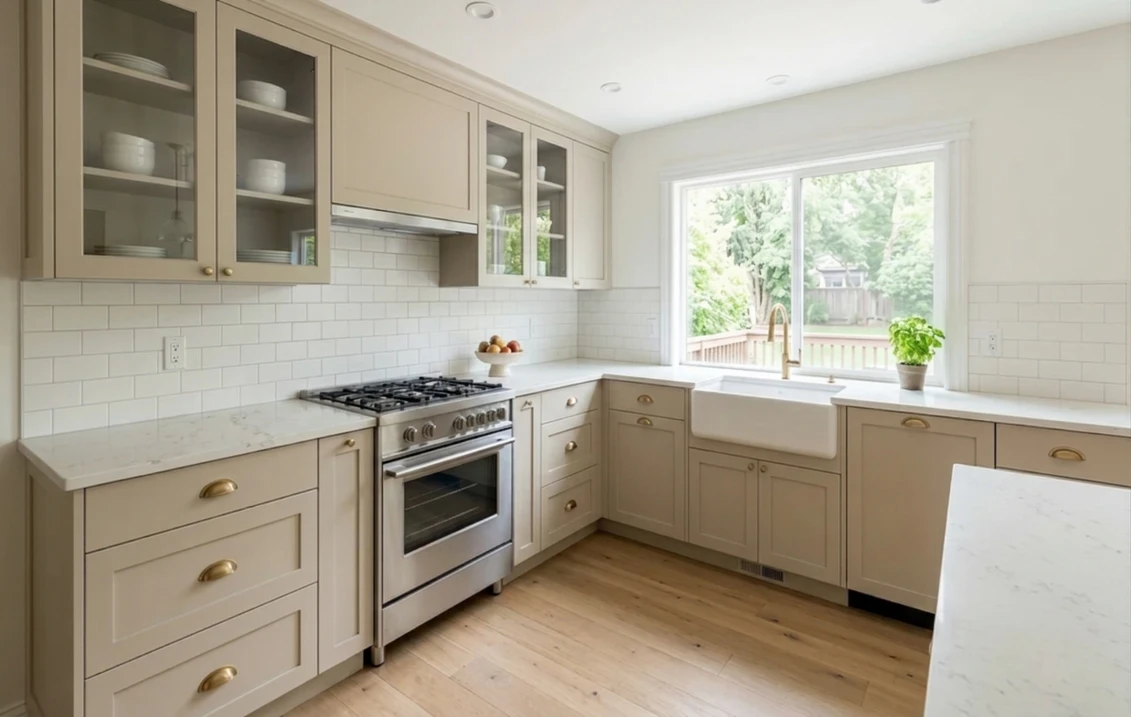
Sherwin-Williams Accessible Beige SW 7036 works on kitchen cabinets as a soft, grayed beige, provided the kitchen has enough light and you accept that it is a mid-light neutral and not a white. Its LRV is 57.67, so the doors reflect about 30% less light than Alabaster doors would (our calculation). It sits most easily beside warm white or wood surfaces, and it can look yellower next to a cool, bright white. For the paint, Sherwin-Williams' cabinet instructions name Emerald Urethane Trim Enamel over Extreme Bond Primer. SnapDry, its fast door and trim paint, is not presented for cabinets on its page or data sheet.
How this page works: color values, product figures and instructions were read on Sherwin-Williams' pages, data sheets and public color data on November 1, 2026. Calculations are ours and labeled as such. No paint was applied for this page and no durability test is claimed. For this color on walls, see our Accessible Beige undertones and best rooms guide; for siding, the Accessible Beige exterior guide.
Opens the interior tool with Accessible Beige and "Cabinets" preselected. How it works: our interior paint visualizer.
Is Accessible Beige a greige? What the numbers say
Everyone calls Accessible Beige a greige, yet the Sherwin-Williams color data uses no such label. It files the color under Neutral, tags it "Diluted, Wan, Pale", and gives an LRV of 57.67. The same data carries CIELAB values for the on-screen color, and those can test the claim. In CIELAB, a* runs from green to red and b* from blue to yellow. The values describe a digital color, not a measured paint film, so use them to rank these neutrals and nothing finer.
| Color | LRV | Gap to Accessible Beige (our calculation) | a* (pink side if higher) | b* (yellow side if higher) |
|---|---|---|---|---|
| Repose Gray SW 7015 | 58.22 | +0.55 | −0.56 | 4.85 |
| Agreeable Gray SW 7029 | 60.386 | +2.72 | 0.33 | 5.71 |
| Worldly Gray SW 7043 | 57.238 | −0.43 | 0.88 | 6.49 |
| Realist Beige SW 6078 | 58.973 | +1.30 | 1.95 | 6.85 |
| Accessible Beige SW 7036 | 57.67 | 0 | 0.93 | 8.74 |
| Natural Linen SW 9109 | 66.329 | +8.66 | 1.46 | 9.39 |
| Balanced Beige SW 7037 | 45.6 | −12.07 | 2.30 | 9.97 |
| Kilim Beige SW 6106 | 57.191 | −0.48 | 2.61 | 13.82 |
| Softer Tan SW 6141 | 60.204 | +2.53 | 1.70 | 13.99 |
Try it on your room
No photo? Try a sample
So the nickname holds up. Worldly Gray, Accessible Beige and Kilim Beige have nearly the same lightness, which isolates color from depth. Accessible Beige carries more yellow than the grays (b* 8.74 against 4.85 to 6.49) and well under the two frank beiges at about 14. Its a* of 0.93 is close to Worldly Gray's, which suggests little pink push compared with Kilim Beige. In practice: on a door it should read as beige first, and it takes a cooler neighbor to show you the yellow side.
The other number that matters is the drop from white. LRV runs from 0 to 100, zero reflecting no light and 100 reflecting all of it. Moving from Alabaster (82.215) to Accessible Beige (57.67) removes about 30% of the light the door faces return to the room (our calculation: 57.67 divided by 82.215). A dim kitchen will feel that loss first.
How Accessible Beige cabinets change with the light
Sherwin-Williams' guide to color by room direction does not mention this color, but it lists Worldly Gray, its near twin in lightness, among its north-facing picks. Its advice there is to avoid cool undertones and look at higher LRVs. In south-facing rooms, it says neutral colors may seem warmer. For west-facing rooms, Benjamin Moore's UK site speaks of muted, late afternoon sunlight in its guide to how light affects color. Bulbs add a second layer: the ENERGY STAR bulb guide says a lower Kelvin number means warmer, yellowish light and a higher one cooler, bluer light. Our reading for doors, not a measurement:
| Kitchen light | What to expect on the doors | What to check |
|---|---|---|
| North window | The warm side helps against the cool light, but an LRV under 60 gives less back in the room's darkest hours | Lower doors on an overcast afternoon |
| South window | Warmer, closer to a plain beige, sometimes pleasantly so | Midday, on the doors the sun reaches |
| East window | Warm in the morning, cooler and grayer toward evening | Breakfast and dinner hours |
| West window | Soft late-afternoon sun, which we expect to warm the door for a few hours | Late afternoon, against the counter |
| Low-Kelvin under-cabinet LEDs | Yellowish light on door faces, which may push the beige toward tan | After dark, every kitchen light on |
| High-Kelvin LEDs | Bluer light that can bring out the gray | After dark, beside wood or a warm counter |
Cabinets add a position problem that walls do not have. Lower doors sit in the shadow of a counter overhang, upper doors sit beside a light source, and a blind corner may never see the window, so a run of lower cabinets can look noticeably darker than the chip.
Accessible Beige with countertops and backsplash
The counter and tile usually stay, so they set the reference. No number on this page compares a counter with a door, because the comparison depends on the actual slab. What follows is color reasoning, to be checked with real samples.
| Staying in the kitchen | Likely effect on the doors | Our suggestion |
|---|---|---|
| Warm white quartz or off-white tile | A clear step in lightness with no argument about temperature | The easiest light pairing; confirm the white really is warm |
| Bright cool white quartz or glossy white tile | The door can look yellower and heavier beside a much cleaner white | Compare with Agreeable Gray, which has less yellow on the b* scale |
| White stone with cool gray veins | The warm-versus-cool difference shows where door meets counter | Test against the slab or a large offcut, not a small chip |
| Beige granite, tan tile or beige laminate | Similar lightness and warmth: surfaces can merge into one flat tone | Look for a real step in depth; if there is none, consider a lighter or darker door |
| Butcher block or oak | Wood brings the warmth, so the door tends to read grayer by contrast | Check that orange-toned wood does not make the door look dull |
| Black granite, soapstone or stainless | Strong contrast, little competition | Usually the simplest case; check under the kitchen's LEDs |
Replacing the tile too? Our white kitchen backsplash guide compares the options.
Check Accessible Beige against your own counter
Upload a photo of your kitchen: the doors change, the counter and tile stay put. Then run Agreeable Gray or Alabaster on the same photo. A preview shows color, not sheen.
Try Accessible Beige on my kitchen photoWalls, trim and island colors for Accessible Beige cabinets
Sherwin-Williams' color data links three colors to Accessible Beige: Sanderling, Cadet and Aesthetic White. The others below are our suggestions. Every LRV comes from the same data, and the gaps are our subtraction. A door this mid-toned needs a real gap from the wall if you want it to stand out.
| Partner color | LRV | Gap to the door | Origin | Use |
|---|---|---|---|---|
| Extra White SW 7006 | 85.861 | 28.19 | Our suggestion | Crisp trim or ceiling; its low b* (2.28) will show the door's warmth |
| Alabaster SW 7008 | 82.215 | 24.55 | Our suggestion | Soft walls or trim, a warmer contrast |
| Aesthetic White SW 7035 | 73.097 | 15.43 | Sherwin-Williams | Quiet walls, doors still clearly darker |
| Agreeable Gray SW 7029 | 60.386 | 2.72 | Our suggestion | Walls only if you want cabinets to melt into the room |
| Sanderling SW 7513 | 31.376 | 26.29 | Sherwin-Williams | Tonal island, warm and deeper |
| Cadet SW 9143 | 31.218 | 26.45 | Sherwin-Williams | Island with a cool answer (b* −2.57) to the warm doors |
| Urbane Bronze SW 7048 | 8.121 | 49.55 | Our suggestion | Dark island or lower run |
Accessible Beige on both doors and walls is a legitimate choice, but then only sheen and shadow separate them, and the room loses the bright surface it would otherwise rely on. If you take that route, keep the trim and ceiling white. Deep islands are covered in our guide to two-tone kitchen cabinets, and every other color family in our complete guide to kitchen cabinet colors.
Which Sherwin-Williams paint for the doors
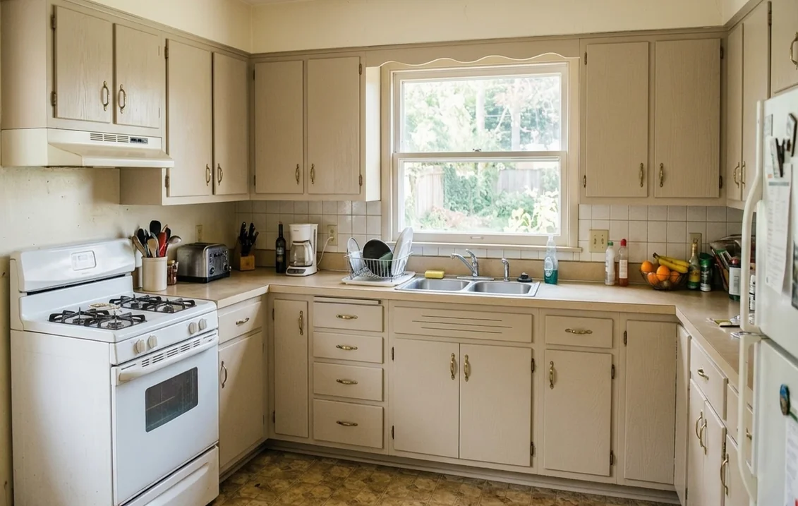
Sherwin-Williams' five-step cabinet project page specifies Emerald Urethane Trim Enamel in gloss, semi-gloss or satin. Its Cabinet Refinishing guide (2019) calls that enamel "the best choice for the most durable results", and it lists two ProClassic enamels alongside it, the waterborne acrylic being "a good choice for cabinetry in an area with low traffic". Check that any ProClassic version is still offered, since the guide is several years old. Figures below come from the Emerald Urethane Satin, Semi-Gloss and Gloss data sheets and the SnapDry Semi-Gloss sheet:
| Spec | Emerald Urethane Trim Enamel | SnapDry Door & Trim |
|---|---|---|
| Resin | Urethane modified alkyd, waterbased | Acrylic latex |
| Named uses | Product page: cabinets, doors, trim | Sheet: doors, trim, windows, shutters; no cabinets |
| Gloss at 60° | Satin 35 to 45; Semi-Gloss 60 to 70; Gloss 65+ | Semi-Gloss 45 to 55 |
| Coverage per gallon | 350 to 400 sq ft at 4 mils wet | 350 to 400 sq ft at 4 mils wet |
| Touch / recoat (77°F, 50% RH) | 1 h / 4 h (Gloss: 2 h / 4 h) | 1 h / 2 h |
| Published cure time for the paint | None on the sheets | None on the sheet |
| Price on the maker's site, Nov 1, 2026 | Not shown without signing in | Not shown without signing in (Oct 28) |
Why not SnapDry? It is allowed indoors: its product page says it can be used inside and out. But neither that page nor the data sheet presents it for cabinets, and the cabinet guide leaves it out. Its selling point is closing a door the same day, which matters little for doors you have taken off and laid flat. Our SnapDry vs Emerald Urethane comparison sets out where it does make sense. That reflects what Sherwin-Williams presents, not a failed test.
Satin or semi-gloss. The names mislead here too: Emerald Urethane Satin measures 35 to 45 units, shinier than some paints sold as satin. Sherwin-Williams' gloss and sheen guide warns that glossy finishes can look lighter or slightly mottled on a rough or uneven surface, and matte colors can look darker at an angle or in low light. For a mid-tone door, we would start with satin, because it already gives a noticeable shine and forgives more of the prep. Our guide to semi-gloss paint for kitchen cabinets explains the trade-off, and the Benjamin Moore Advance cabinet paint review sets Emerald Urethane against its main rival.
On yellowing, the Emerald Urethane product page says only that it resists yellowing compared with traditional oil-based coatings; no measurement is published. If you are still choosing a product line, our best paint for kitchen cabinets guide compares brands.
Primers under Accessible Beige
The Emerald Urethane sheets say that when repainting involves a drastic color change, such as dark stain to pale beige, a coat of primer improves hiding, and that the recommended P-Shade primer optimizes hide and color development. Ask the store which shade goes with SW 7036. The substrate decides the rest:
- Laminate or previously painted wood. The Cabinet Refinishing guide names Extreme Bond Primer, a tintable bonding primer designed for hard, glossy surfaces.
- Unfinished wood. The guide and the data sheets name Premium Wall & Wood Primer.
- Varnished oak. On its cabinet painting article, Sherwin-Williams replies to readers that Extreme Bond is recommended for varnished oak, and that more primer coats with sanding between them can help with grain. Tannin stains that persist on interior wood take a spot coat of ProBlock Quick Dry Oil-Based Primer, per the data sheet.
To sand or not. Sherwin-Williams does not speak with one voice here. The project page says sanding may not be necessary for most clean, paintable surfaces; a staff reply on its blog says finished cabinets will need aggressive sanding; the guide says to test a small area with primer after washing; and the Emerald Urethane data sheet says glossy surfaces should be sanded dull. Our reading: degrease, run the guide's adhesion test, and sand anything still glossy.
Oak deserves a separate decision, because its grain can show through the film unless it is filled. Our painted oak cabinets guide sets out both versions, and the step-by-step cabinet painting guide gives the full sequence. If the home was built before 1978, sanding may also release lead dust, as the data sheets warn. The EPA's lead-safe renovation guidance for DIYers covers how to contain it.
Drying, curing and what a factory finish has that you will not
Three Sherwin-Williams documents give three timelines, each answering a different question:
| Document | What it says | What it is for |
|---|---|---|
| Data sheet | Touch 1 hour, recoat 4 hours, at 77°F and 50% humidity | The minimum in good conditions |
| Pro Cabinet Refinishing guide | At least 24 hours after the last coat before reassembly, "the longer the better" | Avoiding dents and peeling at rehang |
| Homeowner project page | 24 hours after primer, then 24 to 48 hours after each coat | A cautious DIY pace: 3 to 5 days in all (our sum), one face at a time |
None of them states a time to full hardness for this paint, so we will not offer one. Treat fresh doors gently for the first weeks. Coverage is the other planning number. Our worked example in the Advance review comes to about 175 sq ft per coat for a typical kitchen; at 350 to 400 sq ft per gallon, two coats take 0.9 to 1 gallon (our calculation). That leaves nothing spare, so add a quart. The sheet also advises touching up with the same batch and application method as the original, so keep the leftovers.
Expectations and KCMA. The Kitchen Cabinet Manufacturers Association says that before a cabinet design can carry its A161.1 certification seal, its structure, drawers, doors and finish are tested. The finish is exposed for 24 hours to liquids such as vinegar, grape juice, coffee and alcohol. That certifies a manufactured cabinet, so as we read it a repaint in your garage is not covered, whatever the paint. We found no comparable chemical-exposure figure for Emerald Urethane. If you are buying new doors factory-finished in this color, as some online sellers offer, ask whether the maker holds the seal; KCMA's FAQ explains what certification means.
How to test Accessible Beige before you sand anything
- Preview it on a photo. Take a daylight photo showing doors, counter and backsplash together, and run Accessible Beige against one lighter and one grayer alternative. The cabinets option also recolors freestanding furniture, so ignore a stool that changes.
- Get real samples. Sherwin-Williams' paint color samples page offers free color chips, peel and stick samples, and Color To Go, a tinted sample you apply like regular paint. It states no sheen for any of them, so do not assume a sample shows the shine of the door.
- Paint a board, not the door. A board moves around the room, and two coats give the truer color.
- Hold it where it will live. Stand it against the counter and backsplash, under an upper cabinet and in the darkest corner, beside a sample of the rival color, through a full day and after dark.
When another color is the better call
- It looks too yellow beside your counter. Agreeable Gray has less yellow by the numbers above. See Agreeable Gray vs Accessible Beige.
- You like the warmth but need more light. Natural Linen is 8.66 LRV points lighter; see Natural Linen vs Accessible Beige. Or step up to a warm white: Alabaster on kitchen cabinets.
- You want a frank beige, not a grayed one. Kilim Beige has the same depth with far more yellow; see Accessible Beige vs Kilim Beige and our roundup of cream and beige cabinet colors.
- You buy Benjamin Moore. See the closest Benjamin Moore match to Accessible Beige, or our guide to White Dove on kitchen cabinets if you are leaning back toward an off-white.
Settle the color before you take the doors off
Compare the alternatives on a photo of your kitchen first.
Preview Accessible Beige on my cabinetsSources and references
- Sherwin-Williams, public color data: LRV, CIELAB values, family and tags, linked colors. Accessible Beige color page.
- Sherwin-Williams, How to Paint Kitchen Cabinets in 5 Steps and Cabinet Refinishing: A Complete Guide (2019): products, primers, sequence, dry times.
- Sherwin-Williams, data sheets for Emerald Urethane Trim Enamel Satin K37, Semi-Gloss K38 and Gloss K39, and SnapDry Semi-Gloss A71: specs, primers, prep.
- Sherwin-Williams, product pages for Emerald Urethane Trim Enamel, SnapDry and Extreme Bond Primer: named uses and claims.
- Sherwin-Williams, Tips and Tricks for How to Paint Kitchen Cabinets: staff replies on oak and sanding. Color by room direction, gloss and sheen guide and color samples.
- Kitchen Cabinet Manufacturers Association, A161.1 Quality Cabinet Certification, ROI of Cabinet Durability and certification FAQs: what is tested.
- Benjamin Moore UK, How light affects colour: west light.
- ENERGY STAR (U.S. EPA and DOE), Light Bulb Purchasing Guide: Kelvin scale.
- U.S. EPA, Lead-safe renovations for DIYers.
Frequently asked questions
Is Accessible Beige good for kitchen cabinets?
What is the LRV of Accessible Beige?
Does Accessible Beige look yellow or pink on cabinets?
What paint should I use for Accessible Beige cabinets?
Can I use SnapDry on kitchen cabinets?
What primer goes under Accessible Beige cabinets?
What colors go with Accessible Beige cabinets?
Trademarks mentioned (Sherwin-Williams, Benjamin Moore, Behr, Caparol, Brillux, Sto, Alpina, Valspar, PPG, Glidden, Dulux, Crown Trade, Sandtex, Farrow & Ball, Johnstone's, Leyland) are property of their respective owners. FacadeColorizer is independent and not affiliated with any of them. Nominative fair use under Lanham Act §1125.