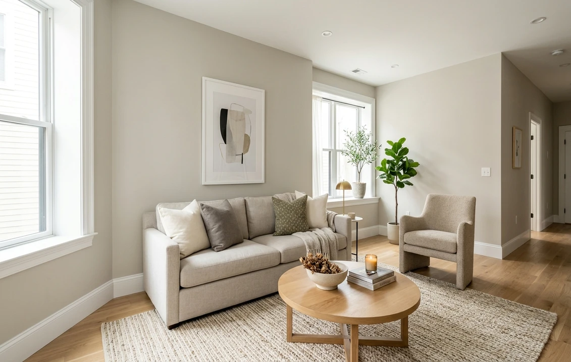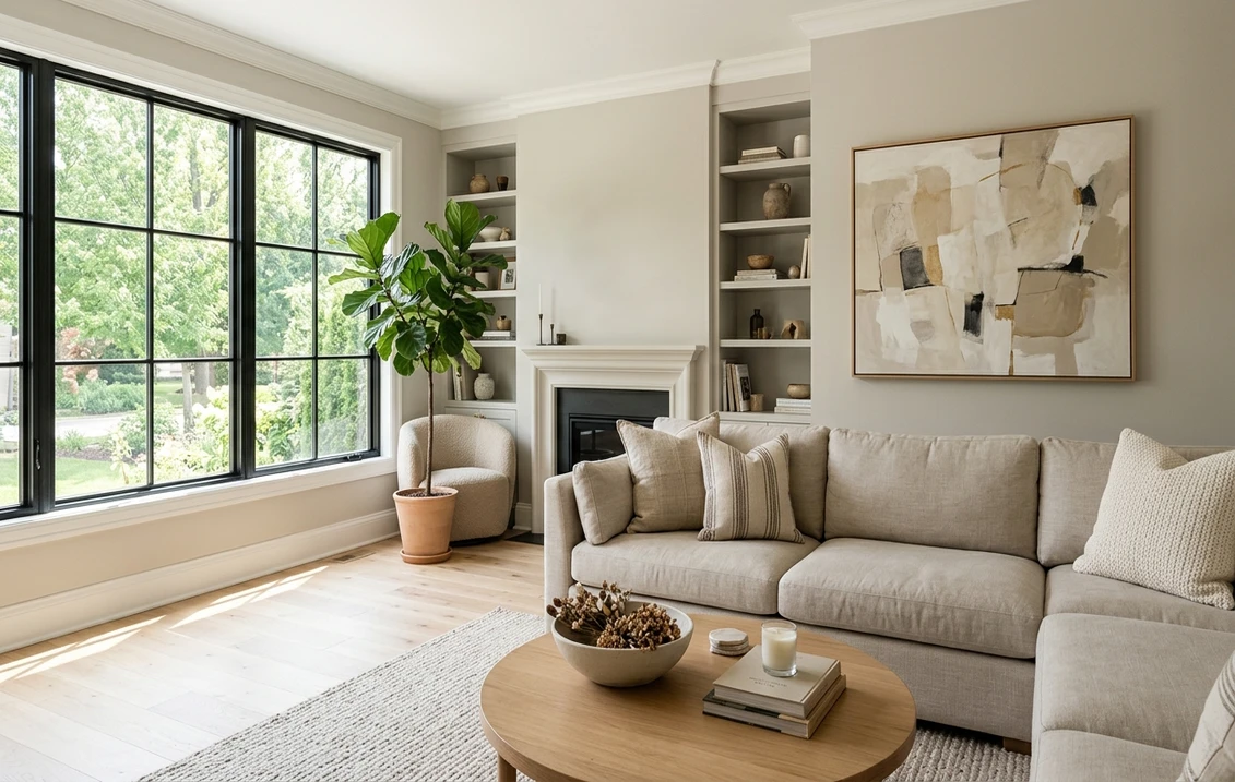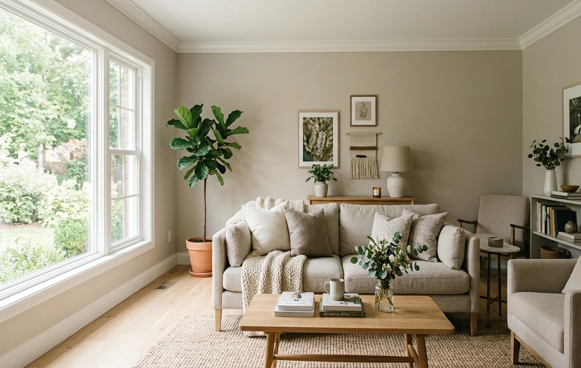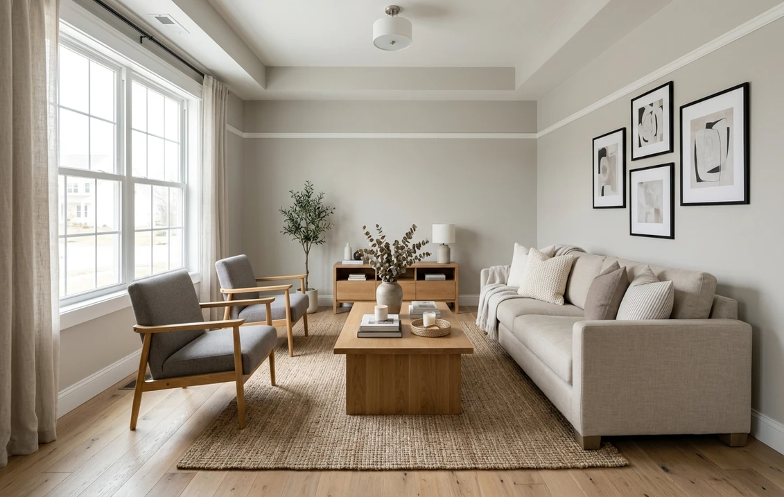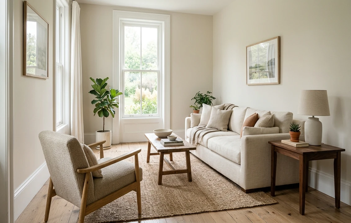
Try it on your room

Sherwin-Williams Aesthetic White (SW 7035) is a soft, warm off-white with a faint greige cast: Sherwin-Williams publishes an LRV of 73.097, an RGB of 227, 221, 211 (hex #E3DDD3) and rates it for interior and exterior use. It is not a bright white. It sits about ten LRV points below the crisp trim whites and reads as a gentle, slightly creamy neutral on walls, with no pink and no green in its numbers. Its closest Sherwin-Williams twin is Shoji White SW 7042, and Sherwin-Williams lists it as the coordinating white for Accessible Beige SW 7036, which is how many people first meet it.
LRV and RGB values below come from each maker's own color page or color data; undertone and color-difference figures computed from them are our calculations and are labeled as such.
The link opens the interior tool with Aesthetic White and "Walls" preselected. How it works: our interior paint visualizer.
Aesthetic White at a glance: the numbers Sherwin-Williams publishes
These values come from the maker's color page (Sherwin-Williams, SW 7035 Aesthetic White). Hex and RGB describe how the color is drawn on a screen, not a tinting formula, so treat them as an approximate digital rendering and decide on a physical sample.
| Attribute | Aesthetic White SW 7035 |
|---|---|
| LRV | 73.097 (Sherwin-Williams rates it "light") |
| RGB | 227, 221, 211 |
| Hex (screen approximation) | #E3DDD3 |
| Hue and saturation on the page | Hue 37.5, saturation 0.07 |
| Family on the page | Designer Color Collection, White & Pastel |
| Use | Interior and exterior |
| Color strip location | 259-C4 |
| Coordinating colors listed by Sherwin-Williams | Pure White SW 7005, Chelsea Gray SW 2850, Aquaverde SW 9051 |
Try it on your room
No photo? Try a sample
Sherwin-Williams also lists Aesthetic White as a coordinating color on the page of Accessible Beige SW 7036, and its color data uses it as the paired white for the whole Accessible Beige strip, down to Tony Taupe and Van Dyke Brown. That is the most useful way to think about it: a white chosen to sit beside warm beige and greige, not to compete with a bright trim.
What an LRV of 73 means on a wall
Light Reflectance Value runs from 0 (black) to 100 (a perfect white). At 73.1, Aesthetic White reflects nearly three quarters of the light that hits it: light enough to keep a room bright, soft enough that it never looks like primer. For scale, Alabaster SW 7008 is 82.215 and Pure White SW 7005 is 83.957 on their Sherwin-Williams pages, while Agreeable Gray SW 7029 is 60.386. Our guide to LRV and how to use it when comparing paint explains the scale.
The practical result: next to a bright white trim, Aesthetic White walls look clearly off-white, a 10 to 11 point gap that reads as a soft frame around the doors and windows rather than a stark outline. Painted on the trim too, it gives a low-contrast, enveloping room.
The undertone: warm and slightly greige, not pink, not yellow-cream
The published RGB explains its character: red (227) leads, green (221) is six points behind and blue (211) trails red by 16. A white whose blue trails red reads warm; with green close to red, the warmth leans toward a soft beige rather than toward pink. Sherwin-Williams' color data gives Lab values of L 88.33, a +0.32, b +5.61: an a value close to zero means no pink or green cast at all, and a b value of about 5.6 means a gentle warmth that stops well short of cream.
Compared with its neighbors on the same calculation (red minus blue, our figures): Pure White trails by only 7 points, Alabaster by 13, Aesthetic White by 16, Shoji White by 19 and Accessible Beige by 25. Aesthetic White therefore sits between the classic warm white and the light greiges, which is exactly how it behaves on a wall: in bright light it reads as a warm white, in low light as a pale greige.
What people describe as pink or yellow on their walls usually comes from the surroundings. Next to honey oak floors and warm bulbs it can drift creamier; next to green foliage outside a window it can look faintly gray-green; beside cool white kitchen cabinets it looks noticeably beige. The numbers themselves show no pink.
How Aesthetic White reads by room orientation
Sherwin-Williams' guidance on choosing color by room orientation points north-facing rooms to colors with a higher LRV and warm rather than cool undertones, says most colors work in south light, and notes that east and west rooms swing between warm and cool with the time of day. Our guide to choosing paint colors by room orientation covers the method. Applied to Aesthetic White:
- North-facing rooms. A good match on both counts: warm undertone, LRV above 70. Expect it to look a shade grayer than the chip, never cold.
- South-facing rooms. It reads as a clean warm white for most of the day; in late afternoon sun it can look slightly creamy.
- East and west rooms. Warmer when the sun is on that side, a soft pale greige the rest of the day.
- Rooms with little daylight. Under 2,700K bulbs it reads warm and cozy; under 4,000K bulbs it looks closer to a neutral off-white.
Strip 259: Aesthetic White and its neighbors
Aesthetic White sits in the middle of an unusual strip: instead of stepping from light to dark, its seven colors stay between LRV 69 and 76 and change mostly in hue. That makes it a strip of whites and off-whites to choose between, not a depth ladder. Values from Sherwin-Williams' color data:
| Location | Color | LRV |
|---|---|---|
| 259-C1 | Heron Plume SW 6070 | 75.37 |
| 259-C2 | Zurich White SW 7626 | 75.85 |
| 259-C3 | Origami White SW 7636 | 76.00 |
| 259-C4 | Aesthetic White SW 7035 | 73.097 |
| 259-C5 | White Heron SW 7627 | 76.04 |
| 259-C6 | City Loft SW 7631 | 70.47 |
| 259-C7 | Windfresh White SW 7628 | 69.19 |
Two neighbors have their own guides: Heron Plume SW 6070, a touch lighter and softer, and City Loft SW 7631, a little deeper and more clearly greige.
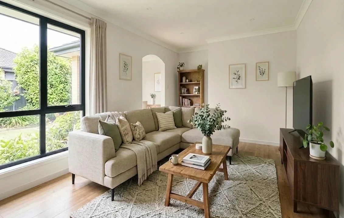
Aesthetic White vs Shoji White, Alabaster, Accessible Beige and Agreeable Gray
LRVs and strips come from Sherwin-Williams; the color difference (ΔE2000) is our calculation from the published values, where under about 2 is hard to tell apart on a wall and above 5 is clearly a different color.
| Color | LRV | LRV gap | ΔE2000 (our calculation) | How it differs |
|---|---|---|---|---|
| Aesthetic White SW 7035 | 73.097 | 0 | 0 | Soft warm off-white |
| Shoji White SW 7042 | 74.345 | +1.25 | 1.0 | Near twin, a hair warmer and more beige |
| Alabaster SW 7008 | 82.215 | +9.12 | 3.1 | Clearly lighter, a classic warm white |
| Pure White SW 7005 | 83.957 | +10.86 | 4.1 | The coordinating trim white, brighter and more neutral |
| Agreeable Gray SW 7029 | 60.386 | −12.71 | 4.2 | A real light greige, grayer and deeper |
| Accessible Beige SW 7036 | 57.67 | −15.43 | 5.6 | A clear warm beige, its partner rather than its rival |
Aesthetic White or Shoji White? At a difference of about 1, most people cannot tell them apart on a wall. Choose Shoji White if you want a hint more warmth and beige, Aesthetic White if you want the slightly cleaner of the two; our Shoji White guide and the Shoji White vs Alabaster comparison go further. Aesthetic White or Alabaster? Alabaster is the brighter white; Aesthetic White is the softer, more muted one, better when Alabaster looks too stark or too creamy against cool flooring (see our Alabaster guide). If you want a real greige rather than an off-white, step to Agreeable Gray or Accessible Beige.
Benjamin Moore colors near Aesthetic White
There is no official cross-brand equivalent. These are the closest Benjamin Moore colors by our calculation, with LRVs read on Benjamin Moore's color pages.
| Benjamin Moore color | LRV | ΔE2000 (our calculation) | Note |
|---|---|---|---|
| Etiquette AF-50 | 74.03 | 1.0 | Closest; available for exterior use too |
| Grandma's China CSP-365 | 72.48 | 1.07 | Interior only at Benjamin Moore |
| Classic Gray OC-23 | 73.67 | 1.53 | Same depth; compare side by side |
| Gray Mist OC-30 | 72.83 | 1.94 | Same depth; compare side by side |
| White Dove OC-17 | 83.16 | not close | Often compared, but ten points lighter |
Swiss Coffee OC-45 (81.91) is in the same position as White Dove: a brighter warm white, not a substitute. Treat every match as a starting point for a side-by-side sample.
Best rooms for Aesthetic White
- Living rooms and open plans. Its strength: warm enough to feel welcoming, light enough to carry from room to room, and neutral enough to sit with wood, linen and black accents. A safe whole-house color.
- Bedrooms. Softer than a bright white at night, with no cold cast in morning light.
- Kitchens. On walls beside white cabinets it reads as a gentle off-white frame; beside wood or green cabinets it looks clean. On the cabinets themselves it gives a soft, warm white that hides fingerprints better than a bright white.
- North-facing rooms. One of the best uses: warm, high LRV, no gray-blue drift.
- Bathrooms. Works beside white tile without looking dingy, as long as the tile is not a stark blue-white; hold a sample against the tile first.
- Less suited: a gallery-style room that needs a truly neutral white, or a room full of cool gray stone, where it can look beige by comparison.
Trim, ceiling and accent colors that work with Aesthetic White
| Role | Color | LRV | Effect |
|---|---|---|---|
| Trim (coordinating) | Pure White SW 7005 | 83.957 | Sherwin-Williams' own pairing: a soft, clear contrast |
| Trim (warmer) | Alabaster SW 7008 | 82.215 | A warmer edge, very low contrast |
| Trim (same color) | Aesthetic White in semi-gloss | 73.097 | Enveloping, modern; the sheen alone separates wall and trim |
| Accent wall or cabinets | Chelsea Gray SW 2850 | 46.86 | Coordinating mid gray from the Sherwin-Williams page |
| Accent | Aquaverde SW 9051 | 48.93 | Coordinating soft aqua-green |
| Adjoining room | Accessible Beige SW 7036 | 57.67 | The beige Sherwin-Williams pairs with it |
Sherwin-Williams notes in its paint sheen guide that sheen can make a color look slightly lighter or darker depending on the light, and recommends semi-gloss for trim and moldings. That is why using Aesthetic White on both walls and trim still reads as two tones. For more on pure trim whites, see our Pure White guide.
Which Sherwin-Williams product, and how to paint it
Aesthetic White belongs to the Designer Color Collection, which Sherwin-Williams makes in select products. Figures from the product data sheets:
| Product | Sheens | Dry / recoat | Coverage per gallon | Best for |
|---|---|---|---|---|
| Emerald Interior | Flat, Matte, Satin, Semi-Gloss | 1 h / 4 h (above 50°F) | 350 to 400 sq ft | Living areas and kitchens: premium washability and stain resistance |
| Duration Home | Flat, Matte, Satin, Semi-Gloss | 1 h / 4 h | 350 to 400 sq ft | Bathrooms and busy rooms: moisture resistant; wait 14 days before washing |
| Emerald Urethane Trim Enamel | Satin, Semi-Gloss, Gloss | 2 h / 4 h | 350 to 400 sq ft | Trim, doors and cabinets painted in the same color |
A room 12 by 14 ft with 8 ft ceilings has about 400 sq ft of wall before doors and windows; two coats make roughly 800 sq ft, so two gallons of Emerald Interior or Duration Home. Going over a strong color such as the terracotta in our illustration, prime first or plan a third coat: off-whites need help to hide a deep base. If your home was built before 1978 and you are sanding old trim, follow the EPA's lead-safe practices for do-it-yourselfers.
Before you paint: sampling an off-white
- Paint two coats on a large sample board, at least 12 by 12 inches; off-whites are impossible to judge on a small chip.
- Look at it on the darkest and the brightest wall of the room, morning and evening, with your own bulbs on.
- Put Shoji White and Alabaster boards next to it: the differences only show side by side.
- Hold it against your trim, flooring, countertop and any white tile; those are what will make it look warmer or cooler.
Compare Aesthetic White, Shoji White and Alabaster in your room
Upload a photo of your room and switch between the three whites in seconds, then buy samples only for the finalists.
Try Aesthetic White on my wallsFor the rest of the brand's whites and neutrals, start with our Sherwin-Williams interior paint colors guide.
Sources and references
- Sherwin-Williams, SW 7035 Aesthetic White: LRV, RGB, hue, family, strip location, use and coordinating colors.
- Sherwin-Williams, SW 7036 Accessible Beige: Aesthetic White listed as a coordinating color.
- Sherwin-Williams, Color by room orientation and Paint sheen guide: LRV and orientation advice, sheen and perceived color.
- Sherwin-Williams, product pages for Emerald Interior, Duration Home and Emerald Urethane Trim Enamel: sheens, drying and coverage.
- Benjamin Moore, color pages for Etiquette AF-50, Classic Gray OC-23 and White Dove OC-17: LRV and screen values used for the comparison.
- U.S. Environmental Protection Agency, Lead-safe renovations for DIYers: precautions when sanding painted trim in pre-1978 homes.
Frequently asked questions
Is Sherwin-Williams Aesthetic White warm or cool?
What is the LRV of Aesthetic White?
Does Aesthetic White look pink or yellow?
What is the difference between Aesthetic White and Shoji White?
What trim color goes with Aesthetic White?
What is the Benjamin Moore equivalent of Aesthetic White?
Trademarks mentioned (Sherwin-Williams, Benjamin Moore, Behr, Caparol, Brillux, Sto, Alpina, Valspar, PPG, Glidden, Dulux, Crown Trade, Sandtex, Farrow & Ball, Johnstone's, Leyland) are property of their respective owners. FacadeColorizer is independent and not affiliated with any of them. Nominative fair use under Lanham Act §1125.