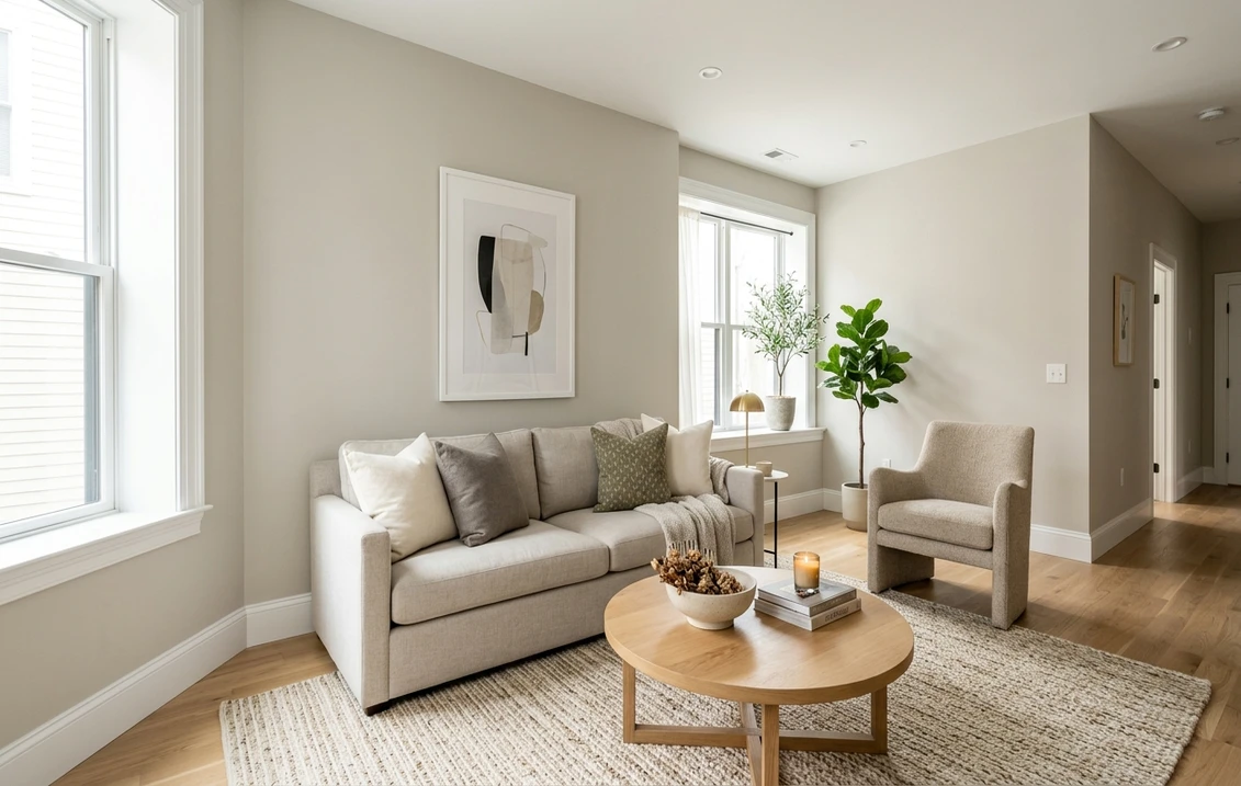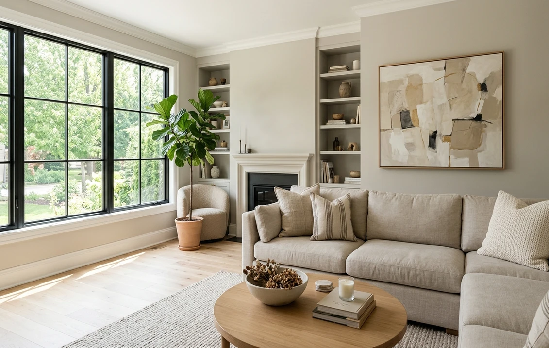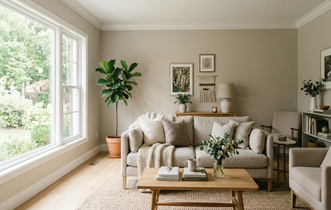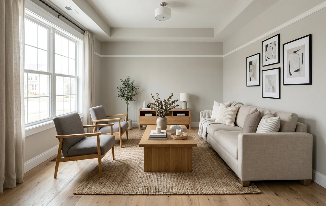
Try it on your room

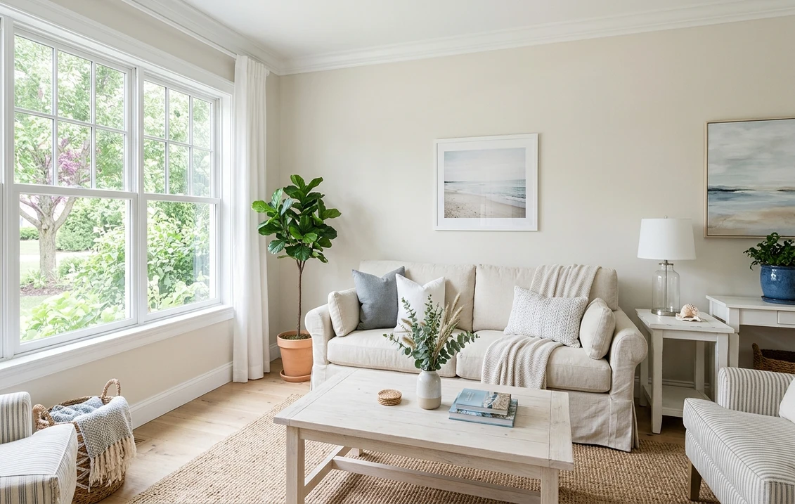
Sherwin-Williams Heron Plume (SW 6070) is a light, softly warm off-white: Sherwin-Williams publishes an LRV of 75.37, an RGB of 229, 225, 216 (hex #E5E1D8) and rates it for both interior and exterior use. In plain terms, it is a white with a gentle warm cast and very little saturation. It reads as a calm, slightly warm white in good daylight, and in shade or north light it settles toward a very pale greige. It is roughly as warm as Alabaster but about seven LRV points deeper, which is why people pick it when Alabaster looks too bright and Ivory Lace looks too creamy.
Every LRV and RGB value below was read on the maker's own color page: Sherwin-Williams for Sherwin-Williams colors, Benjamin Moore for Benjamin Moore colors.
The link opens the interior tool with Heron Plume and "Walls" preselected. How it works: our interior paint visualizer.
Heron Plume at a glance: the numbers Sherwin-Williams publishes
These are the values on the maker's own color page (Sherwin-Williams, SW 6070 Heron Plume). Hex and RGB describe how the color is drawn on a screen, not a mixing formula, so treat them as an approximate digital rendering and judge the final choice on a physical sample.
| Attribute | Heron Plume SW 6070 |
|---|---|
| LRV | 75.37 (Sherwin-Williams rates it "light") |
| RGB | 229, 225, 216 |
| Hex (screen approximation) | #E5E1D8 |
| Color family | White & Pastel |
| Use | Interior and exterior |
| Color strip location | 259-C1 |
| Coordinating colors listed by Sherwin-Williams | Snowbound SW 7004, Versatile Gray SW 6072, Expressive Plum SW 6271 |
Try it on your room
No photo? Try a sample
The strip location helps in a store. Strip 259 also carries Origami White (259-C3) and Aesthetic White (259-C4), so pulling that one card puts Heron Plume next to its closest lighter twin and a slightly deeper, warmer relative. Heron Plume also had a moment in the spotlight: Sherwin-Williams made it its Color of the Month for July 2024, where the brand describes it as a warming, creamy white and ties it to a relaxed California coastal style, with bedroom and exterior examples.
What an LRV of 75.37 means on a wall
Light Reflectance Value runs from 0 (absolute black) to 100 (a perfect reflector). At 75.37, Heron Plume keeps a room bright but sits well below the bright whites: Pure White SW 7005 is 83.96 and Extra White SW 7006 is 85.86 on their Sherwin-Williams pages, gaps of roughly 8.6 and 10.5 points. With that kind of gap the eye sees a clear edge, so Heron Plume walls next to Pure White trim read as "soft white walls, white trim". Our guide to LRV and how to use it when comparing paint explains the scale in more detail.
In practice, Heron Plume is light enough for an average bedroom or living room, but at this depth shadows show: corners, the wall behind furniture and the wall opposite a window look noticeably deeper than the sunlit wall. If you want a white that stays bright everywhere, move up to the 82 to 86 range covered in our guides to Pure White SW 7005 and Extra White SW 7006.
The undertone: warm, barely saturated, with a pale greige cast in shade
The published RGB explains the character. Red (229) is the highest channel, green (225) is just four points behind, and blue (216) is the lowest, 13 points below red. A white whose blue channel trails red reads warm; when green stays close to red, that warmth reads as a soft yellow-beige rather than pink or peach. Converting the same RGB to hue and saturation (our calculation, not a Sherwin-Williams figure) gives a hue of about 42 degrees and a saturation of about 0.06 on a 0 to 1 scale. For comparison, Ivory Lace SW 7013 comes out at about 39 degrees and 0.08: same direction of warmth, but noticeably more of it.
That low saturation is what makes Heron Plume look different in different spots. In direct light the warm cast is visible and the wall reads as a soft warm white. In shade, the color loses lightness but has very little hue to hold on to, so it drifts toward a quiet, pale greige. It does not turn green, blue or pink, because none of those channels leads. This is why the same paint can look like a warm white on one wall and a soft greige on the next.
Surroundings amplify it: honey oak and brass push it toward cream, while white marble and chrome keep it neutral. Next to glossy white tile or a pure white vanity it can look slightly dull by contrast, so sample it right beside those surfaces.
How Heron Plume reads by room orientation
Sherwin-Williams' guidance on choosing color by room orientation gives the framework: north-facing rooms get the least and the coolest light, so warm colors with a higher LRV suit them; south-facing rooms get warm, steady light that flatters most colors; east and west rooms swing between warm and cool depending on the hour. Applied to Heron Plume:
- North-facing rooms. Usable, with care. The warm cast keeps it from turning blue-gray, but an LRV of 75.37 in cool, indirect light will read as a pale greige more often than as a white. In a small north room with one window, a lighter warm white is the safer call. Our list of white paint colors for north-facing rooms covers those options.
- South-facing rooms. Heron Plume's best setting. Strong warm sun lifts it to a clear, soft white, and its low saturation keeps it from turning buttery the way creamier whites can.
- East and west rooms. Expect two personalities: whiter and brighter in the half of the day when the sun is on that side, softer and more greige in the other half.
- Rooms with little daylight. The bulbs decide. Under 2,700K bulbs it reads as a warm off-white; under cooler 4,000K bulbs it looks more neutral and a little grayer.
For the general method behind these calls, see our guide to choosing paint colors by room orientation.
Heron Plume vs the Sherwin-Williams whites around it
The table lines up Heron Plume with nine Sherwin-Williams neighbors, using the values on each color's Sherwin-Williams page (for example SW 7636 Origami White and SW 7014 Eider White). The "warmth gap" column is red minus blue in the published RGB: our calculation from the maker's numbers, not a Sherwin-Williams metric.
| Color | LRV | RGB | Warmth gap (R minus B) | Location |
|---|---|---|---|---|
| Alabaster SW 7008 | 82.22 | 237, 234, 224 | 13 | 255-C2 |
| Ivory Lace SW 7013 | 78.79 | 236, 229, 216 | 20 | 254-C3 |
| Pearly White SW 7009 | 77.33 | 232, 227, 217 | 15 | 254-C2 |
| Origami White SW 7636 | 76.00 | 229, 226, 218 | 11 | 259-C3 |
| Heron Plume SW 6070 | 75.37 | 229, 225, 216 | 13 | 259-C1 |
| Moderne White SW 6168 | 74.47 | 226, 224, 215 | 11 | 258-C6 |
| Shoji White SW 7042 | 74.35 | 230, 223, 211 | 19 | 254-C4 |
| White Duck SW 7010 | 74.01 | 229, 223, 210 | 19 | 254-C5 |
| Eider White SW 7014 | 73.22 | 226, 222, 216 | 10 | 256-C5 |
| Aesthetic White SW 7035 | 73.10 | 227, 221, 211 | 16 | 259-C4 |
Heron Plume sits in a crowded band between 73 and 77 LRV where differences in lightness are small. The warmth column splits that band: Origami White, Moderne White and Eider White are a little cooler, Shoji White, White Duck and Aesthetic White clearly warmer and more beige. So the real choice is "how much warmth", not "how light".
- Heron Plume vs Origami White. The closest pair on the list and on the same strip. Origami White is only 0.63 points lighter with a slightly smaller warmth gap (11 instead of 13). Side by side, Origami White looks a touch cleaner and grayer, Heron Plume a touch warmer.
- Heron Plume vs Alabaster. The same warmth gap of 13, but Alabaster is 6.85 points lighter. Think of Heron Plume as a deeper, softer Alabaster. The north-light behavior of Alabaster is covered in our Alabaster on a north-facing house page.
- Heron Plume vs Ivory Lace. Ivory Lace is 3.42 points lighter and clearly creamier (gap 20). If Ivory Lace reads too yellow in your room, Heron Plume is the logical step toward neutral. Our Ivory Lace SW 7013 guide covers the creamier option.
- Heron Plume vs Shoji White and White Duck. Almost the same depth (74.35 and 74.01) but with a warmth gap of 19. These two read as pale beige-whites; Heron Plume reads as a white. Our Shoji White guide and White Duck guide show when that extra warmth helps.
- Heron Plume vs Eider White. Eider White is 2.15 points deeper and the coolest of the group (gap 10), so it reads as a soft gray-white next to Heron Plume. Our Eider White guide explains its gray side.
Benjamin Moore colors near Heron Plume (and the White Heron mix-up)
First, a naming trap. Benjamin Moore White Heron OC-57 is a different color altogether: Benjamin Moore lists it at LRV 86.69 and describes it as a classic bright white with a slight cool cast (Benjamin Moore, White Heron OC-57). That is more than 11 points brighter and on the cool side: ask for "White Heron" by mistake and you get a very different wall.
There is no official cross-brand equivalent, and a computer match at the counter always drifts a little. Two Benjamin Moore candidates stand out by LRV and description:
- Classic Gray OC-23, LRV 73.67 (Benjamin Moore, Classic Gray OC-23). Benjamin Moore describes it as an ultra-light gray that can also work as an off-white, which is very close to how Heron Plume behaves. It is about 1.7 points deeper. Our Classic Gray OC-23 review details how it shifts by orientation.
- Seapearl OC-19, LRV 76.43 (Benjamin Moore, Seapearl OC-19). About one point lighter, but Benjamin Moore describes its undertone as cool gray, so expect it to look fresher and less warm than Heron Plume.
An LRV and a written description are not enough to match an undertone across brands. Paint large samples of both brands on the same wall and look at them morning and evening. The same method applies to other off-whites, as in our comparison of Classic Gray and Pale Oak.
Best rooms for Heron Plume
Heron Plume works best where you want a soft, lived-in white without the obvious cream of Ivory Lace or Creamy.
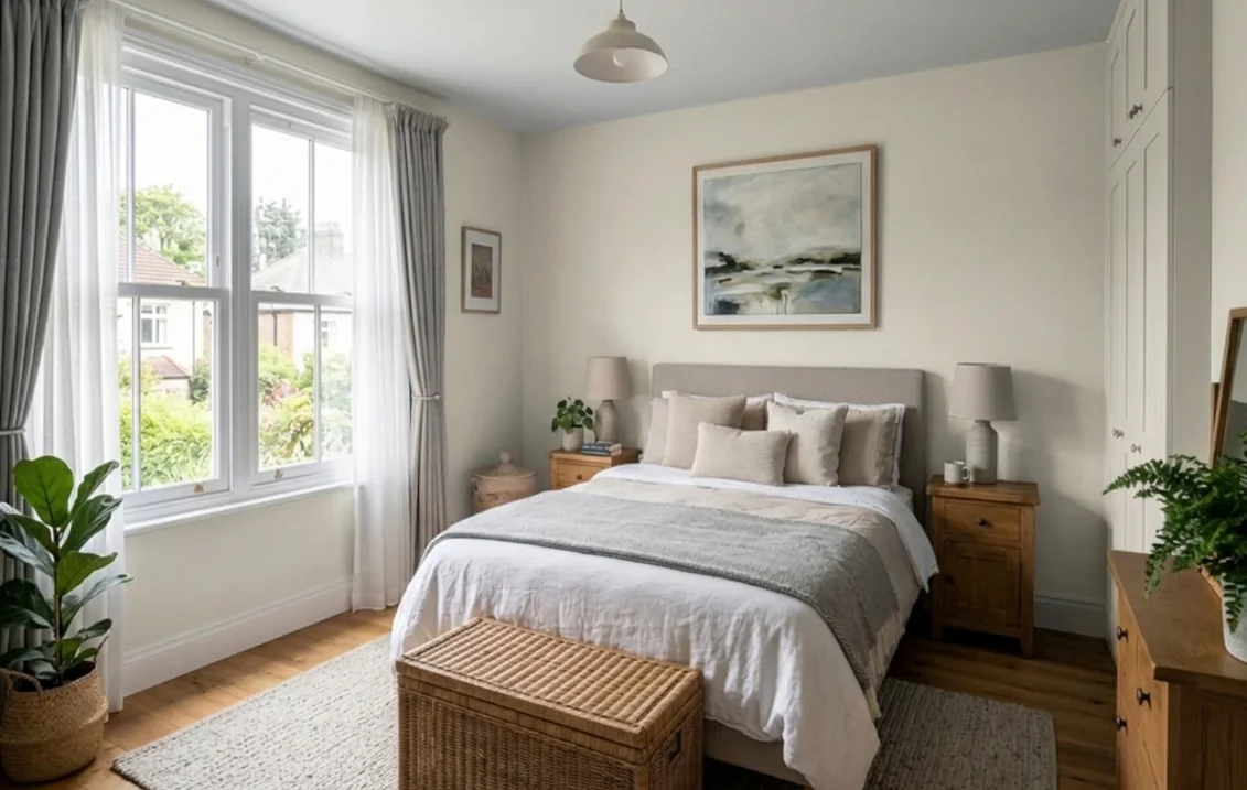
- Bedrooms. Its strongest use, and the one Sherwin-Williams itself illustrates. Linen, natural wood and muted blue or green textiles keep it calm.
- Living rooms with good light. In south, east or west light it reads as a clear soft white and gives a relaxed, coastal feel without any blue.
- Bathrooms and laundry rooms. The color works, but the product matters more than the shade in humid rooms. Our guide to mold-resistant bathroom paint explains what to look for on the label.
Where to hesitate: small north-facing rooms with one window (it can read gray-beige all day), rooms dominated by glossy bright white tile or quartz (the walls can look dull by contrast), and spaces where you want a white that recedes completely behind art. For the wider family of soft whites, see our page on warm white paint colors and their undertones.
Trim, ceiling and accent colors that work with Heron Plume
Start with the pairings Sherwin-Williams lists on the Heron Plume page: Snowbound SW 7004 (LRV 82.77), Versatile Gray SW 6072 (47.76) and Expressive Plum SW 6271 (11.51). The Color of the Month post adds two more: Pachyderm SW 9596 (45.22), a soft greige, and Mount Etna SW 7625 (6.17), a deep blue-green that Sherwin-Williams shows as exterior contrast. The table adds trim whites and darker accents.
| Role | Color | LRV | Why it works with Heron Plume |
|---|---|---|---|
| Soft trim | Snowbound SW 7004 | 82.77 | Listed by Sherwin-Williams; about 7.4 points brighter, so trim reads white without a hard edge |
| Clean trim | Pure White SW 7005 | 83.96 | About 8.6 points brighter and nearly neutral, a clear but calm contrast |
| Crisp trim | Extra White SW 7006 | 85.86 | The strongest white contrast; makes the walls look warmer |
| Tone-on-tone | Heron Plume itself | 75.37 | Same color in semi-gloss on trim for a quiet, enveloping room |
| Adjacent room | Popular Gray SW 6071 | 61.11 | A light warm gray whose own page lists Heron Plume as a coordinating color |
| Adjacent room | Agreeable Gray SW 7029 | 60.39 | A warm greige that keeps the same family of warmth |
| Mid-tone accent | Versatile Gray SW 6072 | 47.76 | Listed by Sherwin-Williams; a taupe-gray for an accent wall or cabinets |
| Mid-tone accent | Pachyderm SW 9596 | 45.22 | The soft greige Sherwin-Williams pairs with it in a bedroom |
| Deep color | Expressive Plum SW 6271 | 11.51 | A muted plum for a door, a vanity or textiles |
| Deep color | Mount Etna SW 7625 | 6.17 | Blue-green depth for a front door or shutters |
| Near-black | Iron Ore SW 7069 | 5.55 | Soft charcoal, less harsh than black against a warm white |
For the ceiling, a flat bright white makes the walls read a little deeper and warmer; a flat Heron Plume ceiling feels softer and suits bedrooms. Our ceiling paint colors guide walks through both. For trim, our guide to Snowbound SW 7004 covers the soft white Sherwin-Williams lists as Heron Plume's coordinating trim.
Sheen matters too. Sherwin-Williams' paint sheen guide ranks the sheens from flat to high gloss and recommends satin or semi-gloss for bathrooms. A semi-gloss trim reflects more light than a matte wall, so the same color reads as two slightly different surfaces, which is what makes the tone-on-tone option work.
Heron Plume on an exterior
Sherwin-Williams rates Heron Plume for exterior use too, and its Color of the Month post shows it outside with a deep blue-green accent. On siding:
- Full sun lightens it. On a sunny elevation it reads as a soft white; on the shaded side of the same house, its greige side shows. Judge it on two sides, not on the porch chip.
- Surroundings set the undertone. Brown or red brick, a warm brown roof and tan stone push it warmer; a charcoal roof and gray stone keep it cleaner and slightly grayer.
- Trim needs a plan. Snowbound or Pure White trim gives a visible, gentle outline. Heron Plume on both body and trim gives a single soft white house, with the door and shutters carrying the contrast.
For a door or shutters, Mount Etna, Iron Ore or Urbane Bronze give the strongest definition. Our guide to white exterior paint shades compares warmer and cooler whites on siding; check any HOA color list before you buy.
Before you paint: sampling, light and prep
A chip tells you little about a color this subtle. Paint two large swatches (at least 2 by 2 feet), one on the window wall and one opposite it, hold your trim color and flooring against each, and look at them morning and night. Add Origami White and Alabaster beside them to see where Heron Plume sits in your light. If the darkest swatch looks gray to you, go lighter rather than warmer.
Plan two coats for any color change. If your house was built before 1978, plan the prep around lead. The EPA's Renovation, Repair and Painting program page states that roughly three-quarters of US homes built before 1978 still contain some lead-based paint, and that anyone paid to disturb paint in those homes must be certified. Homeowners working on their own house are generally outside the rule, but sanding old trim or doors still creates lead dust, so test first and use lead-safe practices. Spot-prime patches and stains so they do not show through a light color.
Check Heron Plume in your own light before you buy a gallon
Upload a photo of your room and see Heron Plume on the walls in a few seconds, then compare it with Origami White, Alabaster or Ivory Lace on the same photo.
Try Heron Plume on my room photoTo browse the rest of the brand's interior range by family, start from our Sherwin-Williams interior paint colors guide, and for the step between white and gray, our page on warm greige paint colors.
Sources and references
- Sherwin-Williams, SW 6070 Heron Plume color page: LRV 75.374, RGB 229, 225, 216, hex E5E1D8, color strip location 259-C1, interior and exterior use, coordinating colors Snowbound SW 7004, Versatile Gray SW 6072 and Expressive Plum SW 6271.
- Sherwin-Williams blog, Color of the Month July 2024: Heron Plume: the brand's description of the color, California coastal styling, bedroom example, pairings with Pachyderm SW 9596 and Mount Etna SW 7625.
- Sherwin-Williams color pages for the comparison table: SW 7008 Alabaster, SW 7013 Ivory Lace, SW 7009 Pearly White, SW 7636 Origami White, SW 6168 Moderne White, SW 7042 Shoji White, SW 7010 White Duck, SW 7014 Eider White and SW 7035 Aesthetic White: LRV, RGB and strip locations.
- Sherwin-Williams color pages for the pairings: SW 7004 Snowbound, SW 7005 Pure White, SW 7006 Extra White, SW 6071 Popular Gray, SW 7029 Agreeable Gray, SW 6072 Versatile Gray, SW 9596 Pachyderm, SW 6271 Expressive Plum, SW 7625 Mount Etna and SW 7069 Iron Ore: published LRVs and coordinating colors.
- Sherwin-Williams, Color by room orientation: how north, south, east and west light shifts warm and cool colors.
- Sherwin-Williams, Paint sheen guide: recommended sheens by surface and the effect of sheen on perceived color.
- Benjamin Moore, White Heron OC-57 (LRV 86.69), Classic Gray OC-23 (LRV 73.67) and Seapearl OC-19 (LRV 76.43): the name confusion and the cross-brand candidates by reflectance and description.
- US Environmental Protection Agency, Lead Renovation, Repair and Painting Program: share of pre-1978 homes with lead-based paint, who must be certified.
Frequently asked questions
What is the LRV of Sherwin-Williams Heron Plume SW 6070?
Is Heron Plume warm or cool?
What is the difference between Heron Plume and Origami White?
Is Heron Plume darker than Alabaster?
What trim color goes with Heron Plume?
Is Heron Plume the same as Benjamin Moore White Heron?
Can Heron Plume be used on a house exterior?
Trademarks mentioned (Sherwin-Williams, Benjamin Moore, Behr, Caparol, Brillux, Sto, Alpina, Valspar, PPG, Glidden, Dulux, Crown Trade, Sandtex, Farrow & Ball, Johnstone's, Leyland) are property of their respective owners. FacadeColorizer is independent and not affiliated with any of them. Nominative fair use under Lanham Act §1125.