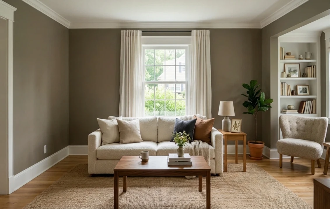
Try it on your room

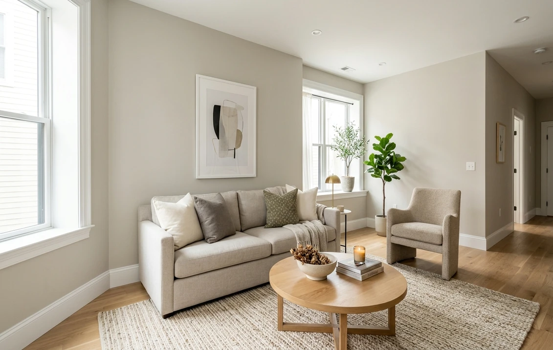
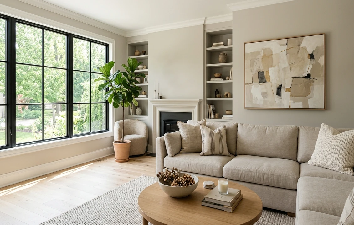
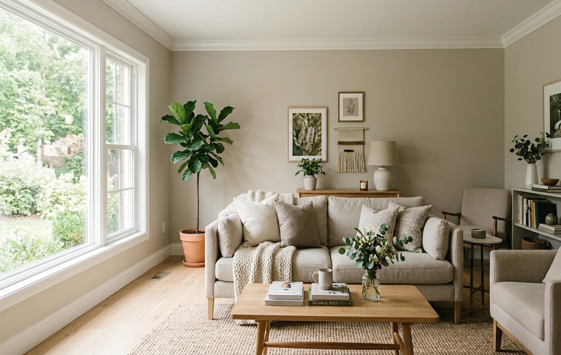
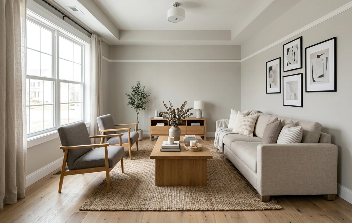
Sherwin-Williams Felted Wool (SW 9171) is a mid-depth warm greige: Sherwin-Williams publishes an LRV of 28.06, an RGB of 151, 144, 131 (hex #979083) and rates it for interior and exterior use. It is a gray-beige deep enough to change the mood of a room, with a soft khaki-taupe warmth rather than a pink or green cast. In bright light it reads as a cozy taupe-greige; in a dim or north-facing room it deepens toward a muted brown-gray. It sits on the same Sherwin-Williams strip as Urbane Bronze, three steps lighter, and its closest twin is Studio Clay SW 9172.
LRV and RGB values below come from each maker's own color page; hue and warmth figures computed from them are our calculations and are labeled as such.
The link opens the interior tool with Felted Wool and "Walls" preselected. How it works: our interior paint visualizer.
Felted Wool at a glance: the numbers Sherwin-Williams publishes
These values come from the maker's color page (Sherwin-Williams, SW 9171 Felted Wool). Hex and RGB describe how the color is drawn on a screen, not a tinting formula, so treat them as an approximate digital rendering and decide on a physical sample.
| Attribute | Felted Wool SW 9171 |
|---|---|
| LRV | 28.06 (Sherwin-Williams rates it "medium") |
| RGB | 151, 144, 131 |
| Hex (screen approximation) | #979083 |
| Hue and saturation on the page | Hue 39, saturation 0.13 |
| Use | Interior and exterior |
| Color strip location | 245-C4 |
| Coordinating colors listed by Sherwin-Williams | Shoji White SW 7042, Skyline Steel SW 1015, Foxhall Green SW 9184 |
Try it on your room
No photo? Try a sample
Felted Wool also shows up in the brand's trend work: it is one of seven colors in the 2019 Colormix Forecast Naturalist palette, the featured color of the 2022 Colormix Forecast Dreamland palette, and one of four coordinating colors Sherwin-Williams lists for Urbane Bronze, the 2021 Color of the Year. The brand styles it as a grounding neutral for greens, blush tones and deep bronze.
What an LRV of 28 means on a wall
Light Reflectance Value runs from 0 (absolute black) to 100 (a perfect reflector). At 28.06, Felted Wool sends back a little over a quarter of the light that hits it, less than half of a typical light greige: Agreeable Gray SW 7029 is 60.39 and Accessible Beige SW 7036 is 57.67 on their Sherwin-Williams pages. It is a deliberate mid-tone that makes a room feel enclosed and warm, and it needs light to look its best. Our guide to LRV and how to use it when comparing paint explains the scale.
In practice, the shadow side of a room looks clearly darker than the sunlit side, and white trim stands out sharply: Pure White SW 7005 (83.96) is about 56 points brighter, so door and window outlines become a design feature.
The undertone: warm khaki-taupe, not pink, not green
The published RGB explains the character: red (151) leads, green (144) is seven points behind and blue (131) trails red by 20. A neutral whose blue trails red reads warm, and with green close to red the warmth leans yellow-khaki rather than rose. Sherwin-Williams lists a hue of 39 and a saturation of 0.13.
Run the same calculation on Accessible Beige SW 7036 (RGB 209, 199, 184) and you get a hue of about 36 and a saturation of about 0.12 (our calculation): nearly the same warmth at twice the reflectance, so Felted Wool behaves like a much deeper Accessible Beige. Taupes such as Elephant Ear SW 9168 come out near hue 32, a touch more rose-brown, which is why they read "taupe" and Felted Wool "greige" beside them.
On the wall, warm direct light brings out the yellow side and it reads as a cozy mushroom greige; cool or indirect light lets the low saturation take over and it reads as a soft brown-gray. Next to strong green foliage it can show a faint olive note, but it never turns pink or purple. Honey oak and brass push it browner; white marble and black metal keep it grayer.
How Felted Wool reads by room orientation
Sherwin-Williams' guidance on choosing color by room orientation points north-facing rooms to warm undertones and a higher LRV, says most colors work in south light, and notes that east and west rooms swing between warm and cool with the hour. Our guide to choosing paint colors by room orientation covers the method. Applied to Felted Wool:
- North-facing rooms. The warm undertone is right, but an LRV of 28 is far from a "higher LRV": expect a deep brown-gray most of the day. Use it for a cocooning den, or step up to Intellectual Gray on the same strip.
- South-facing rooms. Its best setting: warm light lifts it to a clear mushroom greige without making it muddy.
- East and west rooms. Lighter and warmer while the sun is on that side, deeper and grayer the rest of the day.
- Rooms with little daylight. Under 2,700K bulbs it reads as a warm taupe; under 4,000K bulbs it looks grayer and flatter.
Strip 245: Felted Wool and its lighter and deeper steps
Felted Wool sits in the middle of a seven-color strip that runs from a light greige to Urbane Bronze, the easiest way to change depth while keeping the same warmth. Values are from each color's Sherwin-Williams page (for example SW 7045 Intellectual Gray and SW 7048 Urbane Bronze).
| Location | Color | LRV | RGB |
|---|---|---|---|
| 245-C1 | Worldly Gray SW 7043 | 57.24 | 206, 198, 187 |
| 245-C2 | Amazing Gray SW 7044 | 46.89 | 190, 181, 169 |
| 245-C3 | Intellectual Gray SW 7045 | 35.74 | 168, 160, 147 |
| 245-C4 | Felted Wool SW 9171 | 28.06 | 151, 144, 131 |
| 245-C5 | Anonymous SW 7046 | 19.65 | 129, 122, 110 |
| 245-C6 | Porpoise SW 7047 | 12.95 | 107, 100, 91 |
| 245-C7 | Urbane Bronze SW 7048 | 8.12 | 84, 80, 74 |
The steps are uneven: about 7.7 LRV points up to Intellectual Gray and 8.4 down to Anonymous. Intellectual Gray is the natural fallback when Felted Wool samples look too heavy; Anonymous suits cabinets or a library wall; Urbane Bronze gives a door or sash contrast from the same earthy family, covered in our Urbane Bronze SW 7048 guide.
Felted Wool vs Studio Clay, Dovetail and the other look-alikes
The table compares Felted Wool with its closest Sherwin-Williams neighbors, using each color's page (for example SW 9172 Studio Clay and SW 7018 Dovetail). The "warmth gap" is red minus blue in the published RGB: our calculation, not a Sherwin-Williams metric.
| Color | LRV | RGB | Warmth gap (R minus B) |
|---|---|---|---|
| Mega Greige SW 7031 | 36.75 | 173, 162, 149 | 24 |
| Pewter Cast SW 7673 | 31.40 | 155, 152, 147 | 8 |
| Keystone Gray SW 7504 | 29.48 | 158, 146, 132 | 26 |
| Elephant Ear SW 9168 | 28.09 | 152, 143, 133 | 19 |
| Felted Wool SW 9171 | 28.06 | 151, 144, 131 | 20 |
| Studio Clay SW 9172 | 27.13 | 149, 141, 127 | 22 |
| Dovetail SW 7018 | 25.77 | 144, 138, 131 | 13 |
- Felted Wool vs Studio Clay. The closest pair, with consecutive catalog numbers. Studio Clay is 0.93 points deeper and slightly warmer (gap 22), so side by side it looks a shade browner; in most rooms the difference only shows on adjacent samples.
- Felted Wool vs Dovetail. Dovetail is 2.29 points deeper and much less warm (gap 13): a warm gray where Felted Wool is a greige. Our Dovetail vs Gauntlet Gray comparison shows Dovetail against a deeper gray.
- Felted Wool vs Elephant Ear. Same depth and warmth, but Elephant Ear leans a little more toward red and reads as a rosier taupe.
- Felted Wool vs Keystone Gray and Pewter Cast. Keystone Gray is a little lighter and browner (gap 26); Pewter Cast is about 3.3 points lighter and reads as a soft gray (gap 8).
- Felted Wool vs Mega Greige. Mega Greige is 8.69 points lighter, the more familiar greige; Felted Wool is the moodier option. Our Mega Greige exterior guide covers it on siding.
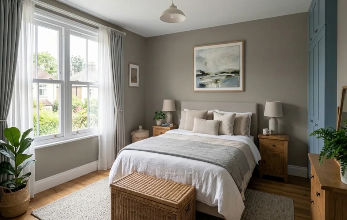
Benjamin Moore colors near Felted Wool (and the Studio Clay name trap)
First, a naming trap: Benjamin Moore sells its own Studio Clay, CSP-380 in the Color Stories collection, at LRV 28.77 (Benjamin Moore, Studio Clay CSP-380). It is not the same paint as Sherwin-Williams Studio Clay SW 9172 (LRV 27.13), so quote brand and code at the counter.
There is no official cross-brand equivalent of Felted Wool. Three Benjamin Moore candidates stand out by LRV and by the maker's own description:
- Studio Clay CSP-380, LRV 28.77: the closest by depth, described as full of the warmth of potter's clay, so slightly browner.
- Weimaraner AF-155, LRV 30.99 (Benjamin Moore, Weimaraner AF-155): described with brown and taupe tones, so a little more taupe.
- Gettysburg Gray HC-107, LRV 30.94 (Benjamin Moore, Gettysburg Gray HC-107): described as a blend of gray and green, so it brings out the olive side.
LRV and a description cannot match an undertone across brands: paint large samples of both on the same wall. For the wider family, see our pages on warm greige paint colors and taupe paint colors and their undertones.
Best rooms for Felted Wool
- Living and family rooms with good light. In south, east or west light it reads as a rich mushroom greige that flatters wood, leather, linen and greenery.
- Dens, offices and dining rooms. Rooms used mostly in the evening under warm bulbs are where its depth feels intentional; paint bookcases in the same color for an enveloping look.
- Bedrooms. A cocooning choice with white bedding and a white ceiling; in a small north bedroom, prefer Intellectual Gray.
- Kitchen islands and lower cabinets. A way to use a mid-tone greige without darkening the whole room. Use a cabinet enamel; our guide to semi-gloss paint for kitchen cabinets compares the sheens on the makers' data sheets.
Where to hesitate: small north-facing rooms with one window, halls lit by cool bulbs, and rooms where dark floors and furniture already absorb most of the light. For a lighter greige in the same family, see our Accessible Beige guide.
Trim, ceiling and accent colors that work with Felted Wool
Start with the coordinating colors on the Felted Wool page: Shoji White SW 7042 (LRV 74.35), Skyline Steel SW 1015 (52.32), a lighter warm gray for adjoining rooms, and Foxhall Green SW 9184 (6.67). The table adds trim whites and deep accents.
| Role | Color | LRV | Why it works |
|---|---|---|---|
| Soft warm trim | Shoji White SW 7042 | 74.35 | Listed by Sherwin-Williams; about 46 points lighter, a gentle outline |
| Soft warm trim | Heron Plume SW 6070 | 75.37 | Low-saturation warm white that keeps the scheme calm |
| Creamy trim | Ivory Lace SW 7013 | 78.79 | Picks up the yellow side for a traditional look |
| Clean trim | Pure White SW 7005 | 83.96 | Nearly neutral, about 56 points brighter: crisp and modern |
| Crisp trim | Extra White SW 7006 | 85.86 | The strongest contrast |
| Deep accent | Urbane Bronze SW 7048 | 8.12 | Bottom of the same strip: doors, sashes, a vanity |
| Deep accent | Foxhall Green SW 9184 | 6.67 | Listed by Sherwin-Williams; draws out the khaki side |
| Near-black | Iron Ore SW 7069 | 5.55 | Soft charcoal for metalwork or a front door |
The soft trims have their own guides: Shoji White SW 7042, Heron Plume SW 6070 and Ivory Lace SW 7013, all 46 to 51 points above Felted Wool.
A flat bright white ceiling keeps a room this deep from feeling low; a Felted Wool ceiling gives a color-drenched den. For tone-on-tone, use Felted Wool on the trim in a higher sheen: Sherwin-Williams' paint sheen guide notes that sheen slightly changes how light or dark a color looks, so matte walls and semi-gloss trim read as two related surfaces.
Felted Wool on an exterior
Sherwin-Williams rates Felted Wool for exterior use, and a mid-depth greige body looks warmer than gray siding without going brown.
- Sun and shade. A sunny elevation reads as a light mushroom greige, the shaded side a full step deeper: judge it on two sides of the house.
- Surroundings. A brown roof or tan stone push it toward taupe; a charcoal roof and gray stone keep it greige.
- Trim. Shoji White or Pure White gives a classic outline; or trim in Felted Wool and put the contrast on the door in Urbane Bronze or Iron Ore.
- Vinyl siding. Sherwin-Williams' VinylSafe colors page explains that a dark color over a lighter one can make vinyl buckle and that VinylSafe colors are formulated to resist warping. That list uses its own SWVS numbers and does not include Felted Wool SW 9171, so ask for the closest VinylSafe color.
For similar schemes, see our idea page on a mushroom greige house with charcoal trim and our Urbane Bronze exterior guide. Check any HOA color list before you buy.
Before you paint: sampling, coats and prep
Paint two large swatches (at least 2 by 2 feet), one on the window wall and one opposite, hold your trim color and flooring against each, and look at them morning, afternoon and under your evening bulbs. Put Intellectual Gray and Studio Clay beside them: if either looks better, go lighter or browner.
Plan two coats, and ask about a primer tinted toward the new color if you are covering a bright white or a strong color. In a house built before 1978, plan the prep around lead: the EPA's Renovation, Repair and Painting program page explains that anyone paid to disturb paint in those homes must be certified and follow lead-safe practices. Homeowners doing their own work are generally outside the rule, but sanding old trim still creates lead dust, so test first.
Check Felted Wool in your own light before you buy a gallon
Upload a photo of your room and see Felted Wool on the walls in a few seconds, then compare it with Intellectual Gray, Studio Clay or Dovetail on the same photo.
Try Felted Wool on my room photoTo browse the rest of the brand's interior range by family, start from our Sherwin-Williams interior paint colors guide.
Sources and references
- Sherwin-Williams, SW 9171 Felted Wool color page: LRV 28.064, RGB, hex, hue and saturation, strip location 245-C4, interior and exterior use, coordinating colors.
- Sherwin-Williams, 2019 Colormix Forecast, Naturalist; Sherwin-Williams blog, 2022 Colormix Forecast: Dreamland; Urbane Bronze, January 2021 Color of the Month: trend palettes and coordinating colors.
- Sherwin-Williams color pages for the tables (LRV, RGB, strip location): SW 7043, SW 7044, SW 7045, SW 7046, SW 7047, SW 7048, SW 7031, SW 7673, SW 7504, SW 9168, SW 9172, SW 7018, SW 7036, SW 7029, SW 7042, SW 1015, SW 9184, SW 7005, SW 7006 and SW 7069.
- Sherwin-Williams, Color by room orientation, Paint sheen guide and VinylSafe colors for vinyl siding: orientation, sheen and vinyl guidance.
- Benjamin Moore, Studio Clay CSP-380 (LRV 28.77), Weimaraner AF-155 (30.99) and Gettysburg Gray HC-107 (30.94): name confusion and cross-brand candidates.
- US Environmental Protection Agency, Lead Renovation, Repair and Painting Program: rules for paid work that disturbs paint in pre-1978 homes.
Frequently asked questions
What is the LRV of Sherwin-Williams Felted Wool SW 9171?
Is Felted Wool warm or cool?
What is the difference between Felted Wool and Studio Clay?
Is Felted Wool darker than Dovetail?
What trim color goes with Felted Wool?
What is the Benjamin Moore equivalent of Felted Wool?
Can Felted Wool be used on a house exterior?
Trademarks mentioned (Sherwin-Williams, Benjamin Moore, Behr, Caparol, Brillux, Sto, Alpina, Valspar, PPG, Glidden, Dulux, Crown Trade, Sandtex, Farrow & Ball, Johnstone's, Leyland) are property of their respective owners. FacadeColorizer is independent and not affiliated with any of them. Nominative fair use under Lanham Act §1125.