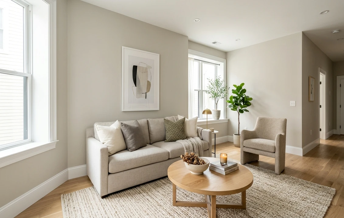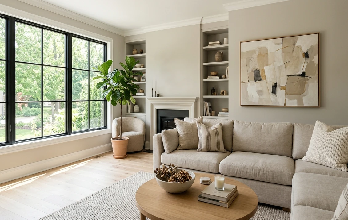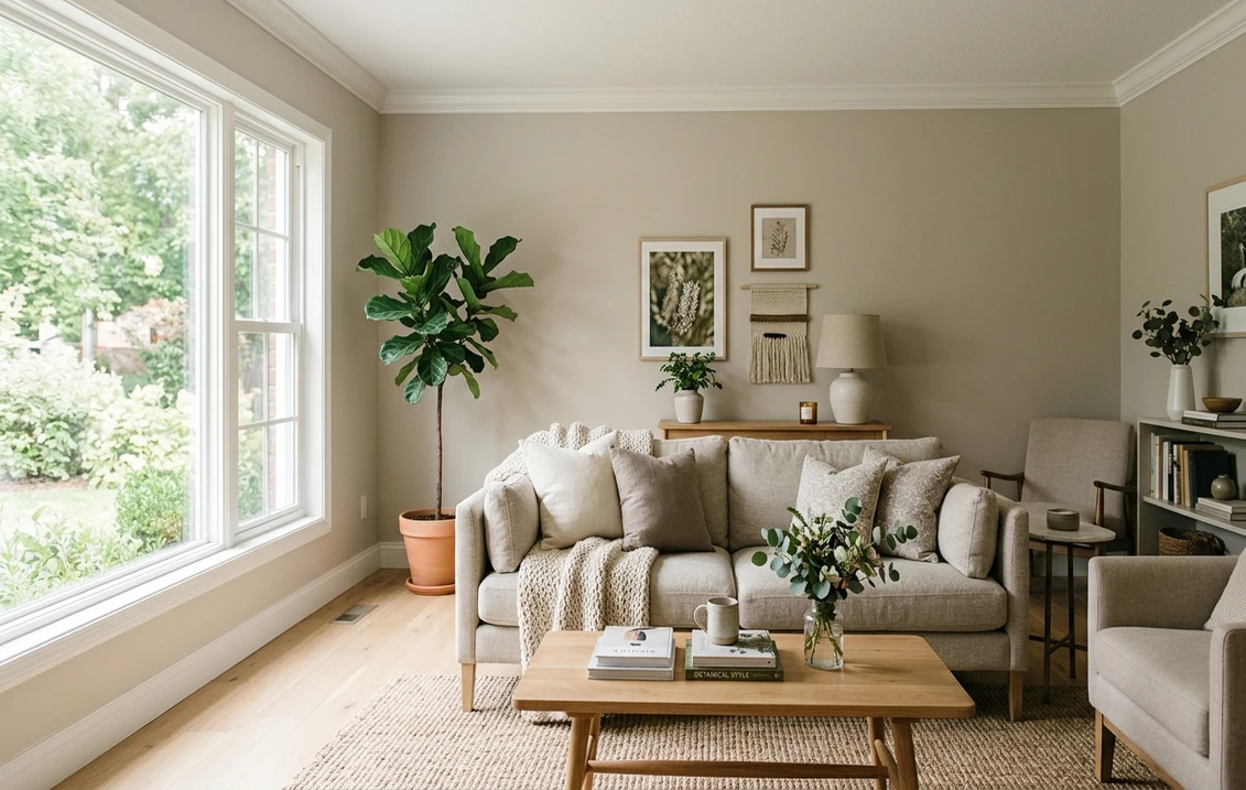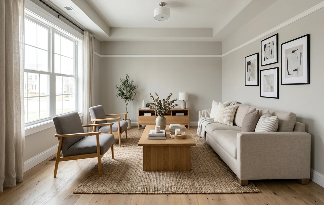
Try it on your room

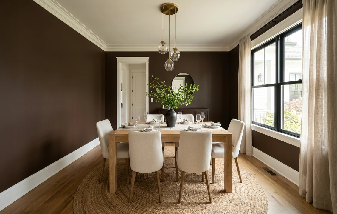
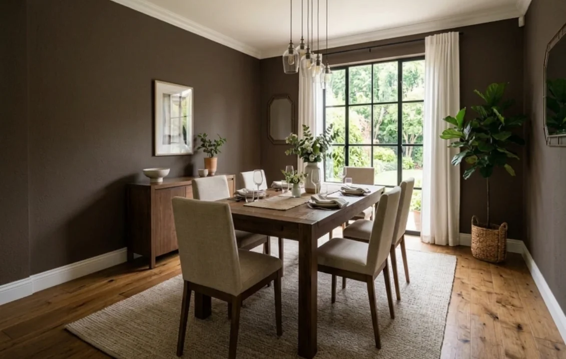
Sherwin-Williams Turkish Coffee SW 6076 is a very deep, warm brown with a red-brown base. Its color page lists an LRV of 4.664, the hex code 4D3930 and RGB values of 77, 57 and 48, so a wall in this color sends back less than 5 percent of the light that reaches it. Indoors it reads as dark coffee or chocolate where daylight hits it and close to a brown-black in a dim corner. It suits rooms meant to feel enclosed and warm: a dining room, a home office, a single accent wall, lower kitchen cabinets or an island, and small rooms painted top to bottom.
One limit first: the color page names no undertone, suggests no rooms and labels no trim color. Every undertone reading and room suggestion below is ours, built on the published numbers and on Sherwin-Williams' general guides. The page lists SW 6076 for interior and exterior use; this guide covers the interior.
Upload a photo of your room and preview SW 6076 on the walls before you buy a sample.
What Sherwin-Williams publishes for SW 6076
The Turkish Coffee color page gives the number SW 6076 and a light reflectance value of 4.664, flagged "dark". It files the color in the Timeless Color family, lists it for interior and exterior use and gives the store strip location 277-C3. It also prints the hue, saturation and value behind the hex: 18.6, 0.38 and 0.3. The coordinating colors are Heron Plume SW 6070, Casa Blanca SW 7571 and Spalding Gray SW 6074, and the page repeats Turkish Coffee under a second code, HGSW2491, so you may see either number on a chip or a label. None of the coordinating colors is labeled as a trim or ceiling color. For the wider set of interior colors we cover, start with the Sherwin-Williams interior paint colors guide.
| Figure | Value for SW 6076 | Source |
|---|---|---|
| LRV | 4.664 (notation: dark) | Color page |
| Hex / RGB | 4D3930 / 77, 57, 48 | Color page |
| Hue, saturation, value | 18.6, 0.38, 0.3 | Color page |
| Family / usage | Timeless Color / interior and exterior | Color page |
| Strip location / second code | 277-C3 / HGSW2491 | Color page |
| Undertone | Not printed | Our reading, see below |
Try it on your room
No photo? Try a sample
How dark is 4.664? The Wikipedia entry on light reflectance value describes LRV as a measure of the visible light a surface reflects, from 0 (no reflected light) to 1 (complete reflection). Sherwin-Williams' color pages print it on a 0 to 100 basis, with their whites in the 80s, so 4.664 means roughly 4.7 percent of the light reflected. For scale, the brand lists Tricorn Black SW 6258 at 2.849, Iron Ore SW 7069 at 5.55 and Urbane Bronze SW 7048 at 8.121. Our own count of the current SW-numbered colors in Sherwin-Williams' public color data (November 9, 2026) found only 32 of 1,727 with a lower LRV: Turkish Coffee sits in the darkest 2 percent of the range.
Screens are approximate. The hex code is a digital rendering: use it to compare shades, and a large physical sample to judge the paint.
The undertone: red-brown, not gray
Because Sherwin-Williams prints no undertone, the RGB values are the best clue. Turkish Coffee has its highest value in red (77), a lower one in green (57) and its lowest in blue (48). On the color wheel, 0 degrees is red, 30 is orange and 60 is yellow, so the page's hue of 18.6 degrees puts it between red and orange. That is why it reads as a red-brown, closer to roasted coffee beans or dark chocolate than to an olive or gray brown. A saturation of 0.38 is enough to read clearly as brown in daylight, not enough to read as red.
Warm or gray? The gap between its red and blue values is 29 points. Urbane Bronze has a gap of 10 and a saturation of about 0.12 by our calculation from its published RGB, which is why it reads as a gray bronze; Iron Ore has a gap of 2 and is close to a true neutral. Under warm bulbs, Turkish Coffee's red base comes forward; in cool daylight, or next to gray tile and steel, it can look flatter, closer to a charcoal brown. This is our reading of the numbers.
Light direction: what north, south, east and west do to a deep brown
Sherwin-Williams' guide to color by room orientation does not mention Turkish Coffee. The points below apply its general rules to SW 6076.
North-facing rooms get the least light. The guide recommends warm colors over cool ones there and a higher LRV, and it adds a line for dark colors: a bold, dark shade chosen for drama in a north room should still have warm undertones. Turkish Coffee meets the warm condition and ignores the LRV advice on purpose: expect a north room in SW 6076 to read close to brown-black most of the day, a lamp-lit room rather than a bright one.
South-facing rooms get warm, steady light. The guide says most colors work there but warns that very warm colors can overwhelm. Turkish Coffee's moderate saturation makes that less likely than with a vivid red-brown; expect a lighter, more chocolate tone in the afternoon.
East- and west-facing rooms and rooms with little daylight. The guide says to choose by when you use the room most, and to treat warm bulbs like a south-facing room and white or cool bulbs like a north-facing one. Judge a dining room used at night under the lamps you eat by. With an LRV under 5 the wall adds almost no light, so bulb color decides most of what you see (our reading).
Sample protocol. Paint a large board with two full coats, leave it up for several days and check it at each hour you use the room, next to your trim and floor.
Best rooms and surfaces for Turkish Coffee
Sherwin-Williams does not name rooms for SW 6076. These suggestions follow from the light rules above and from what an LRV under 5 does to a room; they are our reading.
- Dining rooms. Used mostly in the evening under warm light, when the red-brown base reads richest.
- Home offices and libraries. Wood shelves and books sit well against a deep brown, and the warm base keeps a north office from feeling cold.
- Accent walls. A fireplace wall, or the wall behind a bed or sofa; next to light walls the contrast is very strong.
- Small rooms painted top to bottom. Powder rooms, dens and reading nooks; see the drenching section.
- Cabinets, interior doors and built-ins. Depth without repainting the walls.
If you are still weighing the whole brown family, the guide to brown interior paint colors sets lighter and mid-tone browns beside the darker ones.
Color drenching a room in Turkish Coffee
Color drenching means painting the walls, trim, doors and often the ceiling of a room in one color. With a color this dark, the result is an enclosed, wrapped room. It suits small rooms with some architectural detail, such as a powder room, a den or a study with built-ins, better than a large open family room.
The way to keep a drenched room from looking flat is to change the sheen rather than the color. The Sherwin-Williams paint sheen guide marks flat through low lustre for dining rooms, offices, bedrooms and living rooms, eg-shel or satin through high gloss for trim, cabinets and doors, and flat for ceilings. It also notes that sheen can slightly change how light or dark a color looks. So SW 6076 in matte on the walls and satin on the trim reads as two close shades of one brown, which is the effect drenching relies on.
The ceiling question. At night the ceiling is usually the surface that bounces lamp light back down. Painting it at an LRV of 4.664 removes that, and the room feels lower and darker: fine in a powder room or a den. In a larger room, a warm off-white ceiling such as Casa Blanca, one of the coordinating colors, keeps some light while walls and trim stay brown. This is our suggestion.
Turkish Coffee on kitchen cabinets and woodwork
In a kitchen, a brown this deep is most often used on lower cabinets with lighter uppers, or on an island while the perimeter stays light. A full run of Turkish Coffee cabinets needs a large kitchen with good daylight and light counters (our suggestions).
Durability is about product and prep, not color. The Kitchen Cabinet Manufacturers Association explains on its quality cabinet certification page that cabinets carrying the KCMA A161.1 seal have their structure, drawers, doors and finish tested to simulate a lifetime of use. A finish you brush or spray at home is not part of that program, so its durability depends on prep, primer and enamel. The Sherwin-Williams Emerald family page lists Emerald Urethane Trim Enamel for windows, doors, trim and cabinets and calls it washable and resistant to yellowing, which is the manufacturer's own description.
Sheen on cabinets. The sheen guide marks eg-shel or satin through high gloss for cabinets, and says flat and eggshell finishes hide imperfections best. Our reading of the reverse: on a dark door, high gloss shows dents and fingerprints more, so satin is the middle ground.
Older homes. Repainting original cabinets, doors or trim means sanding, and the EPA's lead-safe renovation guidance for do-it-yourselfers warns that a home built before 1978 may have lead-based paint. It advises testing by a certified lead inspector or risk assessor, a contained work area and HEPA cleanup. To choose the line of paint itself, the Emerald interior paint review covers that product family in detail.
Turkish Coffee next to Dark Clove, French Roast, Black Bean, Otter and Urbane Bronze
Deep browns are easiest to judge side by side. LRV, hex and family come from each color's Sherwin-Williams page; hue and saturation are our calculations from the published RGB, on the same scale as the figures the Turkish Coffee page prints.
| Color | LRV | Hex | Family on its page | Hue / saturation (our calculation) |
|---|---|---|---|---|
| Urbane Bronze SW 7048 | 8.121 | 54504A | Neutral | 36.0 / 0.12 |
| Otter SW 6041 | 6.319 | 56433B | Purple | 17.8 / 0.31 |
| Iron Ore SW 7069 | 5.55 | 434341 | Neutral | near neutral / 0.03 |
| Dark Clove SW 9183 | 5.064 | 4C3D31 | Timeless Color | 26.7 / 0.36 |
| Turkish Coffee SW 6076 | 4.664 | 4D3930 | Timeless Color | 18.6 / 0.38 |
| French Roast SW 6069 | 4.299 | 4F3426 | Red | 20.5 / 0.52 |
| Black Bean SW 6006 | 3.681 | 403330 | Neutral | 11.3 / 0.25 |
Turkish Coffee vs Dark Clove. Dark Clove is the next chip on the same strip (277-C4) and shares the Timeless Color family. It is only 0.4 points lighter, but its hue of about 26.7 degrees sits further from red, so it should read as a slightly earthier, less red brown. Its page lists it for interior use only, while Turkish Coffee is listed for both, which matters if you want an inside door to match the front door.
Turkish Coffee vs French Roast and Black Bean. French Roast is almost the same depth (4.299) but far more saturated, about 0.52, and its page files it in the Red family: on a wall it should read as a redder chestnut, the step toward color if Turkish Coffee looks too muted. Black Bean is darker (3.681) and less saturated, so it reads as a brown-black, the choice for near-black drama with a hint of warmth. Both readings are ours.
Turkish Coffee vs Otter. Otter is about 1.7 points lighter with nearly the same hue, a softer version for a room with less light, even though its page files it under Purple.
Turkish Coffee vs Urbane Bronze and Iron Ore. Urbane Bronze is lighter (8.121) with very low saturation; Iron Ore (5.55) is close to a neutral charcoal. For a dark room that does not read as brown, see the Urbane Bronze undertones guide, the Iron Ore guide and the Urbane Bronze vs Iron Ore comparison; for the darkest neutral, the Tricorn Black guide.
Trim, ceiling and wood pairings
The color page labels no trim color, but its coordinating colors and the brand's common trim whites each have a color page with an LRV. The gap column is our subtraction and the roles are our suggestions.
| Color | LRV | Hex | Gap | Possible role |
|---|---|---|---|---|
| Pure White SW 7005 | 83.957 | EDECE6 | 79.3 | Crispest trim |
| Alabaster SW 7008 | 82.215 | EDEAE0 | 77.6 | Soft white trim and ceiling |
| Creamy SW 7012 | 81.191 | EFE8DB | 76.5 | Creamier trim, traditional rooms |
| Casa Blanca SW 7571 (coordinating) | 76.442 | EDE1CE | 71.8 | Warm cream trim or ceiling |
| Heron Plume SW 6070 (coordinating) | 75.374 | E5E1D8 | 70.7 | Quiet off-white for adjoining walls |
| Spalding Gray SW 6074 (coordinating) | 22.122 | 8D7F75 | 17.5 | Mid taupe for uppers, a next room or textiles |
Every white in the table sits more than 70 points above Turkish Coffee, so the choice is about temperature, not contrast. Casa Blanca (RGB 237, 225, 206) leans warm and softens the outline, Pure White and Alabaster are cleaner, and Heron Plume (229, 225, 216) is the most neutral coordinating white. For the two most-used trim whites, read the Alabaster undertones guide and the Heron Plume guide.
Wood and metal. White oak, maple and ash are far lighter than SW 6076 and stand out clearly against it. Walnut is close in depth and will blend. Cherry and red oak echo the red-brown base. Brass adds a warm highlight, while black iron almost disappears against the wall. These pairings are our suggestions: test them against the real floor and furniture.
Primer and product line for a deep brown
Going from a light wall to a color this deep is where primer matters. In its article on gray-tinted primers, Sherwin-Williams says about 20 percent of the colors in its system look their best over a gray-tinted basecoat. Its Color Prime System runs from P1, a light gray, to P6, the darkest, and the code is printed on the back of the chip when one applies; the brand claims fewer coats and better hide. The Turkish Coffee page shows no P code, so check the chip or ask the store which primer shade, if any, it recommends for SW 6076.
Turkish Coffee is a color, not a product, so it can be tinted into any of the brand's interior lines. The Emerald family page claims better coverage than Duration Home and better hide than SuperPaint; read coverage and recoat times on the data sheet of the line you buy.
Before you paint: ventilation
The U.S. Environmental Protection Agency lists paints and varnishes among the products that contain organic solvents and emit volatile organic compounds (VOCs), and advises increasing ventilation while using them. Open windows, run an exhaust fan and keep fresh air moving while you paint and during the first days of drying, whatever the shade.
Preview Turkish Coffee in your own room
An LRV tells you how dark a color is, not how a deep brown sits next to your floor and window light. Upload a photo of your room and the visualizer shows SW 6076 on the walls with the same hex code as this article, so you can see whether it reads as coffee, chocolate or brown-black before you buy a sample. The interior paint visualizer works the same way for every color compared above.
Sources and references
- Sherwin-Williams, Turkish Coffee SW 6076 color page (LRV, hex, RGB, hue, family, usage, coordinating colors): sherwin-williams.com
- Sherwin-Williams color pages for the compared darks (LRV, hex, family, usage): Dark Clove, French Roast, Black Bean, Otter, Urbane Bronze, Iron Ore, Tricorn Black
- Sherwin-Williams color pages for the trim and coordinating colors (LRV, hex, RGB): Pure White, Alabaster, Creamy, Casa Blanca, Heron Plume, Spalding Gray
- Sherwin-Williams, guide to color by room orientation (north, south, east and west light, dark colors in north rooms, artificial light): sherwin-williams.com
- Sherwin-Williams, paint sheen guide (sheens by room and surface, sheen and perceived color): sherwin-williams.com
- Sherwin-Williams, gray-tinted primer article (Color Prime System, P1 to P6): sherwin-williams.com
- Sherwin-Williams, Emerald family page (urethane trim enamel for trim and cabinets, manufacturer comparisons): sherwin-williams.com
- Kitchen Cabinet Manufacturers Association, KCMA Quality Cabinet Certification (A161.1 seal and testing): kcma.org
- U.S. Environmental Protection Agency, Lead-Safe Renovations for DIYers (homes built before 1978, testing, dust control): epa.gov
- U.S. Environmental Protection Agency, Volatile Organic Compounds' Impact on Indoor Air Quality (ventilation advice): epa.gov
- Wikipedia, Light reflectance value (definition of LRV only, secondary support): en.wikipedia.org
Frequently asked questions
What is the LRV of Sherwin-Williams Turkish Coffee SW 6076?
What is the hex code of Turkish Coffee SW 6076?
What undertone does Turkish Coffee have?
Is Turkish Coffee darker than Urbane Bronze?
What trim color goes with Turkish Coffee?
Can you paint kitchen cabinets Turkish Coffee?
Does Turkish Coffee work in a north-facing room?
Trademarks mentioned (Sherwin-Williams, Benjamin Moore, Behr, Caparol, Brillux, Sto, Alpina, Valspar, PPG, Glidden, Dulux, Crown Trade, Sandtex, Farrow & Ball, Johnstone's, Leyland) are property of their respective owners. FacadeColorizer is independent and not affiliated with any of them. Nominative fair use under Lanham Act §1125.