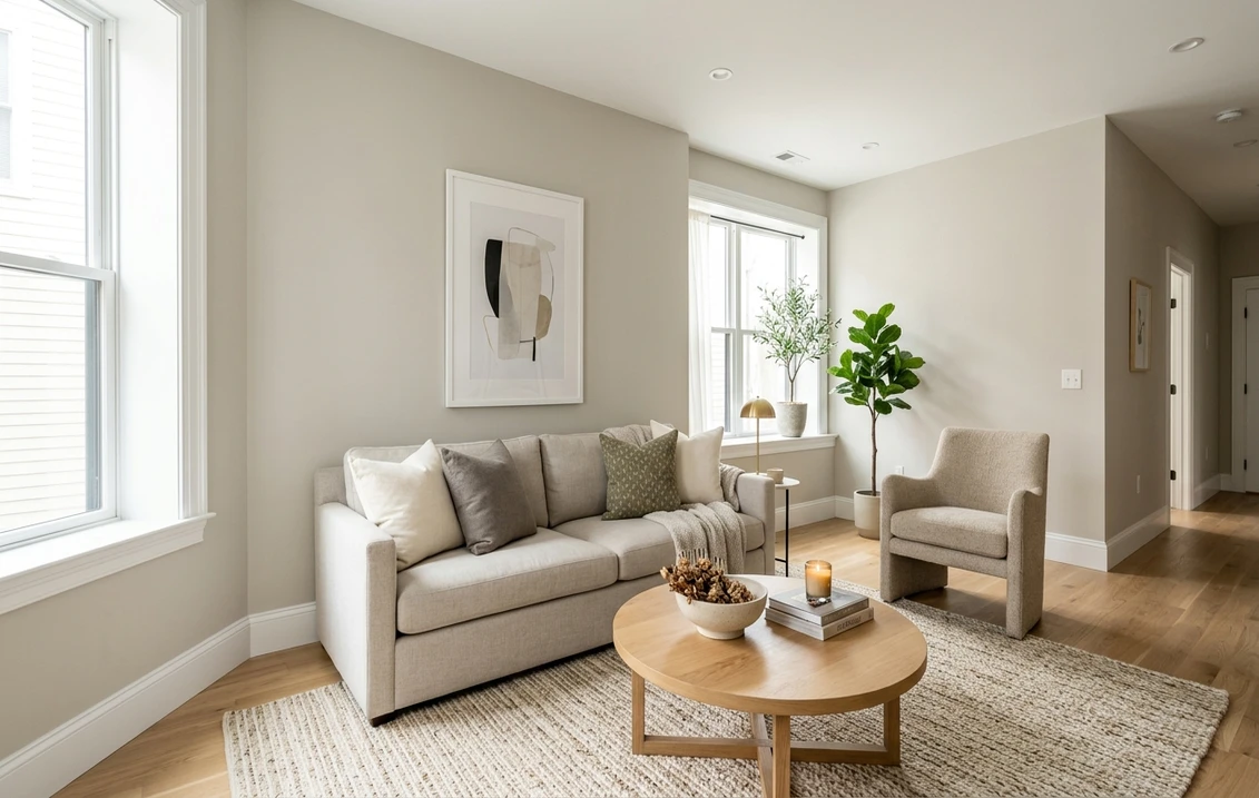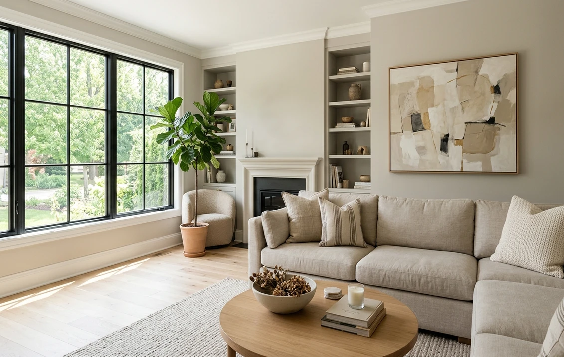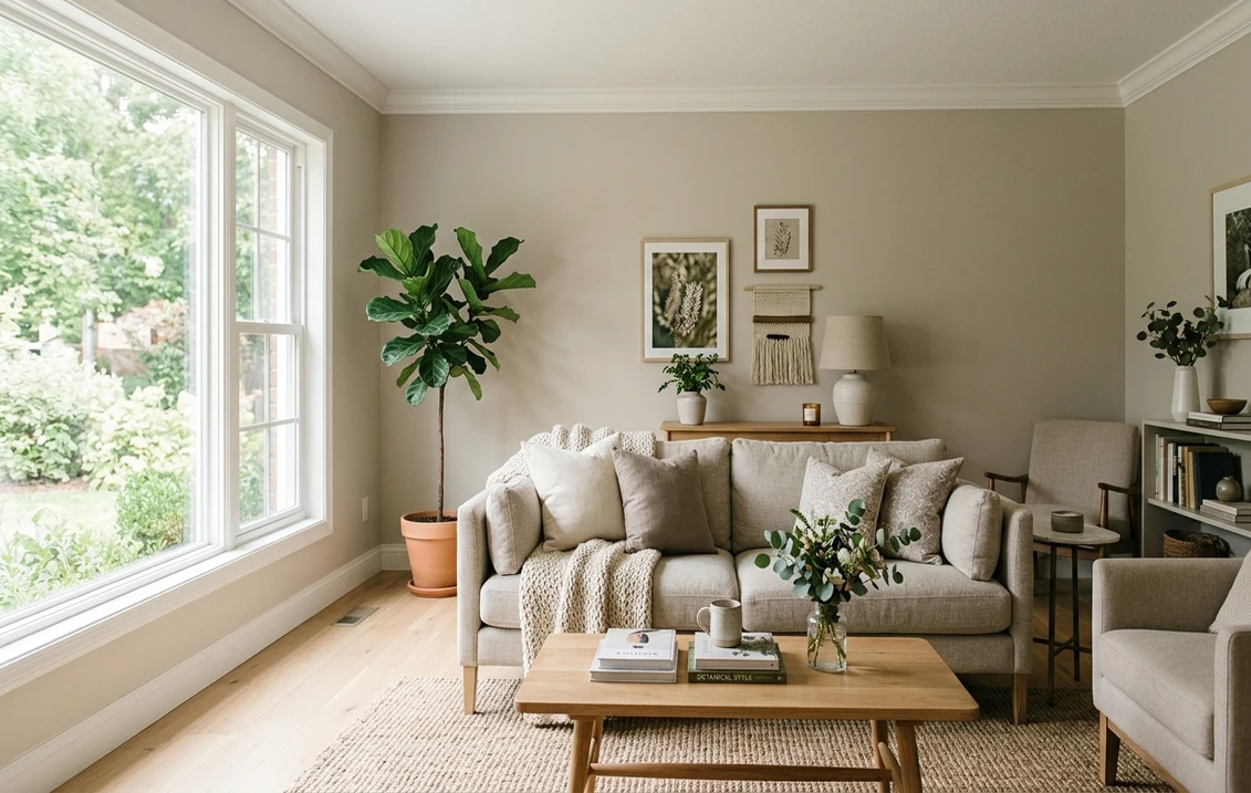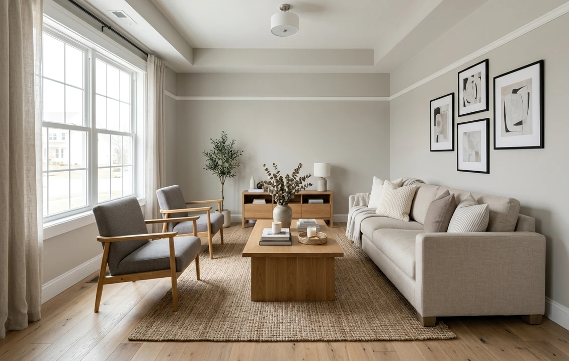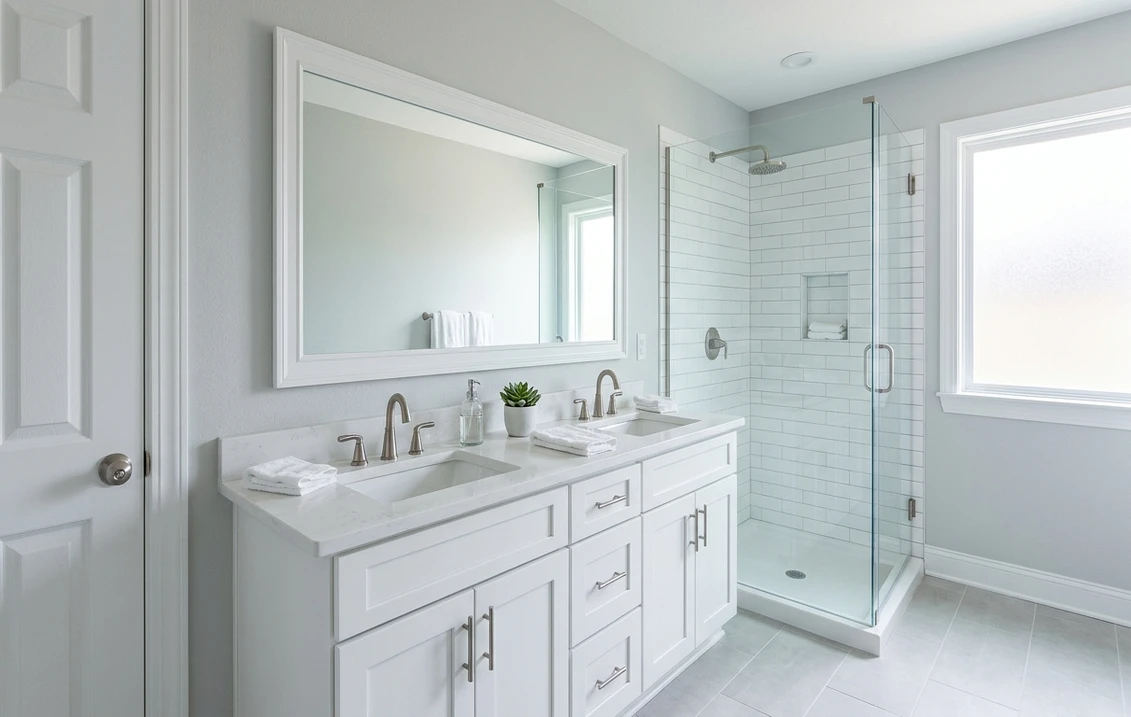
Try it on your room

Sherwin-Williams Passive SW 7064 is a light gray with almost no color of its own. Its color page gives an LRV of 59.885 and the hex code CBCCC9, which is RGB 203, 204, 201. The three values sit within 3 points of each other, so Passive has none of the beige that warms Agreeable Gray or Repose Gray. That is why it reads as a cool, clean gray indoors, and why it can pick up a blue cast in north light.
One limit first: the color data we could read prints no undertone, suggests no rooms and labels no trim color, so the undertone reading and the room suggestions below are ours, built on the published numbers and on Sherwin-Williams' general guides. The page lists SW 7064 for interior and exterior use; this article covers the interior.
Upload a photo of your room and preview SW 7064 on the walls before you buy a sample.
What Sherwin-Williams publishes for SW 7064
The Passive color page names the color SW 7064 and gives its light reflectance value as 59.885, which the page labels "light". The hex code is CBCCC9 and the RGB values are 203, 204 and 201. Usage is listed as interior and exterior, the color family is Neutral, and the color strip locator, the reference used to find a chip in the store fan deck, is 236-C1.
The page lists three coordinating colors: Nebulous White SW 7063, Shell White SW 8917 and Green Onyx SW 9128, plus a repeat of Passive under a second code, HGSW1487. None is labeled as a trim, ceiling or accent color. Sherwin-Williams' public color data also places Passive in several of its collections, among them Foundational Neutrals, Top 50 Interior Colors and Top 50 Exterior Colors. For the wider family of interior colors we cover, start with the Sherwin-Williams interior paint colors guide.
| Figure | Value for SW 7064 | Where it comes from |
|---|---|---|
| LRV | 59.885 | Sherwin-Williams color page |
| Hex code | CBCCC9 | Sherwin-Williams color page |
| RGB | 203, 204, 201 | Sherwin-Williams color page |
| Color family | Neutral | Sherwin-Williams color page |
| Strip locator | 236-C1 | Sherwin-Williams color page data |
| Coordinating colors | Nebulous White SW 7063, Shell White SW 8917, Green Onyx SW 9128 | Sherwin-Williams color page |
| Hue and saturation | Hue 80 degrees, saturation about 0.015 | Our calculation from the RGB values |
| Undertone | Not printed in the data we could read | Our reading, see below |
Try it on your room
No photo? Try a sample
Lightness. LRV is the light reflectance value. The Wikipedia entry on light reflectance value describes it as a measure of the visible light a surface reflects when a light source shines on it, and Sherwin-Williams uses a scale from 0 (no light) to 100 (all light). At 59.885, usually rounded to 60, Passive reflects clearly less light than whites in the 80s and clearly more than a mid gray in the 40s. On a wall it is a light gray that still shows as a color next to white trim.
Undertones: is Passive a blue gray?
Passive is widely described as a gray with cool blue undertones. The search result snippet for Sherwin-Williams' own page uses those words and suggests cool white trim; we could read that sentence only in the snippet, not in the page data, so we report it as such. The numbers tell a more careful story.
On the standard color wheel, 0 degrees is red, 60 is yellow, 120 is green and 240 is blue. Passive's RGB values are 203, 204 and 201. Green is the highest by one point and blue is the lowest by two, which gives a hue of 80 degrees, on the yellow-green side, with a saturation of about 0.015 on a scale from 0 to 1. These are our calculations from the published values. A paint this close to pure gray has no strong undertone of its own. On the screen values it is not a blue gray, and it leans very faintly toward green if it leans anywhere.
So why does it read cool, and sometimes blue, on a wall? Two reasons, both our reading rather than Sherwin-Williams statements.
- It has no beige in it. Popular grays such as Agreeable Gray and Repose Gray have a red value 12 to 16 points above their blue value. That gap is the warmth people call greige. Passive's gap is 2 points. Put a chip of Passive next to a greige, a cream trim or an oak floor and the eye reads the missing warmth as coolness.
- A near-neutral gray takes its tint from the light. With so little color of its own, Passive shows whatever the room gives it. Cool daylight from a north window or a blue sky can make it look bluish; warm bulbs or afternoon sun pull it back to a plain soft gray; a lawn or trees outside the window can bring out the faint green.
If you want a gray that is blue on paper as well as on the wall, Gray Screen, compared below, is the closer candidate, and the blue gray paint colors guide covers shades that go further in that direction.
Light direction: north, south, east and west
Sherwin-Williams' guide to color by room orientation does not mention Passive. The points below apply its general rules to SW 7064.
North-facing rooms get the least daylight, and that light is cool. The guide is direct here: it says it is best to avoid colors with cool undertones, since they make the room appear colder, and it recommends warm neutrals and a higher LRV. Passive is the hard case. It is not strongly cool on paper, but it has no warmth to push back against cool light, so in a north room it is likely to read as a flat, slightly blue gray, and darker than the chip. If that is the look you want, it works. If you want the room to feel warmer, compare it with a greige; the guide's own north-room example is Worldly Gray SW 7043. Our guide to gray paint colors for north-facing rooms goes through the options.
South-facing rooms get warm light that stays fairly steady through the day. The guide says most colors work there, that neutral tones may look warmer and that cool tones may look more neutral. This is where Passive is easiest to live with: warm sun cancels the cool cast and leaves a soft, even gray.
East- and west-facing rooms change through the day. East rooms are warm in the morning and cool toward the evening, and west rooms do the reverse. The guide's advice is to choose by when you use the room most, and it notes that a neutral color creates a balanced feel in a bedroom used all day.
Rooms with little daylight depend on their bulbs. The guide says to pick colors for warm lighting as you would for a south-facing room, and for white or cool lighting as you would for a north-facing room. Under warm bulbs Passive should read as a quiet neutral gray; under cool white bulbs it will look crisper and bluer.
Passive beside Agreeable Gray, Repose Gray, Gray Screen, Light French Gray and Crushed Ice
Light grays are easiest to judge side by side. The table lists the LRV and hex published on each color's Sherwin-Williams page. The last two columns are our calculations: the hue, and the gap between the red and blue values, which is a simple measure of warmth.
| Color | Number | LRV (Sherwin-Williams) | Hex | RGB | Hue (our calculation) | Red minus blue |
|---|---|---|---|---|---|---|
| Crushed Ice | SW 7647 | 65.536 | D6D3CC | 214, 211, 204 | 42.0 degrees | +10 |
| Agreeable Gray | SW 7029 | 60.386 | D1CBC1 | 209, 203, 193 | 37.5 degrees | +16 |
| Passive | SW 7064 | 59.885 | CBCCC9 | 203, 204, 201 | 80.0 degrees | +2 |
| Gray Screen | SW 7071 | 58.547 | C6CACA | 198, 202, 202 | 180.0 degrees | -4 |
| Repose Gray | SW 7015 | 58.22 | CCC9C0 | 204, 201, 192 | 45.0 degrees | +12 |
| Light French Gray | SW 0055 | 52.625 | C2C0BB | 194, 192, 187 | 42.9 degrees | +7 |
Passive vs Agreeable Gray. This is the comparison most buyers make, and lightness will not decide it: the two are half a point apart on LRV (59.885 against 60.386). The difference is temperature. Agreeable Gray's red value is 16 points above its blue value, which makes it a greige with a visible beige side. Passive's gap is 2 points. On the same wall, Agreeable Gray should read warmer and softer, Passive cleaner and cooler. The gaps are our subtraction of the published values. For the warm option in detail, see the Agreeable Gray undertones guide.
Passive vs Repose Gray. Repose Gray is about 1.7 points darker and sits between the two colors above, with a red to blue gap of 12 points. It is a gray with a little warmth, where Passive is a gray with none. The Repose Gray undertones guide covers how that warmth shifts by room.
Passive vs Gray Screen. Gray Screen is about 1.3 points darker, at 58.547, and it is the only color in the table whose blue value is higher than its red value. Its green and blue values are equal, which puts its hue at 180 degrees, on the cyan side. If you like Passive but want the blue to be part of the paint rather than a trick of the light, test Gray Screen. If you want the more neutral of the two, stay with Passive.
Passive vs Light French Gray. Light French Gray is about 7.3 points darker, at 52.625, and a touch warmer, with a red to blue gap of 7 points. Sherwin-Williams files it in its Historic Color family. It is the step down to try when Passive looks washed out in a very bright room. Our Light French Gray guide has its rooms and pairings.
Passive vs Crushed Ice. Crushed Ice is about 5.7 points lighter, at 65.536, and Sherwin-Williams files it under White & Pastel rather than Neutral. Its red to blue gap of 10 points gives it a slight warm lean that Passive lacks. It is the swap to test if Passive turns out too dark or too cold in a room with one small window. See the Crushed Ice guide for its behavior by room.
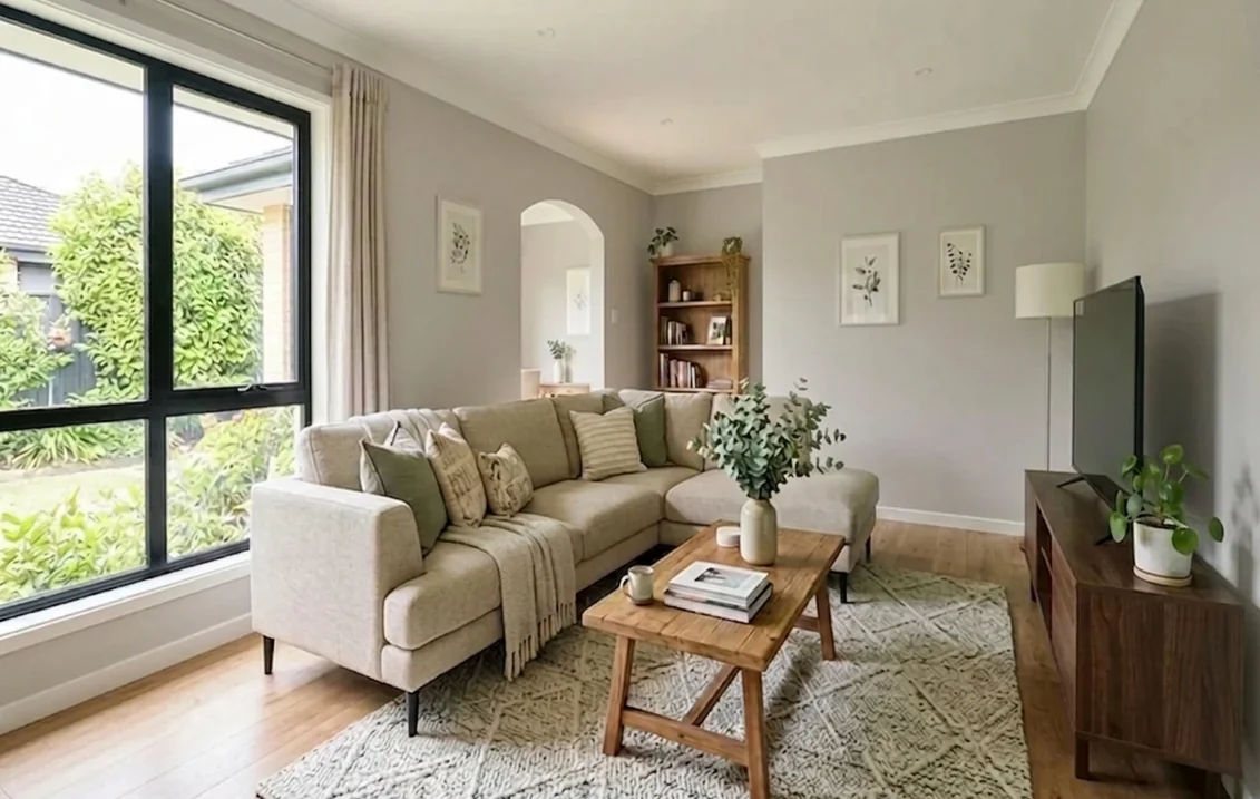
Best rooms for Passive: bathroom, bedroom and beyond
Sherwin-Williams does not name rooms for SW 7064 in the data we could read. The suggestions below come from the light rules above and from what usually sits next to the walls in each room. They are our reading, not a list from the manufacturer.
- Bathrooms. White tile, white fixtures, chrome or nickel hardware and a white vanity are all cool, clean surfaces, and a gray with no beige sits beside them without looking dingy. Bathrooms are often lit by white or cool bulbs, which the orientation guide treats like north light, so expect the crisp, slightly blue version of Passive there. Beige or cream tile is the case to test first: against warm tile, a neutral gray can look cold.
- Bedrooms. The guide's point about neutrals in rooms used all day fits a quiet light gray. With white bedding and warm bedside lamps, Passive should read soft rather than icy. In a north-facing bedroom, compare it with Agreeable Gray before you commit.
- Living rooms and open plans with south or west light. Plenty of warm light keeps an LRV near 60 from looking heavy and keeps the gray neutral.
For a wider view of the gray family, from near-whites to charcoals, the light gray paint colors guide explains how the undertone groups differ. And if Passive is close but you want a lighter, icier neighbor from the same brand, the Big Chill guide covers SW 7648, which Sherwin-Williams' color data lists among the colors similar to Passive.
Trim, ceiling and accent pairings
The color page labels no trim or ceiling color for SW 7064, but its coordinating colors each have a color page with an LRV. The lightness ranking below uses those published values; the pairing advice is ours.
| Color | LRV (Sherwin-Williams) | Hex | Possible role next to Passive (our suggestion) |
|---|---|---|---|
| Extra White SW 7006 | 85.861 | EEEFEA | Cool white trim and ceiling, crispest edge |
| Pure White SW 7005 | 83.957 | EDECE6 | Slightly softer white trim |
| Shell White SW 8917 (coordinating) | 83.247 | F0EBE0 | Warm white trim, to take the chill off |
| Nebulous White SW 7063 (coordinating) | 73.715 | DEDFDC | Tone-on-tone ceiling, or walls in an adjoining room |
| Green Onyx SW 9128 (coordinating) | 31.415 | 989A82 | Accent wall, vanity, island or interior door |
The practical rule is to compare LRVs. A trim color with a higher LRV than the wall reads brighter and gives a crisper edge. Extra White, about 26 points above Passive, has a hue of 72 degrees by our calculation, close to Passive's 80, so the two stay in the same cool, clean register; it fits the cool white trim idea quoted earlier. Pure White, about 24 points above, is a shade softer. Shell White, about 23 points above, is a warm white with a red to blue gap of 16 points: beside Passive it will look creamy, which helps in a north room and can look yellow under cool bulbs. For those whites in detail, see the Extra White guide and the Pure White guide.
Nebulous White is the most interesting coordinating color. Its RGB values, 222, 223 and 220, give the same 80-degree hue as Passive, about 13.8 points lighter on LRV. It behaves like a lighter version of the same gray, so it suits a ceiling, a hallway or the next room in an open plan. Green Onyx, at 31.415, is filed in the Green family on its page: a muted olive that brings out the trace of green in Passive. These gaps are our subtraction of the published values.
Sheen: which finish to pick for Passive
The color page does not name a sheen. The Sherwin-Williams paint sheen guide describes sheens by room rather than by color. For bathrooms it says a satin or semi-gloss sheen is ideal, as it can withstand moisture. For bedrooms it suggests eggshell or satin for a soft, calming feel, and for living rooms satin or eggshell. For kitchens it points to semi-gloss for easy cleaning. Flat is listed for ceilings, with the warning that flat paint is prone to scuffs and stains. For trim and moldings the guide names semi-gloss, and for cabinets and doors gloss or high gloss.
For walls in Passive, that points to eggshell or satin in a bedroom or living room and satin or semi-gloss in a bathroom. Judge the sample in the sheen you plan to use.
Painting a bathroom in Passive: moisture and ventilation
A bathroom is the room where preparation counts most. The U.S. Environmental Protection Agency's guide to mold, moisture and your home is blunt: do not paint or caulk moldy surfaces. Clean the mold and dry the surface first, because paint applied over moldy surfaces is likely to peel. The same guide advises running the bathroom fan or opening the window when showering, and keeping indoor humidity below 60 percent, ideally between 30 and 50 percent.
None of this depends on the shade. Open the window and run the exhaust fan while you paint and during the first days of drying, and check the moisture information on the data sheet of the product you buy.
Preview Passive in your own room
A published LRV and a hex code tell you how light a color is and roughly how it looks on a screen. They do not show it next to your floor, your tile or your window. Upload a photo of your room and the visualizer shows SW 7064 on the walls, using the same hex code as this article, so you can judge whether it reads soft, crisp or cold in your space before you order a sample. The interior paint visualizer works the same way for any of the grays compared above, which makes it a quick way to put Passive and Agreeable Gray on the same wall.
Sources and references
- Sherwin-Williams, Passive SW 7064 color page (LRV 59.885, hex CBCCC9, RGB 203, 204, 201, usage, color family, strip locator, coordinating colors): sherwin-williams.com
- Sherwin-Williams, Agreeable Gray SW 7029 color page (LRV 60.386, hex D1CBC1): sherwin-williams.com
- Sherwin-Williams, Gray Screen SW 7071 color page (LRV 58.547, hex C6CACA): sherwin-williams.com
- Sherwin-Williams, Light French Gray SW 0055 and Crushed Ice SW 7647 color pages (LRV 52.625 and 65.536): Light French Gray, Crushed Ice
- Sherwin-Williams, Nebulous White SW 7063, Shell White SW 8917, Green Onyx SW 9128, Extra White SW 7006 and Pure White SW 7005 color pages (LRV 73.715, 83.247, 31.415, 85.861 and 83.957): Nebulous White, Shell White, Green Onyx, Extra White, Pure White
- Sherwin-Williams, guide to color by room orientation (north, south, east and west light, artificial light, LRV advice): sherwin-williams.com
- Sherwin-Williams, paint sheen guide (sheens by room, moisture and cleaning notes): sherwin-williams.com
- U.S. Environmental Protection Agency, A Brief Guide to Mold, Moisture and Your Home (no paint over mold, bathroom fan, humidity range): epa.gov
- Wikipedia, Light reflectance value (definition of LRV only, secondary support): en.wikipedia.org
Frequently asked questions
What is the LRV of Sherwin-Williams Passive SW 7064?
What undertones does Passive have?
What colors go with Sherwin-Williams Passive?
What is the difference between Agreeable Gray and Passive?
Is Passive a good color for a bathroom?
Does Passive work in a north-facing room?
Trademarks mentioned (Sherwin-Williams, Benjamin Moore, Behr, Caparol, Brillux, Sto, Alpina, Valspar, PPG, Glidden, Dulux, Crown Trade, Sandtex, Farrow & Ball, Johnstone's, Leyland) are property of their respective owners. FacadeColorizer is independent and not affiliated with any of them. Nominative fair use under Lanham Act §1125.