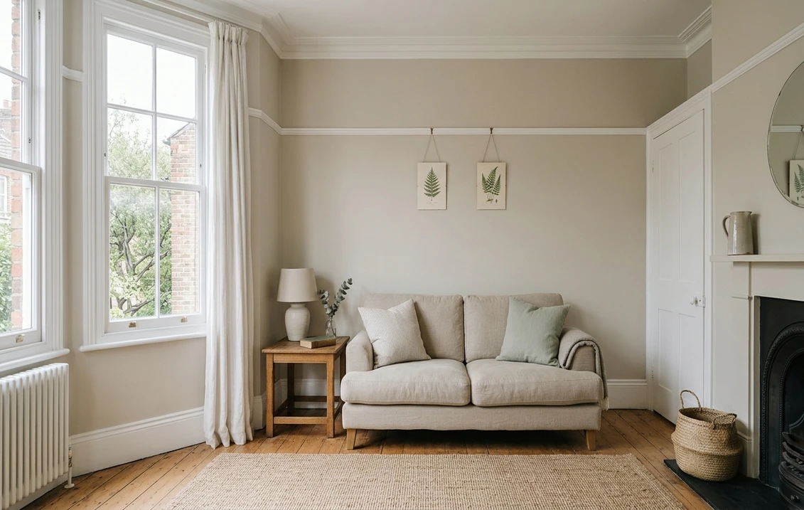
Try it on your room

Farrow & Ball Joa's White No. 226 is a light, clean taupe with the merest hint of black in its base. The maker places it among its Warm Neutrals and names it after Joa, its first colour consultant. Like most light colours, it takes much of its character from the room. Farrow & Ball's own guidance says northern light brings out the cooler tones within a colour, so the same wall can look warm in a south room and grey in a north one. The colour page publishes no light reflectance value (LRV) and no hex code for Joa's White, so every lightness figure in this guide is our own calculation from the swatch in our colour library.
See Joa's White on your own walls
Upload a photo of your room and try Joa's White on the walls before you order sample pots. The interior paint visualiser shows the colour next to your floor, your furniture and your own daylight.
Try Joa's White on my wallsWhat colour is Farrow & Ball Joa's White?
Farrow & Ball describes Joa's White as a light and contemporary taupe, a light and clean colour with the merest hint of black pigment. It sits in the Warm Neutral group, and the maker says it suits the natural textures common in modern interiors, such as stone, leather and linen. According to the colour page, the name honours Joa, the brand's first colour consultant, who still develops many Farrow & Ball colours.
The colour page does not label a hex code for Joa's White. The value #DBCFBB appears in one of the unlabelled colour scheme blocks further down the page, but the page does not say that it belongs to this colour, so we do not quote it as the maker's swatch. In our colour library, the swatch for Joa's White is #DBCFBB. We use that value for every calculation in this guide and for the preview tool. It is a digital approximation, and paint on a wall will look different in your light.
| Item | Value | Where it comes from |
|---|---|---|
| Name | Joa's White No. 226 | Farrow & Ball colour page |
| Group | Warm Neutral | Farrow & Ball colour page |
| Hex on the maker's page | Not labelled for this colour | Farrow & Ball colour page |
| Light reflectance value (LRV) | Not published | Farrow & Ball colour page |
| Swatch in our colour library | #DBCFBB | Our colour library (digital approximation) |
| Lightness (CIELAB L*) | 83.6 | Our calculation from the library swatch |
| Yellow to blue axis (CIELAB b*) | 11.4 | Our calculation from the library swatch |
| Relative luminance (0 to 100) | 63.3 | Our calculation from the library swatch; not an LRV |
Try it on your room
No photo? Try a sample
On our figures, Joa's White is a light colour with a warm lean. A lightness of 83.6 places it well above the middle of the scale, and a b* value of 11.4 shows the yellow side of its base. Its red to green value is almost neutral at 0.8, which is why it reads as beige taupe rather than pink. These are readings of one screen swatch. They are not a measurement of paint, and they do not replace a sample on your own wall.
How north, south, east and west light change Joa's White
Light moves a colour like this one more than a pure white, because its character lies in the small warm and grey notes of its base. Farrow & Ball's guide on how light affects colour says northern light tends to bring out the cooler tones within a colour. It also advises that a lighter tone in that light should avoid a blue or grey base. Taupe sits in the brown grey family rather than the blue grey one, so Joa's White passes that test. A north room will still push it cooler and greyer than the card shows, and that is the first thing to check.
| Room faces | What the light does | What it means for Joa's White (our reading) |
|---|---|---|
| North | Cooler and generally weaker light. Dulux says these rooms can feel dark and cold, and suggests warmer pink, gold or yellow undertones. | The taupe reads cooler and greyer than the card. It can look flat, so check the sample at the times you use the room. |
| South | In fine weather, warm light from dawn until dusk, according to the maker. | The warm base comes forward most here. Look at the sample in the strongest sun before you decide the room is too warm. |
| East | The most sun in the morning, then cooler, muted light in the evening. | Soft and fresh at breakfast and quieter after dark. Judge the sample under the evening lamps. |
| West | Cooler in the morning and brighter in the afternoon. | Quiet at the start of the day and fuller by late afternoon. Look at the sample at both times. |
Dulux's advice for east and west rooms is different. For an east-facing room used mainly in the morning, or a west-facing room used mainly in the evening, it suggests cooler colours with hints of blue, green or violet to balance the strength of the sun. Joa's White has none of those hints. In those rooms, test it against the light of the hours you actually use, rather than assuming it will balance the sun on its own.
Bulbs change the answer as much as the aspect
Farrow & Ball says halogen and incandescent bulbs give a yellow light that makes wall colours look warmer. Cool white bulbs give a bluer light that gives paint a cooler cast, and a neutral white bulb most closely matches daylight. For Joa's White, a warm bulb brings out the yellow side of its base, and a cool bulb makes it look greyer. Read the colour temperature on the bulb packet, then compare the sample under those bulbs after dark.
A room lit by one cool ceiling light looks different from the same room lit by two warm lamps, even in the same daylight. That is why the evening test matters as much as the morning one. If a north room is also lit by cool bulbs, expect the taupe to look its greyest exactly when you use the room most.
Joa's White next to the whites Farrow & Ball names
Farrow & Ball's pages name a short list of colours to compare with Joa's White. The Joa's White page names Dimity as its complementary white. It suggests Pointing and Dimity as a lighter sample set, and Oxford Stone and Jitney as a darker one. The Pointing page names All White as its complementary white, and suggests School House White for a moodier feel. We calculated the colour difference between Joa's White and each of these colours, using the swatches in our colour library.
| Colour | Where Farrow & Ball names it | Lightness (L*) | Relative luminance | Colour difference to Joa's White (ΔE2000) |
|---|---|---|---|---|
| Oxford Stone No. 264 | Darker sample set with Joa's White; trim partner on the Pointing page | 78.7 | 54.4 | 3.5 |
| Dimity No. 2008 | Complementary white for Joa's White; "a very pale taupe" | 89.9 | 76.0 | 4.7 |
| School House White No. 291 | Named on the Pointing page as a darker, moodier pairing | 88.5 | 73.1 | 4.7 |
| Jitney No. 293 | Darker sample set with Joa's White | 73.4 | 45.8 | 7.7 |
| Pointing No. 2003 | Lighter sample set with Joa's White; "a warm and delicate white" | 94.5 | 86.3 | 8.1 |
| All White No. 2005 | Complementary white for Pointing | 96.8 | 91.9 | 11.3 |
On our figures, the nearest colour in this set is Oxford Stone, at 3.5. Dimity and School House White follow at 4.7. Pointing, the lighter sample partner, is 8.1 away, which is a visibly lighter step. We use the CIEDE2000 colour difference formula, abbreviated ΔE2000, computed from the library swatches. Our working rule is that a difference of about 5 is easy to see when two swatches sit side by side. That rule is our judgement, not an industry standard, and it says nothing about how two paints look on a wall in different light.
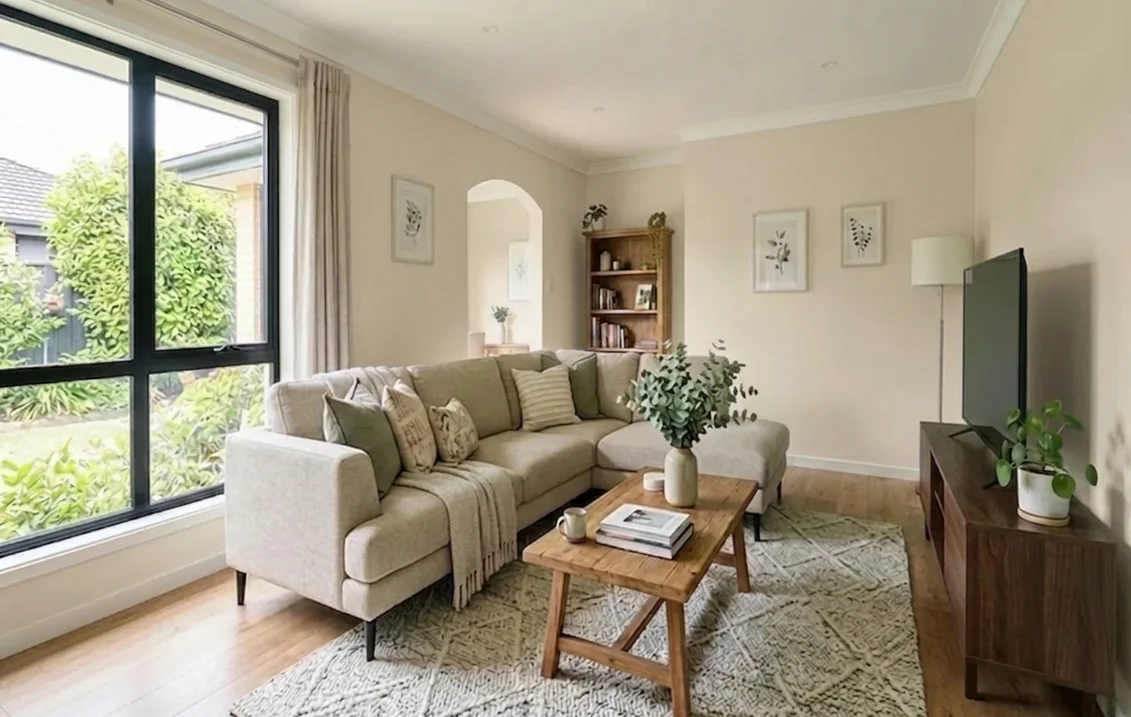
Room by room: where Joa's White works
Each room below combines the light described above with how the room is used. These notes are our reading of the colour, built from the maker's description and its guidance on light. They are not claims that the maker makes for each room.
Sitting rooms and living rooms
Joa's White suits a sitting room that gets steady daylight. Its warm base shows most in direct sun, so a sunny room will look warmer than a shaded one, and a north-facing room will look cooler. Pair it with the textures the maker mentions, such as linen, oak and stone, because those carry the warmth of the colour without adding a second strong tone. Our living room paint colours guide sets other shades beside it for the same kind of room.
Bedrooms
A pale taupe like this one suits a bedroom with plenty of natural light, where the walls can stay calm and quiet. In a north-facing bedroom, check the sample at the time you go to bed, because that is when the room is lit by lamps and the taupe will look at its greyest. Our north-facing room guide sets the same question out across several colours.
Kitchens and hallways
Pale walls show day-to-day marks more readily than darker ones, so in a kitchen or a hall the finish comes before the shade. The maker's Scrub Class 1 rating excludes Estate Emulsion, so for a wall that gets wiped often, choose Modern Emulsion. In a narrow hall with little daylight, look at the sample under the hall lamp as well as by the window. Our hallway paint colours guide covers other options for a narrow space.
Bathrooms
In a bathroom, the finish matters more than the colour. The maker describes Modern Emulsion as washable and resistant to mould, so start with that finish and then choose the shade. Our bathroom paint colours guide covers moisture-resistant options in more depth.
Finish and primer
Farrow & Ball describes Modern Emulsion as a durable matt finish with a 7% sheen. The colour page says it is washable and resists mould, scuffs and stains. The maker rates its colours Scrub Class 1, but that rating excludes Estate Emulsion, Exterior Masonry, Soft Distemper, Casein Distemper and Limewash. For a wall that gets wiped often, Modern Emulsion is the safer choice. Estate Emulsion suits walls that see less contact.
For the base coat, the colour page recommends Mid Tones as the primer and undercoat for Joa's White. Follow the primer advice on the maker's page rather than a generic primer, because a dark or mid primer under a pale taupe can change the colour you see on the wall.
UK rules on solvent emissions set a limit of 30 g/l for interior matt walls and ceilings, measured on the ready-to-use product. That is the category limit in the regulation, not a measured value for any tin of Joa's White. We did not find a VOC figure for this colour on the maker's page. If you need one for a specification, ask the maker for the product data sheet.
Pairings and the sample sets Farrow & Ball suggests
The colour page names Dimity No. 2008 as the complementary white for Joa's White. For a lighter sample set, it pairs Joa's White with Pointing No. 2003 and Dimity. For a darker set, it pairs it with Oxford Stone No. 264 and Jitney No. 293. The Pointing page shows Joa's White with Oxford Stone trim, so the maker's own scheme uses a darker trim against this taupe rather than a bright white.
Our reading is that Dimity is the safest partner where a white is needed next to Joa's White, because a colour difference of 4.7 keeps the two close on screen. Pointing gives a clearly lighter step at 8.1, which suits a hall or landing that needs more light. Joa's White itself has no published LRV, so compare the pairing on a real sample, not on a screen.
How to test Joa's White before you buy
Order a sample pot and paint two coats on a card at least A3 in size, with a white border so the old wall colour does not affect your reading. Move the card between the window wall and the darkest corner. Look at it in the morning, in the late afternoon and in the evening under the lamps you use. Then set it beside the floor, the sofa, the worktop and the woodwork, because those decide whether the taupe looks soft or grey. Our guide to testing paint colours before buying explains how to read a sample across the day.
Joa's White or a lighter neighbour in your room?
Compare the candidates on a photo of your own room before you order pots. Start with the interior paint visualiser, then open the tool to place each shade on the walls.
Compare taupes on my roomHiring a decorator to paint Joa's White
If you are paying a decorator, ask for a sample on your own wall before the work starts, and agree the finish in writing, so that the finish on the quote is the finish that goes on the wall. Our UK interior decorator cost guide is the pillar of this cluster and covers how interior work is priced in the UK.
Sources and references
- Farrow & Ball, Joa's White No. 226 colour page: the name's origin, the description, the Warm Neutral group, the absence of a labelled hex and of a published LRV, Modern Emulsion (7% sheen, washable, mould, scuff and stain resistance), the Scrub Class 1 exclusions, the Mid Tones primer, and the pairings and sample sets.
- Farrow & Ball, Dimity No. 2008 colour page: "a very pale taupe", its Warm Neutral group, and its pairing with Pointing and Oxford Stone.
- Farrow & Ball, Pointing No. 2003 colour page: "a warm and delicate white", its complementary white All White, the Joa's White scheme with Oxford Stone trim, and School House White as a darker pairing.
- Farrow & Ball, How Light Affects Colour: northern light and cooler tones, the effect of halogen, incandescent, cool white and neutral white bulbs, and the light by aspect.
- Dulux, Best shades for north, south, east or west-facing rooms: the cooler, weaker light of north-facing rooms, the warm undertones suggested for them, and the cooler shades suggested for east and west rooms.
- legislation.gov.uk, Volatile Organic Compounds in Paints, Varnishes and Vehicle Refinishing Products Regulations 2012, Schedule 2: the 30 g/l limit for interior matt walls and ceilings, measured on the ready-to-use product.
- Our calculations: CIELAB values, relative luminance and CIEDE2000 colour differences, computed from the swatches in our colour library on 5 November 2026. They are not LRV values and not a colour match with the maker's paint.
Frequently asked questions
Is Farrow and Ball Joa's White a warm colour?
Does Joa's White look pink?
Is Joa's White a good colour for a north-facing room?
What white goes with Joa's White for woodwork?
Which Farrow and Ball finish should I use for Joa's White in a bathroom or kitchen?
Does Farrow and Ball publish an LRV for Joa's White?
Trademarks mentioned (Sherwin-Williams, Benjamin Moore, Behr, Caparol, Brillux, Sto, Alpina, Valspar, PPG, Glidden, Dulux, Crown Trade, Sandtex, Farrow & Ball, Johnstone's, Leyland) are property of their respective owners. FacadeColorizer is independent and not affiliated with any of them. Nominative fair use under Lanham Act §1125.