Try it on your room

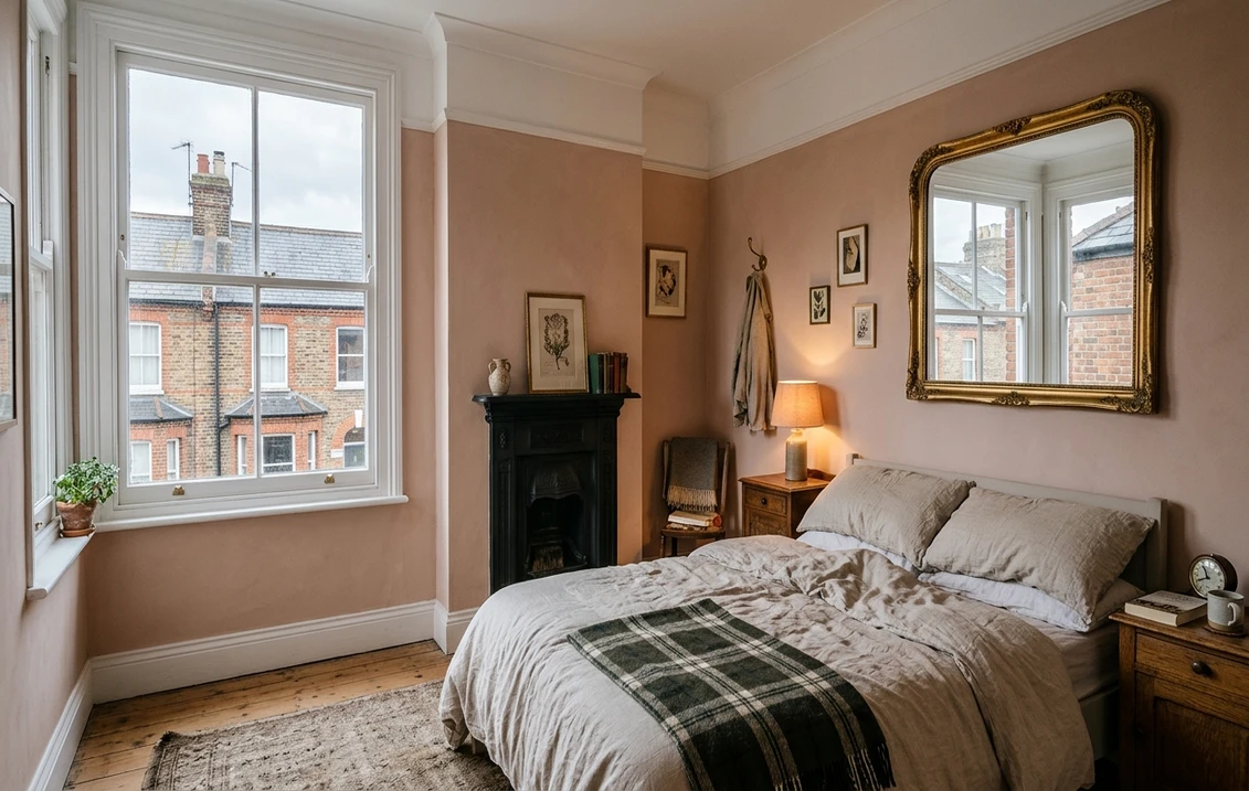
The best colours for north-facing rooms are warm ones: whites with a yellow base, plaster pinks, ochre yellows and neutrals with a pink, yellow or brown undertone, because northern light is cool and brings out any blue or grey in a paint. All three British makers we read agree on that. Farrow & Ball names New White, White Tie, Yellow Ground, Double Cream and Setting Plaster; Dulux names Morning Light, Desert Wind, Natural Hessian, Blush Pink and Copper Blush; Little Greene names Silent White, Hammock, Rolling Fog, Masquerade and Yellow-Pink. A small, dark room can go the other way, with deep, warm colours used all over.
Recommendations, swatch values and prices were read on the makers' websites on 1 November 2026. We have not painted these colours in a test room, so treat each shade as a shortlist entry and sample it on your wall.
See a warm shade on your own north-facing walls
Repaint a photo of the room in Setting Plaster, Silent White or another UK shade before buying a sample pot. How it works: our interior paint visualiser.
Try colours on my roomWhy north-facing rooms look cold in Britain
Little Greene's guide to room orientation describes northern light as cold and blue-toned, and says colours look flatter and cooler in it. Farrow & Ball says the same light pulls out the cooler tones within a colour, and Dulux adds that there is generally less of it, so the room can feel dark as well as cold.
Britain's latitude makes this stronger in winter. The noon sun is low, and it sits in the south, so a north window sees only the sky. This is our own calculation with the standard solar formula (noon height = 90 degrees, minus latitude, plus or minus 23.44), and you can check any date in NOAA's solar calculator:
| City | Noon sun, midwinter | Noon sun, midsummer | Midsummer sunrise, degrees east of due north |
|---|---|---|---|
| London | 15° | 62° | About 50° |
| Manchester | 13° | 60° | About 48° |
| Edinburgh | 11° | 58° | About 45° |
Try it on your room
No photo? Try a sample
Between the spring and autumn equinoxes the sun rises north of east and sets north of west, so a truly north-facing window can catch a little low sun early and late in summer. From autumn to spring it gets none. A colour chosen in July can therefore look colder in January. Cloud adds to it: the Met Office's 1991-2020 UK averages give 42.68 hours of sunshine in December against 171.49 in June, four times as many. Look at samples on a dull afternoon if you can: that is the room at its hardest.
What Farrow & Ball, Dulux and Little Greene recommend
Each row below is a shade its maker links to north-facing rooms. "Lightness index" is the relative luminance of the maker's on-screen swatch, from 0 (black) to 100 (white). It is our calculation, not an official LRV, and the next section shows how closely it tracks one. "Reads as" comes from converting the swatch to CIELAB.
| Shade | What the maker says, in short | Lightness index | Reads as (swatch) |
|---|---|---|---|
| F&B White Tie No. 2002 | Yellow based, bounces light around the room | 82 | Pale yellow white |
| F&B New White No. 59 | Yellow based, bounces light around the room | 79 | Creamy white |
| F&B Matchstick No. 2013 | More relaxed and traditional in a darker north-facing room | 67 | Yellow-beige |
| F&B Yellow Ground No. 218 | Yellow based, bounces light around the room | 63 | Clear soft yellow |
| F&B Double Cream No. 9907 | Counteracts the perceived green light of a north room | 59 | Yellow-beige |
| F&B Setting Plaster No. 231 | Warms a north room up | 56 | Pink-beige |
| Dulux Morning Light | Warm neutral to offset blue-tinged light | 89 | Faint yellow white |
| Dulux Desert Wind | Warm neutral to offset blue-tinged light | 89 | Faint yellow white |
| Dulux Lemon Pie | On its north-room list of warm shades | 76 | Strong yellow |
| Dulux Blush Pink | On its north-room list of warm shades | 71 | Barely pink |
| Dulux Natural Hessian | On its north-room list of warm shades | 68 | Soft beige |
| Dulux Copper Blush | Dulux's featured shade for north rooms | 34 | Terracotta pink |
| Little Greene Stock 37 | On its list of neutrals for north rooms | 90 | Faint yellow white |
| Little Greene Silent White 329 | Its Creative Director's go-to warm neutral white | 89 | Faint yellow white |
| Little Greene Light Beauvais 323 | On its list of neutrals for north rooms | 76 | Soft peach-beige |
| Little Greene Hammock 38 | Warm neutral with umber undertones, a warm uplift | 59 | Yellow-beige |
| Little Greene Masquerade 334 | Plaster-like, easy to use all over | 50 | Pink-beige |
| Little Greene Yellow-Pink 46 | Earthy yellow that can drench a room lacking light | 42 | Mustard |
| Little Greene Mochi 344 | Soft muted pink, versatile | 40 | Pink-brown |
| Little Greene Boxington 84 | Green with yellow ochre and red oxide in it | 38 | Yellow-green |
Our reading: the makers share a method but not a shortlist, and depth runs from 90 to 34. A colour for a north-facing room need not be pale. It needs warmth you can still see once the light has taken some away. Swatches are a digital rendering, so screen, sheen and light all change the result.
Which makers publish an LRV?
Light reflectance value (LRV) says how much visible light a surface returns, from about 0 to 100. Farrow & Ball and dulux.co.uk do not print it on their colour pages. Dulux Trade does in effect, because in its notation system the middle number of a code is the LRV: Blush Pink 50YR 74/054 is about 74 and Copper Blush 50YR 36/263 about 36. Our index gives 71 and 34.
Little Greene is patchier than its reputation suggests. Of the 60 or so colour pages we read, only ten print an LRV, and none of those ten is a shade it recommends for north-facing rooms. They are still useful as a check on our index:
| Little Greene shade | Published LRV | Our index |
|---|---|---|
| Tusk 237 | 78 | 84 |
| Ceviche 230 | 70 | 71 |
| Limestone 238 | 61 | 66 |
| Dash of Soot 244 | 53 | 54 |
| Mortar 239 | 52 | 54 |
| True Taupe 240 | 33 | 40 |
| Dolphin 246 | 31 | 20 |
| Grey Teal 226 | 29 | 25 |
| Grey Moss 234 | 20 | 11 |
| Toad 235 | 8 | 3 |
The gap averages about 3 points on the five lighter shades and about 7 on the five darker ones, reaching 11 on Dolphin. So read the index as a ranking with a margin, not a measurement. A published LRV also leaves out what matters most in this room, which is undertone. F&B New White (79) and Pale Powder (69) are only ten points apart on the index, yet one reads creamy and the other, by the maker's account, nearly grey in a north room. Choose warmth first and depth second.
The best white for a north-facing room
Farrow & Ball's advice for lighter tones is to avoid a blue or grey base and go for yellow. In practice that gives New White or White Tie from its range, Silent White, Stock or Haye White from Little Greene, and Morning Light or Desert Wind from Dulux. Little Greene describes Haye White as a softer, warmer alternative to the umber-toned Slaked Lime, with a little ochre, so it stays a white and does not turn into a cream.
If you already like Old White, be warned that Farrow & Ball says it can read as a subdued green in north-facing rooms. For a white with a little more body, our warm greige paint colours guide covers Skimming Stone and its neighbours, and our Farrow and Ball Ammonite guide looks at a grey that the maker pitches as neither warm nor cool.
Yellows and pinks: the warm way in
Little Greene's north-facing guide, written with its Creative Director Ruth Mottershead, treats yellow as an alternative to a neutral. It suggests the muted Yellow-Pink or Giallo for colour drenching walls, woodwork and ceiling together, the gentler Light Gold or Indian Yellow for an accent wall, and only small doses of the vivid Mister David and Trumpet. If you pair these yellows with a white, it suggests Silent White for its yellow base.
On pinks, Farrow & Ball's Joa Studholme says of Setting Plaster, "It's perfect in north facing rooms because it warms it up", in the maker's lesson on the colour, which suggests a Pink Ground ceiling for a lighter scheme. A close relative at Little Greene is Masquerade, with its paler Mid and Light versions, under a Julie's Dream ceiling. For historic colour with a story, Parlour is a pinkish off-white that the maker says was once used in a north-facing reception room at Dyrham Park, near Bath.
Blues and greens in northern light
Blue and green are where a north room is least forgiving. Little Greene warns that paler blues and greens may look a little cold, and suggests stronger green-blues such as Rome or Canton instead. For a blue in a small room it prefers warm ones: Hicks' Blue and Juniper Ash, both with a subtle red note, or the green-toned Tea with Florence.
For green, the same guide names Boxington, for the ochre and red oxide in it, with Hillside on woodwork, which it describes elsewhere as a warmer version of Sage Green. Its Green Stone family is the neutral route: not too warm and not too cool, by its account. Our guide to colours that go with dark green covers partners.
Should you paint a north-facing room dark?
The makers split on this one, and both positions are sensible. Dulux's north-facing advice says lighter colours make a room look brighter. Little Greene says that in a small north room with very little light you probably will not make it feel bigger, and suggests embracing it with rich, deep, warm colours used all over. Farrow & Ball says dark walls in Railings or Down Pipe give a cosy, cocooning feel.
| Deep route | Shades the makers name | Lightness index |
|---|---|---|
| Dark pink and red | Nether Red, Adventurer | 20, 6 |
| Earthy brown | Attic II, Scullery, Purple Brown, Chocolate Colour | 9, 8, 1, 1 |
| Gold-green | Light Bronze Green | 7 |
| Soft black and lead grey | F&B Down Pipe, Railings | 13, 7 |
Our reading: decide by when you use the room. A wall at index 8 sends back far less light than one at 80, so a deep colour will not help you read by the window at 3 pm in December. A room used mostly after dark, under lamps, loses little by it. That favours deep colour in a snug, a dining room or a cloakroom, and a lighter warm shade in a room you work or dress in by daylight. Our guides to snug paint colours and dining room paint colours take that further.
North-facing bedroom, living room and kitchen colours
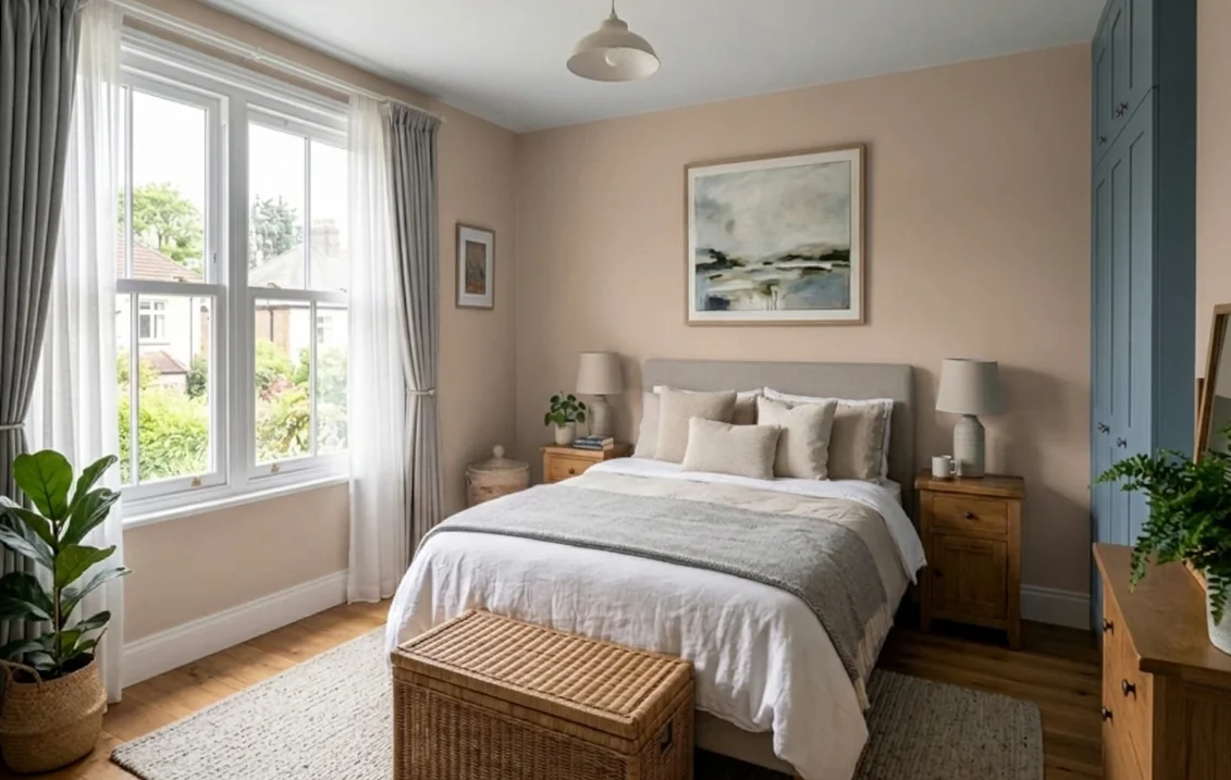
- Bedrooms. Little Greene describes Masquerade as being as much at home in a bedroom as in a ballroom, and calls Adventurer a shade that works beautifully in bedrooms. Setting Plaster with a Pink Ground ceiling is the Farrow & Ball version. See our bedroom paint colours guide, and our small bedroom colours guide for a box room.
- Living rooms. Little Greene suggests the graduated Masquerade family for a calm living room, and describes Hillside as a green that adds warmth to cool living rooms. Our living room paint colours guide has more schemes.
- Kitchens. Little Greene shows Boxington on walls and cabinets together, and says Hillside also suits functional kitchens. Choose a wipe-clean finish, and see our kitchen paint colours guide.
- Bathrooms. Little Greene's guide names Travertine, Clay, Silent White and Hammock for their yellow undertones, or Green Stone for a neutral with less yellow. Our bathroom paint colours guide covers moisture-resistant finishes, and a cold north-facing bathroom may also need our anti-mould paint guide.
- Hallways and home offices. A hall takes scuffs as well as poor light, so washability counts as much as colour: see our hallway paint colours guide. For a desk in a north room, read our home office paint colours guide.
Does light-reflecting paint help?
Dulux Light + Space Matt is the UK product aimed squarely at this problem. Dulux says its patented LumiTec formulation uses light-reflective particles to return up to twice as much light as its conventional emulsions. That is the maker's claim, against its own paints, and we have not tested it. Paint cannot create light, so it helps most where some daylight reaches the wall. Dulux suggests it on the ceiling as well, in warm neutrals such as Desert Wind or Morning Light.
Dulux and Farrow & Ball both recommend a mirror placed to reflect daylight back into the room, ideally on the wall facing the window, and Dulux adds a pale sofa and light-wood furniture.
Bulbs change the answer after dark
In winter a north-facing room is often used under lamps, and the makers' advice differs by aim. Farrow & Ball says a neutral white bulb gives the truest view of a wall colour, cool white casts it bluer, and yellow-toned halogen and incandescent bulbs make it look warmer. Dulux suggests layers for comfort: a bright white bulb in the ceiling light, a softer one in floor lamps and a warm glow on table lamps. Little Greene's lighting guide also recommends a layered approach for darker north-facing rooms.
Dulux's orientation page still mentions halogen and warns about compact fluorescents, but the UK government's 2021 announcement ended retail sale of most household halogen bulbs from September 2021, with many fluorescents to follow from 2023. New lamps for a British home are now likely to be LED, so check the colour on the box, and judge your paint sample under the bulb that will actually stay in the room.
Finish, quantities and cost
Makers' figures, with prices read on 1 November 2026. The price of a mixed shade can differ, so check your colour before ordering.
| Wall paint | Character | Coverage | Price |
|---|---|---|---|
| F&B Estate Emulsion | 2% sheen; wipeable, not washable | Up to 14 m²/L | 2.5 L £61, 5 L £103 |
| F&B Modern Emulsion | 7% sheen; washable, mould protected | Up to 12 m²/L | 2.5 L £66, 5 L £111 |
| Little Greene Absolute Matt | 1 to 2% sheen; wipeable, for low-traffic rooms | About 14 m²/L | 2.5 L £60, 5 L £104 |
| Dulux Matt | Matt, two coats | Up to 14 m²/L | 2.5 L £27, 5 L £45 |
| Dulux Light + Space Matt | Matt, light-reflective; 2 to 4 hours between coats | Up to 13 m²/L | 2.5 L £33, 5 L £56 |
Worked example: a 4.0 m by 3.6 m living room with a 2.4 m ceiling has 36.5 m² of wall, about 32.5 m² once a door and a window are deducted, so 65 m² for two coats. That needs about 4.6 litres of Estate Emulsion, Absolute Matt or Dulux Matt (one 5 litre tin: £103, £104 or £45), or 5 litres of Light + Space with no margin at all (£56). These are maximum figures on smooth, sound walls. Hiring a decorator? Our UK interior decorator cost guide covers the labour.
How to test a colour in a north-facing room
Little Greene sells a sample pot for £5.75, Farrow & Ball a 100 ml pot for £5.95, and Dulux a tester from £2.90. A method suited to this light:
- Pick three shades that differ in undertone, such as Silent White (yellow), Setting Plaster (pink) and Hammock (umber), not three versions of the same one.
- Paint two coats on card or lining paper, at least A3, so you can move them around.
- Put one on the window wall too. That wall gets the least daylight, so it shows the colour at its darkest. Then try the wall facing the window.
- Look at them on a dull day, mid-afternoon, and again after dark under your real bulbs.
- Hold them against what stays: floor, sofa, curtains and any radiator or woodwork in brilliant white.
Our guide on how to test paint colours before buying has the full method. If you are comparing brands, our Farrow & Ball vs Little Greene comparison sets the two side by side, and our taupe paint colours guide ranks warmer neutrals by depth.
Setting Plaster, Silent White or Yellow-Pink?
Compare them on a photo of your room before ordering pots: the tool repaints only the walls. More on the tool: interior paint visualiser for UK homes.
Compare colours on my roomSources and references
- Little Greene, Ruth's guide to choosing colours for north-facing rooms, Considering the orientation of a space and Choosing lighting for your interior scheme: recommended shades, dark schemes, layered light. Colour pages in the tables: descriptions, swatch values, prices, LRV where printed. Absolute Matt Emulsion: sheen, coverage.
- Farrow & Ball, How light affects colour: north-facing advice, bulbs. Lessons in colour: Setting Plaster: quote and pairings. Colour pages in the tables: swatch values, prices. Estate Emulsion and Modern Emulsion: sheen, coverage, washability.
- Dulux UK, How to decorate a north-facing room and Best shades for north, south, east or west-facing rooms: light, named shades, mirrors, bulbs. Light + Space Matt and Dulux Matt: claims, coverage, prices. Colour pages in the table: swatch values.
- Dulux Trade Paint Expert, Blush Pink and Copper Blush: Trade codes. ICI Paints (Dulux Trade), The Colour Palette notation system: the middle number of a code is the LRV.
- Met Office, UK long-term averages, 1991-2020: monthly sunshine hours.
- GOV.UK, End of halogen light bulbs spells brighter and cleaner future: halogen and fluorescent phase-out dates.
- NOAA Global Monitoring Laboratory, Solar Calculator: for checking sun positions.
- Lightness index, swatch readings and sun angles: FacadeColorizer calculation (relative luminance, CIELAB, solar geometry without refraction) from makers' hex values, 1 November 2026.
Frequently asked questions
What is the best colour for a north-facing room?
What Farrow and Ball colours work in north-facing rooms?
What Dulux paint colours are best for north-facing rooms?
What colour should I paint a north-facing bedroom?
Should you paint a north-facing room white?
Can you use dark colours in a north-facing room?
Do Farrow and Ball, Dulux and Little Greene publish LRV values?
Trademarks mentioned (Sherwin-Williams, Benjamin Moore, Behr, Caparol, Brillux, Sto, Alpina, Valspar, PPG, Glidden, Dulux, Crown Trade, Sandtex, Farrow & Ball, Johnstone's, Leyland) are property of their respective owners. FacadeColorizer is independent and not affiliated with any of them. Nominative fair use under Lanham Act §1125.