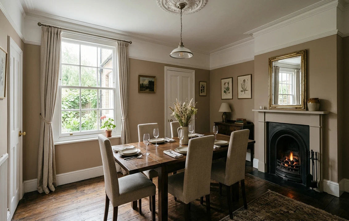
Try it on your room

Taupe paint colours are neutrals that mix grey and brown, and in the UK the shades to shortlist are Dulux Perfectly Taupe (a mid tone, Trade code 60YR 54/028), Dulux Pale Taupe and Natural Taupe 2, Farrow & Ball Joa's White No. 226, Dimity No. 2008 and Oxford Stone No. 264, Crown Taupe and Refined No. 565, and Johnstone's Taupe Tapestry. Choose by light before you choose by name: a north-facing room needs a taupe with visible yellow or pink in it, such as Joa's White, Oxford Stone or Crown Taupe, because cool northern light greys everything down; a south-facing room can carry almost any of them, including the cooler, greyer Perfectly Taupe; and a taupe with a lilac lean, such as Dove Tale No. 267, is worth testing with care in a west-facing room.
Names, makers' descriptions, swatch values and prices were read on the makers' websites on 30 October 2026. Farrow & Ball, Dulux's retail site, Crown and Johnstone's do not print a light reflectance value (LRV) on their colour pages, so the lightness figure below is our own calculation, not an official LRV.
See a taupe on your own walls first
Upload a photo of your room and repaint the walls in Perfectly Taupe, Joa's White or another UK shade before you buy a sample pot. How it works: our interior paint visualiser.
Try taupe on my wallsWhat colour is taupe paint?
Dulux's guide to white and neutral paint describes taupe as a dark neutral with a hint of grey and brown, and groups it with beige, oatmeal and magnolia as a warm, darker neutral. That definition is a starting point only, because the name tells you little about depth. Across the shades in our table, a colour sold as a taupe can sit anywhere from very pale to properly dark.
Makers also disagree about the word. Johnstone's taupe guide lists ten shades, from a mid-tone teddy-bear beige to orange-pink colours most people would never call taupe. Farrow & Ball uses the word sparingly: of the shades we read, only Dimity (very pale), Joa's White (light and contemporary) and Oxford Stone (pared-back) get it in their main description. Others that look like taupe are described as browns or warm greys.
Taupe and greige overlap. Greige starts from grey and adds beige, while taupe brings in more brown, and makers cross the line freely: Johnstone's calls Intuitive a light taupe greige. If you want the paler, greyer end, our warm greige paint colours guide covers Skimming Stone, Elephant's Breath and Drop Cloth in detail. If you want a neutral with neither warmth nor coolness showing, read our Farrow and Ball Ammonite guide instead.
UK taupe paint colours, light to deep
"Lightness index" is the relative luminance of the maker's on-screen swatch, from 0 (black) to 100 (white). It is our calculation, not an LRV, which is measured on a painted sample. It ranks shades reliably, though: Dulux Trade codes carry the LRV as their middle number, and Perfectly Taupe (54 in its code) and Pale Taupe (63) land within two points of our figures. "Reads as" comes from converting each swatch to CIELAB, whose axes show the red and yellow lean.
| Shade | How the maker files or describes it | Lightness index | Reads as (swatch) | Maker's suggested white or partner |
|---|---|---|---|---|
| Farrow & Ball Dimity No. 2008 | Very pale taupe, soft and light | 76 | Warm off-white | Pointing No. 2003 |
| Crown Recipe Book | Tranquil light taupe; warm tone | 66 | Pale stone | Not stated |
| Farrow & Ball Joa's White No. 226 | Light, contemporary taupe | 63 | Yellow-beige | Dimity No. 2008 |
| Johnstone's Pale Taupe | Soft peachy orange with a brown tint | 62 | Peachy pink | Blush or jewel tones |
| Dulux Pale Taupe (00YY 63/024) | Warm Neutral | 61 | Soft grey, barely warm | Cliff Walk |
| Farrow & Ball Oxford Stone No. 264 | Pared-back taupe, darkest of its Warm Neutrals | 54 | Yellow-beige | Dimity No. 2008 |
| Dulux Natural Taupe 2 | Warm Neutral | 54 | Soft pink-beige | Bleached Lichen 4 |
| Dulux Perfectly Taupe (60YR 54/028) | Warm Neutral | 52 | Pink-grey, very little yellow | White Cotton |
| Farrow & Ball Jitney No. 293 | Relaxed brown-based neutral | 46 | Warm brown-beige | Dimity No. 2008 |
| Crown Taupe | Creamy true taupe; textured finish | 45 | Warm, red-yellow | So Gentle |
| Crown Refined No. 565 | Warm, understated taupe; mocha and violet hues | 45 | Pink-grey | Hand Crafted No. 404 |
| Farrow & Ball Dove Tale No. 267 | Warm grey with lilac undertones | 44 | Grey-mauve | Strong White No. 2001 |
| Farrow & Ball London Stone No. 6 | Warm mid-tone brown, from the Archive | 37 | Brown, strong yellow lean | Dimity No. 2008 |
| Johnstone's Taupe Tapestry | Mid-tone teddy-bear beige | 37 | Warm, red lean | Earthy tones or muted greys |
| Dulux Natural Taupe 1 | Warm Neutral | 33 | Deep warm taupe | Java Cream 4 |
| Dulux Grey Taupe | Cool Neutral | 31 | Deep grey-beige, no red | White Mist |
Try it on your room
No photo? Try a sample
Swatch colours are a digital rendering: your screen, the sheen and your light all change what you see on the wall. One trap the table exposes: Dulux Pale Taupe and Johnstone's Pale Taupe share a name and a lightness, but one is a soft grey and the other a peachy pink. Order by brand and name, never by name alone.
Dulux taupes: Perfectly Taupe and the Natural Taupe family
Perfectly Taupe is filed as a Warm Neutral, yet its swatch has less yellow than any other shade in the table, which is why it reads as a pinkish grey more than a brown. Dulux Trade lists it as 60YR 54/028, and in Dulux's notation system the middle number is the light reflectance value, so its LRV is about 54. That makes it a true mid tone. Dulux's own coordinates are White Cotton as the white, Goosewing and Deep Fossil as harmonising greys, and Woodland Trail and Almost Oyster as neutral partners.
If Perfectly Taupe looks too grey, step to Natural Taupe 2, almost the same depth with more warmth. For a lighter wall there is Pale Taupe, and for a much deeper one Natural Taupe 1. Beware the numbering: in this family, a lower number means a deeper colour. Grey Taupe is the odd one out, filed as a Cool Neutral with no red in its swatch.
Farrow & Ball taupes, one by one
Joa's White No. 226: the light one with limestone
Named after Farrow & Ball's first Colour Consultant, Joa's White carries a trace of black pigment, and the maker suggests it next to the limestone, leather and linen of contemporary homes. It has much more yellow than Perfectly Taupe, so it stays warm where a pink-grey may flatten. The maker's schemes pair it with London Clay and Pelt for contrast, or with Dimity and Pointing for a softer room.
Dimity No. 2008: the pale one
Named after a lightweight cotton, Dimity is the lightest shade here and doubles as a warm white. The maker suggests it for understated hallways, and pairs it with Oxford Stone on woodwork for a slightly aged look.
Oxford Stone No. 264 and Jitney No. 293: the warm mid tones
Inspired by Cotswold cottages, Oxford Stone is the darkest of Farrow & Ball's Warm Neutrals and is shown across walls and woodwork alike. Jitney, a brown-based neutral, sits between Oxford Stone and the greyer Elephant's Breath.
Dove Tale No. 267 and London Stone No. 6: the two extremes
Dove Tale is a darker version of Elephant's Breath with lilac undertones, which the maker recommends for bedrooms. London Stone, created for a Nash house in Regent's Park, is a warm brown with underlying magenta. It comes from the Archive, so it is made to order and non-returnable. For a wider view of the ranges, see our Dulux Heritage vs Farrow & Ball comparison.
Crown, Johnstone's and Little Greene taupes
Crown. Crown Taupe is a textured paint, not a flat one: it belongs to the CRAFTED Suede range, whose matt emulsion contains ground olive stones for a soft brushed effect, so you are choosing a surface as well as a colour. Crown pairs it with the off-white So Gentle and the soft black Absolute Granite No. 189. If you would rather avoid texture, Refined No. 565 sits in the Powder range, with Hand Crafted No. 404 and the deep cocoa Tailored No. 451 as partners. Recipe Book is the light option. Our Crown vs Dulux comparison sets the two ranges side by side.
Johnstone's. Its taupe guide leans warmer than the other brands. Taupe Tapestry is the mid-tone anchor, which Johnstone's suggests for a cocooning feel in a small room. Intuitive, a light taupe greige with a pink tint, suits people who find that too rich. Indian Muslin stands in for beige.
Little Greene. True Taupe 240 is listed by stockists, but we could not read the maker's own page, so we give no description, value or price.
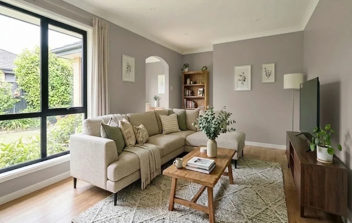
Closest matches across brands (not official)
These are the nearest on-screen shades, measured with the CIEDE2000 colour-difference formula (smaller is closer; around 1 is very close). Paint formulations differ, so none of them is an official equivalent: compare sample pots side by side on your wall.
| If you like | Closest in the other brand, on screen | Difference |
|---|---|---|
| Farrow & Ball Joa's White | Dulux Rolled Oats (same published swatch value) | 0.0 |
| Crown Refined No. 565 | Farrow & Ball Dove Tale | 1.1 |
| Farrow & Ball Oxford Stone | Dulux Marbled Sands | 1.5 |
| Crown Taupe (textured) | Farrow & Ball Jitney | 1.9 |
| Dulux Natural Taupe 2 | Farrow & Ball Elephant's Breath | 1.9 |
| Dulux Perfectly Taupe | Farrow & Ball Peignoir No. 286, which is pinker | 2.5 |
The last row matters if you are switching brands: Perfectly Taupe has no close Farrow & Ball twin (Elephant's Breath is further off, at 3.3), so expect a visible difference.
Taupe in north, south, east and west-facing rooms
Dulux's guide to the best shades for each orientation says north-facing rooms get cooler, generally weaker light, and points to pink, gold and yellow tones to offset it. South-facing rooms get strong, clear light in which all colours work. East-facing rooms get their light in the morning, west-facing ones in the early evening. Its advice on decorating a north-facing room calls northern light blue-tinged and recommends warm neutrals. Applying that to the swatch data gives this reading, which is our judgement, not the makers':
| Room faces | Taupes to try first | Test with care |
|---|---|---|
| North | Joa's White, Oxford Stone, Jitney, Crown Taupe, Taupe Tapestry: the yellow or red shows through | Perfectly Taupe and Pale Taupe (little colour to hold), Grey Taupe, and Mouse's Back, which Farrow & Ball says reads greener in underlit rooms |
| South | Any; Perfectly Taupe, Refined and Natural Taupe 1 keep the room from turning yellow | Very yellow shades can look creamy in full sun |
| East | Natural Taupe 2, Joa's White, Intuitive | Look again in the late afternoon |
| West | Oxford Stone, Jitney, Natural Taupe 2 | Dove Tale: Farrow & Ball warns that its lighter cousin Elephant's Breath can turn almost lilac in west-facing rooms |
In winter many rooms are used mostly under lamps, so look at your sample then too. Dulux warns that compact fluorescent bulbs cast a cool violet or pink light that can wash out subtle neutrals, while warm LED and halogen bulbs suit all colours. Our guide on how to test paint colours before buying explains how to read a sample through the day.
Which rooms suit which taupe
- Living rooms. Johnstone's suggests warm taupes for a relaxed living space. Natural Taupe 2 or Oxford Stone fit that brief, and our living room paint colours guide has more schemes.
- Bedrooms. Farrow & Ball recommends Dove Tale for its soft lilac undertone, and Johnstone's points to deeper taupes with pink undertones. See our bedroom paint colours guide. In a very small room, read our small bedroom colours guide before going deep.
- Hallways. Dimity is the maker's suggestion for an understated hall; our hallway paint colours guide covers the washable finishes a busy hall needs.
- Dining rooms. Johnstone's recommends an earthy shade for an inviting feel. Jitney, Crown Taupe or London Stone suit an evening room, as our dining room paint colours guide explains.
- Kitchens. Johnstone's says a lighter taupe helps a kitchen feel bigger and brighter. Choose a mould-protected finish such as Modern Emulsion, and see our kitchen paint colours guide.
- Period houses. Oxford Stone and London Stone both have a historic story behind them. More in our period property interior colours guide.
What colours go with taupe walls?
A stark brilliant white makes a taupe wall look darker and greyer, so start with the maker's own white: Dimity for Joa's White, Oxford Stone and Jitney, Pointing for Dimity, Strong White for Dove Tale, White Cotton for Perfectly Taupe. Your wall's undertone then decides the accents. Yellow-leaning taupes take deep earthy partners, as in Farrow & Ball's scheme of Joa's White with London Clay and Pelt. Pink-leaning taupes take blush and jewel tones, which is what Johnstone's suggests for Intuitive, Casual Elegance and Indian Muslin. Grey-leaning taupes take Dulux's Goosewing and Deep Fossil for a tonal room.
Check what is staying in the room as well: a pink-leaning taupe beside orange pine can look muddy, while a yellow-leaning one will sit more easily against oak. Deep green is another strong partner, as our guide to colours that go with dark green shows.
Finish, quantities and cost
Makers' figures, prices read on 30 October 2026:
| Wall paint | Character | Coverage | Price |
|---|---|---|---|
| Farrow & Ball Estate Emulsion | 2% sheen, chalky; wipeable, not washable | Up to 14 m²/L | 2.5 L £61, 5 L £103 |
| Farrow & Ball Modern Emulsion | 7% sheen, washable, mould protected | Up to 12 m²/L | 2.5 L £66, 5 L £111 |
| Dulux Matt | Flat finish, two coats | Up to 14 m²/L | 2.5 L £27, 5 L £45 |
| Dulux Easycare Washable & Tough Matt | Matt, stain repellent | Up to 13 m²/L | 2.5 L £33, 5 L £56 |
| CRAFTED by Crown Suede (Crown Taupe) | Textured matt, brush applied; recoat after 4 hours | Up to 14 m²/L | 2.5 L from £24 |
Worked example: a 3.4 m by 3.2 m bedroom with a 2.4 m ceiling has 31.7 m² of wall, about 28.6 m² once a door and window are deducted, so 57 m² for two coats. That needs about 4.1 litres of Estate Emulsion (one 5 litre tin, £103) or Dulux Matt (5 litres, £45), 4.4 litres of Easycare (5 litres, £56), or 4.8 litres of Modern Emulsion (5 litres, £111). Crown Suede at the same coverage takes two 2.5 litre tins, from £48. Coverage figures are maximums on smooth, sound walls, and the price of a mixed shade can differ, so check your colour before ordering. Hiring a decorator instead? Our UK interior decorator cost guide covers day rates.
On solvents, interior matt wall and ceiling paints are capped at 30 grams of VOC per litre by the Volatile Organic Compounds in Paints, Varnishes and Vehicle Refinishing Products Regulations 2012. Farrow & Ball states that Estate Emulsion is water based and scores A+ for indoor air quality.
How to test a taupe before you commit
Farrow & Ball sells a 100 ml sample pot for £5.95, and Dulux a tester for £2.90. A method that suits a colour family this subtle:
- Shortlist three shades that differ in undertone, such as Perfectly Taupe (pink-grey), Oxford Stone (yellow-beige) and Crown Taupe (warm brown), not three versions of the same one.
- Paint two coats on card or lining paper, at least A3, with a white border.
- Move the samples around (opposite the window, then in the darkest corner) and look at them in the morning, afternoon and evening.
- Hold them against what stays: floor, sofa, curtains, worktop.
- Sample in your finish. Crown Taupe's texture will not show on a flat sample.
Perfectly Taupe, Joa's White or Oxford Stone?
Compare them on a photo of your own room before ordering pots: the tool repaints only the walls, so you see each taupe against your floor, furniture and daylight. More on the tool: interior paint visualiser for UK homes.
Compare taupes on my roomSources and references
- Dulux UK, White and neutral paint: definition of taupe. Colour pages for Perfectly Taupe, Pale Taupe, the Natural Taupe family and Grey Taupe: colour family, swatch values, pairings, tester price.
- Dulux UK, Best shades for north, south, east or west-facing rooms and How to decorate a north-facing room: light by orientation, effect of bulbs.
- Dulux UK, Dulux Matt and Easycare Washable & Tough Matt: coverage and prices.
- Dulux Trade Paint Expert, Perfectly Taupe 60YR 54/028 and 00YY 63/024: Trade codes. ICI Paints (Dulux Trade), The Colour Palette notation system: the middle number of a code is the LRV.
- Farrow & Ball, colour pages for Joa's White No. 226, Dimity No. 2008, Oxford Stone No. 264, Jitney No. 293, Dove Tale No. 267, London Stone No. 6, Mouse's Back No. 40 and Elephant's Breath No. 229: descriptions, whites, swatch values, behaviour in low and west light, sample price.
- Farrow & Ball, finish pages for Estate Emulsion and Modern Emulsion: sheen, coverage, washability, prices.
- Crown Paints, colour pages for Taupe, Refined No. 565 and Recipe Book, and the textured finish range: descriptions, swatch values, pairings, price. Crown Decorating Centres, CRAFTED Suede Taupe: coverage, recoat time, olive stone content.
- Johnstone's, Taupe Paint Colours: ten shades, descriptions, rooms, swatch values.
- legislation.gov.uk, VOC Regulations 2012, Schedule 2: VOC limit for interior matt wall paints.
- Lightness index, swatch readings and colour differences: FacadeColorizer calculation (relative luminance, CIELAB, CIEDE2000) from the hex values on the makers' pages, 30 October 2026.
Frequently asked questions
What is the best taupe paint colour in the UK?
Is Dulux Perfectly Taupe warm or cool?
What is the LRV of Dulux Perfectly Taupe?
What colours go with taupe walls?
Is taupe a good colour for a north-facing room?
What is the difference between taupe and greige?
Trademarks mentioned (Sherwin-Williams, Benjamin Moore, Behr, Caparol, Brillux, Sto, Alpina, Valspar, PPG, Glidden, Dulux, Crown Trade, Sandtex, Farrow & Ball, Johnstone's, Leyland) are property of their respective owners. FacadeColorizer is independent and not affiliated with any of them. Nominative fair use under Lanham Act §1125.