Try it on your room

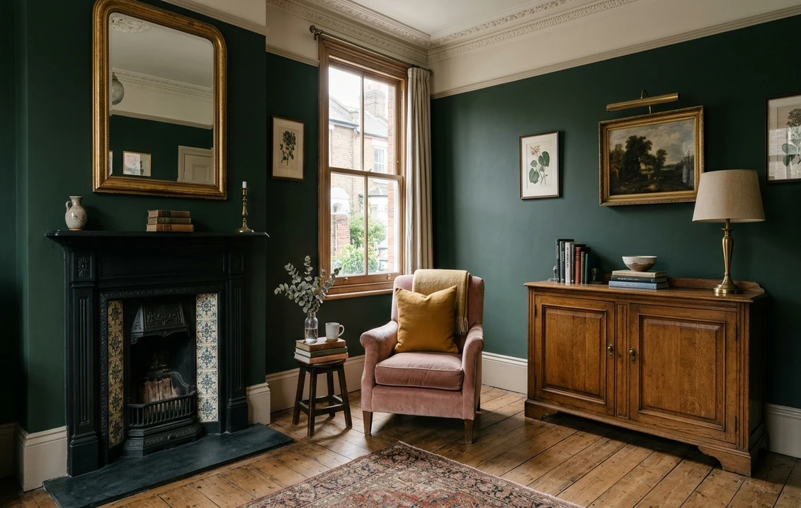
Dark green goes best with softened whites and stone neutrals, dusty pinks and deep reds, ochre and mustard accents, and mid-toned wood and brass. That is what the British paint makers print next to their own dark greens: Farrow & Ball pairs Studio Green No. 93 with Bone No. 15 and Radicchio No. 96, Bancha No. 298 with Sulking Room Pink No. 295 and Green Smoke No. 47 with Dead Salmon No. 28, while Dulux Heritage suggests Potters Pink and Inca Orange beside Mallard Green. This guide gathers those published pairings by brand, then by room.
Every name and number below was read on farrow-ball.com, dulux.co.uk and duluxheritage.co.uk in October 2026. You will not find a light reflectance value (LRV) for each colour: Farrow & Ball and Dulux do not print one on their UK colour pages, so depth is described with the labels they do publish, such as Farrow & Ball's recommended "Dark Tones" primer and Dulux Heritage's "depth of tone: Deep".
What colours go with dark green? The short answer by colour family
Five families come back in the schemes the manufacturers publish for their dark greens. Every example below comes from a published scheme, except the Farrow & Ball yellows: the company puts no ochre in the schemes of its dark greens.
| Partner family | Farrow & Ball example | Dulux or Dulux Heritage example |
|---|---|---|
| Off-whites and stone neutrals | Old White No. 4, Bone No. 15, Lime White No. 1 | White Mist (Palm Night), Turtledove Grey (Mallard Green) |
| Plaster pinks and deep reds | Sulking Room Pink No. 295, Dead Salmon No. 28, Radicchio No. 96 | Lady Penelope, Coral Charm (Palm Night), Potters Pink (Mallard Green) |
| Ochre, mustard and orange | India Yellow No. 66, Sudbury Yellow No. 51 (our suggestion) | Inca Orange (Mallard Green), Brushed Gold (Olive Tree) |
| Browns and wood tones | Jitney No. 293, Drop Cloth No. 283, Deep Reddish Brown No. W101 | DH Drab (Olive Tree) |
| Blues and teals | Oval Room Blue No. 85, Sloe Blue No. 87 | Teal Tension (Pine Needle), Maritime Teal (Mallard Green) |
Try it on your house
No photo? Try a sample
Metal is the sixth partner. Dulux UK's green colour guide suggests contrasting accents such as "hot pink or brass" for a deep green and, for greens in general, mustard yellows, rich neutrals and robust greys (Dulux UK, Colour Know-How: green).
The schemes Farrow & Ball publishes for its dark greens
Each colour page on farrow-ball.com shows three "Colour Schemes" (the colour plus an accent and a trim colour) and a "complementary white", which the company says is "hand-picked from our palette based on undertones". All six greens below take the "Dark Tones" primer and undercoat; Calke Green is a deep sage and Card Room Green a grey green rather than true forest greens.
| Dark green | Farrow & Ball's description | Complementary white | Published schemes (accent + trim) |
|---|---|---|---|
| Studio Green No. 93 | "Our darkest green", almost black indoors unless very well lit | Off-White No. 3 | Bone No. 15 + Radicchio No. 96; Light Gray No. 17 + Old White No. 4; Card Room Green No. 79 + Railings No. 31 |
| Green Smoke No. 47 | Smoky green blue of late 19th-century interiors | Shaded White No. 201 | Light Gray No. 17 + Old White No. 4; School House White No. 291 + Shaded White No. 201; Jitney No. 293 + Dead Salmon No. 28 |
| Card Room Green No. 79 | Dark grey green named after Victorian study-like rooms | Shaded White No. 201 | Oval Room Blue No. 85 + Dead Salmon No. 28; Studio Green No. 93 + Preference Red No. 297; School House White No. 291 + Drop Cloth No. 283 |
| Bancha No. 298 | Olive green, calm "especially when combined with soft pinks and browns" | Shaded White No. 201 | Lime White No. 1 + Old White No. 4; Ammonite No. 274 + Purbeck Stone No. 275; Sulking Room Pink No. 295 + Railings No. 31 |
| Beverly No. 310 | Clean forest green, greener in bright daylight | Shaded White No. 201 | Drop Cloth No. 283 + Shadow White No. 282; School House White No. 291 + Shaded White No. 201; Stirabout No. 300 + Calke Green No. 34 |
| Calke Green No. 34 | Traditional sage green from the breakfast room at Calke Abbey | Slipper Satin No. 2004 | Lime White No. 1 + Old White No. 4; Cooking Apple Green No. 32 + Beverly No. 310; Studio Green No. 93 + Railings No. 31 |
Two patterns stand out. Old White No. 4 and Railings No. 31 recur: Old White, which Farrow & Ball calls the most historic of its whites, is the safe pale partner, and Railings, "a softer alternative to black", sharpens the trim without the harshness of pure black. And pink or red appears in four of the six lists.
Four more deep greens sit in the Archive, made to order and non-returnable, so sample them first: Duck Green No. W55, which "makes a warm and welcoming pair with Deep Reddish Brown on woodwork"; Carriage Green No. 94, shown with Preference Red No. 297 and Light Gray No. 17; Minster Green No. 224, with Setting Plaster No. 231 and Dead Salmon No. 28; and Dyrehaven No. 9819, with Sloe Blue No. 87 and Bone No. 15.
What Dulux and Dulux Heritage pair with their dark greens
Dulux UK colour pages list partners under "The Perfect White", "Combination with Neutrals", "Tonal Combinations", "Harmonising Combination" and "Designer's Choice". The four shades below are filed under Green. Emerald Glade and Fortune Green, both recommended in Dulux's green guide, are filed under Blue (they lean teal), worth knowing if you want a true forest green.
| Dulux colour | The Perfect White | Neutrals | Designer's Choice |
|---|---|---|---|
| Palm Night | White Mist | Silver Shingle, Highland Mist | Lady Penelope, Coral Charm |
| Everglade Forest | Clock Face | Cornflower White, Fresh Foliage | Berry Whip, Summer Fizz |
| Pine Needle | Chalk Dust | Cornflower White, Fresh Foliage | Berry Whip, Blood Orange |
| Buckingham | Pistachio Whip | Letters Unread, Storm Clearing | Sorbet, Toasted Terracotta |
The Designer's Choice column says what Farrow & Ball says: all four greens are matched with a pink, coral or terracotta. A Dulux tester was listed at £2.90 on the Palm Night page when this guide was checked.
Dulux Heritage, the period-inspired range, publishes three tester trios per colour:
| Heritage colour | Published undertone | Designers Choice | Co-ordinating | Tonal |
|---|---|---|---|---|
| Mallard Green | Green/Black, Deep | Potters Pink, Inca Orange | Turtledove Grey, Rosemary Leaf | Green Oxide, Maritime Teal |
| Forest Grey | Green/Blue/Grey, Deep | Powder Colour, Inca Orange | Turtledove Grey, Rosemary Leaf | Green Oxide, Sky Blue |
| Olive Tree | Green/Gold/Grey, Deep | Fitzrovia Red, Potters Pink | DH Drab, Ochre White | Brushed Gold, DH White |
Dulux Heritage calls Mallard Green "as dark as midnight" and "the perfect shade for colour drenching or combining with clay pinks and stone neutrals", and says Olive Tree "effortlessly hides the wear and tear of everyday life". Our Dulux Heritage vs Farrow & Ball comparison sets out how the two premium ranges differ.
Which white goes with dark green?
None of the whites the two makers pick for these greens is a brilliant white. Farrow & Ball's complementary whites are Off-White No. 3 for Studio Green ("a chalky mid tone"), Shaded White No. 201 for Green Smoke, Card Room Green, Bancha and Beverly ("a light grey beige") and Slipper Satin No. 2004 for Calke Green; Dulux chooses White Mist, Clock Face and Chalk Dust. As a rule, the darker and greyer the green, the more grey the partner white can carry: Old White No. 4, a soft grey green, appears in the schemes of Studio Green, Green Smoke, Calke Green and Bancha, while Bone No. 15 is the stronger neutral if you want a visible second colour on the woodwork.
The same choice applies to panelling. The Green Smoke study pairing puts the green on the walls and Wimborne White No. 239, which Farrow & Ball calls "just off white", on the panelling, ceiling and bookshelves of a Georgian study.
Pinks, plasters and reds with dark green
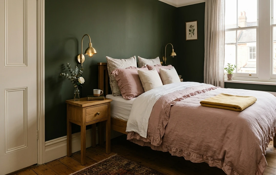
Pink is the partner proposed most often after white, in three registers:
- Plaster pink: Setting Plaster No. 231, "a dusty plaster pink", shown with Minster Green. The gentlest contrast, good on the walls of the room next door.
- Aged pink: Dead Salmon No. 28, named after an aged pink painted at Kedleston Hall in 1805, the trim colour for Green Smoke, Card Room Green and Minster Green.
- Boudoir pink: Sulking Room Pink No. 295, shown with Bancha. Deeper and more muted, it can hold a full wall facing a green one.
Red does the same job at higher intensity: Studio Green with Radicchio No. 96, "a modern crimson", and Card Room Green with Preference Red No. 297, "the deepest and richest" Farrow & Ball red. Dulux offers Coral Charm and Toasted Terracotta as the deeper options, Lady Penelope and Sorbet as the paler ones, and Dulux Heritage puts Fitzrovia Red beside Olive Tree. Our guide to snug paint colours shows how these reds behave in a small, lamp-lit room.
Ochre, mustard and orange with dark green
Yellow brings the warmth out of olive and forest greens. Dulux Heritage builds it into its trios: Inca Orange in the Designers Choice for Mallard Green and Forest Grey, Brushed Gold and Ochre White with Olive Tree. From the Farrow & Ball palette, India Yellow No. 66 and Sudbury Yellow No. 51 (a soft mid yellow named after the staircase at Sudbury Hall, where John Fowler used it) are design choices rather than published pairings. Keep ochre to small doses next to dark green: the inside of a bookcase, a door, a lampshade or a rug.
Wood, brass and the materials that finish the scheme
- Mid-toned wood (oak, elm, old pine floorboards) gives the warmest result; Farrow & Ball's note that Duck Green pairs with Deep Reddish Brown on woodwork shows how far the brown can go.
- Very dark wood such as walnut can disappear against Studio Green or Mallard Green in low light. Lift it with a pale rug or a lighter wall behind it.
- Brass is the metal Dulux names as an accent for deep greens; brushed or unlacquered brass on lights and handles catches lamp light against a matt wall.
- Chrome and nickel are cooler, so they tend to suit the blue-leaning greens (Green Smoke, Forest Grey) better than olive shades such as Bancha.
Dark green room by room in a British home
| Room | Dark green to consider | Published partners | Finish note |
|---|---|---|---|
| Living or drawing room | Green Smoke No. 47 | Light Gray No. 17 + Old White No. 4 | Estate Emulsion: walls in low-traffic areas |
| Kitchen | Bancha No. 298, Olive Tree | Lime White No. 1; Ochre White | Modern Emulsion on walls; an eggshell on cabinets |
| Bedroom | Mallard Green, Bancha No. 298 | Potters Pink; Sulking Room Pink No. 295 | Heritage Velvet Matt |
| Hallway | Card Room Green No. 79, Pine Needle | School House White No. 291; Chalk Dust | A washable finish |
| Dining room | Studio Green No. 93, Mallard Green | Bone No. 15 + Radicchio No. 96 | Matt walls for depth |
| Study or cloakroom | Card Room Green No. 79, Mallard Green | Preference Red No. 297; Turtledove Grey | Dead Flat for walls and woodwork |
Living rooms. A large, multi-use room usually takes dark green better on one or two walls, or below a picture rail, so the pale partner carries the daylight; our living room paint colours guide covers the proportions, and the drawing room colours guide the period context.
Kitchens. Farrow & Ball says Modern Emulsion is "particularly perfect for moisture-prone kitchens and bathrooms". For cabinet doors, Modern Eggshell is its "super tough mid-sheen" finish for wood, metal and concrete, and Flat Eggshell (which replaced the discontinued Estate Eggshell) the low-sheen one. Worktop and splashback pairings are in the kitchen paint colours guide.
Thinking of dark green kitchen cupboards?
Upload a photo of your kitchen and see Bancha, Studio Green or Mallard Green on the cabinet doors before you buy a tester.
Try dark green on my kitchen cabinetsBedrooms, dining rooms and hallways. Rooms used mostly in the evening show a very dark green at its richest, and Dulux Heritage names "studies, dining rooms, bedrooms and cloakrooms" for Mallard Green; see also our dining room paint colours. A narrow hall is the opposite case: a dark matt wall shows scuffs, and Farrow & Ball rates Estate Emulsion "wipeable but not washable" against Modern Emulsion's "washable and wipeable". Dark green below the dado and a pale partner above is the usual compromise, detailed in the hallway paint colours guide.
Light, aspect and finish: why the same green changes
Farrow & Ball warns that Studio Green "appears almost black unless in very well lit rooms" and that Beverly feels "even greener in bright daylight or more conservative in lower light". Dulux Heritage tags Mallard Green, Forest Grey and Olive Tree "Perfect For: South/West Facing". In a north-facing room, cool light pushes a dark green towards grey or black: choose a warmer partner white such as Off-White No. 3 or Shaded White No. 201, add a pink or ochre accent and use warm-white bulbs.
Sheen matters too: a flat finish keeps a dark green deep and velvety, a higher sheen makes it look lighter at an angle. Estate Emulsion has a 2% sheen, Modern Emulsion 7%. Dark colours also want a tinted base, from Farrow & Ball's primers available in tones to complement your chosen colour.
How much paint does a dark green room need?
Coverage is published, so quantity is a calculation. Take a sitting room of 4.0 m by 3.6 m with a 2.4 m ceiling: the walls make 15.2 m x 2.4 m = 36.5 m², less one door (1.6 m²) and one window (1.7 m²), so about 33.2 m², or 66.4 m² over two coats.
| Finish | Published coverage | Litres for 66.4 m² | Tin sizes |
|---|---|---|---|
| Farrow & Ball Estate Emulsion | Up to 14 m²/l per coat | 4.7 l at best | 100 ml, 2.5 l, 5 l |
| Farrow & Ball Modern Emulsion | Up to 12 m²/l per coat | 5.5 l at best | 2.5 l, 5 l |
| Dulux Heritage Velvet Matt | 13 m²/L, 2 coats | 5.1 L | 1 L, 2.5 L, 5 L, 10 L |
"Up to" is a best case on a smooth, primed wall, so order 5 l plus 2.5 l for either Farrow & Ball finish and 5 L plus 1 L for Velvet Matt. A single chimney-breast wall of 3.6 m by 2.4 m (17.3 m² over two coats) needs about 1.2 to 1.5 litres: a 2.5 litre tin in both ranges. Add the tinted primer on bare plaster or when going from pale to dark. If you would rather not cut a dark colour in against a white ceiling yourself, the interior decorating cost guide covers what a decorator charges.
How to test a dark green pairing before you buy
- Sample both colours, not just the green. Farrow & Ball sells 100 ml sample pots, including a three-pot set of French Gray, Green Smoke and Studio Green; Dulux and Dulux Heritage sell testers. Paint two coats of each on lining paper.
- Look at them together at three times of day, in the corner where the two will meet: morning, mid-afternoon and under your own lamps.
- Check the room as a whole. A swatch cannot show how much of the room the green takes or how it sits beside your floor; our method for testing paint colours before buying covers the details.
For the whole-room view, the interior paint visualiser repaints the walls of your own photo, so you can compare Studio Green with Bancha, or Old White with Bone as the partner, before buying a tester.
See dark green on your own walls
Upload a photo of your living room, bedroom or hallway and try a dark green with its partner colours.
Try dark green on my room photoSources and references
- Farrow & Ball, colour pages for Studio Green, Green Smoke, Card Room Green, Bancha, Beverly, Calke Green, Duck Green and Minster Green: descriptions, complementary whites, colour schemes, primer.
- Farrow & Ball, Estate Emulsion, Modern Emulsion and primers and undercoats: sheen, coverage, tin sizes, washability.
- Dulux UK, colour pages for Palm Night, Everglade Forest, Pine Needle and Buckingham: published combinations and tester price.
- Dulux UK, Colour Know-How: light and dark green wall ideas: brass, pink, mustard and grey as partners.
- Dulux Heritage, colour pages for Mallard Green, Forest Grey and Olive Tree (undertone, depth, aspect, tester trios), and the Velvet Matt product page (coverage, coats, tin sizes).
Frequently asked questions
What colours go with dark green walls?
What white goes best with dark green?
Does pink go with dark green?
What colour furniture goes with dark green walls?
Which is the darkest Farrow & Ball green?
Does dark green work in a north-facing room?
Trademarks mentioned (Sherwin-Williams, Benjamin Moore, Behr, Caparol, Brillux, Sto, Alpina, Valspar, PPG, Glidden, Dulux, Crown Trade, Sandtex, Farrow & Ball, Johnstone's, Leyland) are property of their respective owners. FacadeColorizer is independent and not affiliated with any of them. Nominative fair use under Lanham Act §1125.