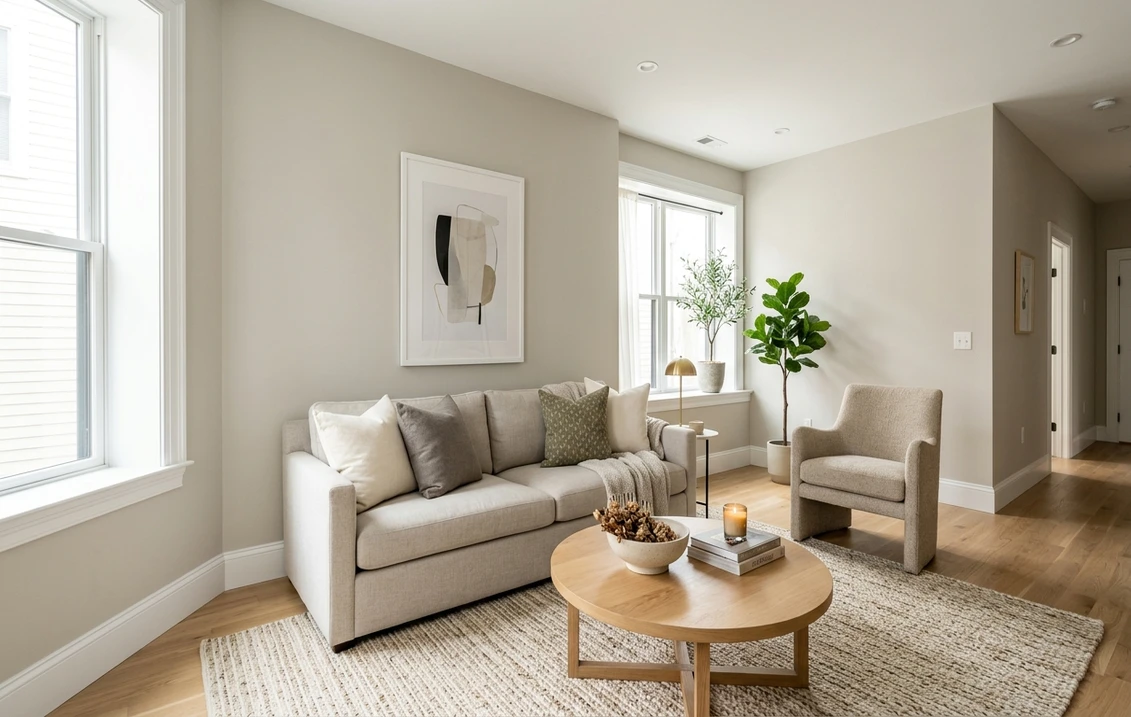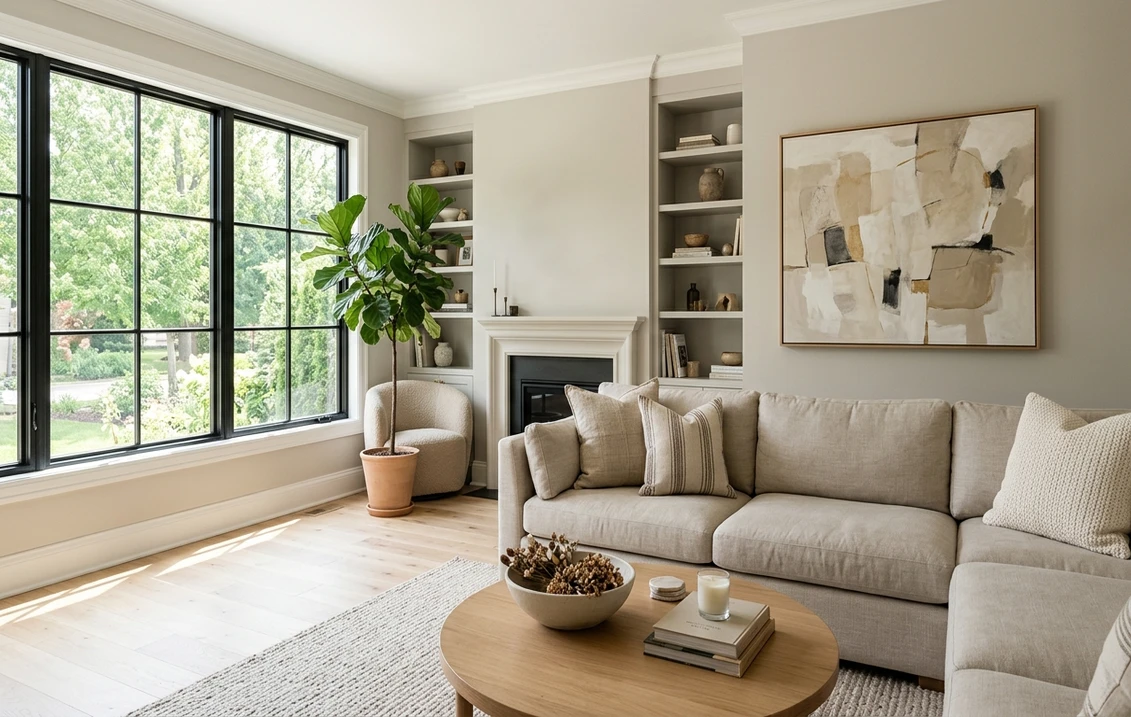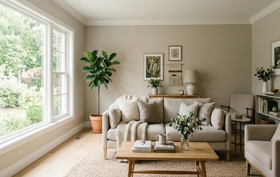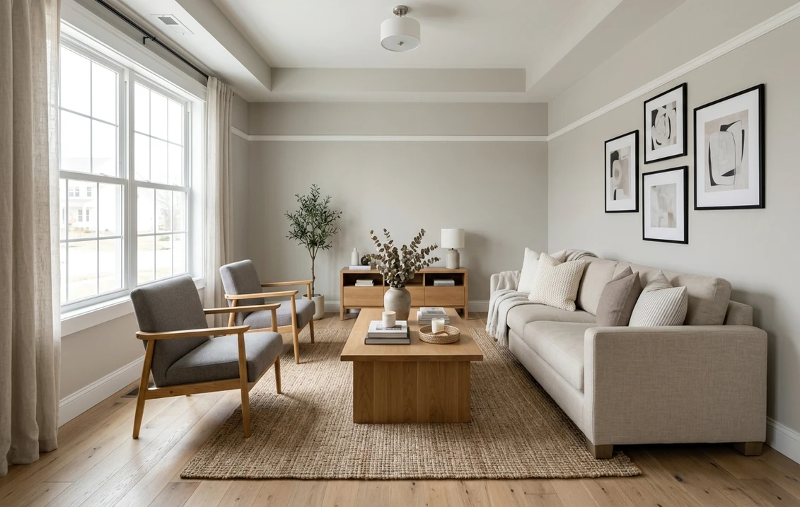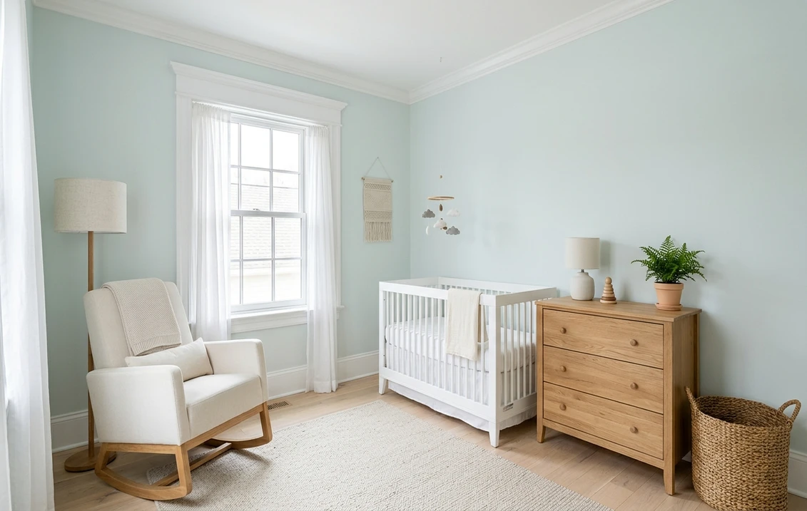

Sherwin-Williams Topsail SW 6217 is a very pale blue-green pastel, light enough to pass for a tinted off-white. Its color page gives an LRV of 74.898 and the hex code DAE2E0, which is RGB 218, 226, 224. Sherwin-Williams calls it a "bright, sky blue pastel" and names two rooms for it, the bathroom and the nursery. Green is its highest RGB value by two points, so the fair description is a pale blue with a green undertone and very little color strength. It is about 11.7 LRV points lighter than Sea Salt SW 6204 and about 14.2 points lighter than Tradewind SW 6218.
One limit first: the color page names those two rooms and three coordinating colors, and no sheen. The undertone readings and most room suggestions below are ours, built on the published numbers; where the brand itself says something, we say so.
Upload a photo of your room and preview SW 6217 on the walls before you buy a sample.
What Sherwin-Williams publishes for SW 6217
The Topsail color page carries a two-sentence description: "Let your mood gently soar with this bright, sky blue pastel. Lends an elegant lightness to any bathroom or nursery." Its full details give a light reflectance value of 74.898, the hex code DAE2E0 and the RGB values 218, 226 and 224. Usage is interior and exterior, and the strip locator, used to find the chip in the store display, is 272-C3. This page stays with interiors.
The brand files the color in two places. The color page sits in the blue section of the website, under the heading Blue; the full details give the color family as White & Pastel. Both fit: a blue by name, a near-white by lightness.
Topsail also belongs to the Create palette of the Living Well collection, which Sherwin-Williams' collection page sums up as "energetic pastels", and it appears in two of the brand's State Your Colors palettes, North Carolina and Rhode Island. For the wider family, start with the Sherwin-Williams interior paint colors guide.
| Figure | Value for SW 6217 | Where it comes from |
|---|---|---|
| LRV | 74.898 (75 rounded) | Full details |
| Hex and RGB | DAE2E0; 218, 226, 224 | Full details |
| Color family | White & Pastel | Full details |
| Strip locator | 272-C3 | Full details |
| Coordinating colors | Pure White SW 7005, Extra White SW 7006, Mount Etna SW 7625 | Color page |
| Hue and saturation | 165 degrees; about 0.04 | Our calculation from the RGB |
Try it on your room
- 1Your photoPhoto
- 2Your colorColor
- 3HD render in ~30 sHD render in ~30 s
Your photo is used only to create your preview. JPG, PNG, HEIC (iPhone)
Lightness. Sherwin-Williams' guide to color by room orientation defines LRV as the amount of light a color reflects, on a scale from 0 (no light) to 100 (all light). The hex and RGB values are a digital rendering; judge the paint on a physical sample.
Is Topsail blue or green?
Blue by name, slightly green by the numbers. In Topsail's RGB values (218, 226, 224), green is the highest, blue sits two points behind and red is the lowest. On the color wheel, green is at 120 degrees, cyan at 180 and blue at 240. Topsail's hue works out to 165 degrees, on the green side of cyan, with a saturation of about 0.04 on a scale from 0 to 1 (our calculation): a pale gray-white, tinted with green and blue, green narrowly ahead.
Sherwin-Williams' public color data also stores a Lab reading, in which one axis (a) runs from green to red and another (b) from blue to yellow. For Topsail, a is about minus 3.0 and b is almost exactly zero (plus 0.03): a small push toward green and none toward yellow or blue. The missing yellow is why the eye reads it as blue (our interpretation): pale greens such as Sea Salt carry yellow, and a green without it looks cool and airy.
So the fair answer is a pale blue-green: a soft blue in cool light, a hint of aqua in warm light, never a mint or a sage.
Is Topsail a white, and is it warm or cool?
It is cool, and it is a pastel, not a white. Red is its lowest RGB value and its Lab reading has no red and no yellow, so nothing in it leans warm. The whites Sherwin-Williams pairs with it sit higher: Pure White SW 7005 has an LRV of 83.957 and Extra White SW 7006 has 85.861, about 9.1 and 11.0 points above Topsail (our subtraction). Beside white trim, the wall is visibly tinted; with nothing white near it, it can pass for a cool off-white.
Where Topsail sits: strip 272, not Tradewind's strip
The number SW 6217 falls between Jasper SW 6216, the darkest chip of strip 218, and Tradewind SW 6218, the lightest chip of strip 219, so Topsail is often taken for the top of one of those strips. It is on neither. Its locator is 272-C3, and its color page shows the six neighbors below. The LRV values are the ones Sherwin-Williams publishes; hue and saturation are our calculation.
| Chip | Color | LRV (Sherwin-Williams) | Hue, saturation (our calculation) |
|---|---|---|---|
| 272-C1 | Sky High SW 6504 | 78.332 | 185.0°, 0.05 |
| 272-C2 | Snowdrop SW 6511 | 79.55 | 172.5°, 0.03 |
| 272-C3 | Topsail SW 6217 | 74.898 | 165.0°, 0.04 |
| 272-C4 | Blue Horizon SW 6497 | 77.646 | 176.0°, 0.06 |
| 272-C5 | Bravo Blue SW 6784 | 77.008 | 185.5°, 0.09 |
| 272-C6 | Iceberg SW 6798 | 75.681 | 190.6°, 0.07 |
| 272-C7 | Undercool SW 6957 | 49.103 | 198.4°, 0.44 |
Strip 272 is not a light-to-dark ladder of one hue, the way strip 219 is: six of its chips are pastels packed between LRV 74.9 and 79.6, and the seventh is a vivid blue. Within those six, Topsail is the deepest and the greenest. Next to Sky High or Bravo Blue, it looks grayer and more aqua (our reading).
The link with strip 219 is real, though. Sherwin-Williams' color data gives Topsail as a coordinating color for all seven chips of strip 219, from Tradewind down to Still Water SW 6223; we read it on the pages of Tradewind and of Rain SW 6219. Not the next shade up from Tradewind, then, but its pale companion.
Light direction: north, south, east and west
Sherwin-Williams' orientation guide does not mention Topsail; applying its rules to SW 6217 is our reading.
North-facing rooms get the least daylight. The guide says to avoid cool undertones there because they make the room appear colder, and to look at colors with a higher LRV. Topsail meets the second condition and fails the first: expect a pale, slightly icy gray-blue.
South-facing rooms get warm light, and the guide warns against colors that are too warm there. Two of the three colors it names for south rooms are cool ones, Rainwashed SW 6211 and Upward SW 6239, and they are 15.8 and 17.5 points darker than Topsail. In strong sun, most of Topsail's tint washes out and the wall moves toward white; for a blue-green that still shows at midday, look one step deeper.
East- and west-facing rooms get warm light at one end of the day and cool light at the other, and the guide's advice is to choose by when you use the room most. An east-facing nursery shows the soft aqua version in the morning and the cooler, grayer one late in the day.
Bulbs: how color temperature shifts Topsail
Bathrooms and hallways often have little daylight, so the bulb sets the color. The U.S. Department of Energy's guide to purchasing energy-efficient light bulbs gives a table of color temperatures that runs from warm at 2,700 K through soft at 3,000 K and neutral at 3,500 K to cool at 4,100 K. Sherwin-Williams' orientation guide says to treat warm lighting like a south-facing room and white or cool lighting like a north-facing one. Applied to Topsail, in our reading:
- 2,700 K (warm). The yellow in the light cancels part of the blue. Topsail reads as a soft off-white with a faint green cast.
- 3,000 to 3,500 K (soft to neutral). The balanced version: a pale blue-green, tinted against white trim.
- 4,100 K and above (cool). The blue comes forward and the wall looks crisp: good at a vanity mirror, cold in a bedroom.
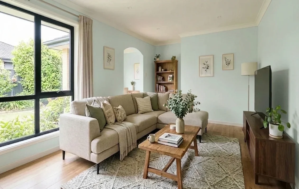
Sea Salt vs Topsail, Tradewind and other close colors
LRV, hex and family are the ones Sherwin-Williams publishes; hue and saturation are our calculation. For more options, see our roundup of Sherwin-Williams light blue paint colors.
| Color | LRV (Sherwin-Williams) | Hex | Family | Hue, saturation (our calculation) |
|---|---|---|---|---|
| Topsail SW 6217 | 74.898 | DAE2E0 | White & Pastel | 165.0°, 0.04 |
| Mountain Air SW 6224 | 73.211 | D8E0DF | White & Pastel | 172.5°, 0.04 |
| Sea Salt SW 6204 | 63.233 | CDD2CA | Green | 97.5°, 0.04 |
| Tradewind SW 6218 | 60.691 | C2CFCF | Blue | 180.0°, 0.06 |
| Rainwashed SW 6211 | 59.055 | C2CDC5 | Green | 136.4°, 0.05 |
What is the difference between Sea Salt and Topsail?
Two things: lightness and yellow. The Sea Salt page gives an LRV of 63.233, the hex CDD2CA and the Green family, on strip 217-C1. Topsail is about 11.7 points lighter: Sea Salt is a light color, Topsail a near-white.
The hue differs too. In Sea Salt's RGB values (205, 210, 202), blue is the lowest; in Topsail's it is two points under green. In the Lab readings, both lean green by about the same amount (a near minus 3), but Sea Salt adds yellow (b about plus 3.4) where Topsail has none. Sea Salt is a gray-green that only hints at blue; Topsail is the bluer and paler of the two. In practice (our reading), choose Sea Salt beside warm finishes such as cream tile, beige stone or oak, and Topsail beside white tile, marble and chrome. The Sea Salt undertones guide covers that color room by room.
Topsail vs Tradewind and Rainwashed
Tradewind SW 6218 is the nearest relative in hue: equal green and blue, a hue of 180 degrees, filed under Blue. It is about 14.2 points darker than Topsail and carries more color (saturation 0.06 against 0.04). The two work together, with Tradewind on the walls and Topsail on the ceiling or in the next room. Our Tradewind SW 6218 interior guide covers the deeper color in full.
Rainwashed SW 6211 is about 15.8 points darker and greener (hue 136 degrees); see the Rainwashed undertones guide. The closest match overall is Mountain Air SW 6224, the first color Sherwin-Williams' data lists as similar to Topsail: about 1.7 points darker and a touch bluer.
Best rooms for Topsail, one by one
Sherwin-Williams names the bathroom and the nursery. The other suggestions are our reading of the light rules above.
Bathroom. The brand's first pick. A pale blue-green sits well beside white tile, white fixtures and chrome or nickel, and at an LRV near 75 it keeps a small or windowless bath bright. The caution is the bulb: warm bulbs turn it into a soft off-white, cool bulbs bring out the blue. For stronger shades, see the blue bathroom paint ideas.
Nursery. The brand's second pick. With white furniture it reads as a tint, not a theme, and it leaves room for wood or stronger accents later. Our page on gender-neutral nursery paint colors lists other candidates. Before painting, read the safety notes in the sheen section below.
Bedroom. Light and calm, with just enough color to separate the walls from white bedding and trim. In a north-facing bedroom it turns cooler and grayer; warm bedside lamps bring it back toward off-white in the evening.
Kitchen. On walls, Topsail suits kitchens with white or natural wood cabinets and stainless appliances, where it reads as a fresh near-white.
Topsail on the ceiling
Sherwin-Williams' article on using color on ceilings notes that ceilings often appear in shadow and describes the standard technique: dilute the wall paint with white, at about 80 percent white to 20 percent wall color, for a lighter shade that creates the illusion of a higher ceiling. The brand's ceiling paint page adds that a light ceiling color is the one to choose for small rooms or rooms with limited natural light.
Topsail does the job of that mix without the mixing. Three ways to use it (ours): over Tradewind or Rain walls, since Sherwin-Williams already pairs it with both; over white walls, for a faint sky tint overhead; or on walls and ceiling alike in a small bath. Our guide to ceiling paint colors and finishes covers whites and sheens for this surface.
Upload a photo of your room and recolor the ceiling while the walls, floor and furniture stay as they are.
What colors complement Topsail? Trim, whites and coordinating colors
The color page lists three coordinating colors: two whites and one very dark blue-gray. The gaps are our subtraction and the roles our suggestions.
| Color | LRV (Sherwin-Williams) | Gap with Topsail | Possible role (our suggestion) |
|---|---|---|---|
| Pure White SW 7005 | 83.957 | 9.1 points lighter | Soft white trim, doors, cabinets |
| Extra White SW 7006 | 85.861 | 11.0 points lighter | Brighter white trim and ceiling |
| Mount Etna SW 7625 | 6.172 | 68.7 points darker | Vanity, interior door, built-in |
Trim. A wall at LRV 75 leaves little room above it. Extra White gives the larger gap and is the cooler of the two, which keeps the pair crisp. Pure White leans slightly yellow (b about plus 3.0), so it looks a little softer against Topsail. A white with more yellow, such as Alabaster SW 7008 (LRV 82.215, b about plus 5.2), sits only 7.3 points above Topsail and can look yellow beside it (our reading). The Pure White undertones guide, the Extra White guide and the Pure White vs Extra White comparison cover the two whites.
The dark accent. The Mount Etna page gives an LRV of 6.172 and the hex 3D484C: a near-black with a blue cast (hue 196 degrees by our calculation), for a vanity, a door or a built-in against Topsail walls.
Deeper blue-greens. Every chip of strip 219 is a ready-made partner: Tradewind or Rain for an adjoining room, Moody Blue SW 6221 for a vanity. The Moody Blue undertones guide covers the deep end.
Sheen and paint line
The Sherwin-Williams paint sheen guide suggests eggshell or satin for bedrooms, which covers a nursery, and flat for ceilings. For bathrooms it says a satin or semi-gloss sheen is ideal because it can withstand moisture, and it points to semi-gloss for kitchens.
For a bathroom, the Duration Home Interior Acrylic Latex page states that the paint has moisture-resistant technology, that it contains anti-microbial agents which inhibit the growth of mold and mildew on the paint surface, and that it comes in flat, matte, satin and semi-gloss. For a nursery or bedroom, the Emerald Interior Acrylic Latex page claims exceptional washability and resistance to scrubbing, stains and burnishing, in the same four sheens. Those are the manufacturer's statements, not independent tests, and neither page shows a price unless you sign in. Our Emerald interior paint review covers that line.
Two safety notes, most of all for a nursery. The U.S. Environmental Protection Agency counts paints among the products that emit volatile organic compounds, and advises increasing ventilation when using them and meeting or exceeding the precautions on the label. And if the house was built before 1978, the EPA's page on reducing the risk of lead exposure at home says it is more likely to have lead-based paint, that projects creating even a small amount of dust can pose health risks, and that you should hire a lead-safe certified contractor instead of removing old paint yourself.
Preview Topsail in your own room
With a color this pale, the floor, the tile, the trim white and the window light decide whether you see a blue, an aqua or an off-white. Upload a photo of your room to the interior paint visualizer and it shows SW 6217 on the walls or the ceiling, so you can compare it with Sea Salt or Tradewind in the same photo before you order samples.
Sources and references
- Sherwin-Williams, Topsail SW 6217 color page (description, rooms named, coordinating colors, neighbors on the strip) and full details (LRV 74.898, hex, RGB, family, strip 272-C3). Read on November 15, 2026, and cross-checked against Sherwin-Williams' public color data (Lab values, similar colors, figures of every other color compared).
- Sherwin-Williams color pages: Sea Salt SW 6204, Tradewind SW 6218, Rainwashed SW 6211, Rain SW 6219, Pure White SW 7005, Extra White SW 7006, Mount Etna SW 7625 (LRV, hex, family, strip, coordinating colors)
- Sherwin-Williams, Living Well collection, Create palette and State Your Colors (palettes that include Topsail)
- Sherwin-Williams, color by room orientation (LRV scale, daylight, artificial light) and paint sheen guide (sheens by room)
- Sherwin-Williams, Using Color on Ceilings (80 to 20 dilution, same sheen) and ceiling paint page (light ceilings in small or dim rooms)
- Sherwin-Williams product pages: Duration Home Interior Acrylic Latex and Emerald Interior Acrylic Latex (manufacturer claims, sheens)
- U.S. Department of Energy, Purchasing Energy-Efficient Light Bulbs (color temperature table)
- U.S. Environmental Protection Agency: Volatile Organic Compounds' Impact on Indoor Air Quality (ventilation, label precautions) and Reduce the Risk of Lead Exposure at Home (homes built before 1978)
Frequently asked questions
Is Topsail blue or green?
What colors complement Topsail?
What is the difference between Sea Salt and Topsail?
What is the LRV of Sherwin-Williams Topsail SW 6217?
Is Topsail a good color for a bathroom?
Is Topsail a good color for a nursery?
Is Topsail the lighter version of Tradewind?
What white trim goes with Topsail?
Can Topsail be used on a ceiling?
Trademarks mentioned (Sherwin-Williams, Benjamin Moore, Behr, Caparol, Brillux, Sto, Alpina, Valspar, PPG, Glidden, Dulux, Crown Trade, Sandtex, Farrow & Ball, Johnstone's, Leyland) are property of their respective owners. FacadeColorizer is independent and not affiliated with any of them. Nominative fair use under Lanham Act §1125.