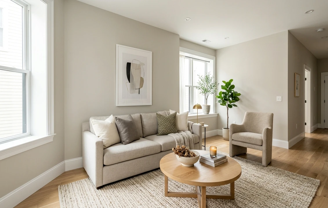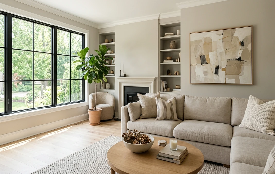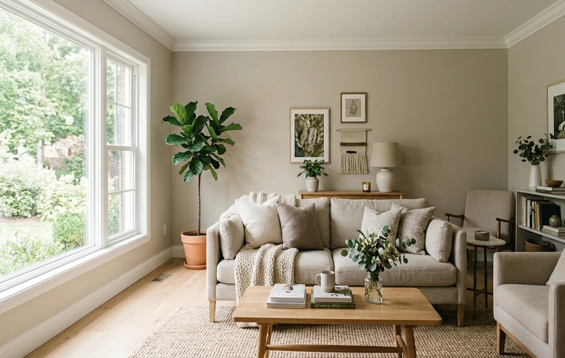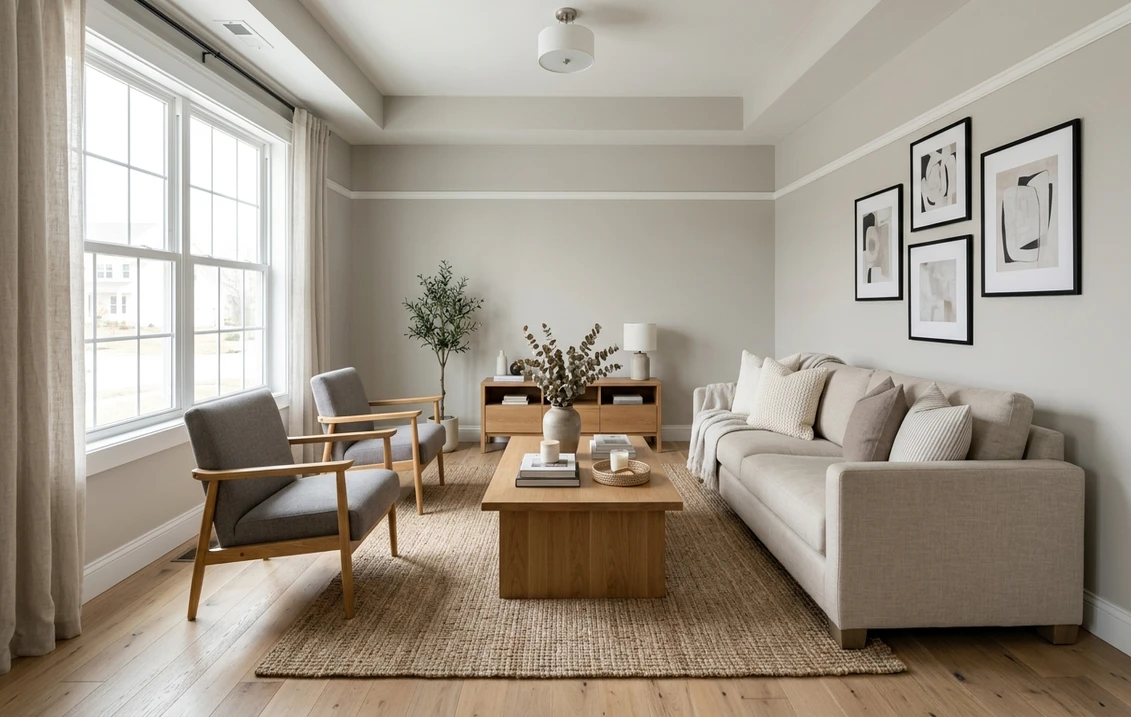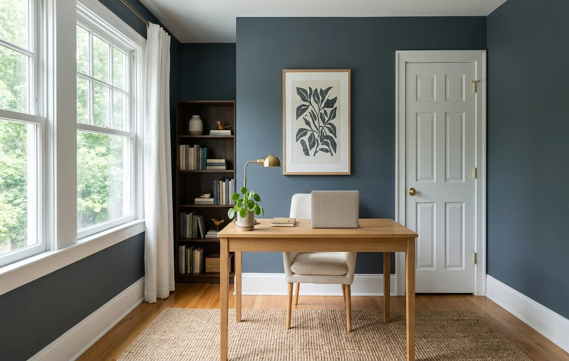

Sherwin-Williams Outerspace SW 6251 is a dark blue-gray: deep enough to read as a moody wall color, light enough that it is not a navy. The brand writes the name as one word, Outerspace, although many people search for it as "Outer Space". Its full details give an LRV of 11.64, the hex code 586168 (RGB 88, 97, 104), the Blue color family and the strip locator 225-C7, the darkest chip of strip 225. Next to the usual navies it is the lightest of the group: about 3.3 LRV points above Hale Navy HC-154, 5.2 above Cyberspace SW 7076 and 7.2 above Naval SW 6244.
One limit first: the color page gives a description, three coordinating colors and the strip, but no rooms, sheens or trim white. The undertone readings and room suggestions below are ours, built on the published numbers.
Upload a photo of your room and preview SW 6251 on the walls before you buy a sample.
What Sherwin-Williams publishes for SW 6251
The Outerspace color page opens its description with "Explore your dark side with this deep, mysterious blue," and its second sentence credits the color's gray undertone with a brooding edge. The full details give the figures in the table below; usage is interior and exterior, and this page stays with interiors. The color page also shows the seven chips of strip 225 and three coordinating colors. For the rest of the brand's interior range, start with the Sherwin-Williams interior paint colors guide.
| Figure | Value for SW 6251 | Where it comes from |
|---|---|---|
| LRV | 11.64 (12 rounded) | Full details |
| Hex and RGB | 586168; 88, 97, 104 | Full details |
| Color family | Blue | Full details and color page |
| Strip locator | 225-C7 (last chip of strip 225) | Full details |
| Coordinating colors | Quicksilver SW 6245, Front Porch SW 7651, Retreat SW 6207 | Color page |
| Lab reading | L 40.6, a minus 1.9, b minus 5.2 | Sherwin-Williams public color data |
| Hue and chroma | 206 degrees; chroma about 5.5 | Our calculation |
Try it on your room
- 1Your photoPhoto
- 2Your colorColor
- 3HD render in ~30 sHD render in ~30 s
Your photo is used only to create your preview. JPG, PNG, HEIC (iPhone)
Lightness. Sherwin-Williams' guide to color by room orientation defines LRV as the amount of light a color reflects, on a scale from 0 (no light) to 100 (all light). At 11.64, Outerspace is dark but well above the near-blacks (Tricorn Black SW 6258 is listed at 2.849). Hex and RGB are a digital rendering; judge the paint on a physical sample.
Is Outerspace blue or gray?
Both, with blue in the lead. In its RGB values (88, 97, 104), blue is the highest and red the lowest. Its hue works out to 206 degrees (our calculation), between cyan at 180 and blue at 240: the hue of slate and storm clouds, not of indigo.
Sherwin-Williams' public color data also stores a Lab reading, where b runs from blue to yellow and a from green to red. For Outerspace, b is about minus 5.2 (toward blue) and a about minus 1.9 (slightly toward green). The distance from pure gray, called chroma, is about 5.5 by our calculation; a true neutral such as Peppercorn SW 7674 sits at zero and Naval near 11. Outerspace carries about half the color of a navy: enough to read as blue, not enough to read as bright.
In a room (our reading), it reads as a slate blue-gray in daylight against white trim, and moves toward charcoal under warm bulbs at night. It is not a green-gray: the green push is small and there is no yellow.
A filing quirk. In their full details, Sherwin-Williams gives Outerspace the Blue family but Naval and Cyberspace the Neutral family, although Naval is about twice as blue by chroma. The label is no guide to how blue a color looks; the numbers are. For more blue-grays across brands, see our guide to blue-gray paint undertones and rooms.
Is Outerspace a navy? Outerspace vs Naval, Cyberspace and Hale Navy
Not by the numbers: the usual comparisons are all darker, and the true navies carry more blue. LRV, hex and family are published by each brand; b and chroma are our calculation from the hex.
| Color | LRV | Hex | Family or collection | b, chroma (our calculation) | Gap with Outerspace |
|---|---|---|---|---|---|
| Outerspace SW 6251 | 11.64 | 586168 | Blue | minus 5.2; 5.5 | None |
| Hale Navy HC-154 (Benjamin Moore) | 8.36 | 434B56 (page swatch) | Historical Colors | minus 7.6; 7.6 | 3.3 points darker |
| Cyberspace SW 7076 | 6.397 | 44484D | Neutral | minus 3.6; 3.6 | 5.2 points darker |
| Naval SW 6244 | 4.458 | 2F3D4C | Neutral | minus 11.0; 11.0 | 7.2 points darker |
| In the Navy SW 9178 | 3.712 | 283849 | Neutral | minus 12.5; 12.6 | 7.9 points darker |
Outerspace vs Naval
The Naval full details give an LRV of 4.458, the hex 2F3D4C and strip 253-C6. Naval is about 7.2 points darker and carries twice the chroma. Side by side, Naval reads as a navy and Outerspace as its grayer, lighter cousin, which keeps a little more light in a small or dim room (our reading). The Naval undertones and best rooms guide covers the deeper color in full.
Outerspace vs Cyberspace
The Cyberspace full details give an LRV of 6.397, the hex 44484D and strip 235-C7. Cyberspace is about 5.2 points darker and grayer (chroma near 3.6 against 5.5): a charcoal that hints at blue, where Outerspace is a blue grayed down (our reading). Our Cyberspace SW 7076 guide and the Naval vs Cyberspace comparison cover those two darker colors.
Outerspace vs Hale Navy
The Hale Navy color page gives an LRV of 8.36, places the color in the Historical Colors collection and calls it "a use-anywhere shade of navy with a classic maritime feel." No hex is printed on the page; the swatch in its code is 434B56, the basis of our calculation in the table. Hale Navy is about 3.3 points darker and somewhat bluer. Across brands, neither is an official equivalent of the other: compare physical samples on your wall. Our Hale Navy HC-154 review and the Hale Navy vs Naval comparison go further.
A simple way to choose (our reading). For a room that reads as navy, Naval, In the Navy or Hale Navy fit better; for a dark color that stays blue without the weight of a navy, Outerspace; for a charcoal with a hint of blue, Cyberspace. For a wider list, see our roundup of navy paint colors for interiors.
Strip 225 and the closest alternatives
Strip 225 is a ladder of one blue-gray, from pale to dark, all seven chips filed under Blue (LRV as published).
| Chip | Color | LRV (Sherwin-Williams) | Hex |
|---|---|---|---|
| 225-C1 | North Star SW 6246 | 62.34 | CAD0D2 |
| 225-C2 | Krypton SW 6247 | 51.939 | B8C0C3 |
| 225-C3 | Jubilee SW 6248 | 45.418 | ADB5B9 |
| 225-C4 | Let it Rain SW 9152 | 34.288 | 979FA5 |
| 225-C5 | Storm Cloud SW 6249 | 22.67 | 7A848D |
| 225-C6 | Granite Peak SW 6250 | 14.35 | 606B75 |
| 225-C7 | Outerspace SW 6251 | 11.64 | 586168 |
Granite Peak SW 6250, the next step up, is about 2.7 points lighter and a little bluer (chroma about 7.2 by our calculation), close enough for adjoining rooms. Storm Cloud is the mid-tone, and North Star or Krypton work as pale versions for a hallway (our suggestions). Sherwin-Williams' color data also lists similar colors; the first four are near twins, so a sample beats any table:
- Grays Harbor SW 6236 (LRV 12.121, Blue): about 0.5 points lighter and a touch greener.
- Rain Cloud SW 9639 (LRV 11.438, Emerald Designer Edition): about 0.2 points darker, greener, a little more color.
- Web Gray SW 7075 (LRV 13.118, Neutral): about 1.5 points lighter and much grayer.
- Needlepoint Navy SW 0032 (LRV 12.671, Historic Color): about 1.0 point lighter and bluer; despite the name, not a navy.
For the deeper end of the brand's blues, see our list of Sherwin-Williams dark blue paint colors.
Light direction: north, south, east and west
Sherwin-Williams' orientation guide does not mention Outerspace; applying its rules to SW 6251 is our reading.
North-facing rooms get the least light, and it is cool. The guide says to avoid cool undertones there because they make the room appear colder, and to choose warm undertones even for a bold, dark color. Outerspace is cool, so it goes against that advice: expect a cold, flat slate. A warm dark such as Urbane Bronze SW 7048 (LRV 8.121) fits the rule; if you want Outerspace anyway, warm bulbs help.
South-facing rooms get consistent warm light, and the guide notes that cool-toned colors may seem more neutral there: Outerspace reads closer to gray-charcoal at midday.
East- and west-facing rooms swing between warm and cool light, and the guide says to choose by when you use the room most. A west-facing dining room used at dinner sees the warmer, grayer version.
Bulbs: how color temperature shifts Outerspace
The U.S. Department of Energy's guide to purchasing energy-efficient light bulbs gives a table of color temperatures that runs from warm at 2,700 K through soft at 3,000 K and neutral at 3,500 K to cool at 4,100 K. Sherwin-Williams' orientation guide says to treat warm lighting like a south-facing room and white or cool lighting like a north-facing one. Applied to Outerspace, in our reading:
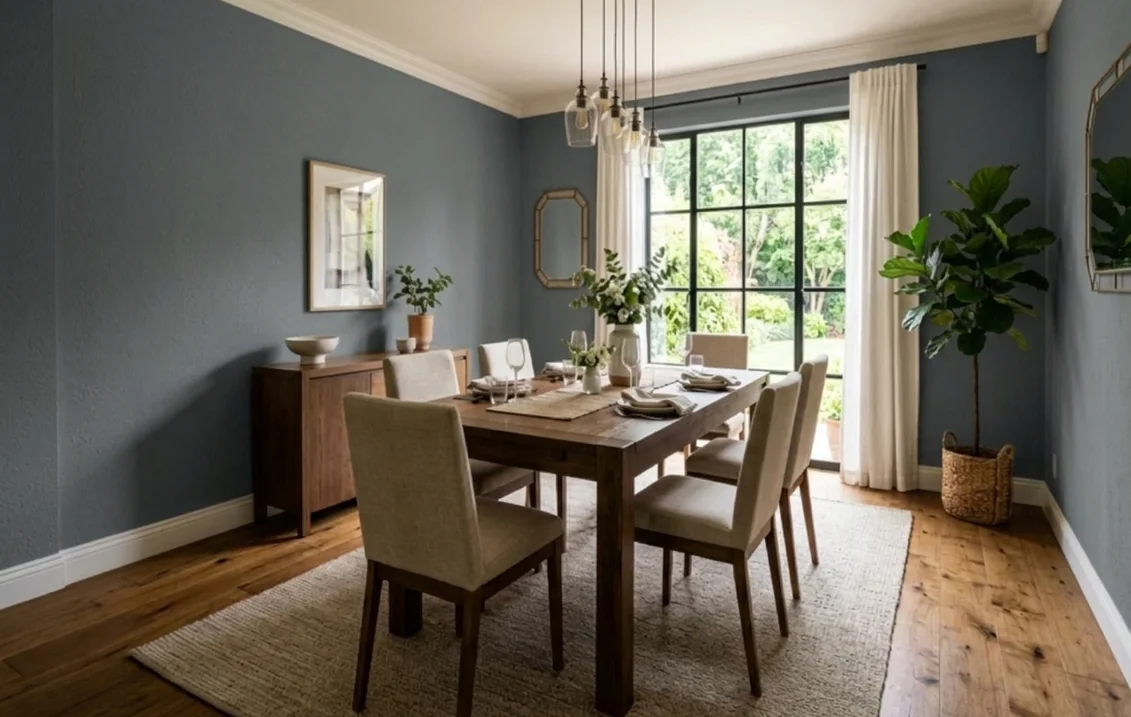
- 2,700 K (warm). The yellow in the light cancels part of the blue: a soft charcoal with a faint blue cast, cozy in a bedroom or dining room.
- 3,000 to 3,500 K (soft to neutral). The balanced version: a clear slate blue-gray.
- 4,100 K and above (cool). The blue comes forward: workable in an office, stark in a bedroom.
With an LRV under 12, the wall returns little of the light that reaches it, so plan more lamps than for a light color.
Best rooms for Outerspace, one by one
The color page names no rooms. The suggestions below are our reading of the numbers and the light rules above.
Home office. A blue-gray wall frames wood and white shelving, and behind a bright monitor it gives less contrast with the screen than a white wall does. Paint all four walls for a study feel, or only the wall behind the desk in a small north-facing room. Our page of blue home office paint ideas lists lighter and brighter options.
Bedroom. On every wall, with linen bedding and warm lamps, it gives an enclosed, quiet feel; on a single wall behind the headboard it is less committal. More ideas in our guide to dark and moody bedroom paint colors.
Dining room. Often used in the evening under warm light, which suits a color that turns softer at night; wood tables, brass fittings and white crown molding sit well against it. The navy blue dining room paint ideas cover the darker alternatives.
Living room. In a bright south- or west-facing room it can go on every wall; in a darker one, an accent wall or a painted built-in gives depth without dimming the space.
Color drenching. Walls, trim and ceiling in one dark color blur the corners of a room. With Outerspace it suits a small room with good lamps, such as a powder room or a den; elsewhere, Granite Peak or Storm Cloud make a lighter ceiling.
Outerspace on furniture, built-ins and interior doors
A dresser, a sideboard, a bookcase or a set of interior doors in Outerspace against light walls is another way to use it. Sherwin-Williams' paint sheen guide suggests a gloss sheen to highlight elements such as wood trim, cabinets, doors and furniture, and its room chart marks satin, semi-gloss, gloss and high gloss for cabinets and for doors and windows.
For those surfaces, the Emerald Urethane Trim Enamel page says it gives "cabinets, doors and trim a smooth, luxurious finish," claims a hard, durable finish and excellent blocking resistance (painted surfaces that do not stick when pressed together, as on doors and drawers), in satin, semi-gloss and gloss. Those are manufacturer statements, not independent tests, and the page shows no price unless you sign in. A dark door reads best with white trim around it (our reading).
Upload a photo and recolor the furniture while the walls stay as they are. For doors, use the door option of the interior visualizer.
What colors go with Outerspace? Trim, whites and coordinating colors
The first three are the color page's coordinating colors; the four whites are added for comparison. Gaps are our subtraction, roles our suggestions.
| Color | LRV (Sherwin-Williams) | Gap with Outerspace | Possible role (our suggestion) |
|---|---|---|---|
| Quicksilver SW 6245 | 75.405 | 63.8 points lighter | Cool off-white for trim, ceiling or the next room |
| Front Porch SW 7651 | 60.16 | 48.5 points lighter | Light gray for adjoining walls |
| Retreat SW 6207 | 20.869 | 9.2 points lighter | Green-gray for cabinets, a door or textiles |
| Extra White SW 7006 | 85.861 | 74.2 points lighter | Crisp trim, doors, ceiling |
| Pure White SW 7005 | 83.957 | 72.3 points lighter | Soft white trim |
| Snowbound SW 7004 | 82.771 | 71.1 points lighter | Soft white trim |
| Alabaster SW 7008 | 82.215 | 70.6 points lighter | Creamy trim, warmer look |
Trim. Against LRV 11.64, every white contrasts strongly, so choose by temperature. In Sherwin-Williams' Lab data, Extra White (b about plus 2.3) and Pure White (plus 3.0) carry little yellow and keep the pair clean; Alabaster (plus 5.2) looks creamier beside a cool blue-gray (our reading). Quicksilver, the lightest coordinating color, sits at 75.405 and reads as a pale gray-white. The Extra White SW 7006 guide and the Pure White undertones guide cover the two cleanest options.
Front Porch and Retreat. Front Porch is a pale gray with a hint of warmth (b about plus 3.5), for a hallway next to an Outerspace room. Retreat is a muted green-gray (b about plus 4.7), for cabinets or textiles.
Materials (our reading). Oak and walnut warm the cool gray, brass stands out against it, and terracotta or rust textiles give the strongest contrast, since orange sits opposite blue on the color wheel. For more combinations, see our guide to colors that go with dark blue.
Getting an even dark color: primer, sheen and paint line
Primer. Sherwin-Williams' article Cover Your Bases describes its Color Prime System, gray primer shades from light gray (P1) to the darkest gray (P6). It says about 20 percent of its colors are maximized over a gray-tinted basecoat, claims accurate color in fewer coats and more uniform color, and tells you to look on the back of the color chip for the shade. The code for SW 6251 is not in the online data read for this page: check the chip or ask at the store.
Sheen. The sheen guide says flat or eggshell finishes are best to hide imperfections and suggests eggshell or satin for bedrooms. Its room chart marks the five lowest sheens, from flat through matte, velvet and eggshell or satin to low lustre, for living rooms, dining rooms, offices and bedrooms. Save the higher sheens for doors and furniture.
Paint line. The Emerald Interior Acrylic Latex page describes "a formula that hides dark colors" and a "high hiding accent base" that it says boosts hiding power and delivers truer colors in matte and satin, in flat, matte, satin and semi-gloss. The Duration Home Interior Acrylic Latex page claims "no color rub-off and less visible shine after washing," in the same four sheens. The SuperPaint Interior Acrylic Latex page describes a paint and primer in one with excellent hide, in flat, satin, velvet and semi-gloss. These are manufacturer claims, not independent tests. Our Emerald interior paint review covers that line in more detail.
Two safety notes. The U.S. Environmental Protection Agency counts paints among the products that emit volatile organic compounds, and advises increasing ventilation when using them, meeting or exceeding the precautions on the label and buying only as much as you will use right away. And if the house was built before 1978, the EPA's page on reducing the risk of lead exposure at home says it is more likely to have lead-based paint, that projects creating even a small amount of dust can pose health risks, and that you should hire a lead-safe certified contractor trained in lead-safe work practices.
Preview Outerspace in your own room
Window direction, bulbs, floor and trim decide whether you see slate, storm blue or charcoal. Upload a photo of your room to the interior paint visualizer to see SW 6251 on the walls, furniture or doors, and compare it with Naval or Cyberspace in the same photo before ordering samples.
Sources and references
- Sherwin-Williams, Outerspace SW 6251 color page (description, coordinating colors, chips of strip 225) and full details (LRV 11.64, hex, RGB, family, strip 225-C7, usage). Read on November 17, 2026, and cross-checked against Sherwin-Williams' public color data (Lab values, similar colors, figures of every other Sherwin-Williams color compared).
- Sherwin-Williams full details: Naval SW 6244 and Cyberspace SW 7076 (LRV, hex, family, strip)
- Benjamin Moore, Hale Navy HC-154 (LRV 8.36, description, Historical Colors collection, swatch)
- Sherwin-Williams, color by room orientation (LRV scale, daylight, artificial light, dark colors in north rooms) and paint sheen guide (sheens by room and surface)
- Sherwin-Williams, Cover Your Bases (Color Prime System, gray primer shades P1 to P6)
- Sherwin-Williams product pages: Emerald Interior Acrylic Latex, Duration Home Interior Acrylic Latex, SuperPaint Interior Acrylic Latex and Emerald Urethane Trim Enamel (manufacturer claims, sheens)
- U.S. Department of Energy, Purchasing Energy-Efficient Light Bulbs (color temperature table)
- U.S. Environmental Protection Agency: Volatile Organic Compounds' Impact on Indoor Air Quality (ventilation, label precautions) and Reduce the Risk of Lead Exposure at Home (homes built before 1978)
Frequently asked questions
What is the LRV of Sherwin-Williams Outerspace SW 6251?
Is Outerspace blue or gray?
Is Outerspace a navy?
What is the difference between Outerspace and Naval?
What colors go with Sherwin-Williams Outerspace?
What white trim goes with Outerspace?
Is Outerspace a good color for a bedroom or a home office?
What sheen works best with Outerspace?
Trademarks mentioned (Sherwin-Williams, Benjamin Moore, Behr, Caparol, Brillux, Sto, Alpina, Valspar, PPG, Glidden, Dulux, Crown Trade, Sandtex, Farrow & Ball, Johnstone's, Leyland) are property of their respective owners. FacadeColorizer is independent and not affiliated with any of them. Nominative fair use under Lanham Act §1125.